
Hi everyone, it's Riikka Kovasin (Paperiliitin) with you today, and I'm here to share with you my very first PaperArtsy blogger project! I'm very excited about this!

When I read the theme of "Second Life", I was captivated. I love re-purposing items and often use bits and bobs in my assemblages. Recently I've been drawn to alter mint tins. The fun part in those is the element of surprise. I rarely alter the box from the outside, but instead concentrate on the inside, creating a world of my own. If you wish to take a peek on the previous tins I've made, here's a Reel about some of them on my Instagram.
I usually "go with the flow" when I'm creating and let the project lead me. This time I had a vivid image on my head of a secret garden inside a tin when I started the project. I wanted to use the beautiful new stamps by Kay Carley (see here) to create a little spring garden inside with lush pastel colors. Those two ideas were my starting point.


My first decision needed to be about the tin. I had a couple empty ones on my stash waiting to be altered. I chose a nice orange one for a couple of reasons. First - it was there, ready to be altered. Secondly, it reminded me about the sun and the increasing amount of light we get here in Finland during spring. And thirdly, that nice warm orange was a great contrast to the colors I was planning for the inside.

The second decision was choosing my path. I often start with the background and move towards the focal point elements. That's how I went about the project this time, too. I started by creating the background for my garden and after I had it done, I started playing with the flowers.
As the background was the sky in my mind, showing through the flowers, I went with blues. I chose PaperArtsy Fresco Finish Chalk Acrylic - Summer Sky (FF150) to be my background color. I painted the edges inside the tin with the paint but also added some paint to a piece of white cardstock. As that was just a monotone surface, it needed something more. On top I decided to have a go with Infusions Dye Stains. I sprinkled some PaperArtsy Infusions Dye Stains - Sleight Blue (CS13) and Royal Blood (CS10) on top of my cardstock and added water. As you can see from the photo underneath, I went heavy handed with the water, releasing a lot of the brown tones from the brown walnut crystals, too. It gave the project a lovely vintage tone and changed my future color choices a little.

After drying the Infusions Dye Stains layer, I then took the tin and chose the placements of the two pieces coming inside it. I cut these bits out. This way I could concentrate to the right areas and especially decorate the edges as I knew the flowers would be covering the middle quite heavily. Although I must say that I enjoy building layers and the process as itself - so if I end up covering something, and I usually do, it's fine! It's all about letting the process lead you, enjoy the flow and not to be too attached to the layers.
As the Infusions Dye Stains set my mind into vintage gear, I wanted to bring some tea tones to the background. That I did by collaging some book paper pieces to the background. To mask these new bits to go seamlessly with the blue, I used stamping. I stamped with two text like stamps on top of the seam, binding the elements together. First I stamped using Ranger Archival Ink - Hydrangea and the weather forecast stamp from PaperArtsy Ink and the Dog Words 3 set (W3). Then I took the alphabet version of the same set and stamped that using Ranger Archival Ink - Jet Black.

As I was going for a sky look of the background, I thought to add some clouds there using a PaperArtsy Kim Dellow stencil (PS035). For the stenciling I used PaperArtsy Fresco Finish Chalk Acrylic - Heavy Cream (FF203). I added a cloud to both of the inserts and then some dots, too. While they add some extra pattern to the background, I also thought them to represent snowfall. This is because of the surprising spring weather of Finland - snow is not uncommon while the first flowers like crocuses emerge through the snow drifts.
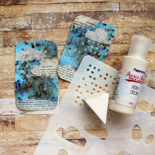
After the stenciling I was ready to insert the pieces inside my tin. I used double sided adhesive to adhere the cardstock pieces in place. If you re-create something like this, my tip for this stage is to add the double sided sheet before cutting the inserts loose several steps back! Then you get a perfect "from edge to edge" coverage with the adhesive without needing to cut the same shape twice! On the other hand, I needed to trim the pieces smaller when I was putting them inside the tin as the sketched line of course is the outer edge of the tin.

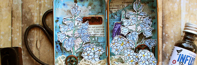
Now that I had the backgrounds done and in place, I could turn my attention to the actual garden part, to the flowers. My first place to ponder and reflect was choosing the flowers to go inside. I wanted to use as many as possible, layered together, but on the other hand wanted to avoid a clutter. Size of the pieces was also something I needed to keep in mind as the tin was a rather small one. I picked some forget-me-nots and checkered lilies from PaperArtsy Kay Carley set (EKC55) and some bluebells from the other set (EKC54) {NB. Both sets available exclusively from PaperArtsy retailers unil April 2022, list of stores here.}
After choosing the flowers I wanted to my garden, I stamped them using Ranger Archival Ink - Jet Black. I still wasn't sure how to color them, so an archival ink was the safest bet.

When I then had my flowers stamped, I needed to decide which medium to use to color them. The two options I was drawn between was using PaperArtsy Fresco Finish Chalk Acrylics and then just colored pencils. With the Frescos I could have gone with a splodgy, haphazard coloring fitting to the grungy background, but I chose the colored pencils instead. Not because of the neatness and ability to control the area of the color better but instead because of the lightness or airiness. Having a background so filled with layers already, I wanted to keep the flowers as tender and light as possible. Kind of capturing their fragile nature.
I chose to color the flowers mostly with their natural colors. Meaning I used blue both to the bluebells and forget-me-nots but went a bit artistic with the checkered lily. After coloring the flowers they were just too neat looking with the grungy background. So, they needed something added to make them more part of the project than just floating on top!
A tip for such a problem is to take something from the background and bring that to the foreground. I picked up the weather report stamp from the background as well as the other Infusion. Adding these two elements on top of the colored flowers made them more in my style and also made them more a part of the background. The stamp was from PaperArtsy Ink and the Dog Words 3 set (W3) and the Infusion PaperArtsy Infusions Dye Stains - Royal Blood (CS10). I used the Infusion just to add some splashes to the flowers. After adding these little touches, I then cut the flowers out.

Now I had my flowers all ready and it was time to plant the garden. I wanted a really layered look. I was kind of going for the look when you enjoy the summer, laying on the grass and see the blooms from a totally different perspective. Like you would be a little fairy or a gnome, flowers towering above.
To get that layered look, kind of perspective, I used foam tape to adhere the blooms. I put the darkest one, the checkered lily to the background not to steal all the attention and then layered the bluebells and forget-me-nots on top. A tip - on this stage you need to pay attention to the height and placement not only because of the flowing composition but also that you're able to close the tin! So, after adding a couple of the flowers in place, I closed the lid making sure that still works before adding a couple more flowers.
I love the term Seth Apter uses about making the composition. He refers to the adding of the elements as "auditioning". I do the same, I test a piece and the placement. I try to audition the pieces quite quickly, so that I rather follow my intuition than my reason. This gives me no time to overthink things!


Now my garden was growing nicely with layered blooms and plants, so the main elements were in. But the flowers were growing out of nowhere. Naturally, you could think that you just can't see the ground or soil, that the point of view is just a little above it, but I wanted to ground my elements. As I already had the vintage touches going on there, I made the ground using some tea dyed lace. To secure that in place, I used a heavy body gel medium. I added some blobs of the medium to the bottom of the tin and then pushed the lace in. This way it's not totally adhered, but will stay put and also will stay fluffy and airy compared for the totally adhered version.
To grunge the garden a little bit more, I then added some small metal embellishments between the flowers. At this stage I was thinking of naming the piece "The Machinery of Spring". To adhere these heavy embellishments I used the heavy body gel medium, too.

It's funny how the last little details usually take the longest time in such a project! In a way, I could add little bits in for hours and hours but I try to remember my husband's one favorite instruction - "don't overdo it!". After the gears I added some Prima Marketing Art Ingredients Art Stones to the ground. They are as the name says little pebble looking things that almost match the tea dyed lace color and add another grounding element, giving an air of ground to the lace.
I wanted some kind of word to the piece, kind of a title. For that I used a fun technique using embossing powder. I first stamped the word lightly to a piece of cardstock, kind of sketching it. Then I cut the piece off, added some embossing ink on top and covered the piece with embossing powder. After melting the first layer, I added two more layers and while the third embossing was still hot, I pushed the stamp into the embossing powder thus creating a dimensional piece with the word. I then highlighted the dimension further by painting the piece first with black gesso and then added a layer with a copper toned wax, Prima Marketing Art Alchemy Metallique Wax - Rich Copper. If you want to see this technique in video form, please see this older video on my YouTube (link).

As the last two details I added some Ranger Distress Ink - Vintage Photo using a wet brush to the biggest white areas on the blooms. With all the warm, vintage tones going on, the white paper I used to stamp the flowers to was just a little bit too bright in places. The small edge didn't bother me, but in the larger areas in the bluebells were stealing the attention too much.

I often finish projects with splashes or add them to the project in some stage. I wanted some delicate white details to the project, but didn't want to risk the splashes going to places I didn't want them. So, instead I grabbed a paint marker and drew some little crosses and dots to the place where I'd wanted the splashes to land. This is a nice way to add tiny details without the risk of something bad happening!
As a finishing touch I added a pencil drawn frame around the background pieces to have a bit of my own "handwriting" in there. A humble pencil is usually dark enough to have some impact but subtle enough not to cry for attention.


Here is my little garden in a tin! I really liked playing with the Infusions for the very first time while doing this project. If I'm honest, the brown tones took me totally by surprise because I'm "try first, read manual later" style with new things. But I loved the effect they created on top of the pastel sky and how they then lead my process to another direction.
I also really like the surprise element of an altered tin! Maybe that's why I've created several in a short time... I love how you can add anything you like to the inside, create a little world of your own. You just need to keep the height and composition in mind so that the tin will close. As otherwise it's not that much of a surprise, right?
Thank you so much for stopping by today! Wishing you all the best!
Riikka

Facebook: Paperiliitin
Twitter: @paperiliitin
Instagram: @paperiliitin