
2021 Topic 10: My Favourite Colour

This is the cutest little pocket niche, and what a great tip to fold before adding colour and stamping so you can get the right details on the front facing sections! Love that clear embossing too! It really looks cool on those old papers to introduce a transparent layer!
~ Leandra
Hi everyone, it's Sara Naumann with
you today, and I'm here to share an easy little pocket-style book. I
have a thing for these simple folded booklets—I love how it makes a fun
presentation for tag art, notes, little treasures, and could easily be
adapted to any style or favourite colours.
Speaking
of favourite colours...(or "favorite colors" for my fellow Americans!),
I was hard pressed indeed to choose as I tend to love them all! But
blues and greens have always been my go-to colors and honestly, when I
feel down or find myself crafting for therapeutic reasons (we've all
been there, right?) then I tend to reach for those shades.
Blue
often represents sea, sky and open spaces, as well as freedom and
imagination. Greens, of course, relate to the earth, renewal and hope.
Blue and green go well together not only in terms of their colours, but
also because of these feelings. In coordination with the nature theme,
I've chosen a new and an older set of stamps: Eclectica ESN47 has those large leaves and inspiring quotes, and Eclectica ESN54
has our "magic" and seahorse. When I'm designing a stamp set, I always
try to make sure it will coordinate with other, older stamps you already
have so you can get the most mileage out of your stash!


First, you'll need an A4 sheet of cardstock—nothing too heavyweight, Smoothy 240
is perfect—and some paints and your brayer. When working with multiple
colours, I find it's easiest to choose one dominant colour (Fresco Finish Marbles), then a secondary colour that I'll use less of (here, Fresco Finish Aqua Duck Egg). Then, I pick a few more contrasting colours to use in smaller amounts as accents. I'm splattering with Fresco Finish Gold, then Fresco Finish Mouse Ears, and edging and reverse-stenciling with Fresco Finish Slate.


You can either fold your paper first, or paint first. I'm going to fold this one first.

First, fold it into six even sections.

Then, fold in each corner as shown. A bone folder really helps, you want those folds to be crisp!

Fold the piece in half the long way.

Position the piece with the long edge closest to you, then fold in each side as shown.

Tuck one corner into the other.

Then
I unfolded the piece to paint it. This means I can plan my painting,
stenciling and edging on which section will be in the front, and what
will be on the back. When I brayer-paint my background, I'll put a
little dollop on my craft mat, run the brayer through the paint and then
across the cardstock. I like to leave some white showing for contrast. I
brayered with Fresco Finish Marbles first, then let it dry and brayered a bit of Fresco Finish Aqua Duck Egg.

I love some Grunge Paste texture! Here I'm using the PS272 stencil, which is a great one for abstract patterns.


Scrummelling some Grunge Paste through your stencil gives interest and dimension—of course you can tint the Grunge Paste with paint but I'm a big fan of the natural bone colour that adds just the right amount of contrast to a painted background.

Bring on the gold! Splatters of watery Fresco Finish Gold paint give some metallic shine and more contrast. Let it go over the Grunge Paste-stenciled design too.

Then repeat the procedure with another colour of paint, like the adorably-named Mouse Ears. This is a darker, leafier green and you only need a touch to create some really gorgeous contrast. It seems to have blue tones as well as green, which makes it perfect in combination with Marbles and Aqua Duck Egg.
When
the paint is dry, then just fold up your pocket. You can then have a
look at what portions of the booklet you want to accent with more
splattering or stenciling. I decided to pull out PS204 and stipple a bit of Mouse Ears on the inside back of the pocket.

Glue the bottom together—I use a bit of white glue on a toothpick.
Now it's time to fill up your book!
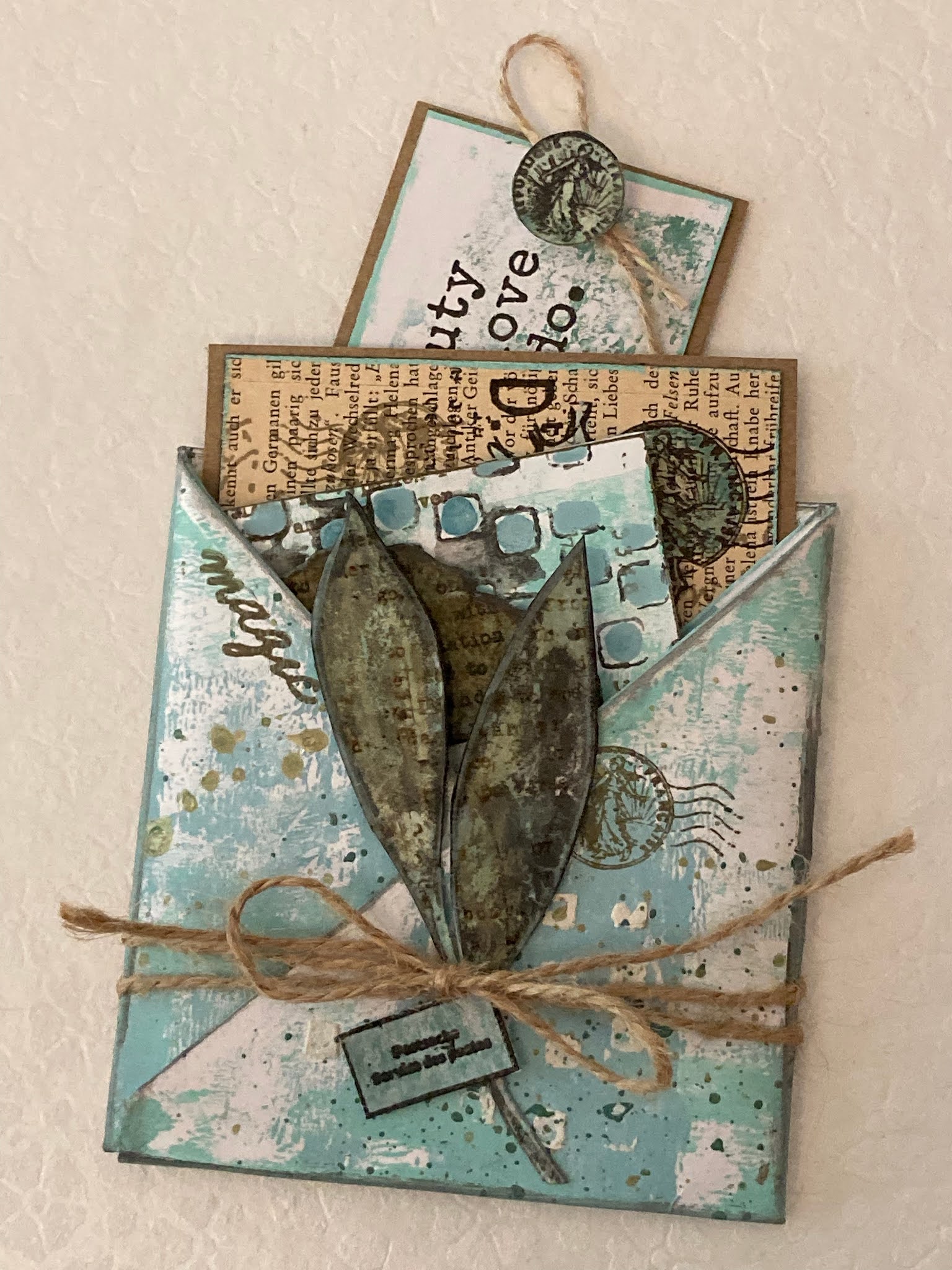
Each fold will create a little pocket, so you have space for all kinds of things.

So
what to put in your pocket book? Well, I love little paper treasures
and notes, personally... but you could also tuck in a gift card, a
special recipe, a thoughtful note or small gift item.

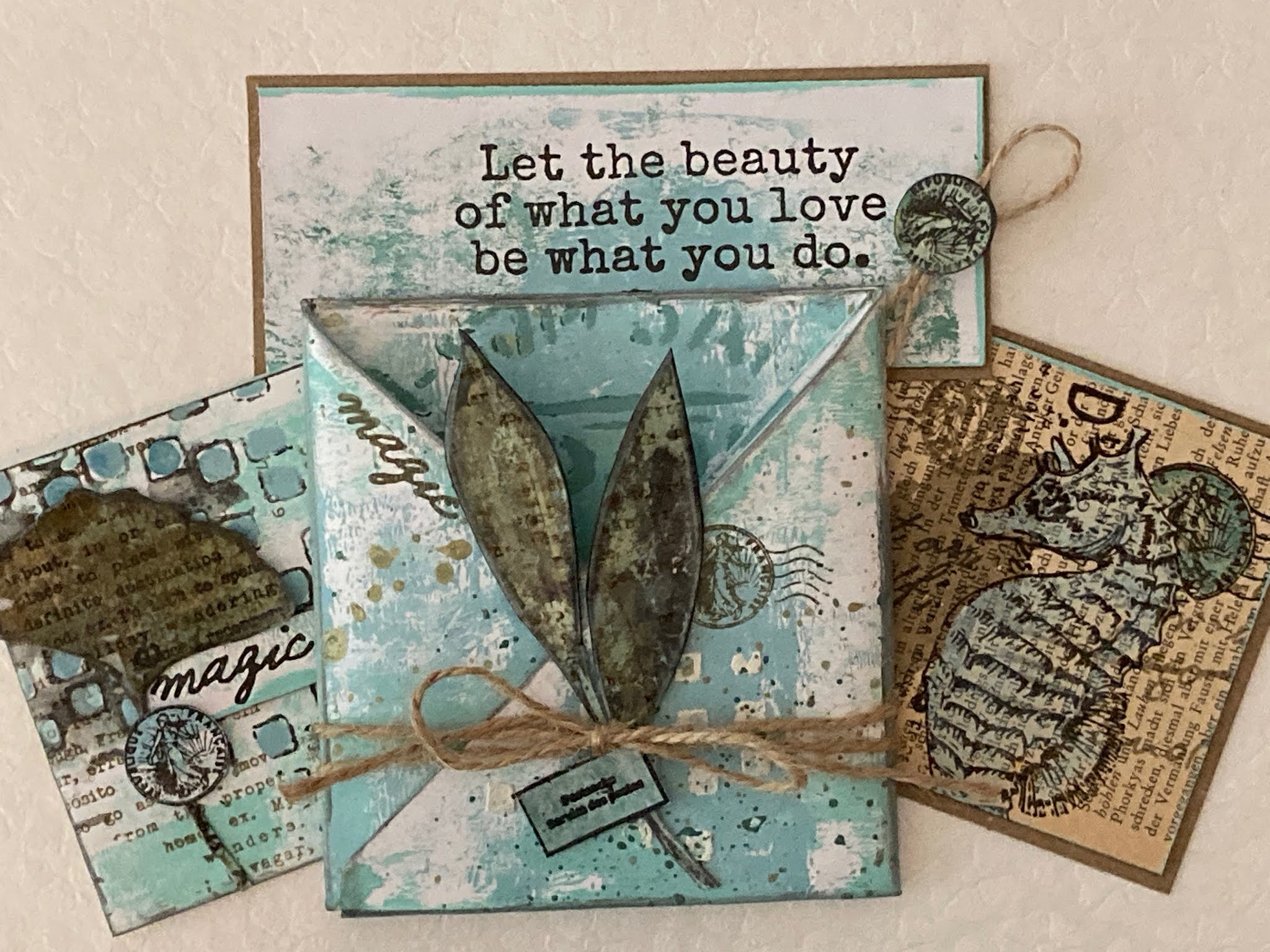
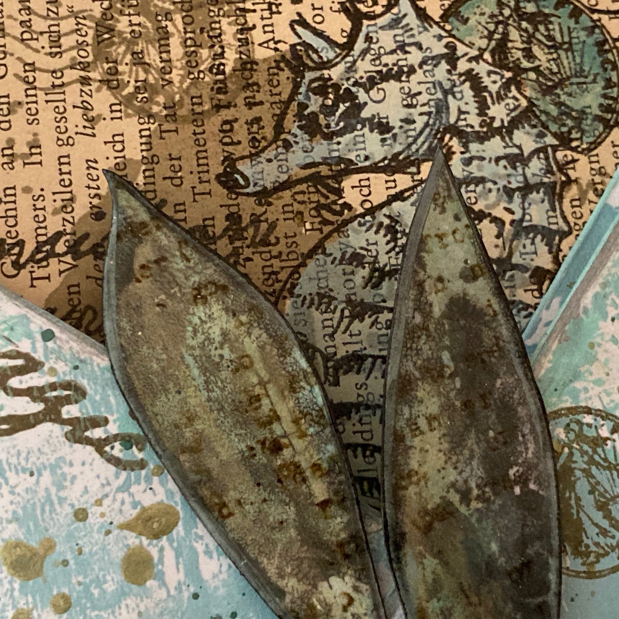
This is a layered combination I really love—the ginkgo leaf from Eclectica ESN47 with the seahorse from ESN54 heat-embossed on top and painted with Marbles and Mouse Ears.

Here's the gingko leaf again, clear-embossed, cut out and layered on top of a reverse-stenciled background done with Fresco Finish Slate and the PS272 stencil. The text stamping is from Eclectica ESN54, and is the dictionary definition for "wanderlust".

This is a favourite quote and one that works nicely as a bookmark-style piece. The postmark "button" at the top is from ESN54.

The leaves here are from Eclectica ESN47. I stamped them with a blend of the blue and green paints, added some Gold and then clear-embossed on top to give some durability before cutting them out and placing them on the front of the pocket.
Then, just tuck your treasures inside the various pockets!


After
everything is folded and assembled, you can add any finishing
touches... more stamping, a bit more stenciling or splattering, some
edging, twine or ribbon. And while I've only made one of these little
pocket books, it occurred to me that you could make several and bind
them together to be a larger book of pockets!
I hope you enjoyed the read today and the colour inspiration too!
Blog: Sara Naumann


