Showing posts with label MN121. Show all posts

Thursday, 6 October 2022

2022 Topic 14 : Colour Study: Triads {by Leandra Franich} with Jo Firth-Young stamps


Hi everyone, it's Leandra with you today, and I'm here to share with you a journal page using the happy rainbow stamps by Jo Firth-Young.


I, possibly like others of you, haven't heavily relied on a colour wheel to inform my colour choices when being arty-farty. I have always followed my instinct, chosen colours I like, and then tend to see what happens. You end up with your go to colour combos, but the rebel in me wants to be able to use all the colours of the rainbow !

I have a few principles that I have found tend to work for me, but there are certain combinations or colour-worlds that I cannot enter comfortably, and those I tend to have less success with, maybe that is because my knowledge about colour theory has some weak spots!

I have loved making lots of colour wheels this year using the template we have created for you at the start of the year. I am very partial to using weird options as my 'primaries' and quite often all 3 starting colours are not primaries, if they are, I often choose non-traditional primaries.


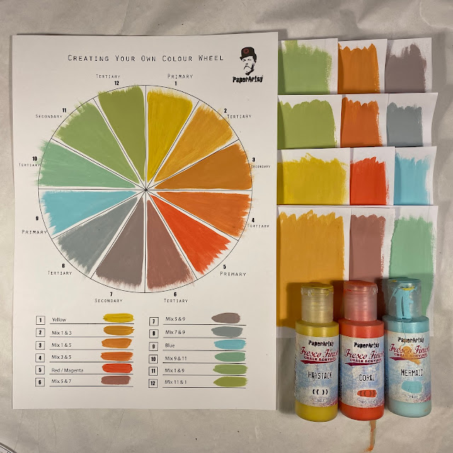
Here is the colour-wheel for this project. As the topic is Triads, I was only allowed to use 3 evenly spaced colours.  Haystack is one of my go-to yellows because it is opaque, and that means when mixed with anything else you will get a  softer, creamy colour. YUM! Mermaid is one of our most popular blues, and it has a bit of brightness to it so that is a tick for me, and my third was lovely Coral, a pretty pinky-orange. So yes, I admit they are all kind of close to primary shades.

The wheel above is what you get when you create a colour-wheel from those 3 shades, and the wheel below is the 3 starting Fresco Finish Chalk Paint colours isolated as a TRIAD.

TIP #1 - SEGMENT BLOCKER
a. I find it much easier to see the possibilities when I have 'windows' through which colour combinations appear. Use a second colour wheel printed on card to 'block' the rest of the wheel. Use a craft knife to cut out the segments. You can then spin the wheel to isolate each of the triad combinations. You can also see the 4 possible triads for this wheel on the swatches to the right.
b. why not create a segment blocker for the two previous colour theory topics we studied earlier this year: Complementary Colours in Topic 1: Opposites Attract, and Topic 8: Split Complementary Colours. ?


TIP #2: SWATCHING 
As you mix you colour wheel... 
a. create swatches on paper squares as you work. (see mine to the right above) These swatches allow you to isolate colours from your wheel, perhaps take them to your paper or embellishment stash to pick out some co-ordinating ribbon, cardstock, fabric etc. 
b. you can also use them to find new colour combos ... maybe from other wheels
c. if you are working across several days with this palette, and you need to re-mix more wet paint, it is easier to colour match to a larger swatch than the colour wheel.

For my project today I decided to go for this triad below. 
The blue-heavy yellow made minty green, The Yellow heavy Coral made tangerine, and the Coral heavy blue made a dusky pink.


Actually, I went a little bit further to use a 'TRIAD PLUS' combo .... in for a penny, in for a pound right !? But I only used the tiniest bit of Mermaid with the Plum (made from Coral and Mermaid) in my journal background. Sneaky huh!
I strictly kept to the 3 Triad colours for my focal elements on top of the background though.


Check out my reel for this post on Instagram and you will see all the above in less than 90 seconds and it will all make a lot more sense!


This page started life as a spread faffing around with colour. I was trying to put a little of every colour of the wheel onto the background, and then see what happened.

It soon got a bit overwhelming the more colours I had on there. I realised swatches would really help me to figure out where to go next, and perhaps I should choose one of the triads. So I started recreating the paints, chose my triad, and used the new batch of paint hide a lot of what was already on the page from the cool side of my colour wheel. Hence why I ended up with Triad PLUS, as the touches of Plum and Blue were still visible. But I wasn't too worried, by the time I finished, I knew those would not be as dominant.

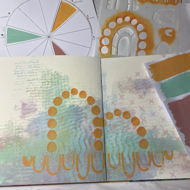
I realised that what it was lacking was the 3rd colour; I had nothing from the warm side of the triad at all, so I hit the tangerine with PS308 (the JoFY rainbow stencil), adding a bit of depth with colour 3, the Orange made from Haystack and Coral.

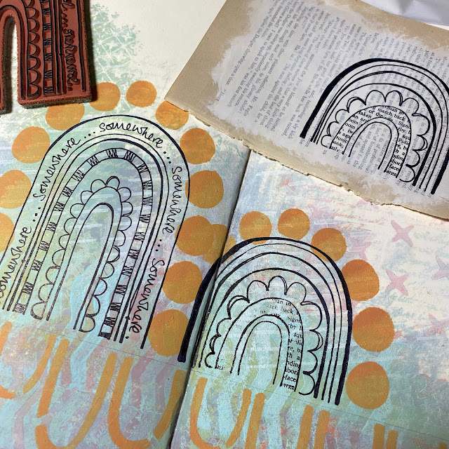
Rainbows...I stamped them on white regular smoothy, on off white painted book paper, and then just stamped directly onto the background. Not an issue for this page...but the facing one...
 
 
...hmmm .. not so good. But I did manage to fill the gaps, although it was very tempting to just stick the book page version on top.


Next step was adding colour. Now I must admit, normally I would just start adding colour without thinking much, but I had to be careful to keep this triad balanced, so I thunk a lot harder than normal! I couldn't add orange to the top semi circle, as there were orange spots there already. To contrast left the choices as nothing (page background), minty green or dusky rose, or book page....or white maybe??


So first decision was easy, use the stamped book page to complete the 'missing' book page segment of the little rainbow. To help the orange pop I put some Chantilly paint (a warm white) under the Tangerine for a bit more oomph. If I put the orange on the blue background, it would have ended up looking a bit more brown than I wanted. The mint went in 2 places, and just one strip of Dusty Rose, as it it ended up quite a bold colour.
 

To finish some white dots and I mixed some Steel Grey with Matte glaze to create a soft shadow.


The rainbows come from this JOFY stamp (JOFY110), and onto the little background zone top right I made a third rainbow from some of the leftover bits stamped on the book page.


White circles were added onto the orange dots as erratically as was possible ...


And I decided a grey shadow line might be a good idea too....although I still feel the lower section may end up with some further tweaking. I am not sure about the orange reflection rainbows at all ... I have 3 different ideas for that area, and not sure yet which route to go....


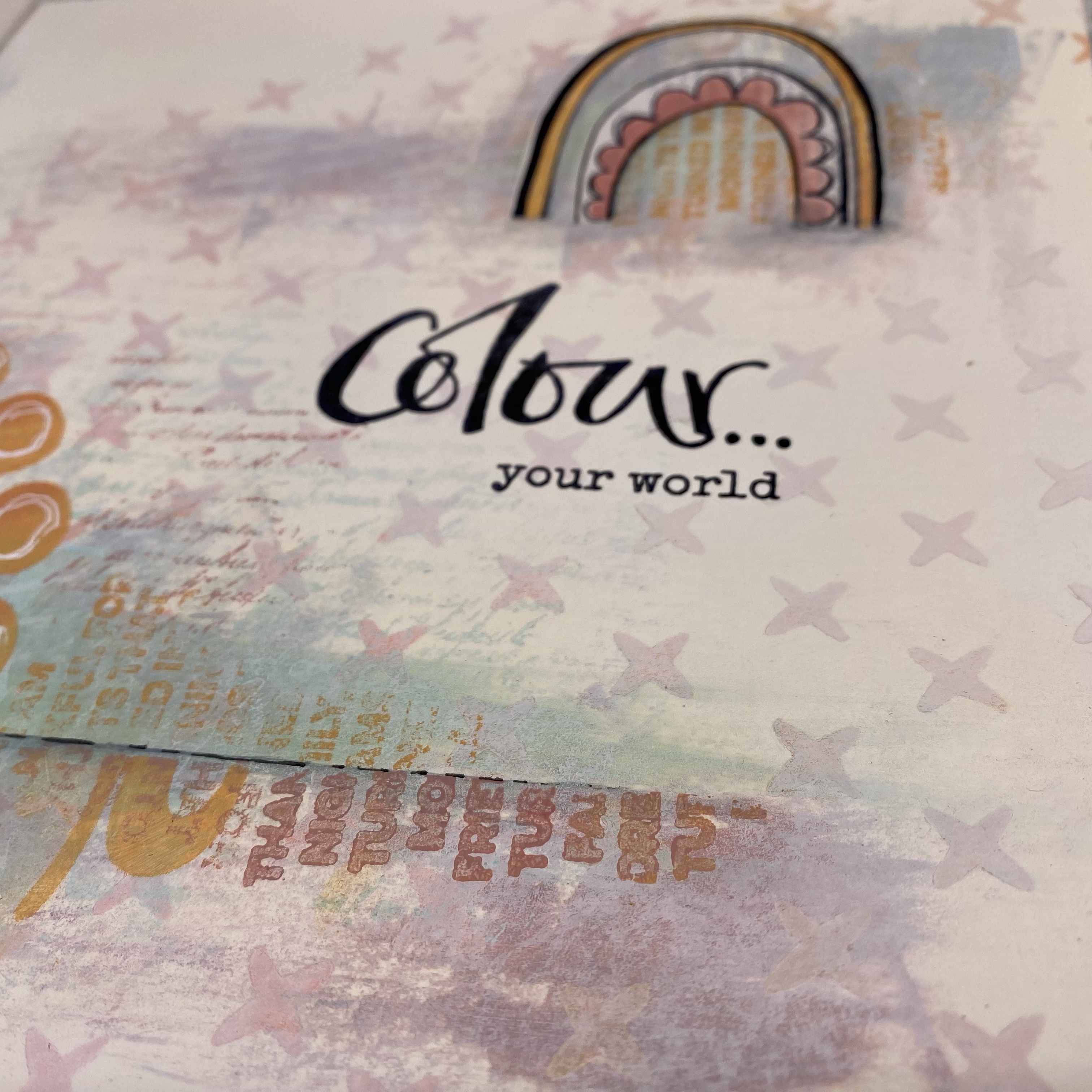
These are happy stamps, everyone loves a rainbow!


I added the colour quote to the right hand page, when I need something to be straight, I use a clear ruler with grid lines as my acrylic block!

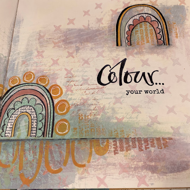
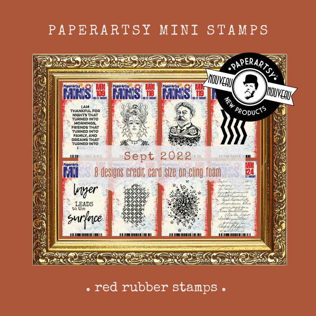
I had also added a bit more blocky type stamping from Mini 109 (MN109) releases last week, and you might also spot Mini 124, (MN124) another newbie, that script is just too delicious not to use everywhere.


Same logic was applied to the left side of the spread.
 
 
I really like how the minty green background wafts off to the upper left side of the page. Oops that is another new mini too MN122, and the chevron is MN121.
 

So there you have it, a fairly simple spread, but NOT in colours I would ever normally choose to use together, and getting the balance right really did take more thought than I would normally need!


I was quite pleased that I managed to stick to the triad colour concept, I love the pop of orange on those circles, I think it would be useful to use this colour combination again, but probably with block of colours in the background ... maybe gel printed to get me to work with the same colours in a different way to build my confidence with them some more.


I tend to listen to arty podcasts over the weekend when I am tackling the household chores or cooking. I am increasingly testing the concept that keeps coming up in the chats I am listening to: pick 3 colours, and create a colour wheel. All the colours you create will always work with each other. Well surely that is super helpful to not make mud ?! So this is my plan, to start working with 3 paints, and see what happens more, and to lean on my colour wheel for guidance.

See you next time!
Leandra

Thursday, 29 September 2022

NEW PaperArtsy Products: Printed Tissue and Mini Stamps {September 2022}


A note from Leandra:
The range of mini stamps we offer, both within the PaperArtsy core collections (Minis, Squiggly Minis), and across our designer lines, both Signature designers and within the Eclectica³ stamp collections, have grown in popularity in recent years. 

They are a great price point, and a fun size for all manner of projects. So it was only natural for us to continue to add to this series with another 8 new Mini Stamps; a range of backgrounds, words and focal designs for all your needs.


Minis are good starting points for newbie crafters, but also a nice addition for those of us a bit longer in the tooth! They also make excellent gifts for your crafty friends and with Christmas coming up could fit the bill nicely for secret Santa gifts too. Many of us are having lots of fun working small, be it mini books, ATC's and other teeny projects. Sometimes, having a small focal is exactly what you need; a frame, a window, a ticket or tag, and tiny patterns, like border strips, can be easily repeated to make larger patterns.


Along with the mini stamps, we are super-excited to share with you our second release of 'Printed Tissue'. The focus is on frames, but you will find some stunning collages we have made and plenty of background text and patterns too.  Once again, you will recognise some of our well known stamp images from both the Ink & the Dog stamp range, and also from Hot Picks. We take great care to make sure the size of the stamps is different to your red rubber version. 

The idea is that you can use the frame either with or without the collage that is sitting inside it. Just by running a wet paint brush inside the frame, you can easily pluck out the image and separate it from the frame. We have also left more white space in case you have the need for some blank areas to stamp up with your own preferred script, words etc.

Leandra and Dounia will be along to share with you LIVE these new products and ideas over in our Facebook Group, PaperArtsy People shortly after this post publishes. Do drop by and come to say hello.
 
For the next few months, these products are available EXCLUSIVELY from our approved stockists. Please check the list at the foot of this post or the dedicated tab at the top of this blog post to find a retailer online or geographically near you, it makes sense to order within your country where possible.
 

Price: RRP €4.90 +VAT    Size: approx credit card size
All stamps are individually trimmed onto cling foam, with a laminated storage/index sheet.
  

Dounia here. I really love working with Mini stamps. They are so fun and versatile. Despite their small size, you can always do more than expected with them and fill bigger projects. This release mixes focals, quotes and backgrounds to give you all the building blocks for any project. I chose to display them in a mini book in a bright and autumnal colour palette. I started with a series of textured backgrounds using MN121 to 124, which became the base of my pages. I also made use of the new Printed Tissue to provide frames and backgrounds on all my pages. You will therefore get some previews and sneak peeks all along!

PaperArtsy Ink & The Dog Mini 109 (MN109)


Some among you may have noticed that the previous Mini release in March started with MN110, while the collection only went up to MN108... MN109 was not actually forgotten! The design already existed but was not released. Here it is, right on time for Thanksgiving and other end of year holidays.


It is a quite substantial quote, great to fill a card, a tag or a page by itself. The bold font makes for a impactful statement. I think the more delicate background provides a great contrast that does not detract from the words.
 

Here it fits snuggly in one of the ornate frame from the Printed Tissue, used without its inside (it was not wasted and appears a bit later in this post!).


I chose to cut up the sentiment and stagger it for more dimension and movement, as it is the star of the page!


This page makes a more subtle use of the quote, here mainly to complement the picture. For a personalized (and shorter) message, I used only some of the words as a border to ground the design.


I also used the stamp to create a background texture. It fills space quickly and the repeat stamping reveals new inspirational or absurd sentences!

PaperArtsy Ink & The Dog Mini 118 (MN118)


This lady is a cousin of MN110, but crowned with candles and draped in stars, she is ready to light up cold nights. With a tiara, necklace and mistletoe, she is dressed to the nines to be the Queen of the winter ball!  


For her, I played with the light and star theme. The necklace and stars easily create a halo to frame her and eliminate the need to fussy cut that mistletoe! The cape makes her look very regal.

 
I love the detail on her face. This close-up certainly shows that my colouring is far from perfect but just a touch is enough to make her come alive.


The letters from the Printed Tissue create a simple transition between the focal and the background, grounding her and completing the page.

PaperArtsy Ink & The Dog Mini 119 (MN119)


This distinguished and jovial mustachioed gentleman also comes from the stars ready to light your way. The King to his Queen, his crown is holly, for cheer and good luck as the year-end nears!
  

Using a frame from the Printed Tissue, I gave him his own halo. It was not on purpose but dressing him in green really gives him a Saint Nicholas air. He is ready for the Holidays in all the time zones!
 
 
I like how smiley he looks, tucked in his frame. A little bit of shadow inside the frame instantly creates dimension and interest. Once again, the background numbers are a simple way to integrate the focal into the background.


Here is the royal couple, appearing at the windows of their castle, in a more fun and peppy colourway. I think they coordinate well as a couple! 


This time she is a blonde and he is a brunette!

PaperArtsy Ink & The Dog Mini 120 (MN120)


This a quote every crafter can relate to! Each group of words is nicely spaced out, giving impact and making them possible to separate for more playability.


This quote obviously needed a layered page! Several puzzle pieces are sprinkled within the Printed Tissue, and reunited in this composition.
 
 
The tissue used in this sample is not our tissue paper; as you can see it is quite thick and does not disappear like the PaperArtsy Printed Tissue would. Here, the quote is broken into its pieces to frame the central image. Three is always a nice number for composition!


Here the quote is used is, making it the focal in a Printed Tissue frame. The boldness of the handwritten font makes it stand out even on a busy and contrasting background.

PaperArtsy Ink & The Dog Mini 121 (MN121)


This is the first of the background stamps, big bold chevrons! Looking at this black and white image, it can look intimidating and stark but you have to imagine it stamped in colour, in soft tones or transparent inks. Lots of pattern play to be had!  


Let's start with some simple tone on tone, for a subtle look. The stamp is designed to be easy to repeat and achieve an overall pattern. Stamping on paint makes the result grainy and imperfect and I love that effect. It is an easy way to create a soft impression, making it less obviously repetitive and deliberately imperfect.


Here the chevrons provide both the background texture and the bottom border. MN121 is stamped in black for the baseline border. In between the chevrons, some opaque paint and a little bit of shading create interest.


The background started with some green and yellow paint brayered onto the paper. I then repeat stamped the chevrons in green ink. Finally, as the space between the chevrons is the same thickness as the lines, I did the same with blue ink. The 'off' placement creates more variation of colour and interest!


This time I played with paints and multiple impressions for an distressed and subtle look. I like how the stamping shows differently on the various background colours and the faded effect of the second and third impressions.

PaperArtsy Ink & The Dog Mini 122 (MN122)


This stamp was inspired by old intricate wallpapers, a little faded and quite torn. The frayed edges make it easy to integrate in a background and join and repeat. The delicate and lacy pattern inhabits the space for an quick classy look.
  

A soft tone on tone repeat use of the stamp makes for a subtle but elaborate look, while bold impactful stamping in black for maximum contrast easily draws the eye. Get yourself a stamp that can do both!


On a painted and brayered background, with its lumps and bumps, stamping is never going to be perfect. Here it adds to the distressed look and softens the contrast of the darker ink while letting the paints shine.
 

Repeat stamping with a gradient of ink is one of my favourite tricks to create depth and interest in a background. The effect is emphasized by different values of green transparent Frescos over the top of the black and grey inks.

PaperArtsy Ink & The Dog Mini 123 (MN123)


This cluster of stars is meant to complement the dresses of Mrs MN118 and Mr MN119 but is quite useful on its own: stars go with everything! The few brave ones escaping the group allow the pattern to fade and integrate into the background, while also helping link repeating impressions if needed.

  
Here I used the same trick as with the previous stamp, overlapping impressions in darkening values of ink. I love the fading effect. The lighter inks create a busy texture without overwhelming the eye or hiding the fact that they are stars.


For this background, the stamp is repeated in a simple grid pattern then softened by layers of paints. I very carefully cut out one big and one small star out of the side of my mini to be able to stamp them separately. It was an easy way to link my main layer to the background, and fun to go to town with those tiny stars. Once I had started, it was hard to stop adding them!

PaperArtsy Ink & The Dog Mini 124 (MN124)


Beautiful script stamps are a staple of the PaperArtsy collections. They are so useful for intricate  backgrounds or just a delicate texture to bring focus your main image. This new one has gorgeous loopy and regular handwriting, thin and slightly slanted for rhythm and movement.
 

This stamp fills space so easily and beautifully! Just add columns of text in a contrasting colour onto your background and voilà! I also used it in black to create a transition with my pretty bold focal.
 

This stamp is so delicate. Even used with paint, the lines are thin and the text readable (for me! it is in French after all)


A more random placement also works great for a dynamic background that showcases the main elements. Over stamping in white (or any very light colour) is a another favorite of mine to soften the darkness and/or contrast of a piece and bring a pop of light!


You do not have to use the whole stamp if you find the shape too sharp and regular. Just take it off the stamping block and delicately bend it to stamp only snippets of it!


Sheet size: 30" x 20" (67 x 47cm) Price: RRP €4.20 + VAT
4 sheets per pack


Our first tissue paper release was so well received. Not only have we had excited customers loving how they can repurpose the packaging when they receive orders from us, but we have had so many emails from people asking how they can buy it! Yes it is available online in the PaperArtsy shop, but also from our stockists. 

We are super excited to reveal the second Printed Tissue - with a 'frames' focus. This one is designed so you can use the images inside the frames with or without the collaged design inside the frame. Just run a damp water-brush around the inside and outside of the frame, then gently pluck the frame and/or collage out of the sheet.


This new Printed Tissue is so packed full of classic PaperArtsy goodness, it is difficult to show it all! If my math is correct, each sheet totals 13 frames, in all sizes and shapes, 16 borders and corners, 9 different background patterns and 11 other little elements sprinkled in there.

Here are most of the frames on a journal spread by Leandra:


Painting the backside with a coordinated opaque colour before gluing the Tissue Paper make the chosen element pop. You can then colour over the tissue with a transparent medium.


All the frames are paired with background textures. If you keep them, they help create a lovely transition into the background. For the Tissue to disappear I recommend: liquid glue on the background, and on the backside of the tissue (delicately!), and also over the top of the glued image.


You can also simply cut out the frame by themselves, with or without their inside. Remember that the more intricate and open your piece of tissue paper, the trickier it is going to be to glue. Separating the frame from its inside is straightforward using a thin brush and water. However, if you can, it is easier to glue the whole piece then cut the inside out, once it is on solid paper!


Once glued, you can colour them with your favourite medium. Here I used markers for the frames and Infusions for the insides. A little shading along the frame helps create dimension.


This Printed Tissue was initially all about frames and borders, but then we could not just leave those frames empty, could we? So you also have characters and collages from the Ink and the Dog and Hot Picks collection. You can easily use them as is like this lady from HP2101. Focal, Frame, border and background all in one!


Gluing a larger piece can be tricky but the paint on the backside helps to make the tissue paper more resistant. And if you have a few little accident, just stick contrasting elements on top and make it look intentional!


The eye in frame and the map background is another composition used as is in this page. The tissue tore a bit in some places but I think it adds to the effect, letting the background shine brighter.


Most of the work done here was colouring. Opaque colours on the backside isolate the focal and make the eye shine. Transparent colours over the top provide depth and relief.


You can also have fun and create your own composition from the different elements. Her face comes from the middle of the oval frame while her body is another frame and her head butterfly has been liberated from the top right corner composition. The tissue paper simply merges with itself and a new image is born!


I love how the patterns faded into the background while the painted part pop out. The possibilities are endless, especially if you bring out the first Printed Tissue and your PaperArtsy stamps.


For an other example of combined elements, here is a trio of siblings, obviously presenting their best profile. I love stacking frames, it creates greater focus on the central image, here the faces. 

Now the second focus of this edition of Tissue Paper was borders. While most of them are, logically, on the sides, they are also spread around the tissue sheet, tucked around frames. We have mixed styles, from grungy to detailed vintage, and shapes. Some are even present in two sizes, for maximum versatility.


Now borders are always so useful! They can easily make a piece look finished without too much work. You can also stick your strips of tissue paper onto double sided tape to make your own washi tape, ready to add interest to any project!


The front is still paper so you can colour them using any medium you like, paint, markers, inks, watercolour... and match them to your project palette. These are a great and quick way to fill space, add interest, and balance a composition. They keep a slight transparency for intricate layered looks! There are lots of other uses for homemade washi tape. Lately I have repeatedly seen it used in fashion illustration, which gave me the idea to dress my characters with it.


Instant patterning in my chosen colours! The constraint of stripes give the result a very specific look, slightly rigid and theatrical, which I think works perfectly for this project. They are now ready to meander in their family portrait gallery, full of old pictures and portraits of ancestors long departed.


I hope you have as much with these products as I had and can't wait to see what you come with!

Project: Printed Tissue Journal Spread 
by Leandra Franich

Printed Tissue is thin enough to adhere to a painted background and become invisible, but robust enough to lift up and reposition (yes you need to be fast and careful, it is fragile). 

To ensure that you don't get  white haze of tissue when gluing it down, you need to use a runny glue, and PaperArtsy Matte Glaze, is perfect; runny enough to grab the tissue and matte enough to not leave glue marks on the Fresco Chalk paint background. A match made in heaven!


I started this project by using a prefilled, fine tip water-brush to lift from the sheet of Printed Tissue the images. Just run the brush around the image, and pull it out. This gives a nice soft edge that also helps with that 'invisible blend' into the background compared to a sharp scissor line.

I was planning this as a spread in my 8.5" Dylusions Journal, so I started by laying them roughly in position to get an idea of where I wanted bold areas of colour, and where I wanted the light contrasting colour zones.


The first part is to crack on without over-thinking it, and get some colour down. I have got into the habit of using my non-dominant hand to add colour to a page. I get a more random looking, less contrived effect. I started dark with a swoop of Claret just below the centre line across the page, to that I added TangoZesty Zing, and started blend it out (roughly) to the edges with Eggshell as a neutral. 

It was all looking a bit samey, so I hit the opposite side of the colour wheel (blue) for a soft pop of Seaglass. Every time I add a contrast my heart skips a beat ... other blended colours emerge as soon as the blue hits the wet Claret and they start to play together - plums, soft purples and pinks appear with hardly any effort at all. Wahoo!


I pushed and pulled a bit with more Tango, and Claret to the right side of the spread, and then started to soften it off from the edges with stamping. Of course, I had to grab those new background minis from today's release. First up it was the large bold quote (MN109) in pinks, blues, oranges in the middle areas. Then the circular lace (MN122) in Snowflake at the edges. I found this stamp is quite happy to be overlapped without any drama making it look like a much larger stamp than it is. {TIP: I drew a vertical line on the back of the EZ mount foam so I could make sure I kept the orientation upright}. Before I did that i got some wonky prints, but hey ho, not that deep!


Next was a lot of the delicious script (MN124) in Claret to the darker central areas stamping 2-3 times, before adding more paint. Once happy with the background (it only took about 5 minutes to make it) I grabbed the PaperArtsy Matte Glaze to use as my glue for the Printed Tissue. I started at the top right with some alphabet; this alphabet is from Ink & the Dog - Words 2 (W2), although it is much smaller than the A6 stamp version.

I knew the postal stamp would not pop unless I painted it from behind to 'block' the alphabet, so I used some Fresco Finish Chalk Acrylic (Snowflake) on the back, then once added to the page, I tinted it with South Pacific around the edges to make it less stark.


Checking the position of the cogs and gears section of tissue, and the woman's face against my background, I ended up moving her further to the left than I originally intended but I adored the pop of colour behind her. I stuck the cogs and gears down first, adding the vertical chevron, just because ;)


Next the focal element. I decided to make her face 'pop' off the colourful background with some shades of Blush and Snowflake that were leftover on my craft sheet from making the background. I added this to the reverse of the tissue in patches. It is easy to tint paint to any skin colour you prefer, and how cool that once adhered colour will be seen from the front without affecting the black printed image of the face detail. You may need to add further shading with translucent paints from the front once the tissue is dry. Coloured pencils, watercolour paints/ pencils/ crayons are all fabulous over fresco paints (AND Matte Glaze) because our paints are so 'toothy' - simple!

I loaded up the page generously with Matte Glaze (if you add lots, then it is easier to reposition as you have more time to lift and reposition). Starting from the lace at the low right I put excess glaze from underneath on top of the tissue, flattening and smoothing as I went. {Tip: use a nice wide smooth-bristle paintbrush, not a rough rugged, ratty one like I did!!}

I was happily, and roughly smooshing the glue about when I realised her face had broken apart. ru-oh. This happened for 2 reasons: 
    1. In my impatience, I had not let the paint on the reverse dry, so now the tissue of the face         area was wet on both sides, and 
    2. The ratty, rough paintbrush (my go to preference for painterly backgrounds), and I was         not being careful


But, I really LOVED the effect ...so I then deliberately tore away some more, leaving bits of the circle frame intact. I then tore out some remnants that were glued to the left and  added a bit of script top left.


Final embellishing to the right was some more lace and a bit of ruler


Here you are, the final spread. I added Seth's very apt new word stamp, there was a gap left just made for it. Serendipity. Very simple, probably took no more than 30 mins, it is all flat, often a good idea in a journal page, but you could easily go further with adding texture and other embellishments.

Thanks so much for joining us today for this release. 

Leandra and Dounia are sharing all these products over in PaperArtsy People, link is below, and the 'live' will be pinned to the featured posts section. 

Remember these products are available exclusively from our approved retailers, we have been shipping out the past 2 weeks, and still have some orders on their way, so contact a retailer near you to find out when they will land in your corner of the world!

Here's wishing you a creative week ahead

From all of us here at PaperArtsy

  PaperArtsy Stockist List

Our stockists are your go-to  source for all PaperArtsy products, and we suggest that you also use the PaperArtsy People Facebook group to source a retailer in your country. Many are members of our FB group and will happily share links to their online stores.

Australia
Bev's Cross Crafts, Spreyton, Tasmania https://www.bevscrosscrafts.com.au/
Crafters Cupboard, Berwick, Victoria www.crafterscupboard.com.au
Memories on the Murray, Murray Bridge, SA  https://www.memoriesonthemurray.net/
Natalie May Scrapbooking, Dover Gardens, SA https://nataliemay.com.au/
Scrapbook Superstore & More, South Penrith, NSW https://www.scrapbooksuperstore.com.au/
The Scrapbooker's Confetti Box, Swansea, NSW https://thescrapbookersconfettibox.com/
The Scrapbook Store, North Perth,WA http://thescrapbookstore.com.au/ 
Time To Createwww.timetocreate.com.au

Belgium
Cart N Scrap Art, Antwerp, www.cartnscrapart.be
Créatelier Caracolle, Liège, www.createliercaracolle.be

Canada
Clipper Street Scrapbook Company, Langley, BC. www.clipperstreet.com
Paper Art Creations Inc, Leduc, Alberta, www.paperartcreations.com/
Scrapbook Centrale, Dollard Des Ormeaux, Quebec www.scrapbookcentrale.ca
Scrap Addicts, Edmonton, Alberta www.scrapaddicts.ca/
Scrap and Bean, Edmonton, Alberta scrapandbean.com/ 
Scrapbooking Fairies, Drayton Valley, Alberta www.scrapbookingfairies.com/
The Paper & ink Boutique, Calgary, Alberta www.paperandinkboutique.com/
The Scrap Yard, Calgary, Alberta, www.thescrapyardcalgary.com/ 

Denmark
Hobbyboden Scrapworld Samso www.hobbyboden.dk

France
Eirl Bancon Cartoscrap, Midi Pyrenees, www.cartoscrap.com
Fée Du Scrap, Saint Sébastien-Sur-Loire, www.feeduscrap.fr/
Horizon Créatif, Ste Jalle www.horizon-creatif.fr
Instant Créatif, La Possession, La Réunion, www.icreatif.re
Katzelkraft, Ingwiller www.katzelkraft.fr/en/
Kerudoc Creation, St Yvi www.kerudoccreation.com
Le Grenier des filles, Pierre Benite
Page de scrap, Saint Pavace, www.pagedescrap.fr/
Scrap Déco Home, Goutrens, www.scrapdecohome.fr/
Toutencolle, Dun sur Avon www.toutencolle.fr

Finland
Heidin Korttipaja, Istunmaki, www.korttipaja.fi/fi
Piia Paper, Kittiläwww.piiapaper.com/fi

Germany
Stempelbar, Berlin, www.stempelbar.de
Stempeloase Munich, Munich www.stempeloase.de
Stempelfee Shop, Hilden www.stempelfee-shop.de
Stempellaedle, Stuttgart, www.stempellaedle.de/shop

Greece
Scraps N Pieces, Kallithea www.scrapsnpieces.gr

Italy
Immagine SAS di Rapaccini, Rome, www.immaginelab.com
Il Negozio Della Mamma Di Cle, Torino, www.ilnegoziodellamammadicle.com
Marte Savona, Savona, www.martesavona.it
Pezze E Colori, Lissone, www.pezzeecolori.it/ 
Piccole Passioni, Siena, www.piccolepassioni.it

Japan
La Wadao, Odawara, Kanagawa, www.lawadao.com
Tiny Dots, Funabashi-shi, Chiba www.tinydots.shop-pro.jp

Netherlands
De Hobbystudio, Genemuiden, www.dehobbystudio.nl/
Doe@ding,Spijkenisse doeading.nl/
Hobbycompleet de Duif, Leeuwarden www.hobbycompleet.nl
Stampingcorner, Capelle Aan Den Ijssel www.stampingcorner.nl

Norway
Hobbygarasjen, Kopervik, www.Hobbygarasjen.no

Spain
Cien por Cien Manualidades, Barcelona,  www.100x100manualidades.es
Ideas 10 Manualidades Y Scrapbook, Bilbao ideas10manualidades.com/
Marakiscrap, Tarragona, www.marakiscrap.com
Scrap & Papers Experiences, Barcelona, www.scrappapersexperiences.com
The Paradise Corner, Barcelona, www.theparadisecorner.com

Sweden
Butik Elva, Staffanstorp, www.butikelva.se

Taiwan
Mandy's Cards, Taipei www.facebook.com/mandy.card.77

United Kingdom
Amelia's Creative Crafts, Studley, Warwickshire  www.ameliascreativecrafts.co.uk
Art from the Heart, Harrogate, Yorkshire www.afth.co.uk
Crafts at The Malthouse, Herstmonceux,  East Sussex, www.themalthouse.co.uk/
Loobi Crafts, Leighton Buzzard, Bedfordshire, www.loobicrafts.co.uk
Papermaze, Ipswich, Suffolk www.papermaze.co.uk/ 
Stampers Grove, Springbank, Lilliesleaf, Melrose,Scotland www.stampersgrove.co.uk
The Artistic Stamper Craft Store, Faversham, Kent www.theartisticstamper.com
The Forget me not Kraft KabinRochford, Essex, www.TheForgetMeNotKraftKabin.co.uk

USA
Artistic Artifacts, Alexandria, VA www.artisticartifacts.com/
Artistic Studio Creations, Fayetteville, Georgia www.facebook.com/ASCbyCrystal
Craftiness, Chatsworth, CA, www.craftinessonline.com/
Ephemera Paducah, Paducah, Kentucky www.ephemerapaducah.com
Everything Scrapbook & Stamps, Lake Worth, Florida https://everythingmixedmedia.com/
Frantic Stamper, Oregon www.franticstamper.com
Free Heart LLC, Denver, Colarado, www.freeheartllc.com/
Joggles, Coventry, Rhode Island, www.joggles.com
PaperCraft Clubhouse, Westbrook, Connecticut, papercraftclubhouse.com/
Qingquing's Stamp Shop, Portland, Oregon
Runaway, Art & Craft Studio, NE Salem, Oregon www.runawayart.com/
Simon Says Stamp, Columbus, Ohio www. simonsaysstamp.com
Topflight Stamps, Irmo, South Carolina topflightstamps.com/

Our brand is only available from established stockists who are VAT/ GST/ sales tax registered and for whom product education is a core principle. If you would like to apply to be a stockist, you can find our more about our supply criteria here.

PaperArtsy Links
Facebook Group PaperArtsy People
Facebook Page PaperArtsy