Showing posts with label ESC25. Show all posts

Tuesday, 30 November 2021

2021 Topic 15: Journalling Gratitude with ESC {by Autumn Clark}

 2021 Topic 15: Journaling Gratitude


Today we have Autumn with...Autumn!! What a beautiful set of pages in her gratitude journal. Her Infusions technique is one worth checking out and with some clever binding and a gorgeous closure, I think we all can be thankful she's chosen to share this with us!
~ Keren

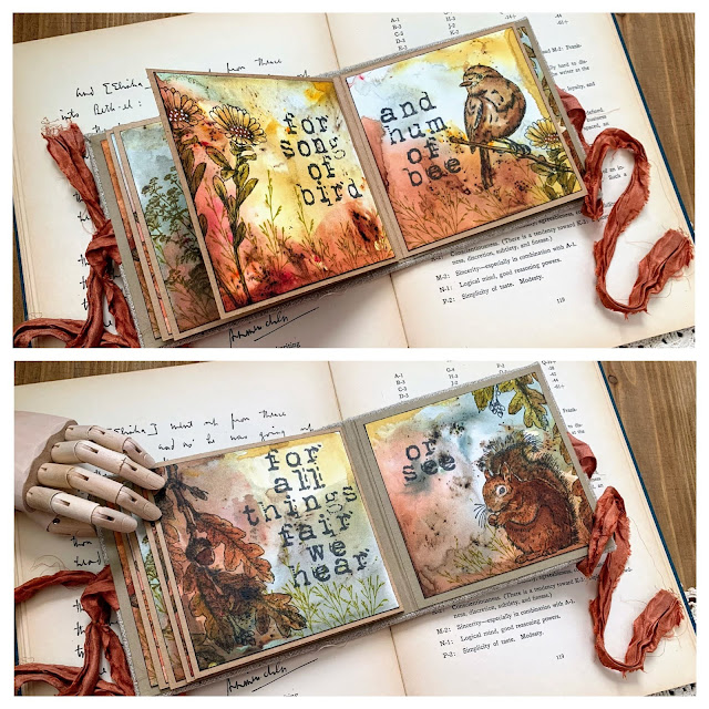
Hi everyone, it's Autumn Clark from SewPaperPaint with you today, and I'm here to share with you a cozy little mini book I made to highlight a beautiful poem of gratitude by Ralph Waldo Emerson, "We Thank Thee."

When I consider gratefulness I am always reminded that even the air we breathe is something to be thankful for. Gratitude changes our outlook on what we have not and re-frames our hearts to know that we have all that we need. Not only are the words of this poem written beautifully, but the imagery they provoke are equally beautiful. And because I am a huge hoarder fan of Raquel's Scrapcosy stamp line, I knew her stamps would correlate with the poem perfectly!


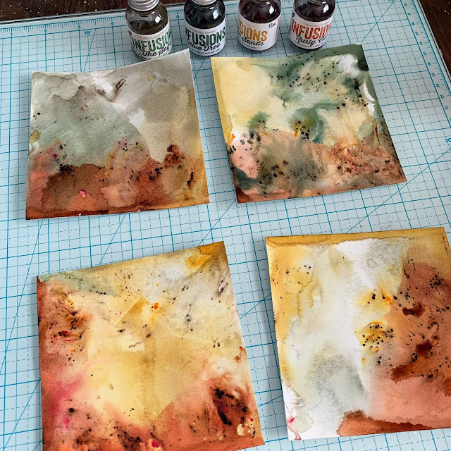
I wanted to use fall colors for this album and ordered some vintage sari ribbon for my closure.  I then picked out some beautiful earthy Infusions that I thought would match it.  I chose The Sage, Olive Tree, Golden Sands and Rusty Car.  I used my favorite new method where I mist water onto my kraft mat, then sprinkle on the Infusions, then spritz again with water, then spritz my paper with water and dip!  That's how I was able to achieve the sections of color.  And I spritzed again if I needed to blend the color further and let it run.  I made ten square panels this way.


I stamped all of the verses with the PaperArtsy {Ink & the Dog} Collection (Words Plate 2).  This is a great stamp set for journaling!  I love the larger sized grungy font.


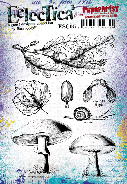
I used an older black ink pad so my stamping wouldn't be too intense, then stamped my heart out and watercolored each image right over the Infusions backgrounds.  I used my very first Scrapcosy stamp set, PaperArtsy Eclectica³ {Scrapcosy} Collection (ESC05), focusing on the mushrooms and snail.  Oh how I love them!


I tried to pick the backgrounds that best worked with the imagery.  Here I used PaperArtsy Eclectica³ {Scrapcosy} Collection (ESC23) for the first time.  I just love these extra large blossoms and they were such fun to color!


This line from the poem really moves me. I am so thankful for beautiful grass and am reminded of childhood spent running and lying in the grass. To make my autumn field I used stamps from PaperArtsy Eclectica³ {Scrapcosy} Collection (ESC17) and from PaperArtsy Eclectica³ {Scrapcosy} Collection (ESC26). I love how the Infusions resemble a moody evening sky.


This spread is my favorite!  It just makes me happy to see those golden autumnal colors!  And given any chance I can use this darling bird stamp, I will. He is from PaperArtsy Eclectica³ {Scrapcosy} Collection (ESC19) and the lovely flower is from PaperArtsy Eclectica³ {Scrapcosy} Collection (ESC20).


When I first saw the squirrel from PaperArtsy Eclectica³ {Scrapcosy} Collection (ESC25) I squealed!  I adore him and am so happy that he sits on the final page of my little book. The leaves are from the mushroom set ESC05 I mentioned above.


Finally, I made a stacked binding with scored kraft cardstock and attached my Infusions pages in the proper order. Then I assembled a soft fabric cover, made with a rugged, woven cloth similar to cross stitch material.  I used cotton batting between the chipboard and cloth to make the book feel softer.  I made this cover the same way I did on THIS post, though I attached the pages differently. This time I simply adhered the nestled pages to the inner spine with redline tape.  I used an 3/8" gutter between all of the pages.
 

Once everything was in place, I added a pop of color for contrast to the front cover.  I used spray mica ink and PaperArtsy Large Stencil {Tracy Scott} (PS210). I put paper to mask off everything but the front cover before spraying.  The first time I added wet media to a handmade cloth cover I was terrified, but because the batting is beneath it and soaks up the moisture (to a degree; so don't go crazy!). I then dipped a paper doily in a tiny bit of brown ink with a lot of water and crinkled it up while heat setting. I folded it in half and added some sisal fibres to the base, then layered carefully watercolored and fussy cut images from PaperArtsy Eclectica³ {Scrapcosy} Collection (ESC26). Originally I was going to use the label stamp for the back of my book, but as I was holding them I realized they could layer together like shown so I went for it and love the fullness with the greenery on the sides. I know this is a long post, but I hope you enjoyed reading about my process and are inspired to pull out your PaperArtsy stamps to create your own gratitude journal today.  


One thing I am most grateful for is the ability to be creative in my home studio.  It is such a blessing to be able to sit down and make things as a form of expression and therapy.  Journaling can be the best therapy! I encourage you to think of how you can use your stamps, stencils and Fresco paints to express your feelings. Even more so, express your thankfulness! We can always find something to gripe about, but choosing gratitude can bring change in our minds and hearts. And choosing creativity as a form of stress relief is both healthy and productive. So why not have a play with Infusions and stamps today?! Just let go and have fun!  If you're not into bookmaking, you can certainly find a wide array of premade mixed media journals to work in, or try what I did years ago and just make journal pages on recycled chipboard which you store in an altered box. There are no set limits.  

I am certainly grateful for your blog visit today and look forward to being back with you next time.  xx, Autumn

Blog: SewPaperPaint
Facebook: Autumn Clark
YouTube: SewPaperPaint
Instagram: @SewPaperPaint
Pinterest: SewPaperPaint

Thursday, 7 October 2021

2021 Topic 12 : Sustainable Crafting with EKC {by Autumn Clark}

   2021 Topic 12: Sustainable Crafting


Creating your own paper might seem a step too far, but Autumn brings an achievable project that seems simple but results in something beautiful. Granted, you might need to carve out a little time, but isn't creating about the cathartic process as well as the end result? 
~ Keren.

Hi everyone, it's Autumn Clark from SewPaperPaint with you today, and I'm here to share with you my upcycled project making handmade paper.  As a stamper, my primary need is for paper!  For this topic I thought back to last year's lockdown when I ran out of white card and ended up taking old scrapbook paper and using the backs for gel printing.  I thought of taking a step further now and making my own paper using shredded paper from the endless supply at my work.  I was very pleased with my paper and have made a journal and several cards from the stash.

I chose this process because I could enjoy a day on my patio soaking in the sun, as a break from creating indoors.  I have been wanting to try paper making for months, after seeing a video by Sharmane Coquilla and her lovely Instagram reels.  She made it look so easy and satisfying and it truly is!  I hope you will be tempted as well... 

I often start a project with a sketch and am always pleasantly surprised when my finished work resembles my starter idea.  My hope was to fill a small journal with my handmade papers with its jaggedy edges showing, coordinating with very textural cover art.  


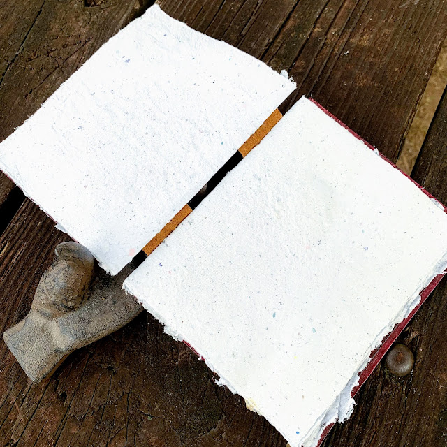
I have recently developed a love for fountain ink pens, feather pens and glass dipping pens.  I cannot wait to try out my new collection on these rough pages in my new journal.  I always enjoy experimenting with bookbinding and this version was new to me.  I thought it would be neat to have an exposed signature binding to show off the textured pages.  
 
 
A while back our leather sofa broke beyond repair (think four kids bouncing on it).  I cut all of the leather portions away and have saved them.  I firmly believe reusing & repurposing is one of the most sustainable concepts.  For my book, I picked the most worn leather and cut two strips from it to bind my journal.  I folded in half each of the five sheets of handmade paper and made a guide to poke my holes with an awl and stitched the journal as shown.  


To make the handmade paper I simply added one very large handful of shredded paper to my food processor, then covered it with water and blended, adding more water half way and blending more than you would think necessary.  Next, I dumped the pulp into a plastic container of water, larger than my paper screen.  (You can make your own screen following numerous tutorials, but I purchased a very cheap one because I don't have the wood working tools to make one.)  I submerged my screen and lifted the pulp in an even layer.  Then I transferred it to a towel covered with an old cotton pillowcase.  Then I pressed the back with a dry rag to remove as much water as possible and lifted the screen gently.  My mistake was not considering my table surface.  My dried paper had embossed into the pattern of my trellis topped iron table!  Yikes!  To remedy this, I misted the dried paper with water and pressed it with a hot iron.  Next time I will pick a flat surface and also iron my cotton drying surface to avoid creases.  But honestly, handmade paper is supposed to look handmade, so I have no qualms over my first work.  From one batch of pulp you can get maybe 4 sheets of paper, then you repeat the process.  Nearer to the end my paper got thinner (and very easily torn), so I learned to keep adding pulp faster.  


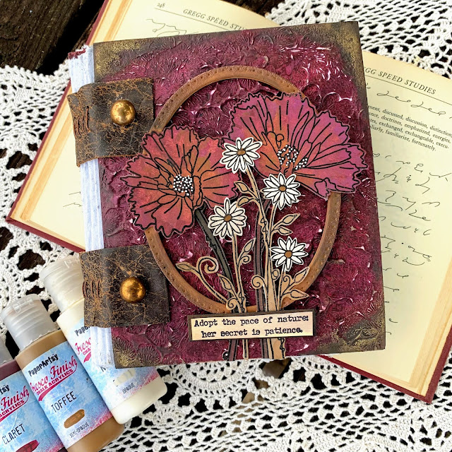
For my covers, I slathered two thick chipboard panels, which were upcycled from the backs of watercolor paper pads (always save those!), with PaperArtsy Grunge Paste.  Because Grunge Paste is so thick, I was able to make impressions into it with stamps.  I picked PaperArtsy Eclectica³ {Scrapcosy} Collection (ESC25) because I thought the ornate leaf stamp would make an incredible repeat pattern and work beautifully behind my chosen flower stamps.  Tip: when you apply moisture to the front of chipboard, try to apply moisture to the back to keep it from warping (Grunge Paste front/gesso back).  


I gessoed the backs and let these panels dry for a day, then left them under a stack of books for a day to flatten.  I built layers of color overtop by mixing one dollop of each color of PaperArtsy Fresco Finish Chalk Acrylics with an equally sized dollop of Matte Glaze and sponging with cut and dry foam.  I started with French Roast, then Claret, then Amethyst.  Finally I sprinkled Black Current Infusions onto the damp panels and sponged Matte Glaze on top.  You can see how much difference the Infusions make!  


I used my stamp platform to stamp, then paint, then restamp the flowers from PaperArtsy Eclectica³ {Kay Carley} Collection (EKC48).  I used the above mentioned PaperArtsy Fresco Chalk Acrylics with the addition of Nougat and Toffee.  I chose a sentiment from PaperArtsy Eclectica³ {Alison Bomber} Collection (EAB21): The Nature Edition.  


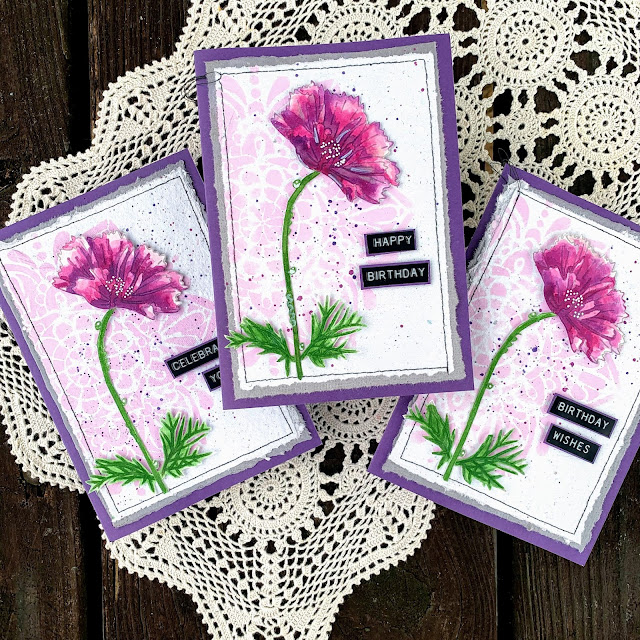
Leandra always encourages us bloggers to share our fails, so let me say that I made an attempt at dyeing my first lot of paper by adding a half of a bottle of Violet Storms Infusions to my vat of water, but it did not turn out well (it was more grey than violet).  I've since read about dying handmade paper and it seems that paint is a better alternative.  I can't wait to dump a bottle of PaperArtsy Fresco Finish Chalk Acrylics into my next vat!  Nevertheless, I ended up using the stained paper as a mat for a batch of cards. 
 
 
See how nicely they layer together!  I used some of my handmade paper scraps to test how watercolor and paints worked.  Watercolor was a no-go due to the density and irregularity of the paper, so I used PaperArtsy Smoothy card for my focal stamping and watercolor.  But paint was a total win!  I chose PaperArtsy {Tracy Scott} Stencil (PS210) and sponged Taro Milk Tea Fresco Chalk Acrylic onto my panels.  I chose purple cardstock for the bases that I've had for decades as one final sustainable push.  Purple is usually the last color I use, so it was fun to nudge myself out of my comfort zone for a change.  


These projects are quite different, but I hope they've shown you just how versatile Kay's stamps can be.  I think they play just as well whether earthy or vibrant, for cards or mixed media...
 

I hope you've thought up a few items you've been saving or have in excess that you can put to work in your own art.  Sometimes you will find the most creative freedom when working with "junk" because it's not so intimidating, being something it won't hurt to mess up.  

It's been a pleasure to share with you today!  xx, Autumn

Blog: SewPaperPaint
Facebook: Autumn Clark
YouTube: SewPaperPaint
Instagram: @SewPaperPaint
Pinterest: SewPaperPaint
 

Thursday, 8 July 2021

2021 Topic 8: A Cabinet of Nature's Treasure with ESC {by Raquel Burillo}

 2021 Topic 8: Nature's Treasure


I don't think Raquel could fit any more of nature in this beautiful project if she tried! So many glorious techniques and the idea of a hidden space for a mini album is so clever. There are lots of Infusions and a great deal to learn from.
~ Keren

Hi everyone, Raquel (scrapcosy) here with you today! I'm really thrilled to share this project with you! Despite its small size it was a huge project, perhaps too ambitious, but the topic deserved it!

As you know (and as you may have seen from my latest release) I love nature, so this topic was the perfect opportunity to create something beautiful to use and display those many collected treasures that I've been finding and saving (or hoarding) in boxes for a long time. I love them! My precious... [she said with a Gollum voice... LOL].

I wanted to create something that could display some specimens as they are, because they are already beautiful and I just wanted to preserve them and admire them later. And at the same time I wanted to use some of those treasures as embellishments to enhance and add textures to my art pieces, so I came up with this idea: I would create some sort of cabinet (or mini jewellery box) with a pair of drawers that I could remove and I would store a mini art journal in the middle. My idea was to fill the art journal as well for today, but I had to limit myself to just one spread because I didn't have more time, but I'll share with you what ideas I have in mind for the rest of the journal pages. 

 Cabinet of Treasures

The structure you see here, (12cm x 13cm x 4cm) is just grey board, filling paper from an Amazon delivery, lots of glue and lots of ink. Add my beautiful stamp set ESC25 to the mix, some laces and some metallic embellishments, and after few late nights working on it I ended up with this!


I love the leather look that I get, it's so simple! Just some Ranger Distress Ink (Vintage Photo) applied on the paper, followed by some white glue (I like to use ModPodge) and once dry add another layer of the same ink. I always like to add some gold, and here I added it in three ways: embossing the title "Walk in the Forest" with WOW embossing powder (Metallic Gold Rich Pale), adding the metallic corners and sewing some gold-like thread onto the vertical lace (the lace was white and I tinted it with Infusions Dye Stain (Golden Sands).


For the back I applied same techniques. And for the images, which I stamped using a waterproof ink (VersaFine Clair (Acorn)), I coloured them with Infusions Dye Stain (Golden Sands and Olive tree) mixed with PaperArtsy Fresco Finish Satin Glaze


For the spine I used Smoothy (Regular) A4 White Stamping Card  and I stamped my band stamp from ESC25 three times (I love it!), then I added a decorative stitching with the sewing machine and added colour with Infusions and water, same colours as before (Golden Sands and Olive tree). I used the same gold-like thread to cover the gap in between the band stamps. So those vertical bumpy lines you see are just that thread which is glued using Multi Medium Matte by Ranger, my go to glue for anything that I want to dry quick and for good. It never disappoints! The corners were glued in the same way. 

TIP: You want to be very generous with the Multi Medium Matte by Ranger, and you need to let the embellishments rest on top of your surface with a thick layer of glue in between. DON'T PRESS the embellishment, because then the glue will spread, the piece will bounce back and there won't be glue between the piece and the surface, you will have air, so the glue will dry without sticking anything together. And don't worry, it dries matte and clear and it shrinks so you won't see it! It's perfect! Again, don't press. I'm watching you!
 
 
The structure closes with a velvet ribbon (the first one I spotted laying around, I didn't even trim it...). It will become handy once the journal becomes bulky and once it doesn't fit in the cabinet space anymore (this will happen really, really soon, because I love adding volume to my projects, I can't help it!). The two brass studs you see act as drawer pulls and the few pages in the middle belong to the mini art journal. 
 

Now we open the cabinet and we see the journal in between the 2 drawers. Ta-da!
 

I just love how the cover turned out. I'll come back to the journal later. Let me share the drawers with you first.


I decided to use the same band stamp for the inside of the spine as well. The drawers were made with Smoothy (Heavyweight) A4 White Stamping Card which I painted with PaperArtsy Fresco Finish Acrylic paint (French Roast) and the frame was made using some packaging from Amazon painted in the same colour. It kind of resembles painted wood and I love it! But I wanted to add some luxurious touch so I decided to stamp one of the stripes in my stamp ESC24 (the Owl one) and emboss it using one of my WOW Embossing Powders (Decadent Ruby) from my Ancient Jewels TRIO.
 
 
The left drawer stores a bunch of lichens, one of my favourite things to collect from nature. I love how much texture they have and I love those beautiful colours! I added a piece that even has some moss. I'm fascinated by these.
 

When you pull the drawer then you get to see what's behind! I stamped the owl from ESC24 and I also stamped the branch from ESC06, the Halloween stamp set.


I really like how the owl scene is patiently hiding behind, waiting for it to be discovered. I decided not to add any colour, so the title stencilled using Grunge Paste could be read. The two quotes are from my latest release, this one is from PS266.


And I of course love the inside of the drawer and the fact that it can be pulled out completely to be admired. I decided to include 2 metallic corners to add a luxurious touch.


Maybe you think I'm crazy and you find that these are just plain pieces of wood covered in strange weird textures but to me these real treasures! So inspiring!
 
 
So when I created the background I wanted something intense but not too distracting. I just wanted a nice base, so I used again Infusions Dye Stain (Golden Sands and Olive tree) and lots of water and drops and heat drying, and many layers, and more water... until I got this. I flattened it using a laminator machine (like a Minc).
 

The other drawer works in the same way. This one contains few maple seeds, another seed (no idea what that is, maybe you know... bottom right corner) and a piece of bark covered in lichen.


This one also opens and it reveals a mini scene of a mushroom from my ESC26 stamp set.


Again, it is a very simple scene but I didn't want to let the title fade. I think it looks really beautiful.


I forgot to mention: the windows are made using acetate and I just applied grunge paste on them (quick layer, don't overwork or you'll start pulling it out from the plastic).
 

I also love what I stored in this drawer. All these seeds. They bring memories too! I picked the 3 maple seeds on a walk with my baby Matt. And the bark I found it on the way from the tube to my previous home. No idea where the other seed comes from... It could be Cambodia, but I'm not sure (that trip to Cambodia deserves a couple of cabinets... my gosh how many things I found! Luckily nobody decided to register my suitcase at the airport...)

On this occasion I went for a lighter Infusions background. It just has less layers than the previous one, I guess you can tell. Still pretty rich texture!


Now let's go back to the Journal! It went through different phases. At first I just added the label from ESC26 which I stamped a couple of times, fussy cut and assemble it with dimension. I added some dried flowers on each side that I kept from the decorations at a friend's wedding (I was the "wedding manager" as a wedding present for them) and I added at the bottom some elderflowers that I collected from the garden at my best friend's house. But I was not happy, it was too plain, so then I added some extra greenery (see bottom picture). The green on the top is the fern I drew for ESC25 (as you can see this Journal is full of good memories already!) and the little fern leaves I don't know where I picked them from (sorry to disappoint you) they could well be from the garden at my previous home (let's pretend that's the case... in fact it's very likely they come from there).


But I was still not 100% happy, everything was kind of floating... I needed to ground it somehow... So what better way than adding few more flowers and some roots! The roots are just the same branch from ESC06 stamped and afterwards I glued the extra flowers.


If you look closer it also has some birch seeds. I got these from Milton Keynes, where I used to work before Matt was born. And the brads on the side of the label were the final additions, they were leftovers of a later thing I made with gold embossing powder, you just melt it and let it drop on your craft mat and there you go! Peel them off and glue them to your project. I learned this from Marion Emberson, check her video demoing this here.
 

Now, for the inside of the journal I had big plans, so I started stamping and colouring many images which I then fussy cut and I ended up with a cute pile of papers. I used all my stamps in the previous release as well as ESC05, the other mushroom stamp set.


Hi squirrel! Are you comfy there? There are many acorns surrounding you, you must feel like you're in heaven!


And you, owl? What are you staring at from behind the ferns and among all those mushrooms?


Oh, the ferns! So difficult to cut but so much satisfying to hold them in your hands! They look like real plants but heavier. I didn't remove all the white gaps but I'm sure that once I use them they won't be noticeable. And if they white parts annoy me, I can always stamp the fern on the project and just use the leaves (chop the entire stem out), which is effectively a paper piercing technique.


Once I had all cut, then I worked on the inside of the journal and I prepared all backgrounds at once, using different Infusions techniques and just using one colour of Infusions Dye Stain (Golden Sands). From top to bottom (I've added links to videos where that technique is used): (1) tap and spritz water, (2) Grunge watercolour with different layers, (3) pastel technique with acrylic paint (demo by Leandra herself!), (4) super grunge and dirty (sorry, no video for this one, just get wild with infusions and water and you'll get something like this).


And for the other pages I used these other techniques: (5) I gave an intense wash out with infusions and then by mistake I splattered water with a brush that was dirty with the leftover paint of the pastel technique so it created this awesome speckled corner, so I wanted to try that as a technique and therefore I created number (6) the one in the middle below. I love it!! Happy accidents are the best! Then (7) is the linen technique.


Then it was time to pair the fussy cut images with the different backgrounds and decide where I would start, so I came up with these arrangements which I would then couple at a later stage with some real leaves and flowers and seeds. I always like to play with all that I have before I decide what to do next and these pictures were actually for me to remember what I liked, they were not meant to be for the post (sorry about the quality), but I thought it would be helpful to share how I plan and think about my projects.
 

Then I played a bit more, to see with which one I wanted to play. I was tempted by these three!


But then it came the squirrel and I just felt like starting my journal with her, so despite of initially choosing one background (top image), I swapped it and I chose the first page for her. In the second image (second round of designing the spread) I incorporated the real elements that I wanted to use. I thought it would be fit to use oak leaves and pair them with the acorn.


I used so much water on the journal pages that the first page was totally detached from the rest, so I had to repair it. I decided to create my own tape using the mushroom definition stamp on a piece of the same kraft paper from the amazon parcel. Just stamped with VersaFine Clair (Acorn) and then aged with Distress ink (Vintage Photo). Voila, a DIY tape (you just need glue).


And so I created the art journal spread. First I fixed the pages with the DIY tape, creating a divider element.


Then I stamped the squirrel to get her hair and her whiskers back into picture and then I glued on top the fussy cut squirrel (this adds dimension). I placed her among acorns and I glued birch seeds by way of forest floor. I love how these seeds seem real tiny leaves!


And on the other side I placed the oak tree leaves and the big acorn from ESC05. The sentiment "Inspired by Nature" is from ESC20. I added shadows around all pieces with a stabilo all pencil (brown).


That's all for today. But I just want to share a final element that I created using the stamp mark on ESC18 and that I'm very proud of! I had been wanting to try this for a while and I love how these turned out.


You just need to melt the powder of your choice mixed with some Melt It by WOW. Here I selected my WOW Embossing Powder (Royal Emerald, from the Ancient Jewels TRIO). Pour it in your craft mat and stamp on it while melted. Be careful, it is really, really hot! I was a bit stingy and didn't put enough powder... I should have used a bit more for a complete surface to stamp on, but still I like it! And you can see the extra drop on the side that I created and used on the label for the cover of the Journal.


For this gold one I used my WOW Embossing Powder (Decadent Ruby, again, from the Ancient Jewels TRIO). I think this one is more striking and the stamped result is more readable. I love it!


And I think I'll use it for a composition like this. What do you think?


That was all for today! Final picture with all the details.


I hope you had fun and got inspired with my project. I certainly did have fun! And now I have some things almost ready to go into my mini journal.

I find that working with real stuff like leaves and seeds adds so much more texture and interest into a mixed media project. I hope you decide to incorporate some of these natural elements in your work. Who knows, maybe tomorrow you find yourself finding and picking interesting things from the floor and putting them in your pockets for a later use, as I do. They are treasures to my eyes, that not only decorate your art but they also bring memories from the time you collected them. It's a way to preserve not only the item but the memories around its finding (when and where it was collected).

Thanks so much for reading! I will see you in the comments and if you want to get in touch with me you can find me here:

Website: https://scrapcosy.com/
YouTube: https://www.youtube.com/c/scrapcosy
Instagram: https://instagram.com/scrapcosy/

Facebook: