Hi everyone! It's Autumn Clark from
SewPaperPaint here with you today.
I've been super excited about the Vintage Topic, as it's by far my favorite of creative styles. With our underlying theme for the quarter being Glazed, I began thinking about how to incorporate a little "trash to treasure" in with a vintage glaze concoction using the new PaperArtsy Mattints...
The reason I'm enamored with Mattints is their gentle ability to transform the color of the surface on which they are placed, especially tissue paper. It's magic to see the tint and glue abilities work simultaneously!
I thought long and hard about a mash up of designers and chose to work with PaperArtsy Hot Picks 1507 (
HP1507) as my focal imagery and a beautiful background Eclectica stamp set 03 by Courtney Franich (
ECF03) to compliment.
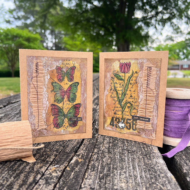
You might tilt your head a bit when you see this color palette. As beautifully styled as the photo is, the colors just don't go together do they? I really had fun with this experiment and hope you will enjoy it just the same.
Some tips on stamping your own tissue: always stamp over scrap paper to absorb the excess ink and always use permanent ink, which you heat set. The fun thing about working with tissue, whether stamped or printed, is having the ability to paint the reverse side for unusual effects. I colored my tulips and butterflies with PaperArtsy Fresco Finish Chalk Acrylics in
Calypso and
Mulled Wine with a detail paint brush over scrap paper. I did make the mistake of painting the front of some of my images, so I learned to tape down the tissue as not to confuse the front/back along the painting process.


A couple of years ago I shared another Hot Picks post, found
HERE, where I showcased stamped tissue. With the addition of Mattints to the PaperArtsy line, I've since posted on the beautiful stain/glaze facet of Mattints on
THIS post and fallen in love with the tintability concept of glazes, which previously I had used untinted (i.e. ModPodge of matte medium). I saw a post by our
Mags Woodcock on the
PaperArtsy People FB group mixing the various colors to create an unlimited array of tints. Thanks for the inspo Mags! I wanted to create an earthy brown, so I picked
Dragonfly and its opposite on the color wheel,
Squeezed, knowing that blue mixed with orange creates brown.
Next, I tore the flap off of a cardboard package and used my mix to adhere my painted stamped tissue. Waste not, want not, right? If this was a total failure, what had I lost? I did an equal mix of each color for this first test and found the Dragonfly was more dominant in pigment.
I thought some 3D embellishment would work well on the panel, so I fussy cut the butterflies, which I had colored with pencils on kraft card and given the same coat of mixed Mattints. I stapled them over some sisal fibers. Then I used the pencils to add a bit of highlight to the coloring work on the dried glazed tissue and edged the panel with Colorbox Chalk Ink in brown and black.
To add the final vintage touch, I dipped the panel in watered
Infusions in Just Walnut for some good splotches of deep brown. The sentiment is from a piece of printed music I found in the recycle bin at the church where I work. :)


2 comments:
Thank you for sharing your wonderful products....so many possibilities. Imagine and live in peace.
Beautiful, Autumn!
Alison x
Post a Comment