Showing posts with label EKC55. Show all posts

Tuesday, 8 February 2022

2022 Topic 03: Second Life {by Riikka Kovasin} with Kay Carley stamps


Hi everyone, it's Riikka Kovasin (Paperiliitinwith you today, and I'm here to share with you my very first PaperArtsy blogger project! I'm very excited about this!


When I read the theme of "Second Life", I was captivated. I love re-purposing items and often use bits and bobs in my assemblages. Recently I've been drawn to alter mint tins. The fun part in those is the element of surprise. I rarely alter the box from the outside, but instead concentrate on the inside, creating a world of my own. If you wish to take a peek on the previous tins I've made, here's a Reel about some of them on my Instagram.

I usually "go with the flow" when I'm creating and let the project lead me. This time I had a vivid image on my head of a secret garden inside a tin when I started the project. I wanted to use the beautiful new stamps by Kay Carley (see here) to create a little spring garden inside with lush pastel colors. Those two ideas were my starting point.


My first decision needed to be about the tin. I had a couple empty ones on my stash waiting to be altered. I chose a nice orange one for a couple of reasons. First - it was there, ready to be altered. Secondly, it reminded me about the sun and the increasing amount of light we get here in Finland during spring. And thirdly, that nice warm orange was a great contrast to the colors I was planning for the inside.


The second decision was choosing my path. I often start with the background and move towards the focal point elements. That's how I went about the project this time, too. I started by creating the background for my garden and after I had it done, I started playing with the flowers. 

As the background was the sky in my mind, showing through the flowers, I went with blues. I chose PaperArtsy Fresco Finish Chalk Acrylic - Summer Sky (FF150) to be my background color. I painted the edges inside the tin with the paint but also added some paint to a piece of white cardstock. As that was just a monotone surface, it needed something more. On top I decided to have a go with Infusions Dye Stains. I sprinkled some PaperArtsy Infusions Dye Stains - Sleight Blue (CS13) and Royal Blood (CS10) on top of my cardstock and added water. As you can see from the photo underneath, I went heavy handed with the water, releasing a lot of the brown tones from the brown walnut crystals, too. It gave the project a lovely vintage tone and changed my future color choices a little. 
 
 
After drying the Infusions Dye Stains layer, I then took the tin and chose the placements of the two pieces coming inside it. I cut these bits out. This way I could concentrate to the right areas and especially decorate the edges as I knew the flowers would be covering the middle quite heavily. Although I must say that I enjoy building layers and the process as itself - so if I end up covering something, and I usually do, it's fine! It's all about letting the process lead you, enjoy the flow and not to be too attached to the layers.

As the Infusions Dye Stains set my mind into vintage gear, I wanted to bring some tea tones to the background. That I did by collaging some book paper pieces to the background. To mask these new bits to go seamlessly with the blue, I used stamping. I stamped with two text like stamps on top of the seam, binding the elements together. First I stamped using Ranger Archival Ink - Hydrangea and the weather forecast stamp from PaperArtsy Ink and the Dog Words 3 set (W3). Then I took the alphabet version of the same set and stamped that using Ranger Archival Ink - Jet Black.
 

As I was going for a sky look of the background, I thought to add some clouds there using a PaperArtsy Kim Dellow stencil (PS035). For the stenciling I used PaperArtsy Fresco Finish Chalk Acrylic - Heavy Cream (FF203). I added a cloud to both of the inserts and then some dots, too. While they add some extra pattern to the background, I also thought them to represent snowfall. This is because of the surprising spring weather of Finland - snow is not uncommon while the first flowers like crocuses emerge through the snow drifts.
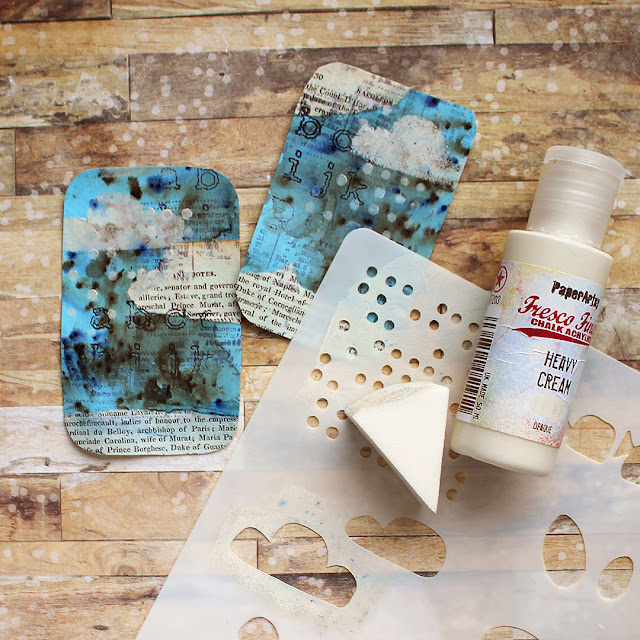
 
After the stenciling I was ready to insert the pieces inside my tin. I used double sided adhesive to adhere the cardstock pieces in place. If you re-create something like this, my tip for this stage is to add the double sided sheet before cutting the inserts loose several steps back! Then you get a perfect "from edge to edge" coverage with the adhesive without needing to cut the same shape twice! On the other hand, I needed to trim the pieces smaller when I was putting them inside the tin as the sketched line of course is the outer edge of the tin. 


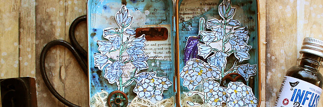
Now that I had the backgrounds done and in place, I could turn my attention to the actual garden part, to the flowers. My first place to ponder and reflect was choosing the flowers to go inside. I wanted to use as many as possible, layered together, but on the other hand wanted to avoid a clutter. Size of the pieces was also something I needed to keep in mind as the tin was a rather small one. I picked some forget-me-nots and checkered lilies from PaperArtsy Kay Carley set (EKC55) and some bluebells from the other set (EKC54) {NB. Both sets available exclusively from PaperArtsy retailers unil April 2022, list of stores here.}

After choosing the flowers I wanted to my garden, I stamped them using Ranger Archival Ink - Jet Black. I still wasn't sure how to color them, so an archival ink was the safest bet. 


When I then had my flowers stamped, I needed to decide which medium to use to color them. The two options I was drawn between was using PaperArtsy Fresco Finish Chalk Acrylics and then just colored pencils. With the Frescos I could have gone with a splodgy, haphazard coloring fitting to the grungy background, but I chose the colored pencils instead. Not because of the neatness and ability to control the area of the color better but instead because of the lightness or airiness. Having a background so filled with layers already, I wanted to keep the flowers as tender and light as possible. Kind of capturing their fragile nature. 

I chose to color the flowers mostly with their natural colors. Meaning I used blue both to the bluebells and forget-me-nots but went a bit artistic with the checkered lily. After coloring the flowers they were just too neat looking with the grungy background. So, they needed something added to make them more part of the project than just floating on top! 

A tip for such a problem is to take something from the background and bring that to the foreground. I picked up the weather report stamp from the background as well as the other Infusion. Adding these two elements on top of the colored flowers made them more in my style and also made them more a part of the background. The stamp was from PaperArtsy Ink and the Dog Words 3 set (W3) and the Infusion PaperArtsy Infusions Dye Stains - Royal Blood (CS10). I used the Infusion just to add some splashes to the flowers. After adding these little touches, I then cut the flowers out.    
  
 
Now I had my flowers all ready and it was time to plant the garden. I wanted a really layered look. I was kind of going for the look when you enjoy the summer, laying on the grass and see the blooms from a totally different perspective. Like you would be a little fairy or a gnome, flowers towering above. 

To get that layered look, kind of perspective, I used foam tape to adhere the blooms. I put the darkest one, the checkered lily to the background not to steal all the attention and then layered the bluebells and forget-me-nots on top. A tip - on this stage you need to pay attention to the height and placement not only because of the flowing composition but also that you're able to close the tin! So, after adding a couple of the flowers in place, I closed the lid making sure that still works before adding a couple more flowers. 

I love the term Seth Apter uses about making the composition. He refers to the adding of the elements as "auditioning". I do the same, I test a piece and the placement. I try to audition the pieces quite quickly, so that I rather follow my intuition than my reason. This gives me no time to overthink things!


Now my garden was growing nicely with layered blooms and plants, so the main elements were in. But the flowers were growing out of nowhere. Naturally, you could think that you just can't see the ground or soil, that the point of view is just a little above it, but I wanted to ground my elements. As I already had the vintage touches going on there, I made the ground using some tea dyed lace. To secure that in place, I used a heavy body gel medium. I added some blobs of the medium to the bottom of the tin and then pushed the lace in. This way it's not totally adhered, but will stay put and also will stay fluffy and airy compared for the totally adhered version. 

To grunge the garden a little bit more, I then added some small metal embellishments between the flowers. At this stage I was thinking of naming the piece "The Machinery of Spring". To adhere these heavy embellishments I used the heavy body gel medium, too.


It's funny how the last little details usually take the longest time in such a project! In a way, I could add little bits in for hours and hours but I try to remember my husband's one favorite instruction - "don't overdo it!". After the gears I added some Prima Marketing Art Ingredients Art Stones to the ground. They are as the name says little pebble looking things that almost match the tea dyed lace color and add another grounding element, giving an air of ground to the lace.

I wanted some kind of word to the piece, kind of a title. For that I used a fun technique using embossing powder. I first stamped the word lightly to a piece of cardstock, kind of sketching it. Then I cut the piece off, added some embossing ink on top and covered the piece with embossing powder. After melting the first layer, I added two more layers and while the third embossing was still hot, I pushed the stamp into the embossing powder thus creating a dimensional piece with the word. I then highlighted the dimension further by painting the piece first with black gesso and then added a layer with a copper toned wax, Prima Marketing Art Alchemy Metallique Wax - Rich Copper. If you want to see this technique in video form, please see this older video on my YouTube (link).
 
 
As the last two details I added some Ranger Distress Ink - Vintage Photo using a wet brush to the biggest white areas on the blooms. With all the warm, vintage tones going on, the white paper I used to stamp the flowers to was just a little bit too bright in places. The small edge didn't bother me, but in the larger areas in the bluebells were stealing the attention too much. 
 

I often finish projects with splashes or add them to the project in some stage. I wanted some delicate white details to the project, but didn't want to risk the splashes going to places I didn't want them. So, instead I grabbed a paint marker and drew some little crosses and dots to the place where I'd wanted the splashes to land. This is a nice way to add tiny details without the risk of something bad happening!

As a finishing touch I added a pencil drawn frame around the background pieces to have a bit of my own "handwriting" in there. A humble pencil is usually dark enough to have some impact but subtle enough not to cry for attention. 


Here is my little garden in a tin! I really liked playing with the Infusions for the very first time while doing this project. If I'm honest, the brown tones took me totally by surprise because I'm "try first, read manual later" style with new things. But I loved the effect they created on top of the pastel sky and how they then lead my process to another direction. 

I also really like the surprise element of an altered tin! Maybe that's why I've created several in a short time... I love how you can add anything you like to the inside, create a little world of your own. You just need to keep the height and composition in mind so that the tin will close. As otherwise it's not that much of a surprise, right? 

Thank you so much for stopping by today! Wishing you all the best! 

Riikka

Tuesday, 18 January 2022

NEW PaperArtsy Products: Eclectica³ Kay Carley {January 2022}


A note from Leandra:
As we sit in the midst of winter (for us Northern Hemisphere people), signs of spring are starting to show. My magnolia tree buds are fattening up more every day, and before you know it there will be daffodils poking through and blossom trees in bloom, already the days are fast getting longer. This is exactly the theme of these stamps, Kay has captured early spring perfectly. As ever, her stencils allow you to add depth in the layers behind your focal flowers, which means you can embrace creating Monet-style gardens for this release!
 
Don't forget Kay will be along to share with you LIVE her new products and ideas over in our Facebook Group, PaperArtsy People shortly after this post publishes. I hope you can drop by for the live, or try to catch the replay. It's super lovely to see the designer and hear direct about the new release and understand first hand the possibilities!!
 
For the next 3 months, these stamps are only available EXCLUSIVELY from our approved stockists. Please check the list at the foot of this post to find a retailer online or geographically near you, we also now have a tab on the blog home page with direct links. It makes sense to order within your country wherever possible for both speed and to save on postage costs.
 
Hi everyone, Kay here

I'm super excited to share with you my newest release for PaperArtsy consisting of 4 stamps and coordinating stencils. For this release I have concentrated on different types of 'spring flowers' - this includes double daffodils, 
muscari, bluebells, fritillaries, forget-me-nots and a BIG spring blossom branch. All of these were in our garden last spring.... You'll find that I have often separated out the 'stamp components' so that you can create a good variety of different sized projects and compositions.


Price: RRP €21.92 +VAT        Size:5" x 6" (13 x16.5cm)
All stamps are individually trimmed onto cling foam, with a laminated storage/index sheet.


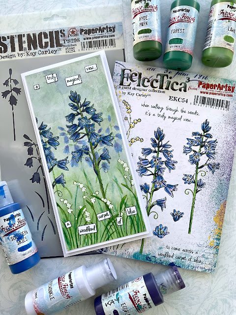
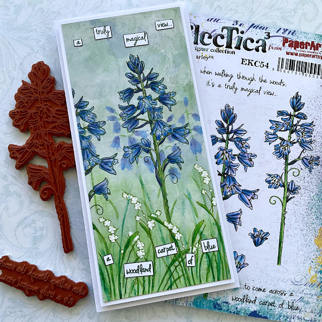
Eclectica³ Kay Carley Set 54 (EKC54)

I do so love bluebells and these are based on cultivated bluebells (that grow in our garden) rather than woodland bluebells (that have droopy heads). As well as the big bluebell stamps I've included a couple of small 'bluebell heads' which can be used to create mini bluebells by stamping them several times and drawing in a stem.


A few years ago I saw an absolute mass of woodland bluebells that seemed to go on forever... from a distance they really did look like a 'blue carpet' hence the quote contained on this set :).
 

The close-up shot (below) allows you to see all the detail of the stamped bluebells.


Eclectica³ Kay Carley Set 55 (EKC55)
 
This is my 'fritillaries' and 'forget-me-nots' set... both of these were in bloom at the same time in our garden last spring and looked really pretty together. (The pairs of leaves positioned at the top of the stamp set can be easily snipped apart, allowing them then, to be used individually.)


You can see (below) how I've used those leaves (individually); positioning them onto the stems of the fritillary flowers.


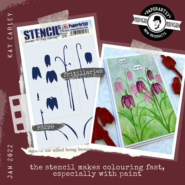
These flowers also have a matching stencil (PS299)....this has been designed to assist with quick and easy colouring of these flowers.
 

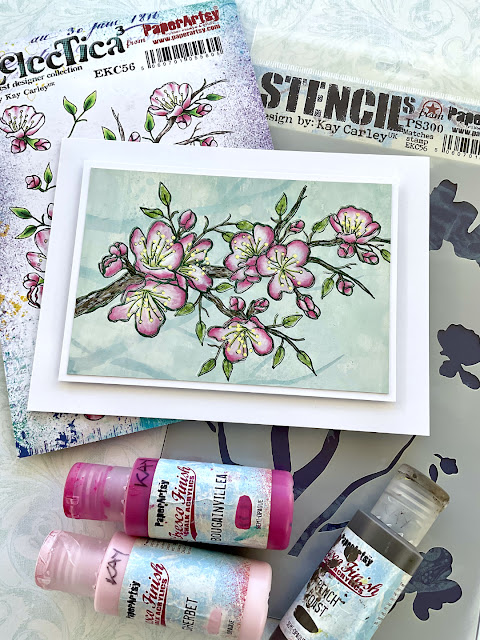
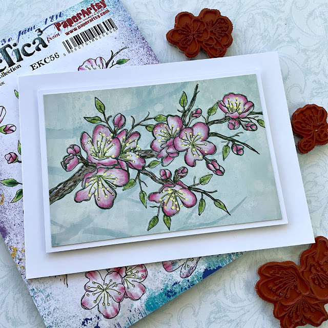
Eclectica³ Kay Carley Set 56 (EKC56)
 
EKC56 consists of a really BIG blossom branch and then lots of little components which allows you to create your own blossom arrangements...you can also use these components to add extra flowers to the blossom branch.


The beauty of having such a large stamp is that you can just let it 'speak for itself'...you really don't need anything else!


The grey shadowing that you can see was added with pencil to make the branch look as if it had been 'sketched' rather than stamped. Although I didn't add more flowers to the branch you can easily do so by using all the extra components contained on this stamp set. (You can decoupage some of them too as all the extra flowers have been taken from the main stamp :).


Eclectica³ Kay Carley 57 (EKC57)
 
Nothing (for me) quite says 'spring has arrived' like cheery daffodils! These 'daffs' are based on the double variety. The leaves for the 'daffs' have been drawn fairly straight so that they can be used either 'as they are' or you can bend the stamp a little when you place it onto an acrylic block so that you have a 'bent leaf'.


A useful stencil (coming up later in this post) containing matching 'daffodil head imagery' enables quick and easy painting of these frilly heads.


Both of these daffodils have nice long stems making is super easy to have 'droopy' daffodils if you so wish (although I kept mine straight for this sample). The matching stencil doesn't contain any stems but they are very easy just to 'paint' in.


The close-up shot (below) shows how I have achieved the shading on the daffodil head. You could easily decoupage this head too for extra dimension.


Large Size: 6.25" x 9.5" (16 x 24cm) Price: RRP €6.28 +VAT
  

PaperArtsy Stencil 298 (PS298)
 
This stencil doesn't actually match the bluebell stamp set (EKC54) - instead it was designed to complement it by containing imagery of traditional woodland style bluebells.


The stencil contains a complete composition of three bluebells with grass at the base of them and then two smaller individual bluebells which are great to add as 'fillers' and to create depth.
 
 
The photo below shows how two of my panels looked, before I embellished with stamping. The individual bluebells (on the stencil) can easily be masked off with stencil tape thus allowing the 'bluebell composition' to be used with Grunge Paste.
 

You can see below how I apply different shades of Fresco paints to create a textured/veined look to the bluebell flowers.


PaperArtsy Stencil 299 (PS299)

This stencil has been designed to match stamp set EKC55 - the flowers, stems and leaves have been separated from each other to make applying colour through each section easier. (Please note: depending on how the corresponding stamps are positioned (when stamping them out) you may find that the images contained on the stencil do not perfectly align without being readjusted slightly.)


As well as the stencil being designed to match the pink flowers contained on stamp set EKC55 it has also been designed so that it can be used on its own.
 

I particularly like to use the stencil to create some background flowers and then to quickly add a base of colour to my main stamped imagery before painting them.


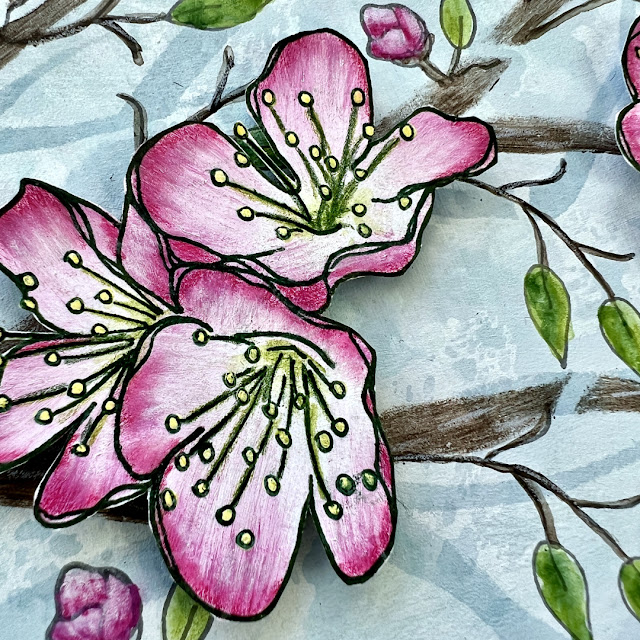
You can see on the light pink flowers (below) how I took a slightly darker pink pencil to outline the individual petals to define them, but you could also doodle around them with a fine black pen to make them into more of a 'feature'.
 

PaperArtsy Stencil 300 (PS300)

My big branch stencil was designed as an 'add on' to stamp set EKC56...the idea behind this was to have a big 'statement branch' that the 'extra components' from EKC56 could be added onto thus giving the versatility of creating different looking spring blossom compositions.


Using the 'stencil branch' first in a 'tone-on-tone' way creates a lovely subtle backdrop for your main imagery.
 

The other imagery contained on the stencil matches some of the extra components on EKC56 so that shaded flowers using Fresco Paint can be easily achieved without needing to paint them all individually. You can also use the elements on the stencil to create some 'splodgy' background flowers!
 

I tried to keep the flower shapes simple (that match this stencil) in order to be able to easily cut them out to create dimension. They would also look fab combined with die-cut leaves etc..


PaperArtsy Stencil 301  (PS301)

As I mentioned earlier, the 'strange looking imagery' contained along the top of this stencil matches the daffodil heads on stamp set EKC57.... Along the base of the stencil are 'muscari style flowers' to complement the muscari stamps contained on EKC57. 


These stencil 'muscari flowers' make creating a background of muscari a breeze! 


Although I haven't done so here....these flowers would look great with Grunge Paste!


I really hope that you enjoy using these new products and that you will find many ways of incorporating them into your projects. Talking of projects.... here's a little peek of a project that may be coming your way soon!


Love Kay x
Facebook Group: Crafting with Kay Carley
Twitter: @carleycards
Instagram: kay.carley
Pinterest: Kay Carley

At this current time, all of my teaching is being done online. You can find details of all of my past and current online workshops over on my Crafting with Kay Carley Facebook Group.

PaperArtsy Stockist List

Our stockists are your go-to  source for all PaperArtsy products, and we suggest that you also use the PaperArtsy People Facebook group to source a retailer in your country. Many are members of our FB group and will happily share links to their online stores.

Australia
Bev's Cross Crafts, Spreyton, Tasmania https://www.bevscrosscrafts.com.au/
Crafters Cupboard, Berwick, Victoria www.crafterscupboard.com.au
Memories on the Murray, Murray Bridge, SA  https://www.memoriesonthemurray.net/
Natalie May Scrapbooking, Dover Gardens, SA https://nataliemay.com.au/
Scrapbook Superstore & More, South Penrith, NSW https://www.scrapbooksuperstore.com.au/
The Scrapbooker's Confetti Box, Swansea, NSW https://thescrapbookersconfettibox.com/
The Thread Studio, 6 Smith Street, Perth http://www.thethreadstudio.com/
The Scrapbook Store, North Perth,WA http://thescrapbookstore.com.au/ 
Time To Createwww.timetocreate.com.au

Belgium
Cart N Scrap Art, Antwerp, www.cartnscrapart.be
Créatelier Caracolle, Liège, www.createliercaracolle.be

Canada
Clipper Street Scrapbook Company, Langley, BC. www.clipperstreet.com
Paper Art Creations Inc, Leduc, Alberta, www.paperartcreations.com/
Scrapbook Centrale, Dollard Des Ormeaux, Quebec www.scrapbookcentrale.ca
Scrap Addicts, Edmonton, Alberta www.scrapaddicts.ca/
Scrap and Bean, Edmonton, Alberta scrapandbean.com/ 
Scrapbooking Fairies, Drayton Valley, Alberta www.scrapbookingfairies.com/
The Paper & ink Boutique, Calgary, Alberta www.paperandinkboutique.com/
The Scrap Yard, Calgary, Alberta, www.thescrapyardcalgary.com/ 

Denmark
Hobbyboden Scrapworld Samso www.hobbyboden.dk

France
Eirl Bancon Cartoscrap, Midi Pyrenees, www.cartoscrap.com
Fée Du Scrap, Saint Sébastien-Sur-Loire, www.feeduscrap.fr/
Horizon Créatif, Ste Jalle www.horizon-creatif.fr
Instant Créatif, La Possession, La Réunion, www.icreatif.re
Katzelkraft, Ingwiller www.katzelkraft.fr/en/
Kerudoc Creation, St Yvi www.kerudoccreation.com
Le Grenier des filles, Pierre Benite
Page de scrap, Saint Pavace, www.pagedescrap.fr/
Scrap Déco Home, Goutrens, www.scrapdecohome.fr/
Toutencolle, Dun sur Avon www.toutencolle.fr

Finland
Heidin Korttipaja, Istunmaki, www.korttipaja.fi/fi
Piia Paper, Kittiläwww.piiapaper.com/fi

Germany
Stempelbar, Berlin, www.stempelbar.de
Stempeloase Munich, Munich www.stempeloase.de
Stempelfee Shop, Hilden www.stempelfee-shop.de
Stempellaedle, Stuttgart, www.stempellaedle.de/shop

Greece
Scraps N Pieces, Kallithea www.scrapsnpieces.gr

Italy
Immagine SAS di Rapaccini, Rome, www.immaginelab.com
Il Negozio Della Mamma Di Cle, Torino, www.ilnegoziodellamammadicle.com
Marte Savona, Savona, www.martesavona.it
Pezze E Colori, Lissone, www.pezzeecolori.it/ 
Piccole Passioni, Siena, www.piccolepassioni.it

Japan
La Wadao, Odawara, Kanagawa, www.lawadao.com
Tiny Dots, Funabashi-shi, Chiba www.tinydots.shop-pro.jp

Netherlands
De Hobbystudio, Genemuiden, www.dehobbystudio.nl/
Doe@ding,Spijkenisse doeading.nl/
Hobbycompleet de Duif, Leeuwarden www.hobbycompleet.nl
Stampingcorner, Capelle Aan Den Ijssel www.stampingcorner.nl

Norway
Hobbygarasjen, Kopervik, www.Hobbygarasjen.no

Spain
Cien por Cien Manualidades, Barcelona,  www.100x100manualidades.es
Ideas 10 Manualidades Y Scrapbook, Bilbao ideas10manualidades.com/
Marakiscrap, Tarragona, www.marakiscrap.com
Scrap & Papers Experiences, Barcelona, www.scrappapersexperiences.com
The Paradise Corner, Barcelona, www.theparadisecorner.com

Sweden
Butik Elva, Staffanstorp, www.butikelva.se

Taiwan
Mandy's Cards, Taipei www.facebook.com/mandy.card.77

United Kingdom
Amelia's Creative Crafts, Studley, Warwickshire  www.ameliascreativecrafts.co.uk
Art from the Heart, Harrogate, Yorkshire www.afth.co.uk
Blade Rubber Stamps, London www.bladerubberstamps.co.uk
Crafts at The Malthouse, Herstmonceux,  East Sussex, www.themalthouse.co.uk/
Fave Rave, Stourbridge, West Midlands www.shabbychicstencils.co.uk
Loobi Crafts, Leighton Buzzard, Bedfordshire, www.loobicrafts.co.uk
Papermaze, Ipswich, Suffolk www.papermaze.co.uk/ 
Stampers Grove, Springbank, Lilliesleaf, Melrose,Scotland www.stampersgrove.co.uk
That's Crafty
, Romford, Essex www.thatscrafty.co.uk
The Artistic Stamper Craft Store, Faversham, Kent www.theartisticstamper.com
The Forget me not Kraft KabinRochford, Essex, www.TheForgetMeNotKraftKabin.co.uk

USA
Artistic Artifacts, Alexandria, VA www.artisticartifacts.com/
Artistic Studio Creations, Fayetteville, Georgia www.facebook.com/ASCbyCrystal
Craftiness, Chatsworth, CA, www.craftinessonline.com/
Ephemera Paducah, Paducah, Kentucky www.ephemerapaducah.com
Everything Scrapbook & Stamps, Lake Worth, Florida www.everythingscrapbook.com
Frantic Stamper, Oregon www.franticstamper.com
Free Heart LLC, Denver, Colarado, www.freeheartllc.com/
Golden Hills PaperCrafts, Fairfax Station, Virginia, www.goldenshillpapercrafts.com/
Joggles, West Warwick, Rhode Island, www.joggles.com
PaperCraft Clubhouse, Westbrook, Connecticut, papercraftclubhouse.com/
Qingquing's Stamp Shop, Portland, Oregon
Runaway, Art & Craft Studio, NE Salem, Oregon www.runawayart.com/
Simon Says Stamp, Columbus, Ohio www. simonsaysstamp.com
The Ink Pad, New York, www.theinkpadnyc.com
Topflight Stamps, Irmo, South Carolina topflightstamps.com/

Our brand is only available from established stockists who are VAT/ GST/ sales tax registered and for whom product education is a core principle. We would rather supply a few hand selected stockists, than the greater masses. If you would like to apply to be a stockist, you can find our more about our supply criteria here.

PaperArtsy Links
Facebook Group PaperArtsy People
Facebook Page PaperArtsy