Showing posts with label backgrounds. Show all posts

Thursday, 19 June 2025

June 2025 - With 3 Things - Hoop wall hanging {by Robin Riley}


Hi everyone!

This is Robin Riley (Robin Rileywith you tonight. I was invited as a guest blogger by the PaperArtsy team and I am so very excited to take the “With 3 Things” challenge. This is my very first time doing this and I had such a good time creating this project!

For this feature on the PaperArtsy Blog, 3 identical items are sent to 3 members of the PaperArtsy blogging team. Typically, we receive a stamp, a stencil and some paint. We have no clue what PaperArtsy HQ is going to send. The whole idea of this challenge is to do something crafty in our personal style with these 3 items.

Let me share with you what I received. The stamp set is  Allison Bomber’s EAB 30. Wish you could have heard my happy squeal when I first saw this! I also received a package of printed tissue, Backgrounds PT07 and to top this off I received the brand new Mattint color Bellflower. Again, there was a little squeal!


Three were also a few freebies in my package (this was the third squeal!) from other Alison Bomber and JoFY sets, that I decided to include in my project.

 
I really wanted to create something different than my usual cards. I hope you find this unique. So, looking through my craft closet (which would probably make you squeal), I came upon an embroidery hoop and that got my wheels turning! I decided to use it as the base for a framed and layered piece.


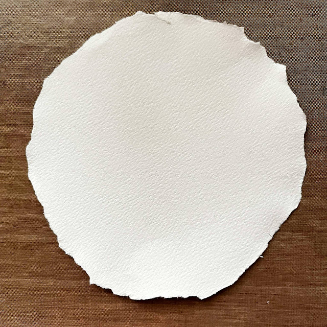
To prepare the main piece of paper that would fill the hoop, I first used the hoop to lightly trace a circle onto a piece of watercolor paper. I then used my water brush to apply water around the circle to softened it. I carefully tore the paper along the waterline, trying to keep close to the drawn outline. I always teared towards me, not away.

I first applied a coat of Mattint Foxglove to the circle. OH no ….too pink for me. I decided the tissue paper was going to rescue me. Quickly I applied a piece from PT07 while the Mattint was still wet.
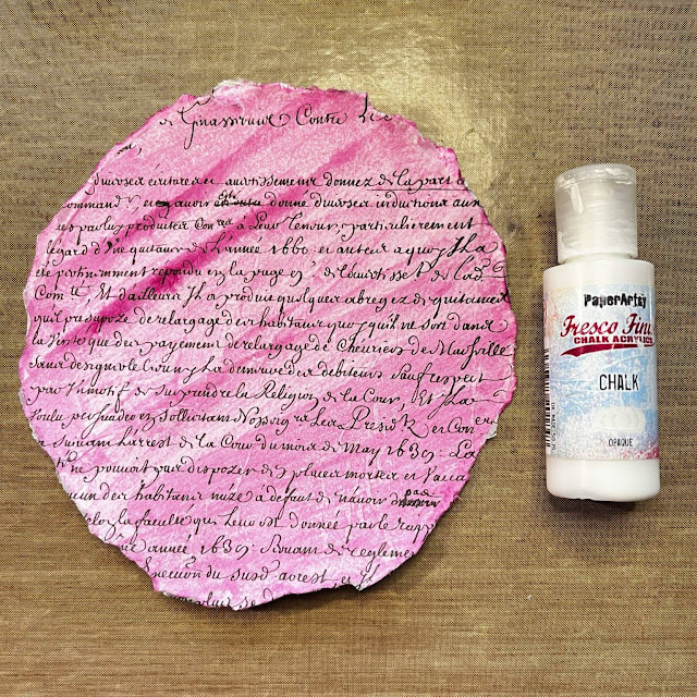

Oh geez, it's still too pink for me! So one more try to save this! I decided to add a layer of Fresco Finish acrylic paint in Chalk, which is opaque to knock down the colour. Finally, a result I was happy with! I let this dry naturally before I moved on to the next step.


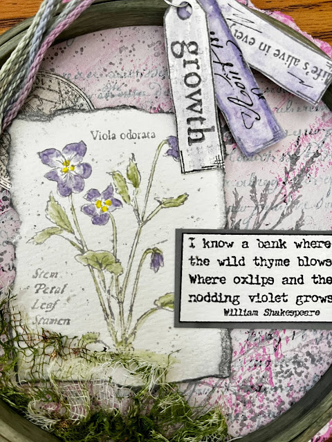
Time to begin the stamping with Alison Bomber's set EAB30I wanted a lighter color for this, something similar to a watercolor effect so the next step was to stamp the beautiful image of the violets onto the smooth side of the watercolor paper in VersaFine Morning Mist. Then another tear around this image. I love doing this to watercolor paper. The results are imperfect, yet so perfect for me!


Using a small scrap piece of watercolor paper, I also used the round ephemera stamp from the set. This time I stamped in VersaFine Clair Morning Mist. I wanted a more detailed image and I wanted to eventually be able to paint over it so I needed an ink that resist water. I made sure to use the smoothest side of the paper for stamping.

I just love the Shakespeare quote from this set (EAB30). To stamp it, I used a combination of inks, VersaFine Clair Nocturne and Morning Mist. I really did not want a full on black, so I thought the Morning Mist would tone it down. I cut around this quote, instead of tearing, to give it a more finished look.

Slowly things started to come together. I laid out the pieces….hmmm this didn’t feel right yet!


Another Alison Bomber set to the rescue! This time EAB40I stamped some solid images of the grass on the background using VersaFine Morning Mist. I also added some splatters of the Distress Oxide Hickory Smoke over all of the pieces. This is now starting to feel right to me!


Now it was time for some real fun. I love using the Mattints to add subtle color. Here I used my water brush to add Bellflower and Fern. Using a dotting tool, I added Acid Mattint dots to the centers of the violets.


The pieces needed to pop more. Using the Distress Oxide Hickory Smoke, I edged the violet piece. I ran a black Sharpie around the edge of the quote. I happened to find a piece of gray scrap to back the quote too. That’s what was needed! Now everything was coming together for me and it was time to assemble.


First I decided to paint the wooden embroidery hoop with the Mattint Shadow. I applied 3 coats, drying in between each coat. To decorate it more, I used a piece of the tissue paper again (Printed Tissue Backgrounds PT07). I took some gray washi tape and adhered it to the back of the tissue to be my guide.


I cut the washi tape from the tissue and glued it to the outer ring of the embroidery hoop.


I really wanted to add another element to this design and I wanted some type of texture, a different material. I felt like the picture needed to be grounded. So what to use? Oh, guess what, recently I made a unique element using cheese cloth and some Fern colored stencil butter from The Crafter’s Workshop. I had also put some PaperArtsy Rusting Powder into the mix.


My go to adhesive for fabrics and heavier elements is Beacon’s 3 in 1 glue. It has never failed me! I used this to attach the cheese cloth along with the hoop. I placed a heavy book on the top and let everything dry. This is exactly what I was hoping for!


I thought another element to finish this project was needed. With the extra stamps I received, I created 3 tags. A little Bellflower Mattint and tissue created the perfect little trio! Finally a little bit of scrap yarn tied around the top of the hoop just seemed to finish this project perfectly.


I really hope you enjoyed seeing me create this fun wall hanging from an embroidery hoop. The products I received sure did make this easier and fun! Thank you PA HQ for giving me this opportunity!

Robin X


Instagram: robin.riley.77
Facebook: Robin Riley
Wednesday, 11 June 2025

June 2025 - With 3 Things - Vintage Frame {by Victoria Wilding}


Hi friends, 
It's Victoria, from VictoriaWildingCreates, with you for another 'With 3 Things' challenge post. 

For this feature on the PaperArtsy Blog 3 identical items are sent to 3 members of the PaperArtsy Blogging team. Typically we will receive a stamp, a stencil and a couple of Fresco Paints.

We have no clue what PaperArtsy HQ is going to send, the whole idea of this challenge is to do something crafty in our personal style with these 3 items. We can incorporate other PA products into the mix if we feel it is necessary.

So let's take a look at what I received from PA HQ ...


I squealed with delight when I saw these goodies! Text, flowers and purple… three of my favourite things. There’s so many creative options with these products, so it was a bit tricky deciding which direction to take, but then I remembered a frame I bought months ago (from a UK shop called The Range), with the intention of framing some art for the house. Needless to say it was still sat in a drawer forgotten, so I decided to make some faux vintage frame art ...... let's take a closer look.

I love relatively clean and simple designs, but you can still pack a punch with lots of visual texture, so that was always the direction I was going to take. I started out with a small rectangle of white cotton fabric and added some text from the Documents Printed Tissue (PT07) using some clear drying glue. I also teased out some threads at the edges of the material for extra interest. 

Next I took a piece of 6x4” Kraft card to use as the main background piece, and added some text stamping using the verse stamp from The Violets Edition set (EAB30) with white embossing powder. I chose the classic look of the white text against the Kraft card to tie in with the white fabric and the text from the printed tissue, 

I then secured the fabric in place using double sided tape, to prevent wet glue soaking through the fabric and creating wrinkles.


I wanted to add one of the violet stamps next, so I stamped out the smaller image onto white card using Black Archival Ink, so I could add colour without the image smudging.


Then I used Mattint in the colour Bellflower to colour the flowers. The transparency of these Fresco Tint’s are perfect for painting over stamped images without obscuring the detail of the stamped image.


Before adding Mattint’s in Greenstone and Fern (MT03) for the stems and leaves. 


I fussy cut the flower and glued it to the bottom right hand corner of the fabric and card


Finally, I wanted one last element to tie everything together and decided on some white splatters using an acrylic paint pen.


I love the simple, elegant look of the finished piece, and whilst I’m using this in a frame, it could easily be used as a card design too.


And the distressed white and brown of the frame, matches the piece perfectly. 


It’s going to look lovely sat on my ladder shelf, together with some candles and dried flowers.


I hope I’ve inspired you to have a go at using your PaperArtsy products to make some art for your home.

Until next time, wishing you a happy, creative week! 

Victoria 


Monday, 26 November 2018

2018 #21 Matchbox Art: Treasures with ESN {by Miriam Grazier}

 2018 Topic 21: Matchbox Art


To kick off the new topic Miriam has created a matchbox from her own stamped background card. Keeping to a limited palette has allowed her to personalise it perfectly! ~ Leandra

Hi everyone, it's Miriam with you today, and I'd like to share with you a matchbox that I have made to use as a jewellery gift box for a Christmas present.

I love making my own gift boxes.  They add such a touch to a gift.  And for me it's even more special when I create a complete background to use for the box.  


There is something so appealing about collage and layering your favourite stamps.  I always worry whether it looks too busy or not busy enough but once the project is complete it always makes me smile.


I started my project by brayering on with Courtney's newbies: Koala, Mulled Wine and Blah Mange Fresco Acrylic Paints.


I then set about stencilling and stamping using Sara Naumann stencils and stamps.

Eclectica³ Sara Naumann Stencils PS113 and PS114

Eclectica³ Sara Naumann Stamps ESN29 and ESN31


I used colours that are not 'traditional' Christmas colours but I loved how they worked and looked together, but I thought these looked quite stylish and 'rich'. There is a link to a matchbox Template here on Leandra's Pinterest page. You can find them online in different sizes.


After the matchbox was die cut I decided to edge it using Mulled Wine Fresco Acrylic paint.  This framed the box.  


I also stamped and cut out the pine leaf.  This was then shaped and added to the top of the
box to create further decoration.


It really was great fun to create this match box.  The possibilities are endless.  You can really personalise the box for the recipient.  I really hope that I have encouraged you to create custom made matchboxes of your own - whether they are for gift boxes or for fun, they are great to make.  You can use whatever colour scheme you wish and I plan to create more of this using other colour schemes.  

Thank you for joining me this evening. You can see more details of how i made this project over on my blog.   I look forward to seeing your creations and inspiration.


To join our challenge and win a £50 PaperArtsy voucher:

Simply make something arty relevant to the topic, and link your creation from any social URL (eg. Instagram, Pinterest, Blog Post etc) sharing your original make to this challenge page.

The current topic link Topic 21: Matchbox Art will close 17:00 (London Time) Sunday, December 9th 2018, and the winner will be announced 2 hours later at 19:00.

All links go in the draw to win a PaperArtsy voucher. Please make sure we can contact you as a prize winner - it helps if you share your contact info from the platform you opt to use.

Good Luck! If you have any questions, don't hesitate to ask!

NEWS FLASH
Annual Sale on now at PaperArtsy
on our new look website

Sale ends Dec 16th
Discount applied at checkout automatically

A good time to stock up, or make your Xmas requests from family.

Monday, 22 December 2014

Xmas 2014 #3UP {Backgrounds}

Hi everyone Leandra here, curating a week of #3UP posts. 

3UP is a feature we run at the conclusion of each semester. We feature the creativity of our blog, twitter and facebook followers.They are given a brief, and this time they were asked to show us their favourite techniques. All those who volunteered are featured over the next 7 nights, so we have lots of ideas for you to explore of the Christmas period in your down time.

Tonight is all about backgrounds. This is such a wide topic, everyone has their own take on the perfect background; inks, dye sprays, stamping, painting, gelli-printing, brayering...the list is infinite. For me, making a background is always my first step before I do anything else. I might select a scrapbook paper, or an old book pages, or a blank piece of smoothy card, I then tweak it to feature the colours I'm going to work with. So lets see what the 3 people up tonight prefer to do. Enjoy!

First up it's Craftyfield. (@craftyfield) She loves to use washes of Fresco Chalk Acrylics to create her background, specifically with the translucent ones which of course are brighter, and layer up allowing the under-layers to be visible. Put a red on top of a blue, and you will create areas of purple. Do the same thing with opaques, and you will soften, make things more pastel or totally obliterate. Perhaps a mix of both would work for you? ....read on...


Hello everyone, Craftyfield here. I am delighted to feature again in this special event, it's a fun and wonderful way of getting involved and sharing with like minded crafters. This is a feature unique to the PA blog so 3 cheers to Leandra!

My chosen technique for this post is "Using Frescos in translucent washes for backgrounds". The technique is actually simple so there isn't much to explain about the HOW, and you'll probably all think, completely underwhelming! So I need to explain WHY this is an interesting technique for me.

Acrylic paints are a recent addition to my crafting arsenal and although my brain understands its numerous advantages, in practice I struggle with them because the paint dries too quickly and it is opaque. Coming from years of watercolours, I am used to a medium that allows me room to manoeuvre: if the colour I've applied is too dark I mop it up to lighten it, too light and I can overlay another wash. I want to be able to change what I have just painted.

This is where PA Fresco paints are different to other acrylic paints. They allow me to use acrylics in the manner that I have become accustomed to because they have unique properties: the finish is matte AND translucent (provided that you select translucent colours, as is clearly labelled on the bottles). Being acrylics, they are permanent when dry which means that further layers can be applied without disturbing previous layers as is quite common in watercolours.... the best of both worlds.

Step One: 

Prepare a wash of Fresco paint, apply quickly and feather the edges by dipping the brush in more water, this is applied onto Chatsworth Paper, by PaperArtsy..


Step Two:

Prepare a second colour and apply in the same way making sure you overlay your first colour in some areas. Dry!


Steps 3 onwards:

Now I have transformed my paper to match the colours in my photos I start using stencil PS001 and stamps from the following sets: EEV06, ESN10 to customise my page further.


Rather than rabbiting on I will let you see the coming together of the layout in this slide show:


I then placed my photos and embellishments, all home-made on the layout. The butterfly is stamped on vellum and coloured with alcohol inks (Hot Pick 1203).


Hope you enjoyed my technique and project and try it out sometime! I'd love to share the excitement over on Twitter but thanks to the wonder of scheduled posts I am not really here and will be mostly incommunicado for the next few days! So if I don't respond it's not that I am ignoring you!

Craftyfield


Next we have Rebecca Harris. (@Craftin_Coates) Rebecca had a plan, but then she totally went in a different direction as inspired by some fabric she recently bought, look how it turned out! Fabulous....


Well here we are again…PaperArtsy 3UP challenge…Oooo exciting!

This one’s all about techniques, we were asked to be creative with our favourite technique. Now I love to try all sorts of techniques and can be a little fickle and just tag along with the current trend…but I do love to create backgrounds, to the point that I think it’s a shame to cover them with a focal point LOL.

Now there are three of us in this group and we were given permission to discuss what we were doing to make sure we didn't duplicate or if we wanted to harmonise our efforts, I’m quite happy to go along with the flow and had planned to do something Christmassy with a mosaic theme and use colours that you wouldn’t normally associate with Christmas BUT then I saw this fat quarter bundle which really caught my eye and it was half price to boot and everything was turned on its head!!


But what was I going to do with it?? It took me a while and time was creeping ever closer to our deadline, so I just sat there for a while then thought…stencils.  A sort through of my PA stencils found PS001 PS002 and PS005. Off to my stash of Fresco Finish paints, I wanted something that would complement the grey/blue of the fabric but also something that would jump out and shout too and so I used Marlin, Nougat and Blood Orange.

Step One: 

Firstly I created a shaded effect with the Marlin and Nougat using the leaf stencil from PS005; I was really pleased how this turned out as I wasn’t sure I would be able to create the shade on the fabric. 


Step Two:
Then came the Blood Orange with the wispy leaf from PS002, now I really liked this and as it’s transparent you could just see the fabric pattern through the leaves. As it had already worked I created shading again using all 3 colours using the gorgeous large flower head and just had a play, finally I filled the gaps with the PS001 and a honeycomb stencil mixing Marlin and Nougat.


Now I know it’s not the British way…but I really like how this turned out and although it is simple I really didn’t want to cover it up and thought what to do next as a finished product, so I scanned it, as you do! I printed the scan onto normal card but I wasn’t happy with the colours so tried it onto matte photo paper and that was much better.

Luckily it’s my brother and sister in-laws wedding anniversary in a couple of weeks so I thought I’d make a quick card. I used a section of the scanned fabric as the background and stamped the hearts from Darcy’s EDY01 with the Blood Orange onto an off-cut then mounted them on some rich velvet paper and adhered them to the card in a cluster hanging from some ribbon and sponged the edges with more Blood Orange.


Step 3:
So what to do with the fabric? I took some of the other fabric from the bundle and applied a thin layer of Satin Glaze to make it a little stiffer and easier to die cut, using a selection of PA Grunge Flower dies #1, #2 and #3 I die cut various flowers and created a 3D flower to attach to the fabric which was all stitched onto a canvas bag.


Anyway I’ve waffled on enough, hope you like the project and Merry Christmas everyone.

Happy Craftin
Rebecca


Our final contributor tonight is Jacqui Chimes. (@jacquichimes). Jacqui is showing us how to create a background with the paper piecing technique, a bit like patchwork for paper, a striking way to use up leftovers too....

My Paperartsy #3UP offerings this time are just a little bit Christmassy. I love all the new Paperartsy stamps but sadly don’t have any so had to go back (willingly) to a few old favourites. I decided to use the same focal point images in 3 different ways. 

The stamp sets I used are from the Squiggly Ink Series: Egg and Nog  1, SIEN3 and SIEN4, Squiggly Mini 15 and Ink and the Dog Mini 72.

First is a card made entirely of patterned scrapbook papers. The trees are stamped in Black Archival ink, cut out and layered up with die cut circles. I have added a few metal stars for accent and the result is a very quick and easy card.


Second is a more ‘arty’ version. I have created my own papers by painting white card with PaperArsty Fresco Finish paints. I used cut and dry foam and built up many layers, making sure each layer was dry before adding the next. I used Guacamole, Limelight and Hey Pesto. For the red I used Claret, Brown Shed and Blood Orange. I mixed in some Snowflake as I went along. This is how the green looked early on.


And here are the completed backgrounds (I changed the red stencilled stars for circles using Paperarsty stencil PS003 to get a better balance for the finished card). Hey Pesto is used for the green stencilling and Claret for the red.


And here’s the finished card with a few metal star embellishments and little Gold Stickles. In real life this is very vibrant.


The red spots and stripes are cut from the red paper and stuck on (paper pieced) – this is a bit fiddly but is worth it.

And finally a different colour way. This time I painted an MDF heart (4.5” x 5.5”) with Antarctic and Snowflake Fresco Finish paint blending carefully where they met. I stamped circles and splodges with Silver Brilliance ink, which looks lovely in real life but doesn't show up well in the photographs. A black fine liner was used to create the ‘hills’. The trees were stamped with Black Stazon ink onto silver card, cut out and then run through the Cuttlebug in the Swiss dots folder to add texture. Metal stars were used again for the embellishments and Elephant Fresco Finish paint added a little subtle shading. White seam binding is used for the hangar.


What a fantastic opening to our week of #3UP. We hope you get a chance to enjoy these ideas, and perhaps have a go yourself too, the best way to learn is to do, and for many of us, once the rush of Christmas is over, I'm sure coming back here for some inspiration may be on your list!

See you again tomorrow night.

Leandra


We would love you to go in our challenge draw for a prize from PaperArtsy, a voucher to spend in our online shop. Link up your creativity HERE. All links go in the draw to win a voucher to spend on products of your choice from the PaperArtsy online store. This link will close 17:00 (London Time) December 31st 2014, the winner will be announced 2 hours later at 19:00, Dec 31st, 2014.