Showing posts with label Tracey Springer. Show all posts

Wednesday, 29 December 2021

2021: PaperArtsy - A Year in Review {Topics 10 to 12}


Hello from PaperArtsy HQ,

We're back for the penultimate round up post of 2021. And hold on to your hats, it's another goodie, full of inspirational ideas, techniques and crafty fun!

Today Dounia has her picks for you from Topic 10:My Favorite Colour, Topic 11:Twinkle, Twinkle and Topic 12:Sustainable Crafting.
 
Get ready for a bit of bling, brightness, and blooming good fun!

Leandra 

Topic 10 : My Favorite Colour

Here is a nice straightforward topic title! In the previous years, we tried to have regular colour topics on the blog but took a break in 2021. Therefore, for our one colour theme of the year, we let our bloggers make their choice and share a favorite combination. As expected, the resulting projects were wonderfully eclectic, from vibrant bright hues to subtle half-tones, from monochromatic cameos to the full rainbow, from barely there nuances to fully saturated splashes. Everybody loves colour, it creates atmosphere, invokes memories, shares feelings, but everyone's love for it is different, making this topic so interesting!

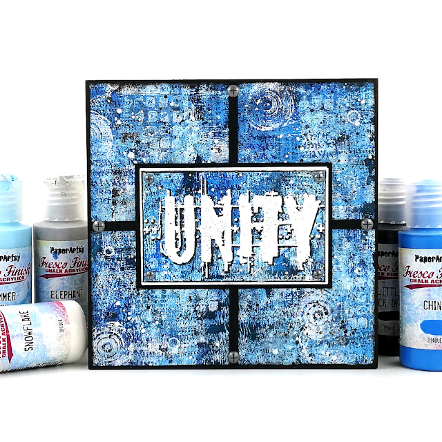
My first pick is this amazing art block by Amanda Pink. Blue is obviously her favorite colour, despite her name, and she rocks the monochromatic look. Check her original blog post to discover her process and watch her master-board develop layer after layer. I love her use of clean lines to cut through the background and how striking the embossed 'Unity' is. This piece is so bright, when blue is so often used as a soft colour.

Ellie Knol chose a combination of teal and reddish brown for her journal covers. The two mix in a gorgeous dark plum, making for a unusual palette. The obscure colours, added to subtle stencilling, create wonderfully atmospheric backgrounds. The focal images are an interesting contrast between realistic stamps and unreal colours. I love how all the elements combine to create a fairy-like dreamy world.(link to original blog post)


Jennie Atkinson's project is all about soft and subtle touches to showcase her favorite colour, tea dyed paper! I love how the Infusion in the background is so diluted, barely there, but still offers a lovely contrast to the focal images. The coordinating paper colours and inks are so skillfully balanced in her layers, providing both cohesion and interest. Jennie's original blog post is a masterclass in building a light and complex multi-technique background.
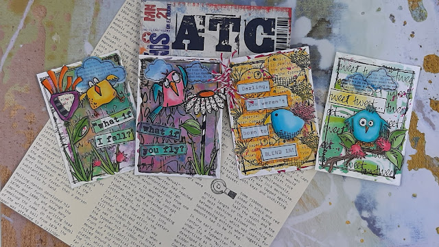

Claire Snowdon certainly does not hide her fondness for pink! She used it in 3 different media: acrylic paints, watercolors and Infusions. I love the variation of tone she achieves, making the flowers pop despite being pink on pink. They seem to burst out of those ATCs! Her original blog post beautifully shows all the details of the texture she create in her backgrounds, with lots of little touches that are not obvious but contributes to the overall style.


Topic 11 : Twinkle, Twinkle
🌟🎵Twinkle, twinkle, little star, How I wonder what you are...🎵🌟 This is basically what we asked our bloggers! Stars are probably one of the first things we doodle and are everywhere in craft products. If you also add everything sparkly, glittery or shiny, and expand the topic to space, galaxies and lights, the possibilities are endless! So what are stars to you? How do you use them in your crafting?

Tracy Springer's clever card has everything that comes to mind when thinking of stars: a galaxy purple background, white and yellow stars of all sizes, shiny gold, halo effects... Add the depth of a tunnel card and a cheeky Zini high priestess and you are in for a world of fun! In her blog post, Tracey shares her process, her struggles (not that you would guess looking at the finished project!) and the inside of the card, which is also gorgeous and star-filled.


Instead of indulging in all things sparkly, Kate Yetter went for star related stamps and a colour palette of neutrals and rusty-browns. She uses it skillfully to provide cohesion to her collage while letting the focal images pop on their white paper. Her original blog post usefully details her process to obtain this deliciously grungy background and gives you a closer look at all the ways she has used the stamps in her layers and elements.


For Jenny Marples, who likes playing with building and architecture in her art, twinkling is for windows at night, which she translated beautifully in this card. Even before she adds the focal image, her project is full of layers and textures, including the music paper, a nice nod the topic title. Despite what you might think, the window is not hand drawn and Jenny shares in her original blog post her technique to get this look from a photography, a must try.


Topic 12 : Sustainable Crafting
We are all becoming more and more conscious of our personal environmental impact so we wanted to explore how to reduce it in our small scale as creatives. Most of us already reuse packaging, empty containers or non-craft materials but there are lots of other ways we could modify our crafting habits: being mindful of the ethos of the companies we buy from, thinking about how much disposables we consume, checking how much water we use, etc. Let's not forget those products languishing in a corner of our craftroom that we just can't bin. Maybe it is time to push ourselves outside of our comfort zone and use them, or get together with other crafty hoarders and swap treasures!

Recently, lots of us have been ordering online, resulting in  mounds of cardboard 
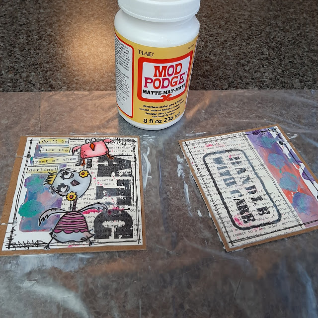
and envelopes. Etsuko Noguchi chose to upcycle those parcel packaging into a bellowed folder and individual inserts. It can even be used sustainably to store left over odds and bits for future use. Check Etsuko's original blog post for details of all her layers and pictures of all the gorgeous and colourful removable envelopes.
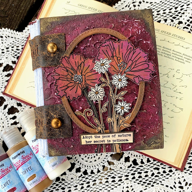


Autumn Clark went full on for her project. She made her own recycled paper to fill this lovely notebook and the leather used for binding it is from her old couch! The overall handmade and weathered look is lovely, especially paired with amazing texture and clean flowers of the cover. In her original blog post, Autumn also shares a trio of card where she experiment with her homemade paper, well worth the read!


Nikki Acton was inspired by the topic in both her use of recycled materials and the subject of her 'green' card. A simple, easily adaptable project, but where all details bring interest and harmony. I love how the circle pattern is repeated all over, on the leaves, in the additional stamps, stencilled in the background, through the translucent disc and the splatters. All the thought behind this piece is explained in her original blog post.


Well, wasn't that a fabulous array of wonderful!? We are so spoiled by our blogging team and the lengths they go to in their projects. I hope you can appreciate the time they put into each piece, but more importantly, how much they enjoy what they do while creating.

Leandra


Tuesday, 28 December 2021

2021: PaperArtsy - A Year in Review {Topics 7 to 9}

Hello again from PaperArtsy HQ,

We hope you are enjoying your daily walk down memory lane to see highlights from the PaperArtsy blog of 2021.

Dounia has selected another series of stunning ideas to share with you today, so sit back, relax and enjoy this review

Today we're sharing picks from Topics 7:Mash Up {with JoFY, Emma Godfrey, Sara Naumann and Ink & the Dog Minis}, Topic 8: Nature's Treasure and Topic 9:Baubles and Bling.

Leandra 

Topic 7 : Mash Up with JoFY, EEG, ESN and I&D Minis
Already half a year had gone by and it was time for our second Mash Up topic! Again we tried to propose a mix of designers/ collections that would bring both focal and background stamps, big and small patterns, open and detailed textures. This time our bloggers combined JoFY's bold florals, Emma Godfrey's funky geometrics, Sara Naumann's layered collages and Ink & the Dog Minis' vintage imagery. They approached this challenge each in their own way and it is so interesting to compare which aspect of the collections each of them focused on, for quite varied, wonderful and, sometimes, unexpected results.

My first pick is this beautiful journal cover by Ellie Knol. I love the contrast she was able to create with a very limited colour palette and no black or any truly dark colour. Her original blog post details her extensive use of stencils and Grunge Paste to achieve the gorgeous background texture. The patterns overlap and meld together to really unify the piece and highlight the focal JoFY butterfly (not a flower!).


Lynn Good went for bright and bold, and JoFY flowers. The stenciled background brings a vibrant jungle vibe, perfect to showcase the warm blooms. How great are the bird focals? They are starkly different from the rest of the piece, both in colour and style, but Lynn cleverly integrated them using the black border stamping. Her original blog post details the twists and turns of this project, a good example of how to adapt when your crafting does what it wants!


Thinking out of the box and going out of her comfort zone, Keren Baker was inspired by Sara's seashells to make this vintage art doll. I love how she diverted lots of the elements from their obvious use. The lovely textures of the dress and the wings really gives a 3D effect and makes the doll stand out. Be sure to go to Keren's original blog post to appreciate all the small details, like the cog heart in the frame or the stamping on the face.


Topic 8 : Nature's Treasure

In the middle of summer, this topic aimed to celebrate nature, her beauty and all the materials and inspiration she offers in crafting. The PaperArtsy collections are certainly full of leaves, seeds, flowers and other natural curiosities and our bloggers did not hesitate in showcasing their favorites. It was also an occasion to reflect on how those organic patterns we have internalized from contact with nature can emerge when crafting, or meld with more 'man-made' imagery. Finally, nature also offers us more physical gifts like leaves, twigs or barks, gorgeous and unique, that we can integrate in our art or use as tools.

Blue might not be the first colour that comes to mind in a topic about nature but Nikki Acton really pulled off the monochrome look in this gorgeous card. The tiled format allows her to display lots of Lin Brown's 'printed leaves', sparing her having to choose, as she explains in her original blog post. Using a different hue of blue for the quote and main leaf is a genius idea: it makes them pop from the background, while the subtle stamped dots anchor them.


Amanda Pink proved that natural textures and patterns can bloom even from abstract stamps like Seth Apter's. I am impressed how well she married grungy, industrial elements and vegetation inspiration. Her original blog post details how she achieved the fantastic texture of the background, reminiscent of bark. Watching the piece transform along the multiple steps of the process is mesmerizing! 


In her project, Dounia Large chose to use Nature's Treasures as tools and materials rather than images. Her not-a-book is lined and decorated with dyed cork. For the cover, she experimented with pressing leaves into the paper and revealing the patterns with Infusions. A delicate look with easily obtained materials! Go to her original blog post to discover the process and see all the details!


Topic 9 : Baubles and Bling

It's Christmas in August! This year, we tried to be good and propose inspiration well in advance of the Holiday season. Our bloggers ended spending the summer in tinsel, I am sure they are thanking us... This topic is a fun one, sure to appeal of the magpie inside all of us! Time to bring the glitter, tinsel and foil out of hiding place and indulge in all things shiny. We thought these elements would pair great with baubles: tiny versatile canvas where sparkles are not only acceptable but expected! Our bloggers did not hesitate to play with size, shape and texture for a wide range of cheerful atmospheres.

She might have chosen an usual colour palette, but Helen Chilton surely brought the baubles and the bling! She certainly understood the assignment! I love how the warm colours pop against the silver. In her original blog post, you can see all the little touches she added for cohesion and maximum sparkle! She also shares her foiling technique. I particularly like how it highlights the texture of her Grunge Paste stenciling, so interesting. 


PaperArtsy designer Tracy Scott came out to play, not surprising as this topic seemed to be made for her! She certainly loves a bit of bling. Her original blog post details all the layers that went into this gorgeous piece. I love her bokeh lights effect, both simple and effective, it is such a great idea. It creating a wonderful depth in the background and helps the baubles stand out and shine (figuratively and literally)!


In New Zealand, it was actually winter for Tracy Springer, which did not stop her project from being bright and warm, but with a fur coat touch!  Her baubles are fuzzy and her doggies are cheeky in this lovely series of cards and their holder. I love her colour palette, not classic but still close enough to 'feel' Christmassy. Go to her original blog post to meet all these cute critters in all their bling out glory. Get your sparkle out indeed!

 
Hang in there, as the review continues for another couple of days more, see you same time tomorrow!

Leandra
  

Monday, 27 December 2021

2021: PaperArtsy - A Year in Review {Topics 4 to 6}


Hello from PaperArtsy HQ,

We hope you have enjoyed a wonderful holiday period with friends, family, old movies and some good food over the past few days! This is the week of the year where we remind you of how amazing our bloggers have been over this past year, and share with you some of the many highlights.

Usually at the start of the year we are tripping around the world to the USA, Germany, UK for the annual crafting trade shows, so early 2021 for us meant we did not get to do those face-to-face events. Instead we stayed in touch with our shops and customers online to share our new product offering. 
 
Many of our designers switched up their classes to be virtual instead of in-person, and we also kept in touch with all our stores monthly too. Sad not to see people in real life, but here at PA HQ, after having undertaken a big move mid-pandemic from the UK to France, we were quite content to be homebodies and crack on with all the projects that needed urgent attention in our new location. For us, 2021 has been a steep learning curve both administratively, physically, and practically as we adjust to new systems, a new climate, new service providers and new suppliers.

Today Dounia has curated a stunning selection from 2021 Topic 4:Free to Fly, Topic 5:Find your Vibe and Topic 6:Mandala Mix.
 
Feet up for 5 minutes, and enjoy!

Leandra 

Topic 4 : Free to Fly

This topic was about all things winged and fluttering. Bees, Birds and Butterflies! Quite a few of our designers had releases with birds and other winged creatures this year and this topic proved quite popular. Indeed, flying invokes dreams of the open skies, freedom of movement and the joy of being outside. I think we were all yearning for those feelings after an often difficult year cooped up inside. Waiting for better times, our bloggers instead escaped to their craftrooms, or their corner of worktable, to let their creativity take flight and take us on beautiful journeys of the mind.

My first pick is this beautiful card by Claire Snowdon, a true mixed-media piece with corrugated cardboard, textured fabrics and clean stamping. Her original blog post describes how she achieved the fabulous texture on the background, playing with grunge paste, paints and Infusions. A study in contrasts: the flowing threads against the graphic staples; the grungy layers against the sharp focal points; the distressed edges highlighting the vibrant bee.


I hope you didn't miss Etsuko Noguchi's amazing fairy booklet. An ode to Lynne Perella's stamps, it is also a real mash-up project seamlessly involving stamps and stencils by 5 other designers. Her original blog post is not only a feast for the eyes, full of whimsical colours and clever details, but also a very thorough exploration of her creative process (with diagrams!) that let you grasp the amount of work and love that went into this project.


I adored how Jennie Atkinson incorporated the topic in both the substrate and its decorations. With its hint of a nest, this could absolutely be a bird house, but instead it is full of butterflies! You might not have realised it but this project does not actually involved anything made of wood! It is only clever use of basic and recycled cardboard elements and Infusions. Be sure to check her original blog post to see how she achieved this bluffing wood effect!


Topic 5: Find your Vibe

Here is another very open blog topic. The vibe is sometimes elusive, often surprising and always ever-changing. This was an occasion for our bloggers to showcase their style and their quirks but also to explore the eternal question: 'how to be YOU in your art?'. At first that question may seem a bit trite but I think we all have struggled at some point between emulating those we look up to, wanting to make something beautiful or impressive, and truly expressing our own personality and sensibilities. As everybody's vibe is indeed different, we had a wide and varied range of projects in this topic, so I have chosen 4 projects instead of 3.

First up is this gorgeous journal layout by Jenny Marples. Everything, from minimal and striking use of colour, to to the multiple layers of texture, is balanced. I am always amazed by her masterful use of white space, full of delicate and subtle variations and contrasting sharply with the focal points. Even if you do not feel up to hand-drawing yourself, in her original blog post, Jenny shares a few of her tricks to overcome our creative roadblocks, this one is really worth a read!


In her blog post, Tracy Springer shares how she finds inspiration in the stamps themselves and takes us on a creative adventure as she builds her characters and their story. Not afraid to mix and match and modify designs, she also reminds us that no image is static and that no one is safe from being chopped up and reassembled (on paper, of course!). This bright and colourful composition is only part of her project, a box hiding a surprise!


Despite the complex layered look of the cover, Autumn Clark's card-folder started with very simple gel printing, a great way to find your spark when maybe lacking inspiration. Don't be intimidated as she shares how she makes the most of her prints and achieves easily an intricate look. Her original blog post is also full of tips and tricks to create that vintage look, full of soft colours and detailed layers.


When trying to find your vibe, you might not think of scrapbooking, but Kate Yetter proved the two are totally compatible! She used this mini album of family photos as an occasion to create lots of yummy mix media backgrounds and just have fun mix and matching. Recycled papers, paints, infusions, textures, stamping, her original blog post has a bit of everything and encourages you to play: each page is an experiment and lets you decide what is you. 


Topic 6 : Mandala Mix
At the intersection of art and spirituality, Mandalas are more popular than ever, both for the meditative process and the stunning result. While the more traditional mandalas, based on circles, symmetry and repeating patterns certainly make for gorgeous pieces, we added 'Mix' to the topic title so that our bloggers would feel free to wander outside the geometric box, and they certainly did not disappoint! While some took full advantage of the mandala-ish stamps and stencils of our designers, some brave souls unearthed their compasses and protractors for a bit of maths and craft!

In the PaperArtsy family, I think it is fair to say that Tracy Scott is our Mandala Queen! Lynn Good certainly thinks so. She chose her stamps to create this vibrant and striking journal page using the Blackout Technique. She shares her process in her original blog post and watching this page's evolution is truly mesmerizing. By adding doodling to the stamping, she even preserved the meditative aspect of mandalas.


Moving out of her comfort zone, Nikki Acton went for a carefully constructed piece playing with contrasts. The circles against the squares, the geometric structure against the natural focal elements, the daring colour combo... Check her original blog post for close up pictures, as each zone is delicately patterned, the different pieces pulled together by symmetry and subtle touches of pen work.


Do not limit yourself, any stamp can be the base for a mandala! Jo Firth-Young masterfully illustrated this with her own stamps, here in a gorgeous subdued palette on kraft card. I love the mix of strict geometry and free doodling. At first look, you are struck by the repetition but a closer look reveals each stalk is unique and slightly different. Her original blog post offers step by step pictures of her process and details two other projects, each with its own vibe.


I'm sure you have found some wonderful ideas to add to your Pinterest boards within this selection of posts. We are so fortunate to have bloggers who push themselves to try new ideas, experiment and share their strengths so willingly with us all.

Leandra


Thursday, 4 November 2021

2021 Topic 13: Tiny (News) Print with ZA {by Tracy Springer}

    2021 Topic 13: Tiny (News) Print


When we start with one idea, it often springboards to another one and Tracey began with the idea of a set of ATCs and ended up with.. well I won't spoil it! Check out her beautiful vintage typewriter and her clever idea for adding tiny text to painted stencilled panels.
Keren.

Hi everyone, Tracey Springer here with you today to share my version of Tiny ‘news’ Print. I knew right from the start that I wanted to do ATC’s with this topic so I rummaged (incredibly skilled at this, lol) through my stamps looking for what to use. I decided that there are a lot of little birds in these sets they may get overlooked for the bigger characters, so I challenged myself to use them. I picked out 2 sets of Elena’s stamps (Zinski Art) and 2 sets of Jo’s stamps (JOFY).


I already had quite a few off-cut gel-printed backgrounds that I could use up for these, but also had an idea to play with this little stencil and these really fresh Fresco colors. I have decided that I love to use my paints like I would inks, and they blend so beautifully!


I chose the cute little guy from JOFY15 to use on my first ATC. I coloured him with Copic markers and also a bit of the tree branch, leaves and little flowers. I die cut the clouds from an offcut background that had blues in it, and stamped a newsprint stamp on them. I used the ‘tweet tweet’ because I love really busy, collaged backgrounds. I stamped the newsprint stamp on the bird as well; I quite liked it, but was just too busy for the finished card – and that’s coming from me who loves crazy, over the top lol! I added a few flicks of pink ink and  I always finish with a double pen line around as a border and a thick surround of Gesso.


The next one I picked was one of the lovebirds from JOFY JM20, and I had an idea to stamp multiple of the same bird on the same colour background and then have one that stood out. I chose my fav Fresco colour Mustard Pickle (FF148) and sponged that on to a piece of book paper I had, and stamped multiple of the lovebird and cut them out. I coloured one quite boldly with my Copics and raised him up on foam tape (I once again tried stamping him with a newsprint stamp but changed my mind later on and covered him with a plain bird). I used my trusty typewriter (isn’t it gorgeous!) to type the wording, a pen border, some tied baker’s twine and gesso to finish.


The last 2 ATC’s were using the fabulous little birds from the Elena Zinski set’s ZA07 and ZA08. I had random strips of offcuts for the backgrounds, clouds, CUTE flowers, my go-to background script stamp of JOFY’s (JOFY89) and this very fitting quote stamp from Eclectica Emma Godfrey (EEG24) Everything got a heavy surround of Gesso to frame them.


And then….what are cute ATC’s if you don’t have anything to keep them in…I felt a little book coming on LOL!  A couple of pieces of craft board, another random little gelli print background, book page paper, this funky bird from Elena Zinski mini’s (ZN22) , an ATC stamp (MN21), typewriter quote and finally I had to use the ‘Handle with care’ stamp from the set by Eclectica Seth Apter (ESA19). I coated it all with Mod Podge which strengthens and protects the cover from wear and tear, and then added a whole pile of ribbons and tassels. I used the disc system to bind as it enables you to add and remove pages easily (I used cut down clear plastic sleeves to hold the cards).


This has been such a fun project to work on….I'm not sure if I met the topic entirely but the main thing is to have fun…zone out and de-stress! Thanks for coming on this journey with me! 

Tracey xx

Instagram: @tracey_springer