Showing posts with label My Favourite Colour. Show all posts

Wednesday, 29 December 2021

2021: PaperArtsy - A Year in Review {Topics 10 to 12}


Hello from PaperArtsy HQ,

We're back for the penultimate round up post of 2021. And hold on to your hats, it's another goodie, full of inspirational ideas, techniques and crafty fun!

Today Dounia has her picks for you from Topic 10:My Favorite Colour, Topic 11:Twinkle, Twinkle and Topic 12:Sustainable Crafting.
 
Get ready for a bit of bling, brightness, and blooming good fun!

Leandra 

Topic 10 : My Favorite Colour

Here is a nice straightforward topic title! In the previous years, we tried to have regular colour topics on the blog but took a break in 2021. Therefore, for our one colour theme of the year, we let our bloggers make their choice and share a favorite combination. As expected, the resulting projects were wonderfully eclectic, from vibrant bright hues to subtle half-tones, from monochromatic cameos to the full rainbow, from barely there nuances to fully saturated splashes. Everybody loves colour, it creates atmosphere, invokes memories, shares feelings, but everyone's love for it is different, making this topic so interesting!

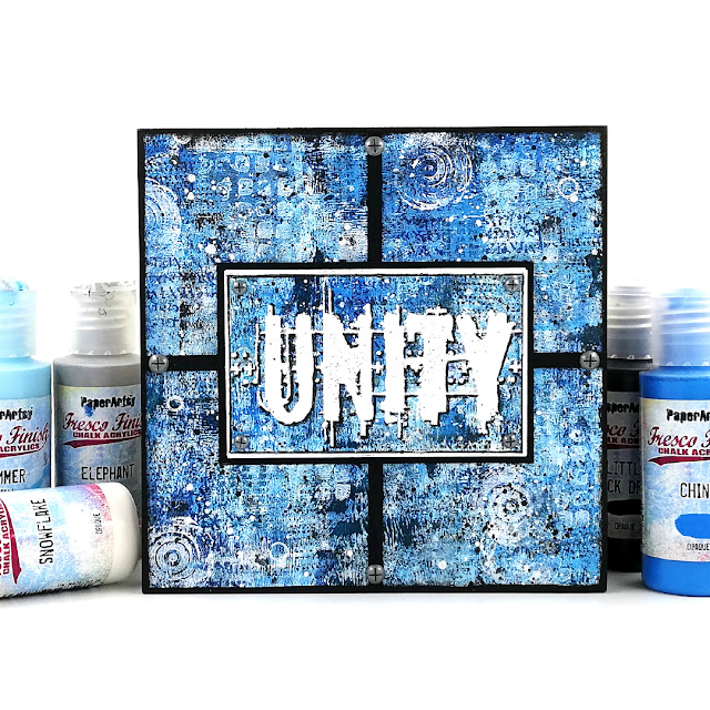
My first pick is this amazing art block by Amanda Pink. Blue is obviously her favorite colour, despite her name, and she rocks the monochromatic look. Check her original blog post to discover her process and watch her master-board develop layer after layer. I love her use of clean lines to cut through the background and how striking the embossed 'Unity' is. This piece is so bright, when blue is so often used as a soft colour.
Ellie Knol chose a combination of teal and reddish brown for her journal covers. The two mix in a gorgeous dark plum, making for a unusual palette. The obscure colours, added to subtle stencilling, create wonderfully atmospheric backgrounds. The focal images are an interesting contrast between realistic stamps and unreal colours. I love how all the elements combine to create a fairy-like dreamy world.(link to original blog post)


Jennie Atkinson's project is all about soft and subtle touches to showcase her favorite colour, tea dyed paper! I love how the Infusion in the background is so diluted, barely there, but still offers a lovely contrast to the focal images. The coordinating paper colours and inks are so skillfully balanced in her layers, providing both cohesion and interest. Jennie's original blog post is a masterclass in building a light and complex multi-technique background.


Claire Snowdon certainly does not hide her fondness for pink! She used it in 3 different media: acrylic paints, watercolors and Infusions. I love the variation of tone she achieves, making the flowers pop despite being pink on pink. They seem to burst out of those ATCs! Her original blog post beautifully shows all the details of the texture she create in her backgrounds, with lots of little touches that are not obvious but contributes to the overall style.


Topic 11 : Twinkle, Twinkle
🌟🎵Twinkle, twinkle, little star, How I wonder what you are...🎵🌟 This is basically what we asked our bloggers! Stars are probably one of the first things we doodle and are everywhere in craft products. If you also add everything sparkly, glittery or shiny, and expand the topic to space, galaxies and lights, the possibilities are endless! So what are stars to you? How do you use them in your crafting?

Tracy Springer's clever card has everything that comes to mind when thinking of stars: a galaxy purple background, white and yellow stars of all sizes, shiny gold, halo effects... Add the depth of a tunnel card and a cheeky Zini high priestess and you are in for a world of fun! In her blog post, Tracey shares her process, her struggles (not that you would guess looking at the finished project!) and the inside of the card, which is also gorgeous and star-filled.


Instead of indulging in all things sparkly, Kate Yetter went for star related stamps and a colour palette of neutrals and rusty-browns. She uses it skillfully to provide cohesion to her collage while letting the focal images pop on their white paper. Her original blog post usefully details her process to obtain this deliciously grungy background and gives you a closer look at all the ways she has used the stamps in her layers and elements.


For Jenny Marples, who likes playing with building and architecture in her art, twinkling is for windows at night, which she translated beautifully in this card. Even before she adds the focal image, her project is full of layers and textures, including the music paper, a nice nod the topic title. Despite what you might think, the window is not hand drawn and Jenny shares in her original blog post her technique to get this look from a photography, a must try.


Topic 12 : Sustainable Crafting
We are all becoming more and more conscious of our personal environmental impact so we wanted to explore how to reduce it in our small scale as creatives. Most of us already reuse packaging, empty containers or non-craft materials but there are lots of other ways we could modify our crafting habits: being mindful of the ethos of the companies we buy from, thinking about how much disposables we consume, checking how much water we use, etc. Let's not forget those products languishing in a corner of our craftroom that we just can't bin. Maybe it is time to push ourselves outside of our comfort zone and use them, or get together with other crafty hoarders and swap treasures!

Recently, lots of us have been ordering online, resulting in  mounds of cardboard and envelopes. Etsuko Noguchi chose to upcycle those parcel packaging into a bellowed folder and individual inserts. It can even be used sustainably to store left over odds and bits for future use. Check Etsuko's original blog post for details of all her layers and pictures of all the gorgeous and colourful removable envelopes.


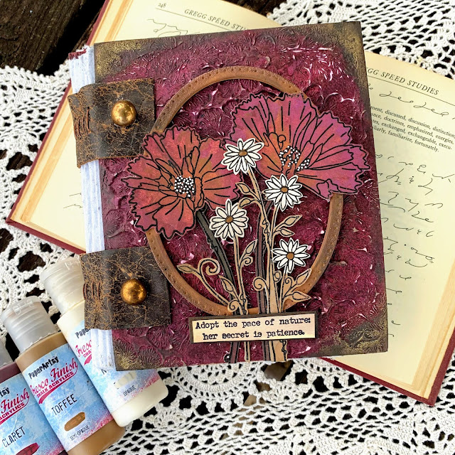
Autumn Clark went full on for her project. She made her own recycled paper to fill this lovely notebook and the leather used for binding it is from her old couch! The overall handmade and weathered look is lovely, especially paired with amazing texture and clean flowers of the cover. In her original blog post, Autumn also shares a trio of card where she experiment with her homemade paper, well worth the read!

Nikki Acton was inspired by the topic in both her use of recycled materials and the subject of her 'green' card. A simple, easily adaptable project, but where all details bring interest and harmony. I love how the circle pattern is repeated all over, on the leaves, in the additional stamps, stencilled in the background, through the translucent disc and the splatters. All the thought behind this piece is explained in her original blog post.


Well, wasn't that a fabulous array of wonderful!? We are so spoiled by our blogging team and the lengths they go to in their projects. I hope you can appreciate the time they put into each piece, but more importantly, how much they enjoy what they do while creating.

Leandra


Saturday, 4 September 2021

2021 Topic 10: My Favourite Colour with TS {by Claire Snowdon}

Watching someone layer up elements is always a treat. Claire has built up each layer with care, so each one is distinct and amplifies the textural effect. Her favourite colour pink is loud and proud going from the purple pinks right through to the orangey hues and is definitely the star of these beautiful ATCs.
~ Keren

Hi everyone, it's Claire Snowdon here with you today to share a trio of ATC's I created using my favourite colour - PINK!  To be honest I was pretty surprised about the distinct lack of love for pink during this topic......I think I'm only the second blogger to choose it for this topic.

Creating on multiple pieces at the same time is one of my favourite things to do when I'm not using a journal - it leaves plenty of room for error as you can just discard one piece if you don't like it.
 

So to start with I took my three ATCs and swished on Fresco Finish Chalk Paint in Blah Mange, Sorbet and Cerise to create a kind of marbled effect.


Once dry I used a Tracy Scott stencil (PS201) and Grunge Paste on each ATC to create some texture and extra interest.


Whilst my Grunge Paste was drying I moved onto the focal elements for the ATC's. I stamped two of the flowers from Tracy Scott set 61 (TS061) onto some PaperArtsy Smoothy card then used watercolour pens to add colour.  Then I fussy cut the flowers into three separate elements and inked all the edges in black.


Now that my Grunge Paste stenciling was nice and dry I went in with the Infusions to grunge them up a bit more - I used Magenta and Raspberry.  Spritzing with water, dabbing and drying until I was happy with the effect - I really love using Grunge Paste and Infusions together as the paste takes on some of the colour in places and then the infusions puddle in the grooves too so every time you use them it's unique.


I decided the cards needed some black - so I went in with black ink and a crackle stamp from Tracy Scott set 52 (TS052) and added the stamping at random to each card.  I also edged around each card using the same black ink too.
I also added splatter to all three cards using three colours of Fresco Finish Chalk Paint - Little Black Dress, Cloud 9 and Gold.


The last thing to do was assemble each card - I took some black cotton thread and added it to each card underneath the main floral image. I attached the flowers with foam pads to give them some extra depth.


And the very final touch was adding a quote sticker to each card.


Here are some closer up photos of the finished ATCs - I really love how textural they turned out.
 

The black cotton thread was another textural element that created another layer of depth on the cards.


Here are the three completed ATC's - you can see how the theme running through each card is consistent however they are all very individual.


And some close up's of each of the flowers from Tracy's beautiful set (TS061).


And one final photo of the three ATC's together.


I love how my ATCs turned out - the techniques I used to create them could be used for any number of projects for example cards or journal pages.
Creating these in my favourite colour has been so much fun - but any colours would work equally well! 

Thank you for joining me today,


Thursday, 2 September 2021

2021 Topic 10: My Favourite Colour with LPC {by Etsuko Noguchi}

  2021 Topic 10: My Favourite Colour


We're all intrigued by clever paper engineering but when you combine it with the beauty of Lynne Perrella stamps, you end up with something quite magical. Etsuko has created an awesome flip book plus some really clear instructions with lots of beautiful backgrounds that really enhance the beauties of the stamped women.
~ Keren

Hi everyone, Etsuko (My Favorite thingswith you today, and I'm here to share with you Infinity Flip using fabulous Lynne Perrella stamps.

This time I tried to make a little old style flip card. This theme is My Favourite Colour, so I made the card in some of my favorite colours, blue and yellow. Detailed instructions on how to make an Infinity card can be found on Nicole Fenimore's site.


This is the short video.


The first step is to make the base of the card using PaperArtsy Smoothy (Heavyweight) A4 white card and lightly color it with a brayer in Fresco Chalk Acrylic (Snowflake), (Cerulean), (A Bit Fishy).


Cut 4 pieces at 6 x 3 inches. Score both four pieces at 1 1/2 and 4 1/2 inches.


Apply glue to the bottom layer where the red hatch marks indicate. Then align and glue the blue hatch marks on top of the red hatch marks.


Create two color papers as a base by gel-printing, used Fresco Chalk Acrylic (Cerulean), (Deep Sea), (Sargasso) and (Blue Oyster) on the blue paper.


On the other yellow paper, used Fresco Chalk Acrylic (Yellow Submarine), (Lemon Meringue), (Persimmon) and (Cerulean). Then I stamped halfway down the paper with Lynne Perrella set 028 (LPC028) and Jofy set 09 (JOFY09) by Ranger Archival ink (Saffron and Forget-Me-Not). I cut both base into the small squares shown below. ★ 2 3/4 x 2 3/ (2) Pieces ★ 5 3/x 2 3/ (3) Pieces ★ 2 3/x 1 1/ (8) Pieces ★ 1 1/x 1 1/ (8) Pieces.

Page one,


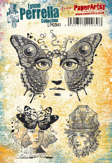
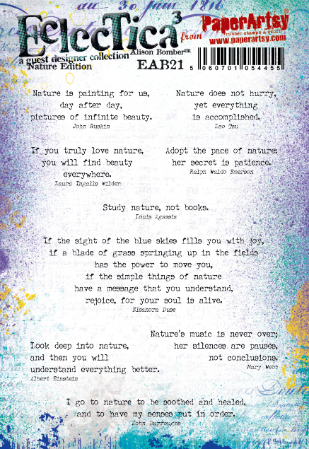
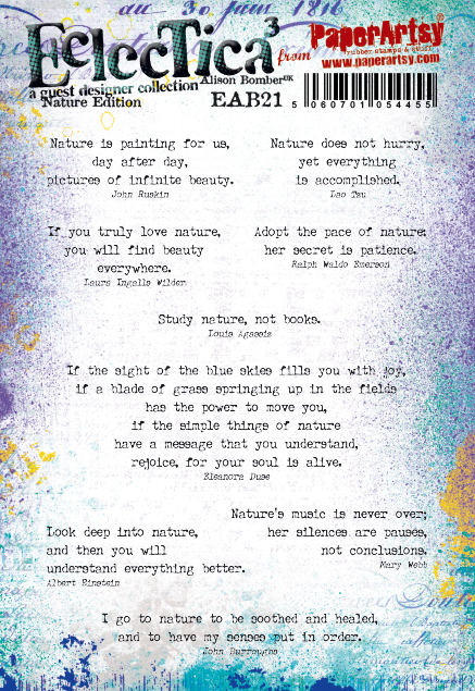
Page one-- Using stamps are Lynne Perrela set 041 (LPC041), Hot Pics set 1005 (HP1005by Ranger Archival ink (Jet Black). Alison Bomber set 21 (EAB21) for the quote with Ranger Archival ink (Jet Black). Fresco Chalk Acrylic (Blush), (Toffee), (Snowflake) and (Cerise) for her face. For the four blue rectangular bands I used Lynne Perrella set 023 (LPC023) by white WOW embossing powder. Once everything was done, I glued it up.

Page two,


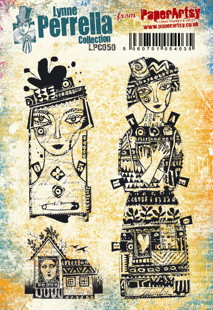
Page two--Stamped Lynne Perrella set 050 (LPC050) by Ranger Archival ink (Jet Black), stamped set 005 (LPC005) and set 006 (LPC006) by WOW some embossing-powder. These golden towers are the same ones on both sides of page three.

Page three,


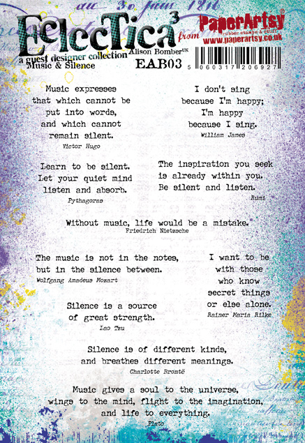
Page three-- I stamped Lynne Perrella set 049 (LPC049) by Ranger Archival ink (Jet Black) and stamped Hot Pics set 1005 (HP005) by Ranger Archival ink (Fern Green and Library Green). Small squares are painted Fresco Chalk Acrylic (Gold) then embossed set 009 (LPC009) on it with WOW Turquoise powder. Also I added Alison Bomber set 03 (EAB03) quote.

Page four,


Page four-- Lynne Perrella set 050 (LPC050) stamped on the central focal point by Ranger Archival ink (Jet Black), Seth Apter set 20 (ESA20) used for the side rectangles and embossed by WOW yellow powder. Also I added Alison Bomber set 21 (EAB21) quote.

These are the finished Infinity Flips.


And more parts.


It was a very fun project, but I may not be explaining how to make it well enough. Please take a look at Nicole Fenimore's site and I hope you try making one. 
Thank you so much for visiting.

Etsuko xxx 

Blog: My favorite things
Facebook: Etsuko Noguchi
Instagram: Pixienest
Pinterest: Etsuko N