

Hello again from PaperArtsy HQ,
Here
we are at our final post for the year. I hope you have enjoyed taking a
look back at some of the blog highlights with us. It's amazing the
variety of ideas that we have shared over the past year, and of course,
we will be back with many more next year too!
As
we round off the year, I would just like to offer a heartfelt thanks to
all our bloggers, past and present, (and future) ! The projects they
create for us, and of course for you, are always absolutely superb, we
cannot thank them enough for their attention to detail and willingness
to share their tricks, tips and creative secrets with you all.
To
our designers who go from strength to strength, you are such a fun
team, all so supportive of each other, and an absolute joy to work with!
I know you all have your individual quirks, and work differently and
that is why you are all so unique! We have missed seeing you all face to
face at the trade shows, and look forward to spending time again
hopefully in the not too distant future!
To
our retailers around the world who have pulled out all the stops to
offer classes, both online and face to face and who regularly order so
that you have access to our brand in all your corners of the world...
thank you for your friendship, support, feedback and encouragement, and
especially your patience as we have adjusted to life in France and all
the new systems we are still coming to grips with!
And to the lovely staff here at PA HQ, we thank you too for always picking orders accurately and shipping fast so that people don't have to wait too long for anything!
I love how you are always thinking on your feet and make suggestions on
how we can all improve and be more efficient. You guys have been so
patient as we continue to try to get things set up in the new PAHQ
spaces. Oh and also for the fun Friday after-work gin tastings!
So lets talk about today's topics we are remembering! We have picks from Topics 13: Tiny (News) Print, Topic 14:Mash Up (with LPC, EGL, EEV and EAB) and last of all Topic 15: Journaling Gratitude. These have all been beautifully written,and joyful ideas as we have come to the end of the year! Lets take a look back.
Leandra
Topic 13 : Tiny (News) Print
Text
and letters play a crucial part in creation, from titles and
describing, to expressing what images cannot, or perhaps to play a role
as the visual texture of a piece. Topics linked to writing, typography
and letters are recurrent on the PaperArtsy Blog. This time we wanted to
put a big focus on tiny letters. Newsprint is the obvious example but
encyclopedias, telephone books (now a vintage memory), medication spec
sheets or travel guides are also good candidates, as well as lots of
stamps! Our bloggers run with the idea, sneaking snippets of text in
their backgrounds, putting emotion in their sentiments, or creating
embellishments out of printed pages.
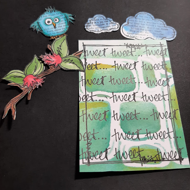
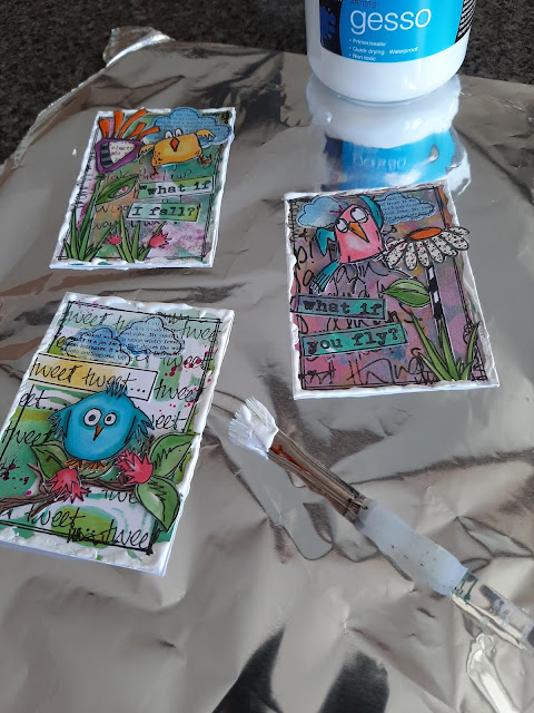
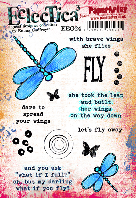
My first pick is this amazing vintage spool book by Jennie Atkinson. As she explains in her original blog post,
this was not her initial plan but sometimes you have to go where your
muse takes you. Tiny text is everywhere, from quotes to subtle stamping
on the fabric. Yes, that text on the fabric looks part of the design but
she actually added it to the pre-printed design! I love how all the
elements are pulled together by the repeated use of limited colours.

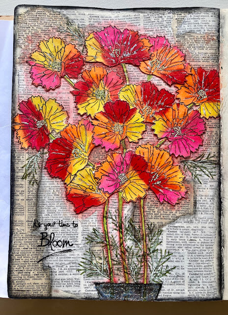
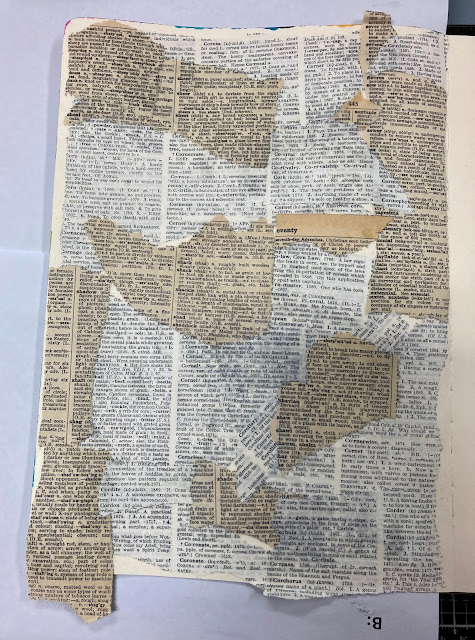
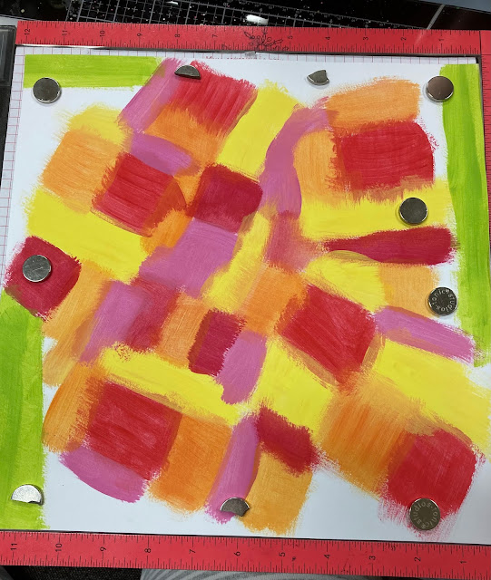
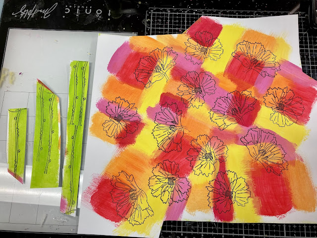
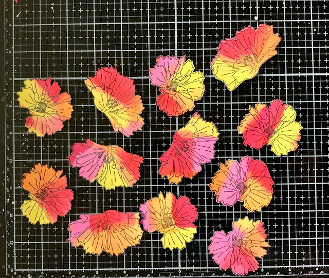
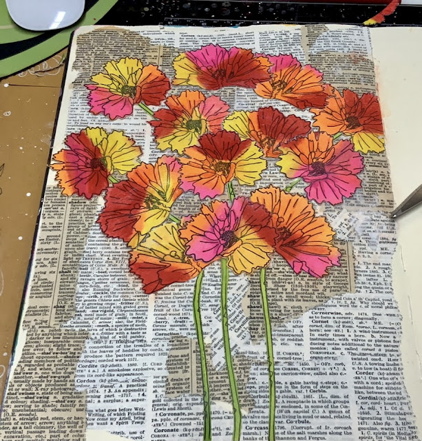
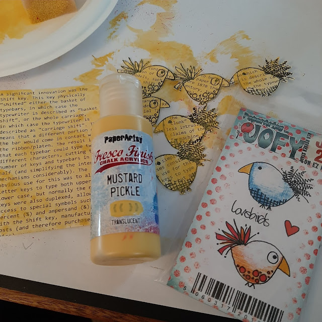
And I hope you didn't miss Lynn
Good's bright bouquet, a riot of colour in her art journal.The tiny
letters are obvious here, busy filling the background. As Helen also
shares in her original blog post, mixing
different dictionaries, with a range of fonts, sizes and colours, is a
fantastic idea to create easy and interesting backgrounds.The contrast
between the subdued text and the vibrant flowers, aided by subtle
shadowing, makes for a truly striking piece.

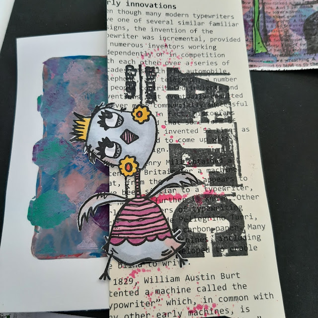
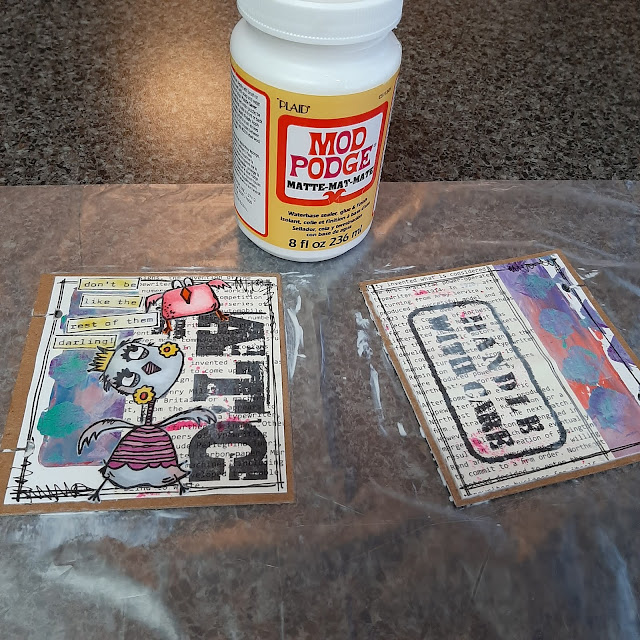
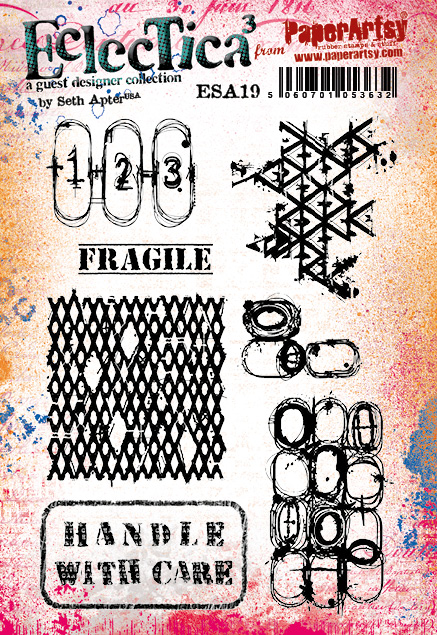
I adored how Jenny
Marples took Seth Apter's rather abstract stamps, saw their
architectural inspiration and translated it into a completely
representative scene, full of texture and depth. The tiny print is quite
discrete here, but her original blog post shows
in detail how she transformed a text stamp into the stone wall. Genius!
A real lesson in how to look at stamps differently and discover the
other images hidden within.

Topic 14 : Mash Up with LPC, EGL, EEV and EAB
The
end of the year comes near and with it the third and final of our
Mash-Up topics. This time the participants are: Lynne Perrella, the
original queen of collage, with her intricate characters, Gwen Lafleur,
with her intricate and ethnical patterns, Ellen Vargo, with geometrics
bold and delicate, and Alison Bomber, with inspiring words. As somewhat
expected with this selection, the Lynne Perrella stamps often provided
the focal people but it is always amazing to see how differently our
bloggers are able to interpret the same stamps. Be it with colour,
technique or composition, they beautifully merge together each with their own style.
First
up is Alison Bomber with this magnificent wintery piece. I love how she
looked past the first most obvious use for Gwen's and Ellen's stamps
and translates them into crystals and snowflakes for a very atmospheric
set-up. The Ice Queen and King obviously come forward as the focal
point but they are still perfectly integrated. Alison's original blog post explains all her process and is a wealth of inspiration and tricks for subtle texture and details.


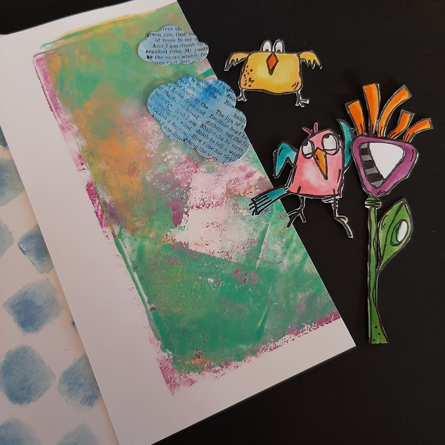
Nikki Acton experimented with vellum and a royal colour palette, gold and purple! How she has used only parts of the stamps is so interesting, revealing new details and creating new combinations. I also love the text peaking through the face: is it a hint of their thoughts? Her original blog post is a fascinating look at how inspiration flows, how sometimes only one little idea drives a project, which then seems to advance almost by itself.

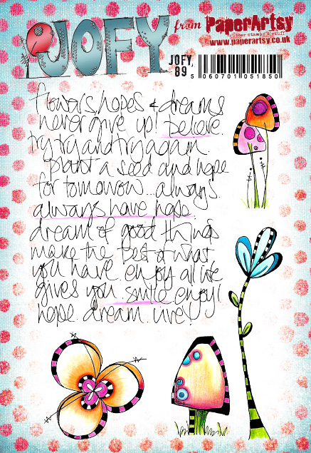
Topic 15 : Journaling Gratitude
The
end of the year is approaching fast... This is our last topic! As
tradition dictates, it is the time to reflect back on another strange
year. Lots of crafters explain how creating helps them express, process
and share their feelings, and provides a bit of balance in their life,
making things more manageable. In
these isolated and anxiety-inducing times, we should not forget the
good things and be grateful for the small rays of sunshine or
unanticipated joyful moments. We
hoped this topic to be an occasion for the community to share tips for
journaling, memories of the year and inspiration for positivity.Autumn
Clark made her journal from junk materials and leftovers from the
year's projects, a great way of doing her year in review and expressing
her hopes for the future. I love her use of the hands and rope, so
clever and innovative! In her original blog post, she shares all her inspiration and tricks for this journal, as well as two other finished spreads. Her gel printed backgrounds are full of interest, making the pages easier to fill, battling blank-page anxiety.

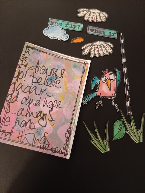
She
might not be a regular journaler but Helen Chilton still wanted to
celebrate positivity and did so in a heartwarming riot of colours and
texture. The mix of Infusions and paints create so much variation and surprise combinations. I
love how the colours swirl and mix within the images, revealing details
and creating depth. Helen's techniques and process, detailed in her original blog post, are very intuitive and playful and could absolutely used in a journal.


Thank you for joining us again today.
In 2022 we are adding a handful of newbies to the team, something we have not done for a few years, so we are very excited to be sharing with you who they are over the next week or so on our instagram @paperartsy . Wishing you a restful holiday season, and here's to 2022 being a key turning point for us all. Warm wishes to you all
Leandra and the team at PaperArtsy


.png)

