Showing posts with label kate yetter. Show all posts

Tuesday, 18 October 2022

2022 Topic 14 : Colour Study: Triads {by Kate Yetter} with Seth Apter stamps


Hi everyone, it's Kate (Kate Yetter – Musings, Tea and Drippy Paint) with you today, and I'm here to share with you a card using a selection of stamps designed by Seth Apter.


I am really drawn to Seth's Grungy look, but of course I love my color. I thought a card using inspiration from my own color wheel would be the perfect pairing along with these grungy stamps.


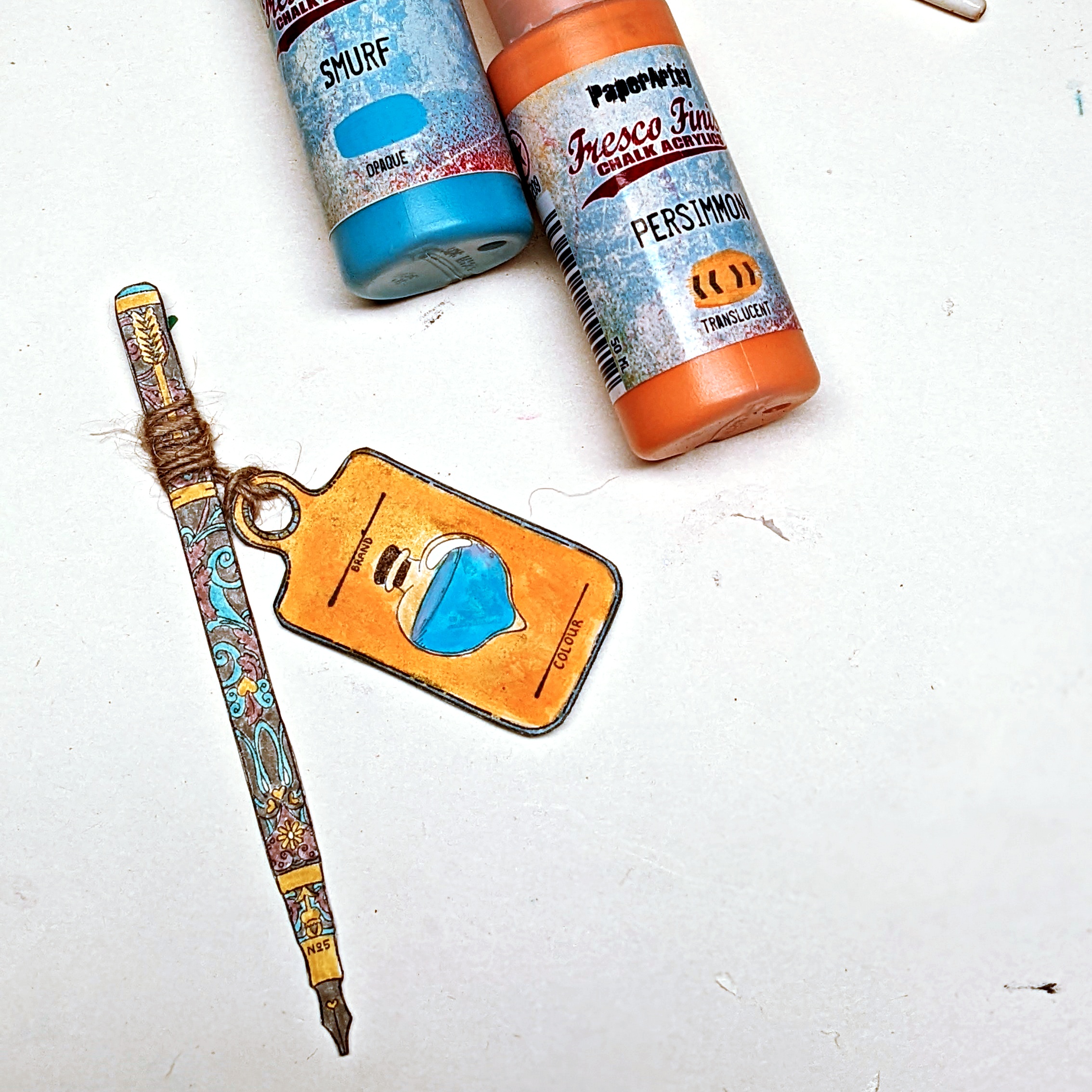
I started by printing out my color wheel and gathering the 3 primary colors that I wanted to work with. I chose Fresco Finish acrylic paints in Bubble GumChina and Key Lime. While they generally follow the Magenta, Blue & Yellow color expected of primaries, they are just just a little different, making for an interesting color wheel.


I used a glass plate to mix my paints.
 

I should have used better paper, but basic copy paper is what I had on hand so that did the trick. Aren't those colors pretty?
 

When trying to decide what colors to work with, I decided on a triad of tertiary colors, 1 space apart: positions 2, 4 & 6 on the wheel, this gave me an apricot, rusty pink, and a deep purple.


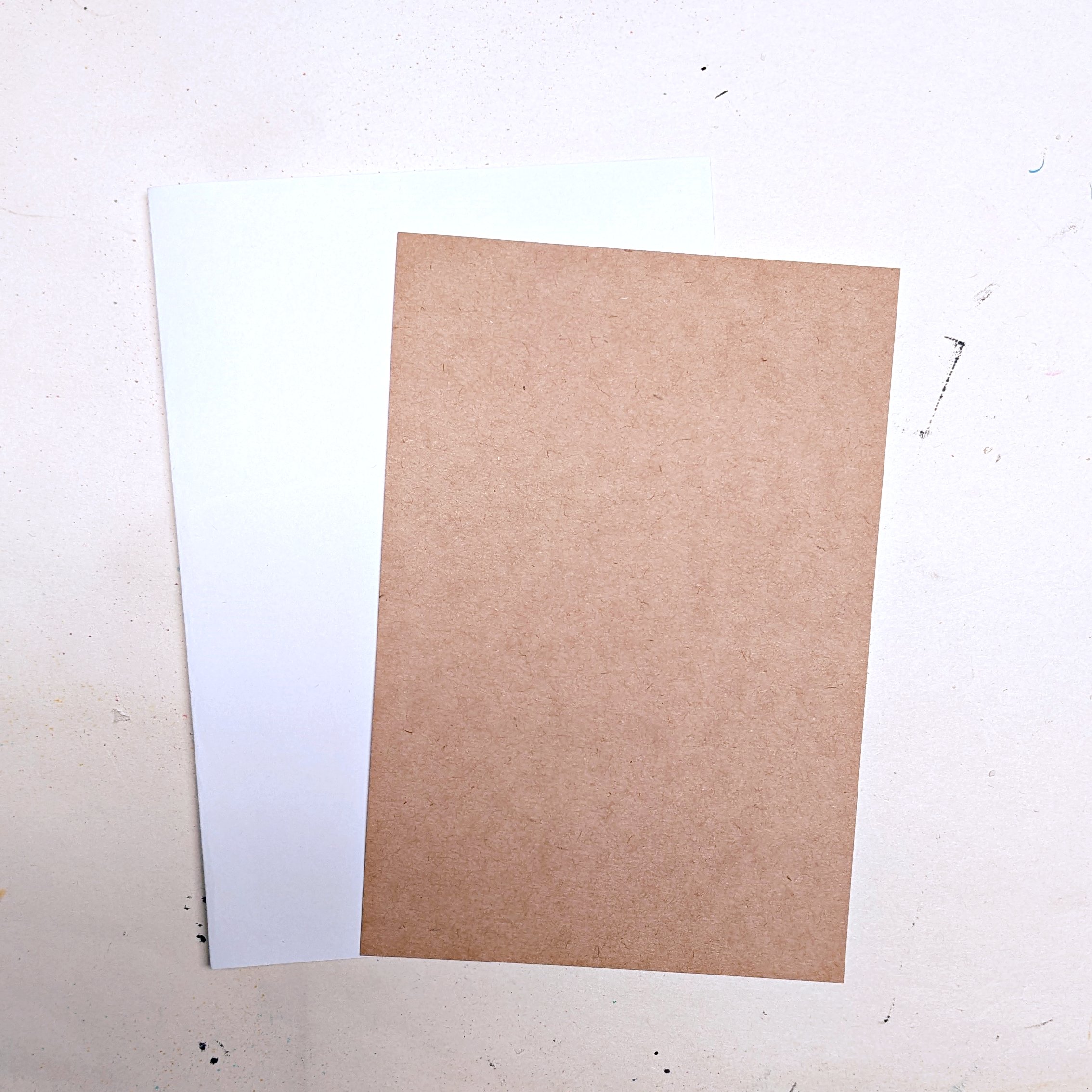
I chose white cardstock as the card base and kraft paper as the frame.


I started by layering my ephemera, book paper and an old tea bag.
 
 
Grunge Paste is one of my favorite ways to add instant texture. Using a PaperArtsy stencil, PS234 by Tracy Scott, I added the paste, dried it, and then added a watered-down version of one of my tertiary colors (#2), from my color wheel.


To finish off the background, I stamped images from Seth Apter's new stamp set, ESA32.


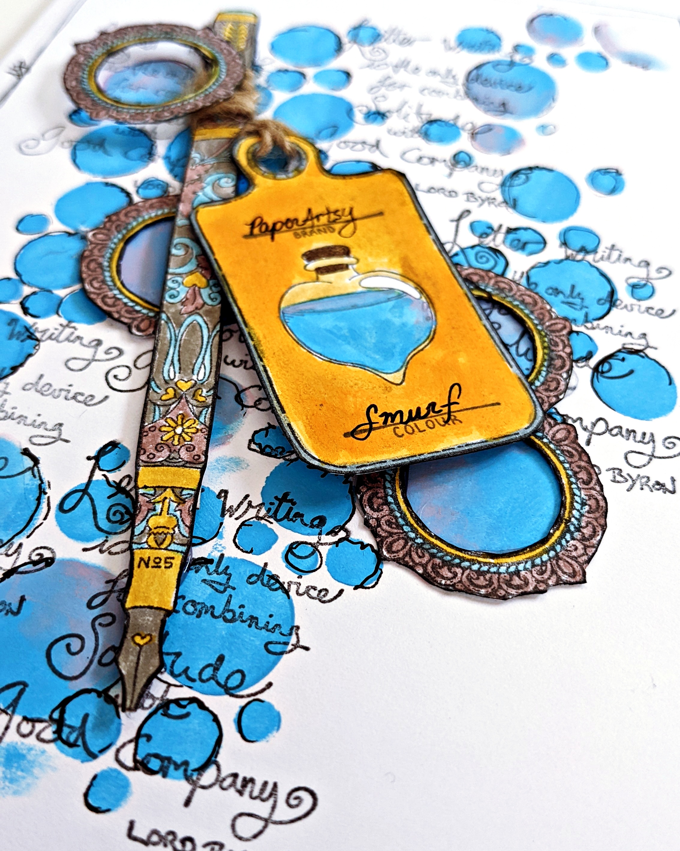
After completing my color wheel, I saved the excess paint of the chosen tertiary colors. Using a credit card, I scraped it onto cardstock, which I used as a background for stamping. For my focal, I chose the letter circle from Seth Apter's set ESA31, perfect to cut apart and/or layer.


I layered the stamps and added a bit of fiber and washi tape for more texture.


I had a lot more fun than I thought with my homemade color wheel. As I said above, next time I would use cardstock to prevent wrinkling but really you can use any white paper you have on hand. I admit, most times I am too lazy to mix colors but I loved this challenge and I know I will try it again. I hope you will give it a try. As you can see, my primary colors are not so primary, so just get creative!

Kate

Thursday, 11 August 2022

2022 Topic 11: Stamp Mash-up {by Kate Yetter} with Tracy Scott, Nicci Battilana and Scrapcosy stamps


Hi everyone, it's Kate (Kate Yetter – Musings, Tea and Drippy Paint) with you today, and I'm here to share with you a stationery set.


Letter writing is one of my hobbies and I love writing on pretty paper. Lately, I have found it difficult to find stationery in the stores as letter writing is a lost art. I thought, "Why not create my own set with matching envelopes?" 


I knew this was going to become a set of stationery, so I decided to keep the colors pretty and pastel. Some of the stamped images were very detailed so I chose coordinating colored markers for the small areas on the paintbrush and pen handles.


As this was mail art, I challenged myself to keep everything relatively flat. With the rate of postage nowadays, I don't want to pay through the roof for a thick envelope. My goal was to keep it simple yet pretty.


When choosing how to use the stencil, I thought it would be cute to have the squid blowing bubbles up the page. I ended up loving this stencil and using it throughout the set.


Who doesn't like to get a bookmark in the mail? A matching bookmark seemed like the perfect way to use this paintbrush stamp.


On the envelope below, I decided to use the bubble stencil again to create continuity throughout the set. To add depth to the bubbles, I used some pink.


 On the envelope closure, I added the stamped seal, colored with markers. 


 Stenciling around the paintbrush added color and texture.


For the greeting card, I again used the two-toned bubbles and stamped script on top.


Stamping with paint is also an effective way to use paints and stamps together. Just remember to clean your stamp off right away.


To finish off the letterhead, I used an ink pen around the edges to add squiggles. I love adding this hand drawn border to tie a piece together. {NB Irish Cream is a discontinued colour}


To complete the bookmark, I stamped on top of the stenciled area to create more interest.

An area for the name and address was added to the envelope below.


Embellishments were made for the greeting card using stamped images, paints and markers. I also stamped, colored and cut out several circular motifs and layered them on top of the bubbles.


Below is the completed greeting card and matching envelope. This card was the only one where I layered embellishments.


I had so much fun putting this stationery set together. I never intended to make this many things but once I got started, I couldn't stop. While creating, I made an envelope that I had to throw out as it didn't match the set at all. That is what happens when I venture outside the chosen color palette. I like how everything turned out and I am in LOVE with those bubbles! I hope you saw how easy making your own stationery can be. All you need is paper, stamps and some color. You should give it a try!

Until next time,
Kate