Showing posts with label ATC's. Show all posts

Monday, 29 September 2025

ATCs with NEW Sara Naumann Minis {by Victoria Wilding}

Hi everyone, it’s Victoria here with you today. It’s so good to be back on the blog and sharing some inspiration for some fantastic new products.

This year on the blog, we are doing a deep dive into a PaperArtsy product range of our choosing, and for this post I have been exploring Sara Naumann's new stamps. 

I feel privileged to have had early access to these beauties, and boy have I had fun playing with them. Today’s blog post is from my first sit down with the products and I decided to go for the obvious in this first play session, and create a set of ATCs. The mini stamps by PaperArtsy, are the perfect match for ATCs, so I’ll show you that even when you choose to stay small, there are still a myriad of creative choices you can make to switch up the designs and give your makes a twist of your own. 


I do love making in multiples. There’s just something so satisfying about seeing makes that are the same but different!


Sara’s new collection of 8 mini stamps, has a bit of everything. Big, bold, text and quotes on EM129, EM130, EM135 and EM136, and delicate nature themed images with all the little background details that make them perfect for mixed media on EM131, EM132, EM133 and EM134.


I also selected four PaperArtsy Fresco Finish Acrylic Paints to bring the colour to my project, deciding on a selection of greens and a light neutral as my colourway. Vanilla (FF65) has high coverage due to its opacity and is perfect for stamping on. I like to choose a more neutral colour to break up colour on the page and give the eye a place to rest, and this yellow leaning cream was a great choice. For the greens I went with Pistachio (FF181), Guacamole (FF05) and Beanstalk (FF182).


The first stage was all about creating the colour background for the ATCs. I decided on slightly different techniques, splitting the eight cards in half. For the first half I applied my paint colours using a brayer. Gently applying the colour from each side and making sure to leave some white space, whilst going back with more colour to layer and build the colour.


I like to use a gel plate to apply the colour to my brayer, which always means that you get a lovely build up of colour on the plate. So it was an obvious choice to use this and do some gel printing for the other half of the cards.


And here are the backgrounds all complete. There’s something really exciting about seeing this first stage of colour going down and knowing the project is unfolding before your eyes. Honestly, the grunge that you can create with an brayer and a gel plate just never gets old. 


Moving onto the magic of Sara’s new designs, I started off my stamping party with the text stamps in the collection. I stamped them all in Grey Archival Ink and picked out random spots on the lettering with an embossing pen, which I then embossed using Sara’s Pure Platinum embossing powder for Wow!. Positioning of the stamping was key, as I was thinking ahead and thinking of the cards as a collection, so the placement of the text on each card is different, in order to add variety. 


I’m all about framing texture into my makes, so next up I distressed the edges of each card.


At this point I decided that the cards needed some extra detail, so I carefully applied Beanstalk (FF182) Fresco Finish Acrylic to the outer leaves on EM134 and stamped to the outer edges on a couple of the cards.


A quick application of Distress Oxide ink in Iced Spruce, defined the distressed edges of the text cards.


Next I moved onto creating ATCs with the nature based images. I started by stamping out EM134 in a dark grey Archival Ink. This ink layers nicely over the Fresco Finish Paints, and is waterproof so you can go back in with more colour should you want to at a later stage. I stamped the full image in the bottom left corner before adding leaf elements from the same stamp to the side and top. Working to the power of three, creates balance in the composition and encourages  the viewer to move around the piece. 


Similarly with EM131, I extended the design. Stamping with the main image first, I then used some of the background line elements, to extend the background across the whole card.


For my EM133 ATC, creating butterflies that lift off from the page was the goal. To achieve this I first stamped the whole image on the card, before re-stamping the butterfly section onto watercolour card. I then coloured with watercolours and fussy cut, before gluing the middle sections into place on the card and leaving the wings to be manipulated to create extra dimension.


Finally, I decided to give some of the cards an extra pop of colour, so went in and added coloured pencil over the top of the stamping. With the cards finished, it was a simple job to layer them on some plain white card and add a clip for a final visual detail.


Here are the finished cards! Starting off with the text cards, I love how the simplicity of the background colour and detailing to the outer edged leads you into the quotes and text.


The distressed edges do a great job of complimenting the distressed paint layers, making the whole design work wonderfully together. 


And saving the showstoppers until the end, here are the image based stamps! Florals and butterflies are two of my favourite things, so these designs were always going to be a hit. I love how they look together, as a collection.


This butterfly card just looks gloriously vintage!


Each card has a slight variation in colour, but using the same colour palette across all the pieces gives a uniformity to the collection. 


Whilst the coloured pencil really lifts the stamped images off the background.


And those embossed highlights on the text is so yummy!


I hope you enjoyed today’s project, and that you’re inspired to get out your supplies and get creative. Keep an eye on my socials for more inspiration with these wonderful new designs, I’ve more ideas coming. 

Until next time, wishing you a happy, creative week!

Victoria 

Wednesday, 13 August 2025

August 2025 - With 3 Things - Artist Trading Cards {by Riikka Kovasin}


Moikka again, it's Riikka from Paperiliitin with you today for another 'With 3 Things' challenge post. For this feature on the PaperArtsy Blog 3 identical items are sent to 3 members of the PaperArtsy Blogging team. Typically we will receive a stamp, a stencil and a couple of Fresco Paints.

We have no clue what PaperArtsy HQ is going to send as the whole idea of this challenge is to do something crafty in our personal style with these 3 items. We can incorporate other PA products into the mix if we feel it is necessary.

This time PaperArtsy headquarters send me a parcel with Kate Crane supplies! My 3 things included a flower stencil (PS441), a butterfly stamp set (KC014) and two Fresco Finish bottles, one color, Beach Hut (FF43) and one glaze, Metallic Glaze (FF24).


I added a set of watercolors to the mix and made some vibrant summer ATCs! Let's take a closer look, how the cards came into being. Oh, and please let me know if you would like to have one! The instructions are at the bottom of the post.


When I was pondering what to do, I thought about a CAS card, an art journal spread or tags, but I kept returning to my first idea of ATCs. The minute I set my eyes on the stamp set (KC014), I saw those butterflies decorating ATCs! So, I followed my own advice of going with your gut and went with the first idea.

I began the cards by making layering material using the stencil (PS441). I patterned a sheet using the Metallic Glaze (FF24) and also created four flowers using the same stencil and Beach Hut (FF43). 

The glaze sheet in this stage looked almost like white on white, but I knew the glaze would resist watercolor I was planning to spread on top and thus get a great patterned paper! I used a sponge to add the paint mediums.


Before reaching to my watercolors, I made more layering elements - this time the focal points. I used a black ink and stamped four butterflies and four sentiment strips to my cardstock. These elements are from the stamp set (KC014).


Then it was coloring time! I used the watercolor set to add some color to my resist patterned bloom paper. I chose a contrasting color to the turquoise shade of Beach Hut (FF43) to make the colors very vibrant. I also used the watercolors to add some touches inside the stenciled turquoise blooms and colored the butterflies with colors of the rainbow.


More paint touches were needed! I used the Metallic Glaze (FF23) to add some shimmer to the butterflies. I was careful not to paint over the lines so the watercolors would bleed onto each other. Instead I picked areas on each creature to accentuate. 

I also cut a bit smaller than ATC sized bits (2 1/4" x 3 1/4") out of cardstock and painted those turquoise using Beach Hut (FF43). On top I swiped some Metallic Glaze (FF23) here and there using the left over on my palette from painting the butterflies. 


Assembly time! I cut ATC sized pieces (2½" x 3½") from black cardstock and mounted the smaller, painted pieces on top. To add more contrast, than just the framing black, I then grabbed my trusty paint marker and traced the edges of the cards with a faux stitch line. I also added hand drawn details to the flowers, because without it, they felt overpowered by the butterflies.


Next I added a piece of the resist paper on top. I used a ruler to tear the edges to give the pieces a bit more personality. I also cut a couple into little banners. I attached the layers using double sided tape. 

I really loved how the teal and the orange tones worked together at this stage! The combo transferred me to somewhere tropical. 


Now that I had the bigger layers put, I turned my attention to the focal points. I paired each card with a bloom and a butterfly. I used craft glue to adhere those in place.


Just one more layering element to add! Having added the butterfly and bloom, I then added the sentiment piece to each card. I took this photo before deciding the final pairing, so if you look closely, you can see some sentiments swapped in next step.


As the final step I added some white doodles to the cards to multiply the white areas, so the sentiments wouldn't be the only ones. I added some dots to the flowers and bubbles here and there around the cards.


And there they are - a set of small flutters! The cards have tropical flair to them and shiny details, which you can maybe see better in the detail photos underneath. 


I promised some details, if you would like to get one of these cards to yourself. Please know that it is first come, first served -kind of deal and I will send the cards anywhere in the world using regular mail. 

So, if you wish to receive a card, please send me a message over at the Instagram and let me know your mailing address! My account on Instagram is @paperiliitin.


Thank you for your visit today! Have a great week everyone!

Xoxo, Riikka

Instagram: Paperiliitin


Thursday, 4 November 2021

2021 Topic 13: Tiny (News) Print with ZA {by Tracy Springer}

    2021 Topic 13: Tiny (News) Print


When we start with one idea, it often springboards to another one and Tracey began with the idea of a set of ATCs and ended up with.. well I won't spoil it! Check out her beautiful vintage typewriter and her clever idea for adding tiny text to painted stencilled panels.
Keren.

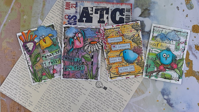
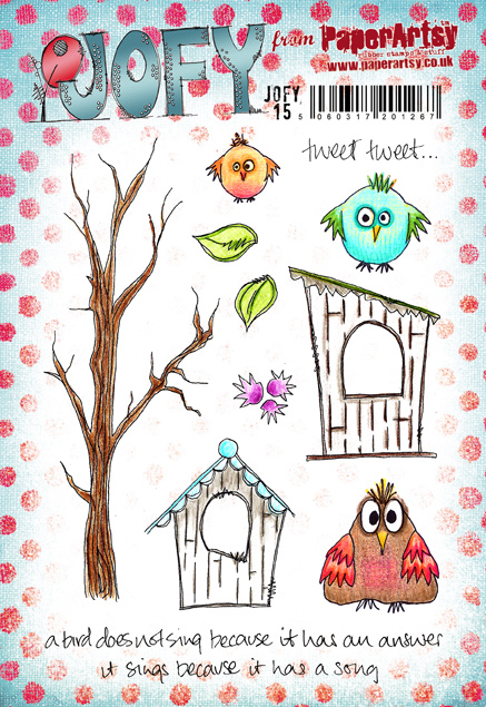
Hi everyone, Tracey Springer here with you today to share my version of Tiny ‘news’ Print. I knew right from the start that I wanted to do ATC’s with this topic so I rummaged (incredibly skilled at this, lol) through my stamps looking for what to use. I decided that there are a lot of little birds in these sets they may get overlooked for the bigger characters, so I challenged myself to use them. I picked out 2 sets of Elena’s stamps (Zinski Art) and 2 sets of Jo’s stamps (JOFY).


I already had quite a few off-cut gel-printed backgrounds that I could use up for these, but also had an idea to play with this little stencil and these really fresh Fresco colors. I have decided that I love to use my paints like I would inks, and they blend so beautifully!


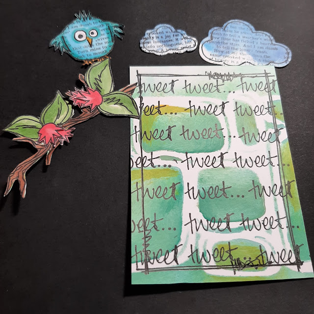
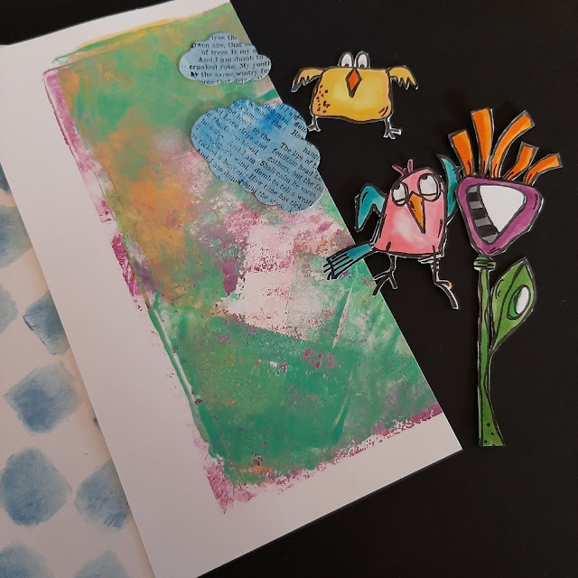
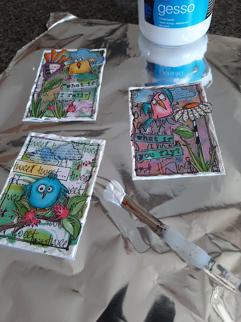
I chose the cute little guy from JOFY15 to use on my first ATC. I coloured him with Copic markers and also a bit of the tree branch, leaves and little flowers. I die cut the clouds from an offcut background that had blues in it, and stamped a newsprint stamp on them. I used the ‘tweet tweet’ because I love really busy, collaged backgrounds. I stamped the newsprint stamp on the bird as well; I quite liked it, but was just too busy for the finished card – and that’s coming from me who loves crazy, over the top lol! I added a few flicks of pink ink and  I always finish with a double pen line around as a border and a thick surround of Gesso.


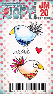
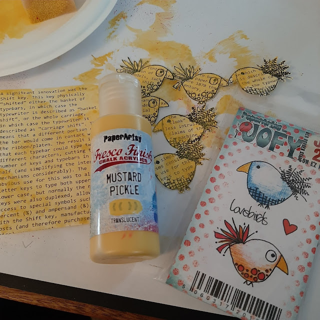
The next one I picked was one of the lovebirds from JOFY JM20, and I had an idea to stamp multiple of the same bird on the same colour background and then have one that stood out. I chose my fav Fresco colour Mustard Pickle (FF148) and sponged that on to a piece of book paper I had, and stamped multiple of the lovebird and cut them out. I coloured one quite boldly with my Copics and raised him up on foam tape (I once again tried stamping him with a newsprint stamp but changed my mind later on and covered him with a plain bird). I used my trusty typewriter (isn’t it gorgeous!) to type the wording, a pen border, some tied baker’s twine and gesso to finish.


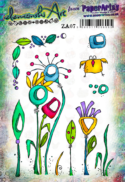
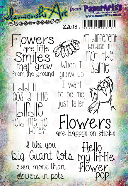
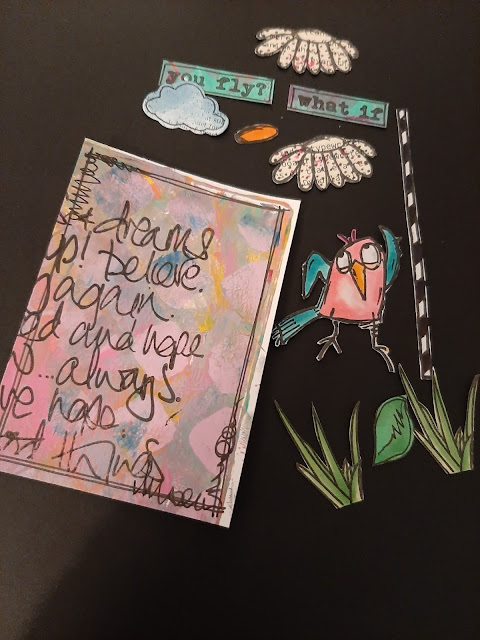
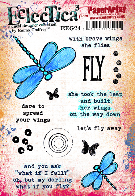
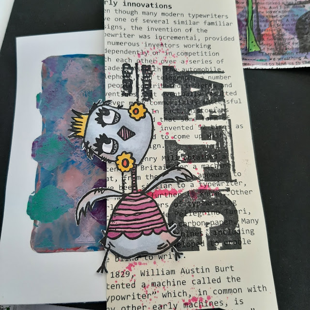
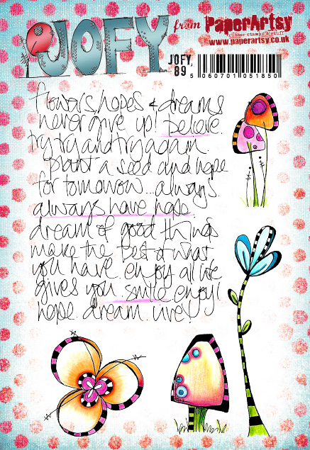
The last 2 ATC’s were using the fabulous little birds from the Elena Zinski set’s ZA07 and ZA08. I had random strips of offcuts for the backgrounds, clouds, CUTE flowers, my go-to background script stamp of JOFY’s (JOFY89) and this very fitting quote stamp from Eclectica Emma Godfrey (EEG24) Everything got a heavy surround of Gesso to frame them.


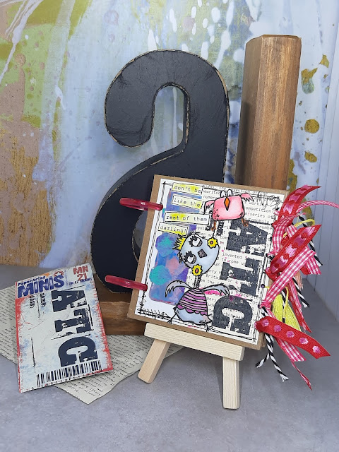
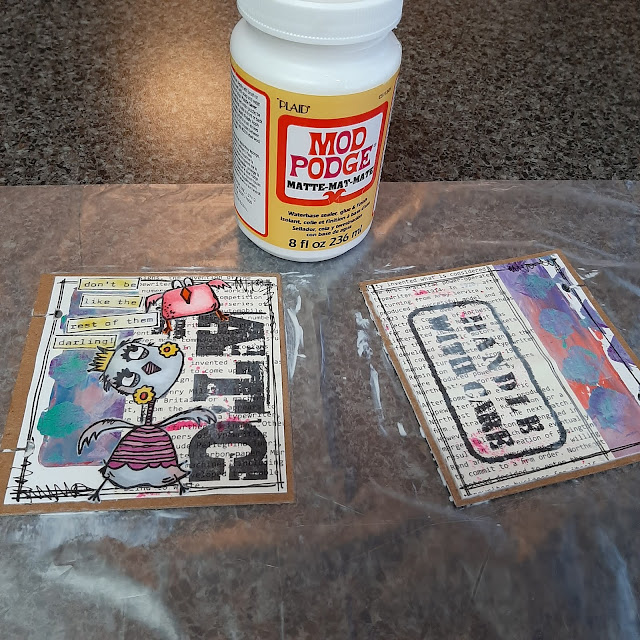
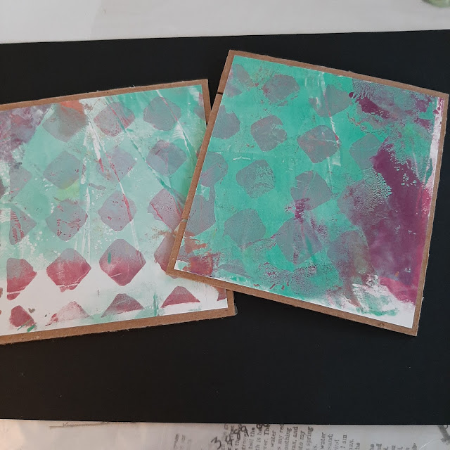
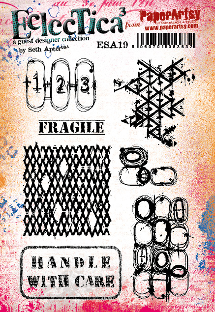
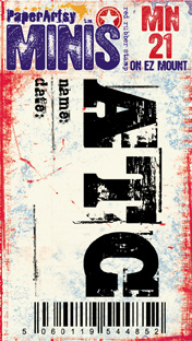
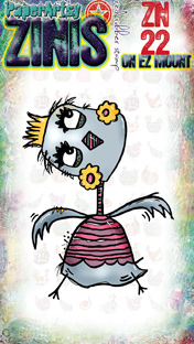
And then….what are cute ATC’s if you don’t have anything to keep them in…I felt a little book coming on LOL!  A couple of pieces of craft board, another random little gelli print background, book page paper, this funky bird from Elena Zinski mini’s (ZN22) , an ATC stamp (MN21), typewriter quote and finally I had to use the ‘Handle with care’ stamp from the set by Eclectica Seth Apter (ESA19). I coated it all with Mod Podge which strengthens and protects the cover from wear and tear, and then added a whole pile of ribbons and tassels. I used the disc system to bind as it enables you to add and remove pages easily (I used cut down clear plastic sleeves to hold the cards).


This has been such a fun project to work on….I'm not sure if I met the topic entirely but the main thing is to have fun…zone out and de-stress! Thanks for coming on this journey with me! 

Tracey xx

Instagram: @tracey_springer