Showing posts with label Dounia Large. Show all posts

Friday, 9 January 2026

2025 Year in review: Lynne Perrella {by Dounia Large}


Comment from Leandra
I'm sure you have all heard me say most every Lynne Perrella release, how much I have long enjoyed her design style. From my very early days of crafting in the late 1990's to the early 2000's when we moved from New Zealand to the UK, I remember going to craft shows and seeking out her wood mounted stamps made on her own Acey Deucy label. 

I was initially drawn to the Japanese characters created in her iconic collage style, and from there I became somewhat obsessed. I soon discovered True Colours Magazine, a colour-based journal swap that Lynne initiated, and Stampington Magazines published. I poured over the pages to seek our details and tips about layering paints, embellishments, and where on earth to source supplies. Pretty soon I started following other contributors to that collab, and would order products direct from the USA - I was so new to the UK and really didn't know where to source at all. Plus internet shopping was only in the early stages, so 'googling' wasn't widely available or practised back then! We relied on shows, shops and magazines, oh and yahoo communities!!

So, here we are, over 25 years later, and we have a magnificent collection of designs by  Lynne and she even started stencils for us late 2025 too. We are almost at her 80th stamp set designed exclusively for PaperArtsy, I still find this a pinch-me moment!

Lynne is a huge lover and user of colour and for sure there is nothing more satisfying than a LPC stamp loaded with colour, all the tiny details come to life. However, not every crafter likes lots of colour, so it can be super-interesting to see the same stamps used with muted colours, or a limited colour palette too. 

Let's take a look back at some creative highlights with Lynne's stamps from 2025, plus Dounia has created a final project at the foot of this post. This is the final of our look back at 2025 review posts

February Release: Regal Symmetry
LPC073, LPC074 & LPC075

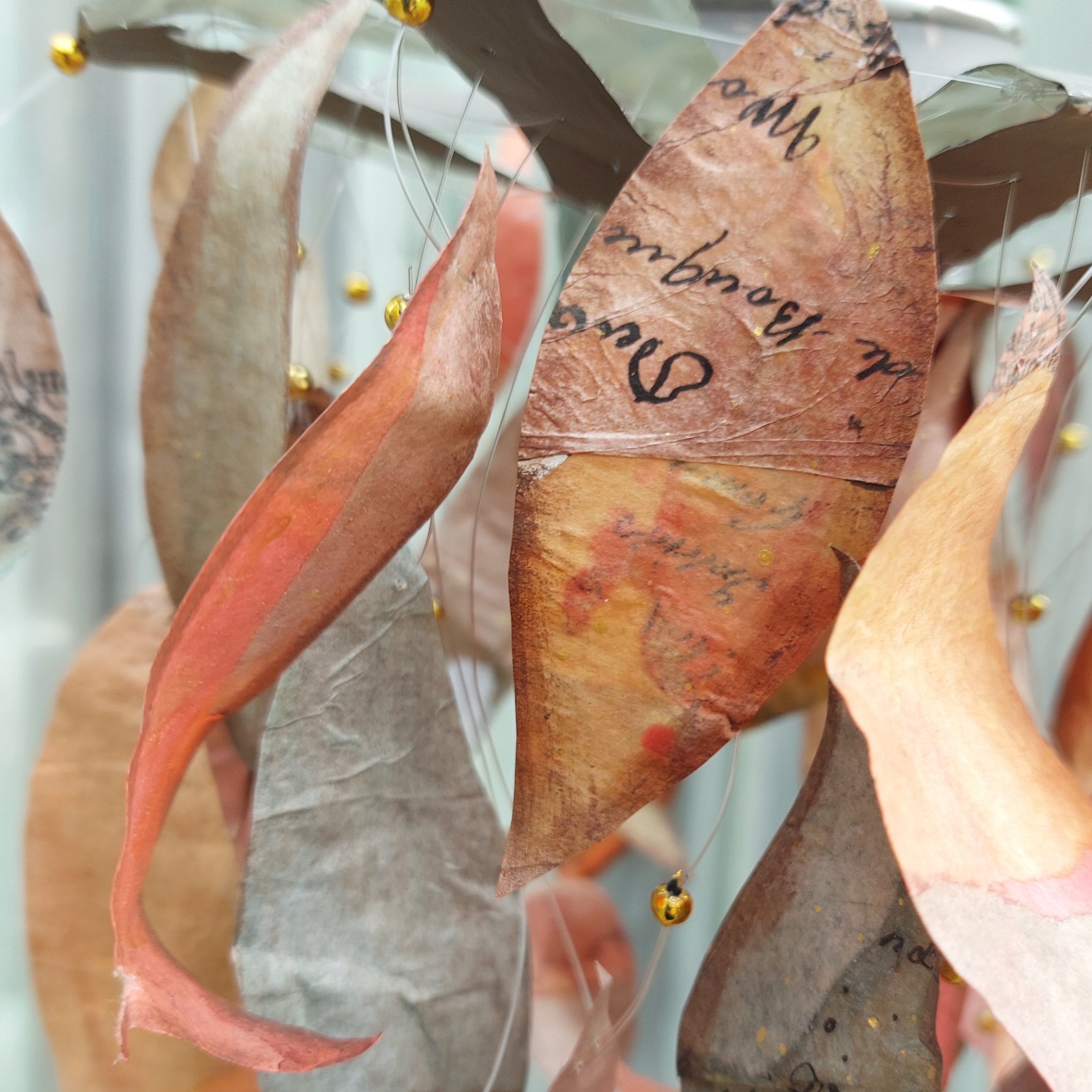
For this release, Lynne imagined mysterious libraries full of leather-bound journals hiding drawings and secrets on thick yellow pages, then filled them with regal characters, inspired practitioners of alchemy and fortune telling or scientific minds involved in architecture and botany.

by Leandra Franich

With stamps as intricate as Lynne Perrella's, you don't need much to create interest! Some inspired gel prints are enough to give life to the designs. I love how the bright colours contrast but still complement the stamp themes.

By Dounia Large

The smaller designs on the sets are great to build compositions but also to create smaller project. Those stamps are still full of incredible details, and this a great example of highlighting them with colour and dimension.

by Dounia Large

This release is full of portraits and I love how they can developed into full characters. Here the elements of the head are also cleverly used to build a coordinated background.

By Leandra Franich

I love the out of the box thinking here, using the hands to create a fashionable dress. Now that's a statement piece of wearable art!

by Liesbeth Fidder-de Vos

Here is a gorgeous look at the whole collection. I love the use of deep colours! And the characters seems to be looking at each other so intently. This could be a three volume historical saga full of love stories and intrigue!

August Release: Fragments of Frida
LPC076, 076 & 077
PS480, 481 & 482 (Regular)

Lynne Perrella second offering was all about Frida Khalo and Mexican iconography. Intricate pattern, quirky animals and fierce faces. And Lynne's first stencil release with PaperArtsy!

by Etsuko Noguchi

This release lends itself particularly well to bright colours! I love the use of the pattern stamp as a frame. 

by Leandra Franich

These two ladies are either in a (Mexican) stand-off or are judging us together. Either way, do not be fooled by the delicate lace and pretty flowers, they mean business!

by Leandra Franich

I love how this sample manages to be colourful and moody at the same time. Just right for Frida Khalo!

by Liesbeth Fidder-de Vos

The contrast of the bright and deep colours with the black and white is so impactful in this sample! I love how Liesbeth mixed the stamps and samples, showing their filiation so well.

by Leandra Franich

This stencil is a favorite and the 'bumping' technique used here makes it even more striking! The watery blends are of course infusions powders.

By Leandra Franich

Same stencil, completely different vibe. The face here is just a suggestion but still staring right at you!

By Mi Mii

I love how the stencils can also be used as a guide to construct more realistic faces. This is such a great example!

End of Year Project: Interrupted Siesta


This end of year project is inspired by Lynne Perrella's first stencil release with PaperArtsy. They really make me think of street art and I wanted to recreate that vibe, mixing it with peppy colour to go with their Mexican inspiration. I couldn't resist also adding some colourful characters living in this decorated building!


My choice went to PaperArtsy Stencil PS481 by Lynne Perrella as I particularly like the wide open areas in the hair. I completed with stamp set LPC077 as the ladies in it are angled and therefore could face each other. I wanted bright poppy colours so I chose a Magenta/Turquoise/Bright Orange combo in both Infusions, with Are you Cerise, A Bit Jaded and Orange County, and Mattints, with The Pink, Dragonfly and High Viz. The two work so well together!


I wanted to create an interesting texture to suggest a wall. I used an A4 piece PaperArtsy's Heavy Smoothy and after roughly deciding where my main elements would go, I dry brushed a series of neutral Fresco Finish Acrylic paints. I started with the darker Sand, using a very coarse brush and only adding a few patched here and there. I then went lighter and lighter with Buff and Stone, trying to occupy most of the space and keeping my strokes (mainly) horizontal and vertical. I finished with Nougat, layering it a bit everywhere to homogenise the background, but making sure some naked paper was still showing between the paint.


Once the paint was dry, I played with Infusions in Are You Cerise, A Bit Jaded and Orange Country. I sprinkled a tin bit of powder one colour at a time, sprayed it with water and let it react and absorb for a few second before bloating the excess liquid. The Heavy Smoothy is great there as it doesn't buckle.


The Infusions absorb well where the paper is naked and a lot less where it is covered in paint so the colour settles in the 'grooves' between the paint strokes, creating a delicate and interesting texture.
.

Next I worked on a 'wood' panel to give shutters to my window. I adapted a technic by Scrapcosy, as shown in this video. She uses glaze in her sample but I went with the Sand Fresco Finish and the previous Infusions to tie it to the rest of the project. I masked stripes with tape, sprinkled the Infusions, and activated them with the paint using only vertical strokes.


I then masked the painted parts and did the same process on the empty parts. This creates colour variations that help imitate wood.


Using paint instead of glaze mutes the Infusions and created a more homogenous result. I wanted more definition between the 'slats' so I repeated the tape process, sponging some black ink this time. I really like the weathered effect.


Time for the main event! I taped my stencil, PS481 by Lynne Perrella, very well, and went through it lightly with black ink. Then I stamped in the biggest openings with the stamps from the LPC077 set. I used tan ink to add flowers and patterns to most of the stencil and black ink to add the focus, the face in the hair.


I like how the stencil and stamp match... She's thinking about herself!


I wanted to give her more body and contrast so I used Mattints in The Pink, Dragonfly and High Viz to add patches of colour. The Mattints' total transparency allowed me to add colour without masking the stencilling, or having to stay in the lines! I went darker on her and also added some lighter patches around her to gradually tie her to the background.


Finally it was time to take care of the other characters in this scene. I chose the other lady in the LPC077 stamp set, as well as the pretty bird and went to colour them with Mattints.

My go-to to create a skin tone is generally a mix of Are You Cerise and Rusty Infusions. If I am working with Mattints instead, I use The Pink and Squeezed with some Nutty to replace the walnut crystals in Infusions. Here I stayed with the colours used in rest of the project and played with the ratio of Orange County Infusion in The Pink Mattint to get the skin tone I wanted. You can see all my swatches as I fine tuned it. Be sure to create enough of your mix to cover all the skin! Obviously no 2 people have the same skin tone, so by adjusting ratios and colours chosen, you should be able to get wide ranging skin tones to suit all ethnicities following these principles.

To add shadows, I like to add a complementary colour to the mix, like green or blue, to create an interesting and harmonious tone. Here I used A bit Jaded. By itself, it looks way too grey and dark, by a light transparent layer over the main skin tone works perfectly!


I stencilled bits of trim in Nougat to anchor the different elements and voilà! My story for this project is that this well dressed Mexican lady lives in this house with a big mural on the wall.


She was taking her nap in the heat of the afternoon but a colourful bird perched on the corniche and started singing! While she finds the bird beautiful, she is quite displeased with being woken and is sternly telling it off. The bird does not seem intimidated. This is a stalemate...


I hope you enjoyed this project and maybe found some inspiration in it.

This concludes the 2025 blog cycle (a bit late, I know!). We had so many beautiful projects and interesting explorations! I hope you enjoyed the ride and will keep being crafty & curious with us in 2026.... Coming your way next week!

Stay creative
Dounia x

Friday, 12 September 2025

September 2025 - With 3 Things - Woven book {by Dounia Large}

Hi friends, 

It's Dounia from PaperArtsy HQ with you for another 'With 3 Things' challenge post. 

For this feature on the PaperArtsy Blog 3 identical items are sent to 3 members of the PaperArtsy Blogging team. Typically we will receive a stamp, a stencil and a couple of Fresco Paints.

We have no clue what PaperArtsy HQ is going to send, the whole idea of this challenge is to do something crafty in our personal style with these 3 items. We can incorporate other PA products into the mix if we feel it is necessary.

So let's take a look at what I 'received' from PA HQ ...


We had a very autumnal kit this time: a lovely stamp set full of textures from Lin Brown (ELB34), a choice of leaves in a fun stencil from the archives, PaperArtsy Stencil PS002  (also from Lin Brown) and two gorgeous warm Fresco Finish acrylic paints from the Seth Apter range: Kiwi Gold and Rusty. I also added a couple Fresco Finish colours from my stash for contrast and variation: Mahogany and Toffee.

With all of that I made a little sketch book with a fun woven cover.

The base for the cover of my book was a series of Regular Smoothy card bands, as well as a full A4 sheet for the inside cover. I worked simultaneously on all of them, without thinking too much, treating each like a mini master board.

I started with the texture stamps from ELB34. I used them quite randomly all over the bands, stamping in coordinated, water resistant inks.

Once dry, I added a layer of paint all over using Kiwi Gold, Rusty, Mahogany and a range of mixes. As all those paints are translucent, you can partially see the layers beneath, creating lovely and subtle textures. For an ever lighter coverage, I diluted some of the mixed with a bit of water.


I cut the finished bands into strips of varying width and it was time for weaving! 

I kept the more textured backgrounds quite large to show them off and the cut the brighter and darker ones one much thinner. I took inspiration from plaid for the weaving sequence but I think a random one would be gorgeous too! I tried to keep everything square with the help of a grid but the end piece is not exactly rectangular...


Now for the stencil, PS002 by Lin Brown. I really love the group of little leaves on it and wanted them to run along the whole cover. I secured the ends of my woven panel with masking tape and turned it over. I positioned the stencil under it and marked the groves with a stylus to create embossing. It is a technique I love but here it was not the easiest to achieve a clear image because of the thickness of the woven substrate and the breaks between the strips.


I then gave the whole cover a wash of Toffee Fresco Finish paint, making sure to push it in all the crevices and them wiping the excess on the raised parts. This disguised the white cut edges of the strips and helped all the colours work together .


I re-did the same technique with pure Toffee paint on the leaves to accentuate the relief. I also lightly sanded the raised parts  to make them stand out even more.


I love the overall effect! Then I 'only' had to glue on the inside cover and sew on the signatures. However, once I had the book completely constructed, I was not convinced the leaves were visible enough, so I dry brushed a little bit of Gold on the raised pattern. It was the final touch I was missing! I reminds me of a sunny autumn day!


The inside cover was done just like the bands with Kiwi Gold and Rusty, just on a bigger size.


I had a lot of fun with this project and love the result. It was a pretty safe bet as the colours are among my favorites! 

I hope this helps you travel toward autumn and maybe inspire you to try your hand at paper weaving.

Stay creative!  

Dounia x

Saturday, 25 January 2025

Suncatcher with Mattints {by Dounia Large}


Hi everyone Dounia here with you today.

This year on the blog, we are being given free reign to do a deep dive into one of the PaperArtsy product ranges, and for this post I have been exploring Mattints! I one of their main properties is their transparency so I decided to explore and exploit that in some semi transparent art, a fall inspired suncatcher mobile.


I really love how it transforms depending on the light! For the base of this project, I'm sharing with you one of my favourite technique with Mattints, making 'tissue skins'. It is is really simple and 'brainless' with gorgeous results. I hope you enjoy it too.


For transparency, the 'skins' are built out of tissue paper. The more transparent the better! I know all the PaperArtsy printed tissues will work, so I grabbed the Blank and Background Tissues (PT07 et PT10) I had on my craft table.

For a project about Mattints, I used... Mattints! also for their transparency. I somewhat limited my palette, to help create a united look. Any theme would work so I chose my favourite, fall colours! I love warm hues so went for yellow/orange/red with some greens and browns to completely cover the foliage range. I also added the 'wild cards' The Pink (MT08) et Dragonfly (MT07) to spice things up and create variety.


I first prepared the building blocks necessary, by colouring blank tissue with my chosen Mattints.


I painted roughly A4 pieces in all my fall colours, and half that in the 'wild cards'. The intensity of the colour depends a lot on the quantity of Mattint applied. Here I did two coats on one side and another coat over only half the other side. That way I had two shades of each colour, for more variety and depth.


Here is my very high-tech drying system. With the current weather, my projects are enjoying the wood stove with me! As the Mattints also work as a glue, you have to be careful not to let the sheets stick to one another!


I like to add opaque parts to all transparent projects, to create contrast & texture and highlight the transparency. For this one, I did some very basic mark making on more blank tissue with a opaque Fresco Finish Acrylic Paint. I chose Cloud 9 (FF149), a warm white, because white shows off colours the best and I thought warm version worked the best with my chosen colours.

As you can see, not much thinking is necessary for these steps, just fun playing with paint! Now it is time to start putting the layers together.
 

The principle to creating the 'skins' is to glue layers of tissue on top of each other with a transparent and wet medium, like Matte Glaze (FF52) or Mattints. For the tissue 'disappear', it is crucial to fully saturate it with glaze when gluing it. I like to apply the glaze on the back of the tissue and on the top of receiving substrate before connecting them, then apply another layer on top of the glued down tissue while it is still wet. Here you can easily see the difference between the already glued pieces and the still dry ones.


As my base, I used half of one the big sheets of painted tissue, this one is the Ladybug (MT12) one. I created a layer on top using pieces of the Backgrounds tissue as well as the tissue with white mark making. To create more variation and depth of colour, I decided to glue the pieces with Mattints instead of a colourless glaze. I chose Ladybug (MT12), Squeezed (PT06) and Nutty (MT02) to coordinate with the background. The limits of the tissue pieces are more noticeable that way but I did not mind for this project.


I repeated the process with Nutty (MT02), Glow (MT01) and Fern (MT03) backgrounds. This is the results after this first layer. The white opaque patterns will be softened by the following step.


On top of the 'pattern' layer, I added another one, this time with pieces of the coloured tissues, using coordinated Mattints to glue them. The picture seem to imply I planed their placement but in reality, I did not think too much and just glued stuff on top of each other. If the pieces overlay in some places, it just creates even more colour variation.


As the Mattints are also sealants, they make the tissue less absorbent. So I have found that you often need to 'work' the glue a bit more into the painted pieces, but they too end up disappearing.


Once all of that was a bit more dry, I repeated those two layers on the other side of the bases. This creates even more variations and also makes a stronger 'skin'. I really love how they turned out, with the bits of pattern poking out and all the different colours. However, I think their true beauty shine when seen in transparency.


There you can really see all the layers and the new colours they build. I like the darker touches created by the opaque white paint. I could just make those 'skins' for themselves and display them on my windows, but here I also wanted to show you a use for them.


All those colours had to become leaves! I roughly traced the shapes with Fresco Finish Chocolate Pudding (FF42) and cut in the middle of the lines. This both helped guide the cutting and created a border around the leaves. I think it gives them dimension and reminds me of fallen leaves starting to brown at the edges.


Here is my pile of leaves and my (also very high-tech) structure for the mobile: a cut open soda can. It then only needed a couple hours of threading the leaves onto fishing wire and adding them to the can...

I absolutely love the result. It is a bit messy and misshapen, like real leaves, and I am mesmerized by how different it looks in different lights.


The aim was to have light shine through the leaves, creating shadows and patterns, and here in the rising sun, it does not disappoint!


But I think it is also beautiful in the sun light, without transparency. The depth of colour really shows here and, I think, capture the feeling of an early autumn day.


With no direct sunlight, the colours are softer and more reminiscent of fallen leaves. I love how the golden beads pop then, adding even more whimsy.


Inside, lighted by a lamp, this thing moves with the slightest air currant and cast crazy wispy shadows. So moody!
I leave you with a couple of detail shots of the leaves.


I love the snippets of pattern and texture that randomly show.


I prefer warm colours, but let's not forget the beautiful greens that bring depth and contrast.

I hope you enjoyed this journey in Mattintland and that it inspires you to try making tissue 'skins'. The process itself is easy and fun and the possibilities to use them are endless!

Keep creative
Dounia x