Showing posts with label Pixie Dust. Show all posts

Thursday, 29 February 2024

2024 Topic 1: Miniature {by Etsuko Noguchi} on the PaperArtsy Blog


Hi everyone Etsuko (My favorite things) here with you today. The cold season is passing by and I can feel the breath of spring in my garden. And my mind can't stop thinking about the tropical landscapes that are just around the corner.

Our first topic of the year is 'Miniature' and I was tempted to create a small tropical world using my favourite artist Gwen's stamps. I had a bit of time to create the project, so I decided to create three pieces incorporating resin and glass in this season's theme 'Glazed'. Today I'd like to share with you what I did well in the process of making these, and what I unfortunately did notdo so well. Please enjoy with me to the end. Thank you.


Making jewellery is always a pleasure, especially Boho jewellery which excites me!! Usually I decorate with ethnic fabric scraps, beads or embellishments, but today I tried it with what we had on hand.


The anemone fish stamp made by Gwen is a must in tropical aquariums, and tribe stamps were used because I thought they would make interesting pendants with decorative faces. I used these pastel colours for this project and added coloured pencils in some areas.

Stamps are Gwen stamp set 09 and 37 (EGL09, EGL37).
Colours are Fresco Finish Chalk Acrylics ( Dolly Mix, Wisteria, Blue Oyster, Cerulean, Fuzzy Cactus, Vanilla and Mahogany )


The first step was to make an aquarium pendant using a small Cloche Dome. The star of the show inside is the Anemone fish. I made jellyfish, starfish and seaweed, and the rhinestones were added to make it look like jewellery.


The image of the fish is stamped onto a paper with any black ink, scanned into the printer and fed into the computer to set the opacity of the image to 50%, which is then printed onto inkjet shrink plastic. The reason for the 50% opacity is that 100% produce a darker colour baked in the oven. The fish image on the left has been coloured with paint, the on the right is just an outline. After the plastic is cooked, it shrinks to 1/4 of its actual size. 


In my experience, toaster ovens seem to be less likely to fail than shrinking plastic with a heat tool.


Just the outline of the image can be stamped or printed on plastic and then coloured in later with oil-based coloured pencils for a beautiful finish.


Finally everything was glued down with PVA glue and glass glitter was sprinkled around the bottom on top of the glue, the dome was installed and the chain was attached to finish.
The first miniature with glitter and glass dome glazing. So did you get a bit of the tropical vibe?
This glass dome freebie site by Stephanie Rubiano's Studio Rubiano.


The second piece is the Boho pendant and necklace. I love this tribal stamps and have used them in various forms, but this was the first time I had used it in jewellery and I was very excited. The theme 'Glazed' is explored with the shiny resin finish.


In addition to the above, most of the materials are things that everyone has, such as resin solution, clay, clear document folders, clear tape, glass glitter gold wax and PVA glue.


Cut the coloured images into the oval shape.

.
Gwen stencilled excess papers attached to the reveres.


As all tribal image are on paper, apply Paper Sealer on both sides to prevent the resin solution bleeding onto the paper.


There are no ready-made bezels to fit this irregular oval shape, so I usually use flat copper tape and solder the bezel, but this time I thought of a different and convenient method and remembered that resin does not stick to clear folders, so I decided to use this.


I cut the clear folder into 5mm wide strips and stick them onto the wide clear tape in the shape of the bezel and protect the outside of the bezel with PVA glue to prevent a resin liquid leakage. 


Fill the bezel 1/2 full with resin, allow the resin to dry, place the tribal image on top of the resin and pour the resin until the paper is covered, holding it up with a stick to remove any bubbles. Small bubbles disappear easily with heat tool. After the bubbles have been removed, pour the resin until the bezel is full again. -Always wear surgical or polyethylene gloves when using the resin.-


Leave it to dry for two days (in winter) when the resin completely dry, remove the tape underneath and remove the surrounding bezel to complete the process.


I chose to use glass glitter and beads to decorate the the pendant's edges,  and using a strong glue to prevent peeling.


I was thinking of sari ribbons for the necklace, but thought it would be nice to add handmade beads, and the idea of printing tribe stamps on clay come to mind. Now let the enjoyable work begin!!  The images below were stamped on the clay stretched into an oval shape, how clear the image appeared.


Then next step is to use round wood dowel or the back of a thin brush, shape the beads into long and narrow.


Once the clay is dry ( the clay I used was baked ) it's time for some fun colouring, I used Fresco Finish Chalk Acrylics ( Little Black Dress, Caribbean Sea and Chocolate Pudding ) for a vintage look, but you can choose any colour you like.


When the paints are dry, lightly rub the top with gold wax for a more vintage look.


This is the Boho pendant and necklace finished look, I still wanted to use the sari ribbons so I added the back of the neck to adjust the length and make it more comfortable. And it has a Boho taste.


I hope you all have a bit more fun with me. This is the last piece Boho earrings. 


This time the background and tribe faces was painted over acetate. This way it would not be too thick when seen from side. This is because the earring edges remain intact.


When the background paint is dry, stamp with Ranger Archival Ink Jet Black.


The original plan for the earring technique was to drip 2-3 colours of alcohol ink onto the resin and stir it a little to create a marbled pattern, and then insert the acetate with the tribal face printed on it into the resin which is nice, but when I actually tried it, the colours developed too dark and did not work as shown in this picture.


The above plan was temporarily put on hold and the resin was made in clear, the picture shows the bezel of the clear folder removed after drying.


This image is from the side view of the earrings, so sorry although it may be difficult to see.


And the back of the earrings.


Creating objects to decorate the room or jewellery making always gives me happy moments. I created this project to share this moment with you and I am very happy if you like it. 
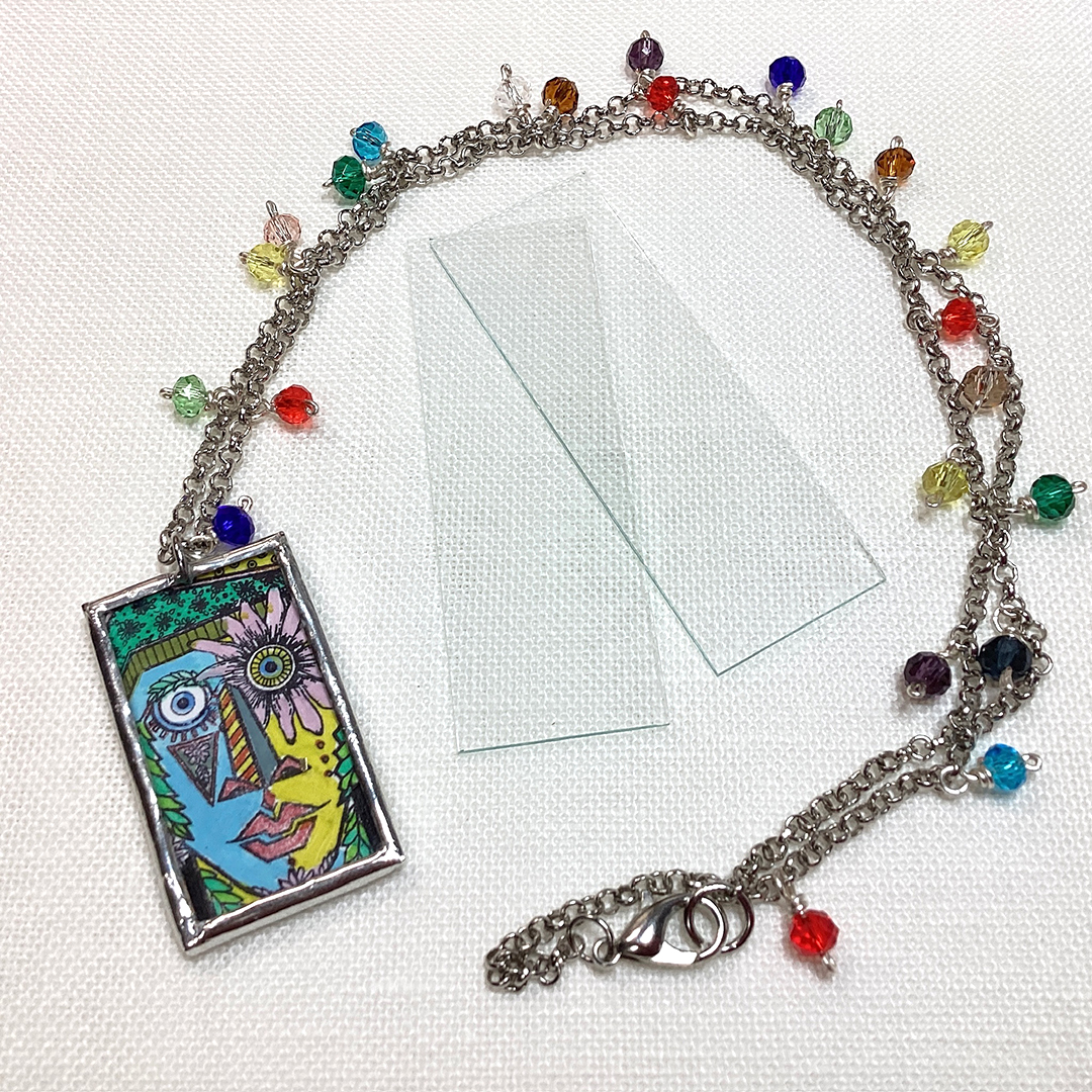
Finally, I add another pendant picture. (I'm soldering with micro slide glass.)


Facebook: Etsuko Noguchi
Instagram: Pixienest
Pinterest: Etsuko N

Monday, 27 February 2023

2023 Topic 03: Focus on Seth Apter {by Asia Marquet} with Seth Apter Products


Hi everyone,

It's Asia Marquet (Lemon Creation) here with you today.

Some of you probably know already that I love Seth Apter's designs as I love everything grunge and messy. This was the first thing I though about when I saw the Track theme and Seth's stamps. But today I put a little spin on Seth's designs and decided to use  them  in sparkly and feminine and not so much grungy way. 

This idea brings a smile to my face, as this isn't really a type of project you would think to do with grungy stamps. But then again - why not? I love good challenge, so here it is; a feminine layout with messy stamps. Let me know if you think I managed to pull it off.


Before I start, let me be honest with you - it has been more than a year, maybe even two, since I created my last scrapbook layout.  Why? Well, mostly because of its size- you make it, you need to store it somewhere and you need quite a lot of products to fill it up as well. So todays project will be a tiny bit different. If you, like me, are overwhelmed with 30x30 scrapbook layout size, then make it smaller! This is what I did here. Making my layout a tiny bit smaller than standard size helped me to better manage the background and to take better photos.

This is such an easy "trick" so not to get overwhelmed with filling up a big piece of paper and needing 1000 different embellishments to fill it up.  If you are not a scrapbook lover, or if big projects scare you, try to create today with me and you may actually be really surprised.

Why create a scrapbook layout then? Because to me they can be a particularly feminine art form within mixed media and I thought the 'Tracks' theme would be more visible on a bigger background. It was easy and fun to create it and hopefully it will give you an idea of using Seth's stamps in a completely new way.

What's more important, while creating this project I came up across very funny way of creating your own "3D" type embellishments from stamps, so let's have a look at the process.


As I already mentioned earlier, I really love working with Seth's stamps, but I am learning to create more with acrylic paints. While planning this project, I knew I was going to use acrylics as they are all creamy, nice and perfect for a clean, romantic design. I did not have a general idea in my head, I just wanted to make a feminine layout, so I knew I was going to go for purples and light pink from the Seth's Apter Fresco paint collection (and to be honest I do not know how to work with real, bright pink- a color that overwhelms me).
 
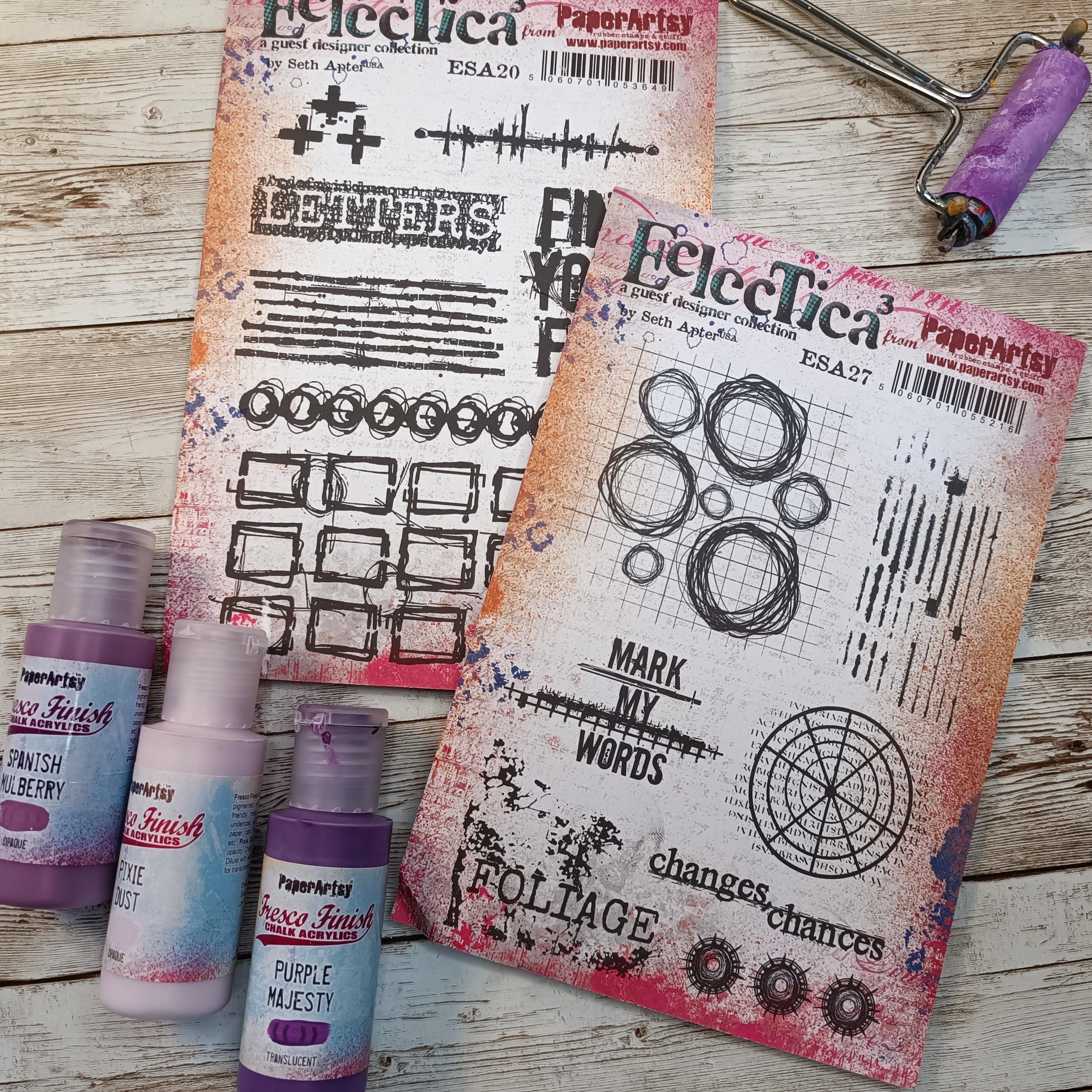
But the general idea stays the same with the colors I have chosen, as they are very feminine and as close to bright pink as I could manage. My choices of Fresco Finish Chalk Acrylics for this project are: Purple Majesty (FF221), Pixie Dust (FF113) and Spanish Mulberry (FF71).
I have chosen two Seth Apter's stamp sets 20 (ESA20) and  set 27 (ESA27). The first one will help me to create a background, from the second one I decided to use some parts to create embellishments.


The very first thing I made was a background on which I wanted to do some stamping to use as embellishments later on.  I started here as honestly I was not sure what to do on the layout itself. I needed to have some time to think and see the embellishments first and then go from that. This is a good tip if you are stuck- instead of doing things in the "right order", start somewhere in the middle and see where this 'middle' will take you.


This background was created on a scrap piece of mixed media paper by adding (with a brayer) two Fresco Finish Chalk Acrylics- Spanish Mulberry and Pixie Dust.  After drying the page (dids you realise Fresco paint dries so quickly!?), I added some splatter with Fresco Finish Chalk Acrylics (Spanish MulberryFF71) for more definition and interest, then let it partially dry and then cleaned the insides of the splatter with a damp cloth. This is a really cool technique which allows you to get some sort of "empty" splatter (see photo below).


Happy with the background, I added to it some stamping with different elements from Seth Apter's stamp set 27 (ESA27). I used VersaFine (Onyx Black) permanent ink (which dries rather slowly, so be careful not to make a mess with your fingers!), if you're impatient, you can use a heat tool or emboss with a matt clear ink.


After the ink was dry, I fussy cut all the elements. The biggest 3 circles were fussy cut differently- one exactly as I stamped it, but the two remaining ones were cut with some parts missing (see photo below). This is another "trick" I like to use- altering the shapes of my stamps to add more interest to the page and really get more out of your stamp sets.


I think the best part was to fussy cut the stamps and adjust them a little to my liking, but in the next step I will show you how to get them to really stand out from the project.

At this point I finally had a clear idea in my head; let's add some circles to the background of the layout as well. I took the scrapbook page and a piece of printing paper from which I cut different size of circles. I used this piece of paper as a mask on my page and applied paint through these 3 circles: Fresco Finish Chalk Acrylics: Purple Majesty (FF221) and tiny bit of Pixie Dust (FF113) (application  with a brayer).


I wanted the colors on the backgrounds to be a little bit different than on the embellishments, even though they are quite similar. The application with the mask and brayer left me with some small imperfections, but this will be fixed later on by adding embellishments. To match the background circles to Seth's stamps I doodled around them a little bit with UniPin black fine liner.

Next step was stamping- a fairly easy task. I used Seth Apter's stamp set 20  (ESA20) and the same VersaFine ink (Onyx Black), trying to make a criss-crossing track pattern on the page. I have chosen from the set two stamps which worked in my opinion the best with the "circular" feel of the page. While stamping, don't forget about the masking technique- if you don't want stamping in some places on your project and you need to use an acrylic block, add a piece of thin paper in the place where you want your stamp to not be visible. I used this technique here as well.


The second stamp from this set was stamped ever so lightly onto the page. To get this effect you can either use brighter ink, or you can stamp the first impression on the piece of scrap paper, and then without re-inking the stamp, stamp it onto the layout (second impression). This will give you a nice, but way brighter image (photo below).


Let's make some cool embellishments now!


This is definitely the part of the project I enjoyed the most- making embellishments from previously stamped images! While making them I got this funny idea to kind of twist or fold them between my fingers, so they changed shape.


Happy accidents make good embellishments at the end- in a few swift movements of my fingers, my whole layout got more texture and layers. Don't they look super-cool now all crinkled and dimensional?


The very last steps of my project were to put everything together. I made clusters of my fussy cut embellishment around the photo I have chosen as the focal point. As you can see it is a picture of a very beautiful, elegant woman. I wanted to highlight the fact that this is a very feminine layout. To make it even more sweet and romantic, I found some enamel stones which I added to the page.


A little bit of glitter and some micro beads always gives such a nice touch to this type of page.

I felt like my layout needed some sort of sentiment to finish it correctly. I chose the part of one of the stamps (ESA27) which says Changes. I thought, after all I made some changes to the way Seth's stamps are usually used hence this part of stamp will be better; Then again, as women we go through so many changes- so this word just sits so right with me for this layout.

Here is the finished project:


I am wondering what do you think of my layout and this quite unusual use of Seth Apter's stamps? I did have fun making it, even though it's not something I would be creating every day. I am, after all, a grungy girl. But it was a nice challenge and I was so happy with the way my embellishments turned out, all bendy and nicely textured. This was definitely the high point of my project. The low? glitter and stone embellishments- adding them to the paper, with glue sticking to my fingers- not the most enjoyable part of this story, but hey, I managed!
I truly hope I gave you an idea on using your stamps in a completely unexpected way (or any other products for that matter). What will you create next? I am sure it will be something beautiful!

Asia


Facebook: https://www.facebook.com/asia.marquet/
Instagram:https://www.instagram.com/lemoncreation_art/
Pinterest: https://www.pinterest.fr/LemonCreationAsiaMarquet