Showing posts with label scrapbook layout. Show all posts

Monday, 27 February 2023

2023 Topic 03: Focus on Seth Apter {by Asia Marquet} with Seth Apter Products


Hi everyone,

It's Asia Marquet (Lemon Creation) here with you today.

Some of you probably know already that I love Seth Apter's designs as I love everything grunge and messy. This was the first thing I though about when I saw the Track theme and Seth's stamps. But today I put a little spin on Seth's designs and decided to use  them  in sparkly and feminine and not so much grungy way. 

This idea brings a smile to my face, as this isn't really a type of project you would think to do with grungy stamps. But then again - why not? I love good challenge, so here it is; a feminine layout with messy stamps. Let me know if you think I managed to pull it off.


Before I start, let me be honest with you - it has been more than a year, maybe even two, since I created my last scrapbook layout.  Why? Well, mostly because of its size- you make it, you need to store it somewhere and you need quite a lot of products to fill it up as well. So todays project will be a tiny bit different. If you, like me, are overwhelmed with 30x30 scrapbook layout size, then make it smaller! This is what I did here. Making my layout a tiny bit smaller than standard size helped me to better manage the background and to take better photos.

This is such an easy "trick" so not to get overwhelmed with filling up a big piece of paper and needing 1000 different embellishments to fill it up.  If you are not a scrapbook lover, or if big projects scare you, try to create today with me and you may actually be really surprised.

Why create a scrapbook layout then? Because to me they can be a particularly feminine art form within mixed media and I thought the 'Tracks' theme would be more visible on a bigger background. It was easy and fun to create it and hopefully it will give you an idea of using Seth's stamps in a completely new way.

What's more important, while creating this project I came up across very funny way of creating your own "3D" type embellishments from stamps, so let's have a look at the process.


As I already mentioned earlier, I really love working with Seth's stamps, but I am learning to create more with acrylic paints. While planning this project, I knew I was going to use acrylics as they are all creamy, nice and perfect for a clean, romantic design. I did not have a general idea in my head, I just wanted to make a feminine layout, so I knew I was going to go for purples and light pink from the Seth's Apter Fresco paint collection (and to be honest I do not know how to work with real, bright pink- a color that overwhelms me).
 
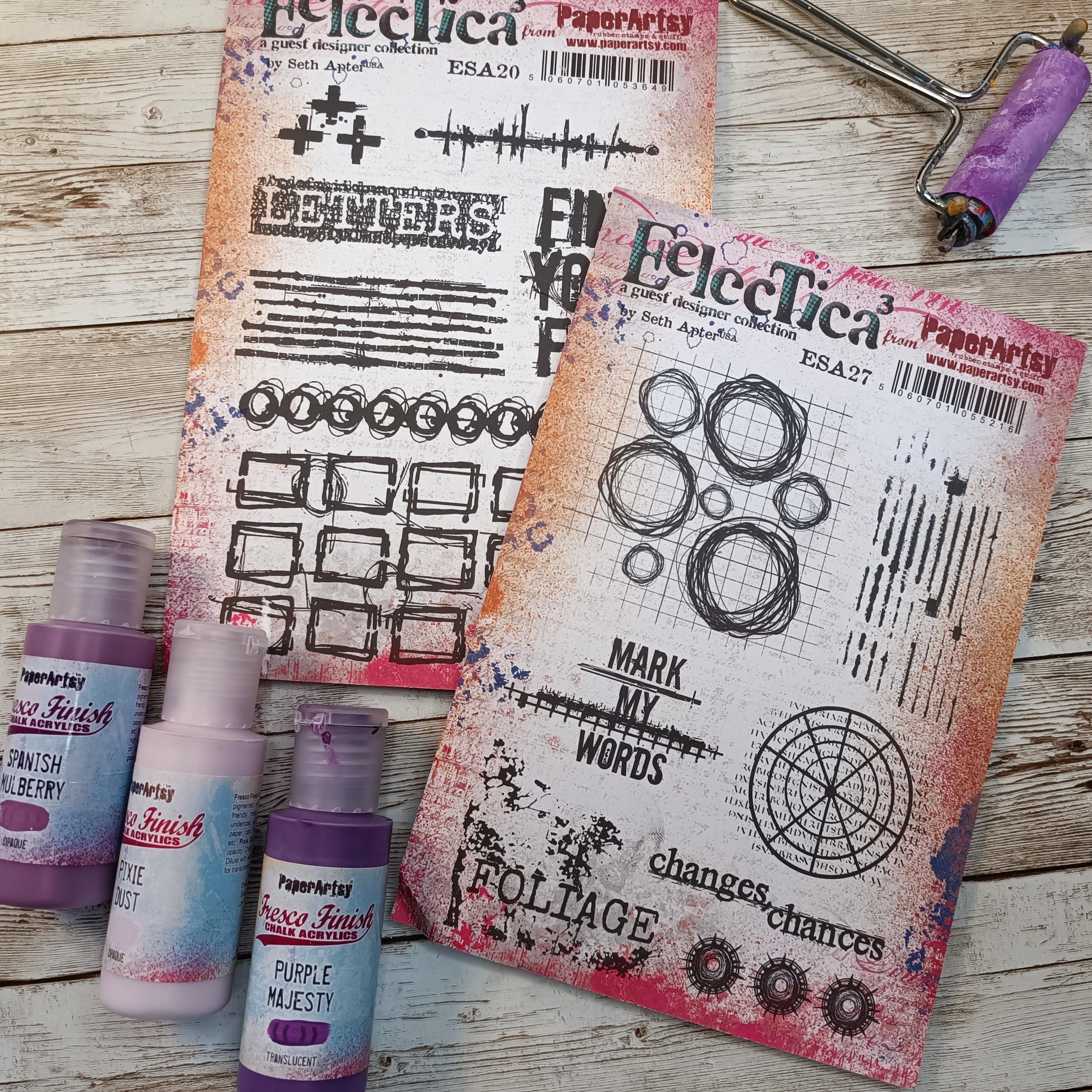
But the general idea stays the same with the colors I have chosen, as they are very feminine and as close to bright pink as I could manage. My choices of Fresco Finish Chalk Acrylics for this project are: Purple Majesty (FF221), Pixie Dust (FF113) and Spanish Mulberry (FF71).
I have chosen two Seth Apter's stamp sets 20 (ESA20) and  set 27 (ESA27). The first one will help me to create a background, from the second one I decided to use some parts to create embellishments.


The very first thing I made was a background on which I wanted to do some stamping to use as embellishments later on.  I started here as honestly I was not sure what to do on the layout itself. I needed to have some time to think and see the embellishments first and then go from that. This is a good tip if you are stuck- instead of doing things in the "right order", start somewhere in the middle and see where this 'middle' will take you.


This background was created on a scrap piece of mixed media paper by adding (with a brayer) two Fresco Finish Chalk Acrylics- Spanish Mulberry and Pixie Dust.  After drying the page (dids you realise Fresco paint dries so quickly!?), I added some splatter with Fresco Finish Chalk Acrylics (Spanish MulberryFF71) for more definition and interest, then let it partially dry and then cleaned the insides of the splatter with a damp cloth. This is a really cool technique which allows you to get some sort of "empty" splatter (see photo below).


Happy with the background, I added to it some stamping with different elements from Seth Apter's stamp set 27 (ESA27). I used VersaFine (Onyx Black) permanent ink (which dries rather slowly, so be careful not to make a mess with your fingers!), if you're impatient, you can use a heat tool or emboss with a matt clear ink.


After the ink was dry, I fussy cut all the elements. The biggest 3 circles were fussy cut differently- one exactly as I stamped it, but the two remaining ones were cut with some parts missing (see photo below). This is another "trick" I like to use- altering the shapes of my stamps to add more interest to the page and really get more out of your stamp sets.


I think the best part was to fussy cut the stamps and adjust them a little to my liking, but in the next step I will show you how to get them to really stand out from the project.

At this point I finally had a clear idea in my head; let's add some circles to the background of the layout as well. I took the scrapbook page and a piece of printing paper from which I cut different size of circles. I used this piece of paper as a mask on my page and applied paint through these 3 circles: Fresco Finish Chalk Acrylics: Purple Majesty (FF221) and tiny bit of Pixie Dust (FF113) (application  with a brayer).


I wanted the colors on the backgrounds to be a little bit different than on the embellishments, even though they are quite similar. The application with the mask and brayer left me with some small imperfections, but this will be fixed later on by adding embellishments. To match the background circles to Seth's stamps I doodled around them a little bit with UniPin black fine liner.

Next step was stamping- a fairly easy task. I used Seth Apter's stamp set 20  (ESA20) and the same VersaFine ink (Onyx Black), trying to make a criss-crossing track pattern on the page. I have chosen from the set two stamps which worked in my opinion the best with the "circular" feel of the page. While stamping, don't forget about the masking technique- if you don't want stamping in some places on your project and you need to use an acrylic block, add a piece of thin paper in the place where you want your stamp to not be visible. I used this technique here as well.


The second stamp from this set was stamped ever so lightly onto the page. To get this effect you can either use brighter ink, or you can stamp the first impression on the piece of scrap paper, and then without re-inking the stamp, stamp it onto the layout (second impression). This will give you a nice, but way brighter image (photo below).


Let's make some cool embellishments now!


This is definitely the part of the project I enjoyed the most- making embellishments from previously stamped images! While making them I got this funny idea to kind of twist or fold them between my fingers, so they changed shape.


Happy accidents make good embellishments at the end- in a few swift movements of my fingers, my whole layout got more texture and layers. Don't they look super-cool now all crinkled and dimensional?


The very last steps of my project were to put everything together. I made clusters of my fussy cut embellishment around the photo I have chosen as the focal point. As you can see it is a picture of a very beautiful, elegant woman. I wanted to highlight the fact that this is a very feminine layout. To make it even more sweet and romantic, I found some enamel stones which I added to the page.


A little bit of glitter and some micro beads always gives such a nice touch to this type of page.

I felt like my layout needed some sort of sentiment to finish it correctly. I chose the part of one of the stamps (ESA27) which says Changes. I thought, after all I made some changes to the way Seth's stamps are usually used hence this part of stamp will be better; Then again, as women we go through so many changes- so this word just sits so right with me for this layout.

Here is the finished project:


I am wondering what do you think of my layout and this quite unusual use of Seth Apter's stamps? I did have fun making it, even though it's not something I would be creating every day. I am, after all, a grungy girl. But it was a nice challenge and I was so happy with the way my embellishments turned out, all bendy and nicely textured. This was definitely the high point of my project. The low? glitter and stone embellishments- adding them to the paper, with glue sticking to my fingers- not the most enjoyable part of this story, but hey, I managed!
I truly hope I gave you an idea on using your stamps in a completely unexpected way (or any other products for that matter). What will you create next? I am sure it will be something beautiful!

Asia


Facebook: https://www.facebook.com/asia.marquet/
Instagram:https://www.instagram.com/lemoncreation_art/
Pinterest: https://www.pinterest.fr/LemonCreationAsiaMarquet

Thursday, 17 April 2014

Masterboard Makes {with JoFY Stamps by Designer Jo Firth Young}

Hi everyone, Jo here with the second part of my Masterboard project.  Last month I created this:
...and it was great to see so many of you join in and create your own masterboards I hope you had fun- & apologies to those who found it slightly addictive!  Printing and colouring are relaxing ways to spend time don't you think!
EDIT: If you'd like to see the original post showing how to create the board and which stamps sets were used you can find it HERE.

When I created my masterboard I also made a colour index of all the coloured pencils I'd used.


I created 'embellishments' by stamping lots of spare flowers onto PaperArtsy Smoothy Card and coloured them matching the same colours as the masterboard.


So now we've created our masterboards we need to create with them.  I scan and save my masterboards onto the computer, and I also photocopy them - I have to admit cutting into the finished board for the first time is a little bit scary so I feel better if I have a copy..(or 2...) of the original.

On the masterboard I coloured each type of flower the same which, I feel, makes the board look like a printed piece of fabric and that became my inspiration for the projects.

The first project I created was a scrapbook page. I lean towards the 'less is more/clean & simple' when it comes to scrapbooking. This page is taken from one of the versatile 12x12 Kraft albums that PaperArtsy sells - I LOVE THESE!!


Great weight of paper pages - perfect for big messy journaling or for neat & tidy.  The ringbinding makes them easy to take apart to remove pages to work on and then replace when finished.
They're not available on the PaperArtsy website but give them a call if you'd like one.


I die cut lots of hexagons from various papers that coordinated with the masterboard: booktext, the green/white spotted paper, painted pieces and papers from the stash) & of course the masterboard. I played around the the layout of the hexagons making sure that no two the same were side by side and when happy I secured them with a glue stick.
Then came the fun part - I sewed round all the pieces with the sewing machine (nb. paper/card can blunt needles so keep a needle to use solely for sewing these substrates).

It was fun sewing around all those shapes - I had to go over a couple of lines twice to keep the line going but that's not a problem- adds to the handcreated effect.
to finish the page I hand sewed some of the individual flowers onto the page along with few buttons and die cut leaves.  I also wrote brief notes on the notepaper hexagons.

The back of the page looked like this and as much as I like it I do prefer for my pages to have a clean back and so I sewed this and another matching page together around the edges.
Sewing the two pages together added to the sewing theme and, more importantly, reinforced and flattened the original page which had to be bent to get it through/under the arm of the sewing machine.

The first page used a lot of sewing machine work and so while I was on a bit of a roll with the masterboard, sewing, patchwork, hexagon theme I created another one this time using only 'faux' stitching - I like adding faux stitching to projects and its useful if you don't have a sewing machine but still want to achieve the the 'sewn' look:

I die cut more hexagons - this time in several different sizes - and arranged them to suit on the page - overlapping the elements: the photo, the hexagons the flowers so that everything is connected.  All pieces were adhered with either doublesided tape, 3d foam (small hexagons) and glossy accents (buttons and flowers).

The bigger buttons had cotton sewn through them and then were glued to the page to avoid sewing into the page itself.
I like continuing the line of stitching over the edge of the patterned piece - it helps to 'tie' the piece to the background.

I've used hexagons for my shapes but different shapes could be used - square and rectangles for example which would create a nice tiled effect.. or circles for a fun layout.

I created a few cards with the remaining masterboard - these are simple cards - mat & layering with simple embellishments (once again I'm a bit of a less is more with card design.)

This first card is almost completely covered with the masterboard - I've matted it on black as it makes the panel pop.

I also added a separate flower (one created at the start of this blog post) and left the petals raised - it gives the panel movement - this could be done with any of the flowers - or raise part of the flower such as the star in the centre of the pink flower.

Stem images was stamped on black with Chalk Fresco Finish - I painted some of the flowers and then added colour with pencils to tie in the masterboard circle.

Finally this card is very clean and simple - masterboard was cut and matted with kraft, gems and buttons added... and a simple tag (JOFY23)added on very fine string.

Phew this feels like a long blog post!  I hope I've inspired you to cut up your masterboard and create with it.  I still have some pieces of masterboard left and I'll be blogging some more ideas on my blog over the next few days.

Take care.


If you would like to join in this week's challenge and play along with Jo's techniques, then do link up your creativity here, and go in the draw to win some PA stamps of your choice! You need to link your entry by 17:00, Sunday April 20th 2014

Saturday, 23 February 2013

It's All About Colour ....

Hi everyone Gillian here, I hope you have had the chance to play along this week with our challenge inspired by Linda's creativity. Winners will be announced tomorrow evening!

I'm still knee deep having fun with the uber gorgeous stamps that are the Eclectica3 Collection designed by Sara Naumann. Most of the samples from me seen HERE were grungy/masculine in design so with that in mind I have challenged myself to use some bright colours and do something girly with these stamps. I have two completely different projects to share with you today, one using Fresco Acrylic Paints and the other using Distress Inks .... two completely different looks.

So lets begin. I have used a 7Dots Studio Domestic Goddess 12x12 paper (Overused Tablecloth) to create a scrapbook layout (the style inspired by Anna Dabrowska). Now to choose some colours ... Rusty Rose, Very Bery, Pansy, Pumpkin Soup and Butternut (along with Snowflake to "knock back" and Little Black Dress to add some texture when stamping).


To create a softer look when using the paints I mixed all the paints up in these small spray bottles (consistency approx 50/50 with water).
I have used the Bubbles Stencil to create some dimension to the background.
Then stamping with Little Black Dress to add some texture. The stamp is one of the new releases from JOFY10 set.


Cover the previously stencilled area before adding more layers of stamping and further layers of paint, this time I have just splated/flicked the paint directly from the bottle (have to say I'm completely converted to Pansy *shhhhh don't tell Mrs PaperArtsy*!!
The "bubble wrap" stamp from ESN08 was stamped using Archival Ink (Pale Ochre)
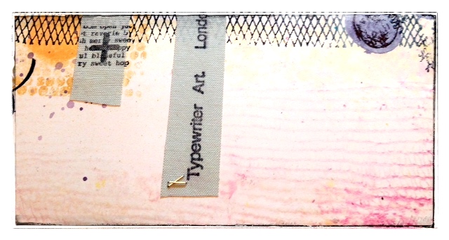
Continuing to build up the layers I then used strips of adhesive canvas which were then stamped using Archival Ink (Jet Black). The stamps are from ESN08


I have used a co-ordinating piece of cardstock from 7dots Studio to stamp all my images onto, most have been inked with Walnut Stain Distress Ink around the edges.
Next I sprayed these wooden leaves using Rusty Rose and Pumpkin Soup, dry with heat gun before stamping.
The script stamp is from ESN01


You can see how the addition of Snowflake has knocked back the vibrant colours.
I then attached all the different images using a Tiny Attacher and some wire mesh to add an "industrial" element to the layout.
To finish off I "flicked" some black ink. The "circles" to the bottom left hand side are from Mini 56


Okay moving onto project #2 ....

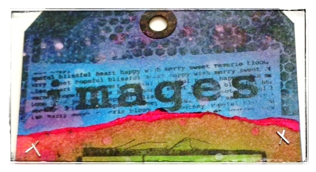
Another piece this time using a #8 Manilla Tag and Distress Inks (Picked Raspberry, Mowed Lawn and Salty Ocean), along with diluted Snowflake and Water.


I love how all the colours of Distress Ink have blended to create even more colours within the tag background .....

ESN07

ESN08

and the water has bleached out the centre area perfectly!
I've really enjoyed playing out with my comfort zone on the scrapbook layout colours. So go on and have some fun with colour! Remember you still have time to join in with this weeks challenge, click HERE to share your creativity.