


Servus everyone,
Claudia from VonPappe II here with you today.
"Tracks" is this quarter's most inspiring theme on the PaperArtsy blog and I really embraced it for several reasons. First, because it reminded me to follow my own creative tracks backwards in time and look out for my very own traces I've left on this path so far. Secondly I simply love any kind of mark making (using various tools but also stamp designs that are especially fit for creating delicate visual marks) and also traces left by time in the form of beautiful decay (like rust, weathered wood, found objects, vintage buttons,...).
What I found on my trip back towards my creative roots were some techniques and items I really loved to use but somehow forgot about while continuing my creative journey. I guess this happened because I've been keep on learning new techniques and trying out new products and styles. But re-visiting older projects taught me that I still feel very much drawn to particular background styles and techniques and special items like rusty wire, die cutting left overs or vintage buttons for example - and that all of these make me especially happy.
Also this project is a "Pure Seth Apter" one - I have used only paints, stamps, embossing powders and cutting dies designed by him in the process. My love for Seth Apter's designs and products originated quite early. I remember seeing some of his fabulous assemblage pieces where he used found objects and his uniquely inspiring backgrounds alongside his own cutting dies - and I recognised that these found objects were quite similar to a lot of hoarded treasures in my own stash. Only until that day I hadn't had a clue on what to use these for and how. For me that was a revelation!
So I decided to re-follow these particular tracks on my own creative path and re-discover the almost forgotten joy of using some of my "old loves" in this project.

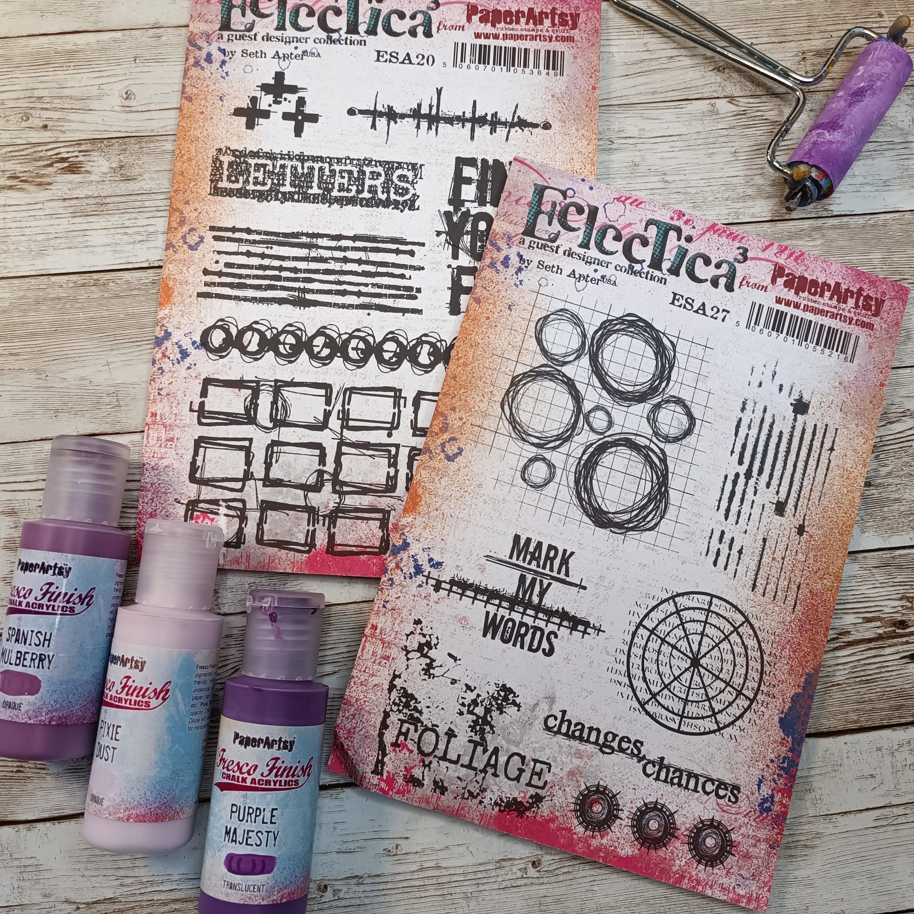
First I already very much enjoyed rummaging through my treasure boxes, digging through piles of beautiful vintage buttons, picking the Seth Apter embossing powders I thought would work best with his awesome PaperArtsy Fresco Finish Chalk Acrylic paints - all inspired by his two amazing PaperArtsy Seth Apter stamp sets ESA19 and ESA20.
I think all his designs and stamp sets are great, but these two - from my point of view - are especially great to use alongside a lot of different smaller sized found objects.
And how great was my excitement when I found out, some of the stamp designs perfectly matched the size of the "Robo Bar" cutting dies set he designed for Spellbinders (one of my oldest dies sets from my stash and still one of my favourites)!
So when all the designs, products, paints and tools you use, go together so well and so easily, the project can only turn out great! Of course I've picked the colour scheme I feel most at home with, but the design of my project works in any other colour combo just as nicely. Only make sure you use paints (no more than five) that vary in tonal value (that reach from darker colour tones to lighter ones) and make one of them a contrasting colour (like the bright turquoise against the earthy tones on my project). I really hope my project will inspire you to create your very own version! I think you will especially love the background technique I've used as it is so quick and easy to do, and gives great results!

The only short struggle I had, when approaching this project, was to decide which background (and background technique) was best to build a worthy (but not too "noisy") stage for all the beautiful stamp designs and found objects. Going for a flat background without any texture would make playing around and working on it with all the beloved bits 'n pieces I had in mind so much easier - but it would still have to be a background that would provide visual candy.

As you can see I had already chosen the found objects that I thought would work best with Seth's stamp designs. In the end I used six different colours of his Fresco Finish Chalk Acrylic paints range (I know: the image shows seven, but I found I definitely didn't need the darkest one and you could even narrow that number down to four and still get a great result - as long as you keep the one contrasting colour in the mix!).
The book box I had decided to alter was a gift from my sister (she knows I love boxes of all kinds). Instead of priming the cover (that had a boring print on it) with white Gesso, I decided to use a cut to size sheet of heavy mixed media paper as my base and thoroughly glue that to the box lid for starters. I picked a very smooth paper that I knew would take all the detail of the stamped images.

Keeping the stamp designs in mind (and in sight) I played around with my found objects to find spots where they would create visual interest but also still leave enough space for the stamped images. The image shows only one possible design (I always repeat this arranging step several times during the creative process as sometimes (nah! - actually quite often) happy accidents or changes of ideas occur (and then want and need to be embraced).

I then built the first layer of my "quick smudge background" by applying colour drops in different sizes directly from the paint bottles to my glued on background paper. I started with Seth Apter PaperArtsy Fresco Finish Chalk Acrylics Desert Bush (FF214), Mud Splat (FF61) and Blue Lagoon (FF131).


Next, I picked an old plastic card and used that to smudge the paint drops by scraping straight down from the top to the bottom of the cover. Don't overdo this - leave some white spots (these will make the orange colour we'll be adding in the next step pop!).

Then I added a second layer using the same technique - this time using Seth Apter PaperArtsy Fresco Finish Chalk Acrylics Smoked Paprika (FF36) and Mahogany (FF124).


I then added another layer of Desert Bush on top as I found my background was too dark and had too much noisy contrast going on. This time I also scraped from left to right in some spots.
Once that had dried I diluted tiny drops of Smoked Paprika and Mahogany directly on my palette, heavily loaded my soft brush and created tiny splatters on the background to add some texture.

At that stage my book box cover looked a bit like a mess, as the Desert Bush had toned down a lot of beautiful brown and orange tones - but I knew this was necessary to make the stamped images pop from the background. I loved the random shapes and brighter spots though! And together with the great rusty and colourful found objects I was going to add, that background was really going to make an impact!

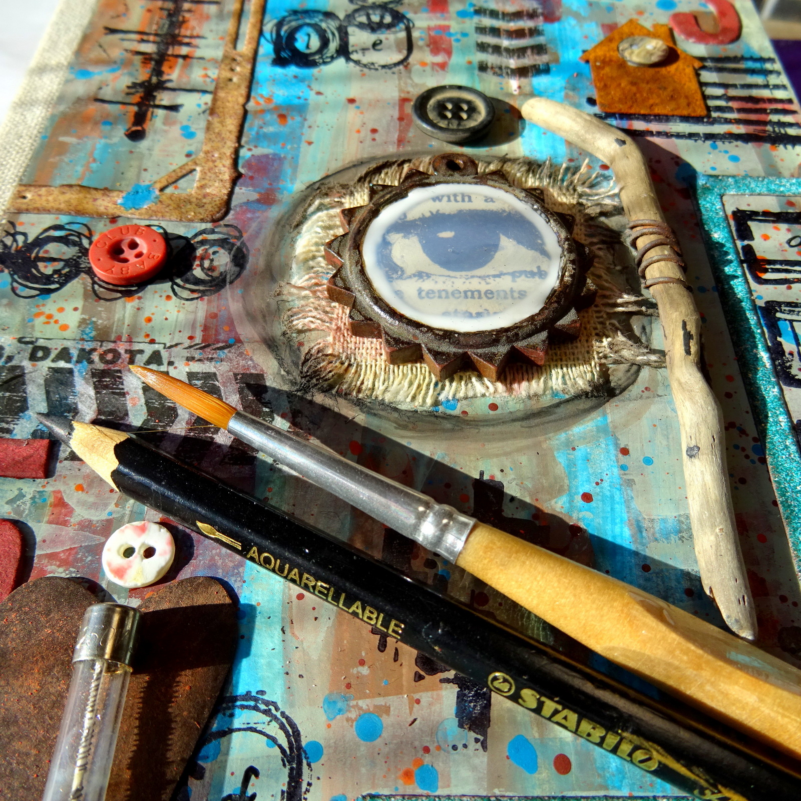
The idea for the focal element accidentally came up when browsing my PaperArtsy stash for additional "mark making options". I stumbled across the awesome Printed Tissues that had not only a cool picture on them that reminded me of wheel tracks, but I also found a peering eye - perfect to put behind a glass cabochon in a wooden pendant (also a re-discovery of some forgotten stash).
I wanted to rust the wooden frame, so I first primed it with a layer of PaperArtsy Fresco Finish Chalk Acrylic Mahogany (FF124).


...and the fabulously peering eye from the PaperArtsy Printed Tissue "Frames" (PT02). I simply used the glass cabochon as a mask to draw my circle around.


To activate the rusting process I repeatedly sprayed the pendant with vinegar and let that dry before spraying on more vinegar.
In the meantime I indulged in some happy stamping with the awesome designs from the PaperArtsy Seth Apter stamp sets ESA19 and ESA20!


Not to forget - another spritz of vinegar to keep the rusting process on the pendant going! And while that dried I die cut and heat embossed some frames using the Spellbinders "Robo Bar" dies (also Seth's design) and his embossing powders "Ancient Amber" from Emerald Creek's "Baked Texture" line and his WOW! embossing powder "Sea of Tranquility".

Time (I thought!) to paint the background for the Printed Tissue "eye" with PaperArtsy Fresco Finish Chalk Acrylic "Buff" (FF96)! It later turned out that at that point the vinegar hadn't completely dried in the wood (although I thought it had) and that led to a chemical reaction with the Triple Thick (from DecoArt) I had decided to use instead of the glass cabochon (as I thought it was a bit too bulky).

Time to slightly alter some of the found objects so they matched the used colours on the cover even better! I used Mahogany again - this time to paint the die cut numbers (left overs from past projects) - and Smoked Paprika to "rust" the metal heart shape by dry brushing it with mere traces of the paint. Once the heart looked like the rusty little house and the rusty wire I was happy!
Also a small stick of drift wood got wrapped with a bit of rusty wire (mainly for reasons of happy play I guess). Now all my bits 'n pieces were ready to go to their final spots! Yay!


Not so "yay!" was the discovery (as mentioned above) that some chemical reaction had started to turn the usually crystal clear Triple Thick into a milky white mess. I think it was the vinegar still left inside the wood of the pendant. The rusting though had turned out just beautifully! I loved how old and worn the frame now looked!

I put the pendant to the side at that point (hoping that maybe the reaction just stayed at that stage and then I could go in with some shading around the white edge and "mask" it).
Using matte DecoArt Decou-Page glue and sealant I fixed all the die cut elements, rusty bits and vintage buttons to their spots. I was happy about how well the buttons matched my chosen colour scheme!
I had also cut a piece of rough linen ribbon to size to put behind my focal piece. As the back and spine of the book box were covered with linen too, I thought it would be a good thing to repeat that somewhere in the design on the cover.

I played around with how to build a kind of visual frame around the eye-pendant as I felt I needed to repeat the circle shape to lead the focus towards the centre piece. I drew a circle with my black Stabilo aquarellable pencil and smudged that with a wet brush.
I still wasn't totally content with that look (and in the meantime the eye had started to disappear behind a haze of milky white), so I needed to come up with something better and fix the messed up eye-pendant.

Finally I found I had no other choice than to redo the eye-pendant! But before I felt ready to tackle this, I finally had an idea for a self made frame to use around the pendant! I would simply create one from some cheap crafting wire! In the end I found I really liked the wobbly frame as it matched the worn look of the whole cover and especially Seth's stamp designs!

Luckily I was able to simply scrape off the whole milky-eye-mess inside the pendant frame, so I didn't have to redo the rusting on a new pendant! Back to Plan A it was! And that meant using the glass cabochon instead and gluing the newly cut out eye from the Printed Tissue onto a circle (cut from a heavy white paper scrap) instead. To make sure nothing would "react" this time, I also added a coat of matte transparent sealant underneath, before I glued the eye and the cabochon in place!

Final touches were done by adding some hand-written letters to the stamped images here and there using a black Faber-Castell PITT Artist pen with a fine tip. To me these letters add traces of a story untold...who wrote them and what for? What do these traces tell us about the person who left them behind? I love to add a bit of mystery and story-telling!

I also love how the decoupaged "wheel tracks" from the PaperArtsy Printed Tissue fused with the background and the stamped images! My final step was to add that little clip to the edge of the cover - just to break the straight format of the cover's rectangle and add a piece you are actually meant to touch (and use to open the box lid). I also love how the rusty house stands on a "stamped ground" (a plowed field maybe?).


Oh, I so loved this little creative journey, following my own tracks back to the roots to re-discover a lot of stuff I still enjoy and love A LOT to play with!

So I hope my project does not only inspire you to search your hoarded treasures and indulge in some happy and inspiring play with these, but also makes you look back on your own creative journey and look for "traces left" and "tracks not followed on" - I am sure you will - like me - return to some techniques, products, themes and items that bring back some forgotten happiness to you. Because - you back then picked these for a reason and our first picks most often are the ones that make us happiest! We only sometimes forget about them because there always is so much new and exciting to learn and discover, right?

But maybe my quick smudgy background technique is something that you will take with you, as it allows you to get to the more playful part of a project faster and still provides sufficient eye candy? I hope you will give it a try (or two)!
Hugs and happy crafting!
Claudia
xxx


