Showing posts with label MN118. Show all posts

Monday, 26 June 2023

2023 Topic 7 : Art Dolls {by Autumn Clark} with Mini I&D stamps


Hi everyone it's Autumn Clark from SewPaperPaint here with you today.  An online art group I belong to shares a handmade Christmas ornament exchange each year and thought it would be fun to do an ornament/art doll twist up for this topic and in preparation for our exchange.  I've always loved making paper dolls and was surprised when I looked back to find that I've shared FIVE paper doll posts here on the PaperArtsy blog!  It's no big shock to find me raising my hand to share for this topic!  You can find my pervious posts HERE, HERE, HERE, HERE and HERE. For today's project I twisted things up by altering a juice can lid, fun fun!


The altered juice can lids turned out to be an amazing substrate and I so enjoyed working with them. I hope you will be inspired to try them out as well.


I always enjoy starting a project by selecting a color palette. I chose colors of PaperArtsy Fresco Finish Chalk Acrylics that would work well with my metallic substrate. I picked Caramel, White Fire and Pewter.


I sorted through all of my PaperArtsy Ink & The Dog Mini Stamps and picked a few that would work well as doll parts.  For my masculine doll, I picked MN111 and MN123. for my feminine doll, I chose MN118 and MN115.


Watercoloring is my favorite thing, so I decided to watercolor the faces from Mini Stamps MN118 and MN111 to get things started. Next, I cut circles from silver cardstock sized to fit into my juice lids. I used 3D embossing folders to add texture to each.


I added some paint in the above mentioned colors to each lid to give it an aged quality, similar to tin ceiling tiles. I then adhered some glass glitter for extra texture and bling.


Next, I stamped the wings from Mini Stamp MN115 with Staz-On ink onto acetate and let it dry fully.  I cut out the butterfly image then adhered metallic flakes onto the transparent surface.  I adhered some tulle behind each wing for an additional feminine, transparent detail.


I've learned over the years that handmade ornaments can easily get messed up in the yearly packing/unpacking cycle, so I added transparent packing tape to the front and back of each stamped face before fussy cutting. I used a couple layers of mounting foam and extra strength glue to adhere the faces to my altered lids.


I made hangers using silver and gold wire, curling it here and there randomly. For the gentleman, I adhered stamped Mini Stamp MN123, which I cut in half, in the place of wings. I used a paint marker to paint the backs of the tiny stars gold. I also attached a shimmery button to the front of the juice lid to tie in with his dress shirt.


As a final touch, I added some metallic marker details on each image, though it's hard to see this in the photos. I love to use metallics for Christmas, especially with hints of red and green!


The glass glitter, metallic marker detail and metal from the juice lids all sparkle just so and I think will be really beautiful when hanging on a lighted tree!


I've made as many as 30 ornaments in years gone by and am not sure if I can handle making as many of these fun dolls! But it's definitely a possibility if I can enlist friends and family in saving their juice lids on my behalf! Meanwhile, I've even started saving the ends of canned biscuits, which offer a smaller substrate for such a project...I just love the round shape here for Christmas, to mimic ornaments. I really hope this project has given you some ideas for your own art dolls. xx

Autumn


YouTube: SewPaperPaint
Facebook: Autumn Clark
Instagram: @sewpaperpaint
Pinterest: SewPaperPaint

Sunday, 16 October 2022

2022 Topic 14 : Colour Study: Triads {by Jennie Atkinson} with Ink and the Dog Mini stamps


Hi everyone, it's Jennie (Live the Dream) with you today, and I'm here to share with you a small book box using some fiery colours and a selection of stamps from the Ink and Dog Mini Stamps Collection.


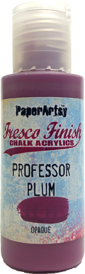
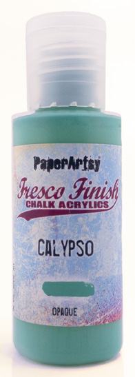
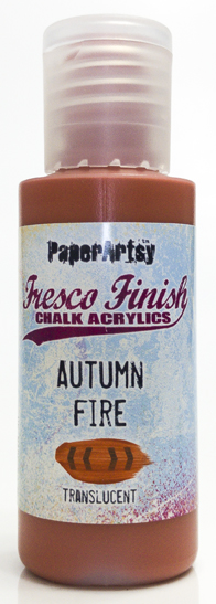
For those of you that know me I am very much a neutrals/pastels creator and so when I was asked to consider taking part in this Triad Challenge I wasn't too sure what I was letting myself in for! I spent ages looking at colour wheels and decided to choose my Triad from colours which were not main primary colours but a "step" away. This gave me the choice of a turquoise (Calypso) instead of blue, plum (Professor Plum) instead of red and an orange (Autumn Fire) for my yellow.

The resulting painted colour wheel was extremely interesting particularly the lilac in section 6 but the green in section 11 seemed very odd ! and in fact I mixed it twice to make sure it was correct. However, Autumn Fire is transluscent and I was mixing this with an opaque so the latter must have "won" the battle of the mix!

I decided that the colours had a real Moroccan Market feel and decided to experiment first with paints on my Gel Plate before deciding how to use them ..... the result was a small book/box which can be used for trinkets or other finds.


Whenever I want to experiment with colours I nearly always turn to the Gel Plate. I love the way colours can be combined but also the way not everything blends together well so there appears to be little spots of lighter/darker mixing and due to the waxiness of the plate the odd little bit of white shows through. This gives a feeling of "texture" without adding anything into the mix at all.


I did try some random mixing of colours which didn't quite have a "feel" to them but once I decided on landscape striped areas of colour the feeling of an early evening Marakesh market square came to life!

I turned next to the stamps and had already fallen in love with the pattern of MN122 which again had a Moroccan carpet feel to it. Random stamping with some matching Archival Ink along with the text of MN124  started to fill in some of the areas.


MN124

However .... I did turn to two favourite Ink and the Dog Mini Stamps which I tend to use in ALL my backgrounds. In fact MN72 never leaves the block and sits on the craft table all the time.

                                                      MN23                           MN72


I didn't have any matching inks for the middle section but decided to go for a turquoise Archival ink which blended well with the Calypso but didn't look out of place on the Autumn Fire. As this was beginning to feel more like "sky" I used only the text and splatter stamps keeping a more open finish.

My main focus of my project had always been the beautiful new Mini Portrait stamp. I had instantly thought she was a "red head" so started by colouring with the hair and kept everything else quite simple.


She needed a frame ...... I tried different ideas from die cuts to wooden frames but then this little mask caught my eye and she fitted the aperture perfectly!


I new from the start that I would have to choose one of the three Triad colours as the main embellishment colour. As the frame would be located on the plum area of the paper I decided to go for the plum rather than adding in another distraction. I tried mixing Professor Plum Fresco with the Grunge Paste but it came out rather pink, so in the end used the Grunge Paste in its natural form on some thickish watercolour paper and once it had dried and was cut out, painted it with the Fresco Paint.


I used Eileen Hull's Skinny Mini Box Die to create the box as it is a good size for utilising an A4 sheet of gel plate print. I cut the paper in sections so it wrapped around the cover. However it would be easy enough to make a book cover in a similar way without the box.

I used one of my other prints to create a similar piece inside the box along with the quote from MN109.

This print was darker in colour and I felt worked better inside the box rather than outside. By this time the colours were really appealing to me and I was on a roll in terms of tying in other embellishments which focused on the Triad colours.... (I never thought I would feel so relaxed about bright colours!).


In keeping with the Moroccan feel I added some gold dry brush work on the frame. I felt the wooden embellishment worked better in the same colours as the frame but the little paper flowers painted in Autumn Fire Frescos added the contrast without being overpowering.


I experimented with other coloured embellishments but went for the contrast ribbon and hanging embellishment which felt more tonal ..... if you can say that with such bright colours!


Without the challenge of using the colour wheel I would not have put these three colours together or felt confident in creating with them. I cannot stress enough how "out" of my comfort zone this was, but being able to rely on a technical means of choosing the colours there was a reasonable acceptance that they should work together.

I am not sure that my random prints would have worked well but by isolating the colours into the three individual strips they combined better and gave me something which I felt I could identify with .... the Moroccan Market by night.

I shall certainly try this again in order to move myself away from my usual colours. It was exciting, terrifying, creative and satisfying all at the same time! I hope you give it a try!

Jennie x

Facebook: Jennie Atkinson
Instagram: @atkinsonjennie