Hi everyone
Floss from flossWORKSHOPart here with you today.
I've been puppy sitting recently so having a 7 month Cockapoo in the workshop with me has been both interesting and distracting...especially when he finds something poking out of a basket, tucked under my workbench, and runs off with it like he's won the lottery so I have to down tools and chase him!
Anyway...back on task...This ink pad topic had me thinking about how many different ink pads and spray inks I actually own and how and when I use them. I think we must all have our go to inks and favourites of those...mine has got to be my embossing ink pad. I like to use it at any point of a project as it is quite versatile.
As the focus is on inks and this quarters theme is hidden, I decided to share how I use inks (and no paint) on a waterfall card project with you today with a 'grungy' outcome...


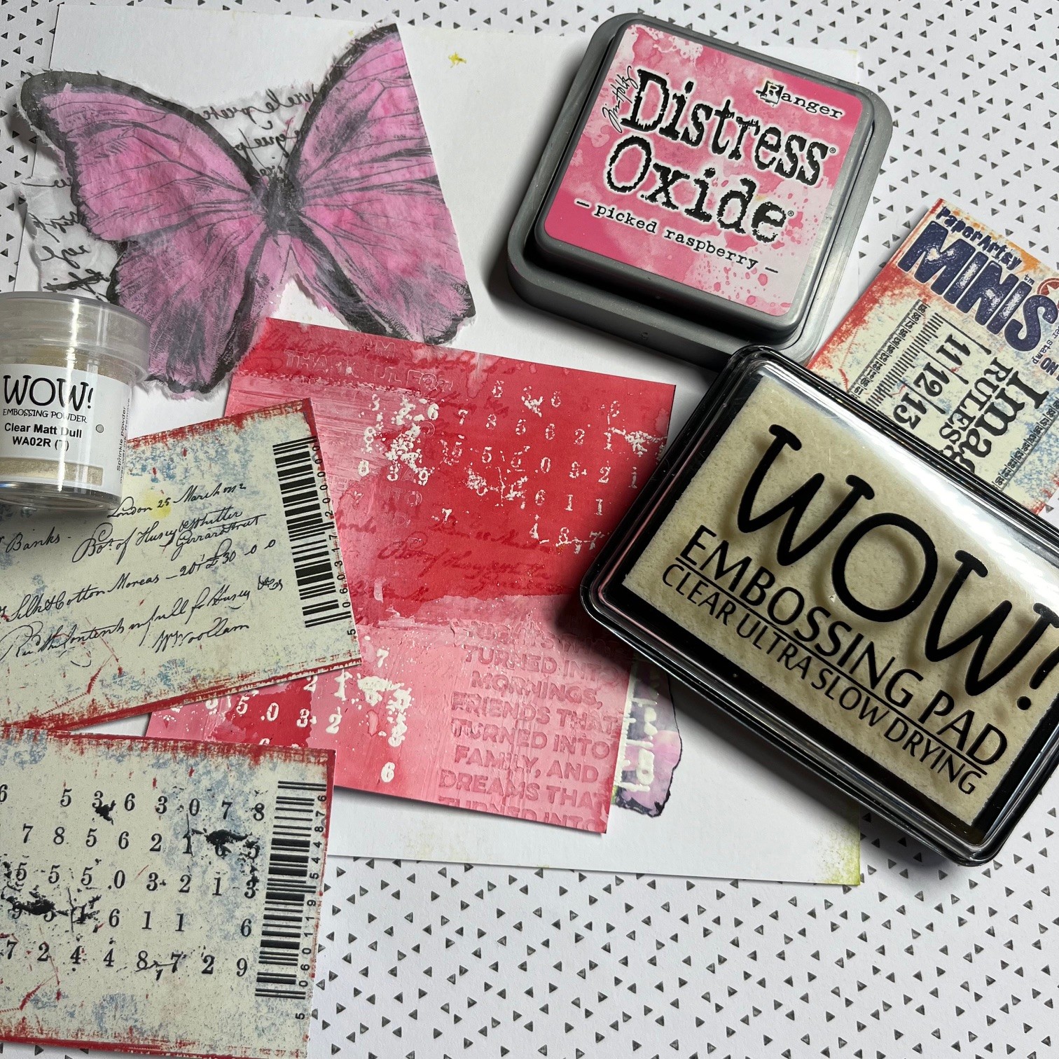
I grabbed some A4 300gsm card stock, an embossing ink pad, my favourite WOW white vanilla embossing powder, the matt clear embossing powder, my box of distress oxides, some spray inks, my trusty (dirty) gel plate and brayer and a selection of PaperArtsy mini stamps...I wanted to make a waterfall card but had no firm plan on the final outcome at this stage...being intuitive is always exciting and scary all rolled into one but I do like to see how things unfold and that's quite literally with this project...

More photos of the supplies I use will appear throughout the post

I started by embossing the card stock with WOW clear matt embossing powder using the PaperArtsy MN62 stamp, then using Ranger peeled paint Distress Oxide on the gel plate to colour the page.

Embossing Ink is a unique type of ink that is essentially a slow drying 'glue'. My personal preferred embossing pad is WOW! There is something about the actual felt pad that allows the right amount of 'glue' ink to be pressed onto the stamp which keep the lines clear and defined. I often finish my pieces with embossing but here I wanted to use the first layer as a resist. Using the embossing ink on the paper first to do this allowed the distress oxide to 'puddle' more around the embossed areas giving me more colour tone concentration variation.
I used Ranger Industries 'Peeled Paint' Distress Oxide directly onto the gel plate because I like the wetness and opaqueness of this ink.
"Distress Oxide Inks are a little smoother in texture. Oxide inks are a fusion between dye & pigment. Pigments are considered opaque, meaning you can't see through them. Because of this, they have a slower drying time and show up wetter. You can also see more of the chalky quality that Distress Oxide Ink has especially once it reacts with water." Source Cherry on top
After pulling the print, I applied water over parts of the printed card where I used the oxides using a large brush to give some watery diffused areas. I paid particular attention to around the edges as well as sections through the middle.
I then used the Ranger Peeled Paint Distress Oxide without the embossing resist to colour the envelope. I used PaperArtsy stamp MN122 to lift the oxide from the gel plate from where I had rolled it and onto a clean area of the gel plate before pulling the print. This enabled the image of the stamp to be seen as a negative and positive image.

I used the stamps into wet gesso and let them dry before applying spray inks onto these card pages. I particularly like how water soluble spray inks soak into the surface of the page where the gesso isn't and how you can wipe the ink off the where the gesso is (resist) leaving you with a depth variation of the sprayed colour.
Dye inks consist of a soluble
colourant, or dye, that are dissolved in liquid. These Izink spray beauties don't clog like many other sprays do and are suitable for anything porous so they especially allow a brilliant depth of colour when allowed to soak in. I particularly like the way the ink soaks into the edges of bits of collage when adding layers to mixed media art or areas where the gesso is stamped or scratched into.
I like to lift the spray ink off the gesso areas with a baby wipe; the ink collects in the baby wipe allowing you to use that on other areas in a less "concentrated ink" meaning you are able to add lighter/softer amounts elsewhere. I do save my used baby wipes that have ink on in an old screw lid moisturiser tub to use again another time...as long as the air doesn't get to the wipes, they stay usable for quite some time!

I added some text from book pages onto some of my printed pages and scraped some gesso in places over that. I dabbed a little Ranger Villainous Potion Distress Ink onto and old plate and sprayed it with water. I used a brush to apply that to the gesso areas on the page to bring in some subtle colour.

With the Distress Ink having a more transparent quality to it than that of an oxide it enabled a hint of the colour rather than an opaque/solid area of colour.
I then used the PaperArtsy MN37 with the Villainous Potion Distress Ink to stamp some features onto the sheet. I liked the way the image was slightly diffused over the gesso parts. I was able to use a small brush with water to colour in more of the background.


Having made a selection of papers I now had to decide what size the waterfall would be. I cut the pages into 100mm x 100mm squares and had a few to choose from!

I added more interest to the squares using my embossing ink pad and Oyster Glintz Embossing powder...

...and some extra texture here and there with my favourite Vanilla White Wow embossing powder and MN23 stamp. I also tore the butterfly from one of the original PaperArtsy tissue papers using a fine wet paintbrush to add to one of the squares. I dabbed some picked raspberry Distress Oxide onto the reverse of the butterfly and spread that with a damp paintbrush. I needed to be careful using the Distress Oxide for this as the tissue is delicate and being too wet could have torn it. I wanted to use the distress oxide rather than acrylic for this as I wanted the distressed look rather than a solid colour.
To create the waterfall feature I used a piece of thin card 400mm x 100mm. I decided to use the waterfall horizontally instead of vertically and so the first score line was the width of the square 100mm/10cm I then spaced the other lines 15mm apart.

I do like a torn edge and a more grungy appearance than a pristine crisp finish so I used the the MN48 stamp as I particularly like the tiny measurement feature of the stamp to create some pieces to add to the edges of each square. I embossed these using my favourite Wow opaque vanilla white embossing powder. I then used my Ranger jet black archival ink to blacken the side edges of each square.

Because I didn't want the sentiment of the MN107 stamp to be really bold I used matt clear embossing powder over Ranger archival jet black ink using my stamping platform to position the stamp exactly over where the first impression was. The effect was much softer and less stark.

I cut a strip of card 250 x 40mm to glue to the scored card between the last waterfall image and the scored card roughly 15mm from the edge.


Well almost ta dahh...

I decided no piece is quite complete without some stitching on it... and so I zigzagged a body detail onto the butterfly and free motion stitched the antennae...then a few stitches along the edges where I'd added the torn extras.

After I'd glued what I thought I was going to use for the last page on the waterfall and tested the mechanism, the pull out piece was blank...that was definitely a design feature I had overlooked!
I had two choices...to decorate the pull out section or change things around. I liked the idea of using what would have been the last waterfall page as the pull out piece instead and so glued that in place on the pull out section.
I glued the holding strip into what would now be my last waterfall page.

Wrapping the holding strip card ends around the back of the mechanism, I used a glue gun to secure the ends together and then glue it into position on the card.
I wrapped the end of the 'pull' around the back of the card and cut a circle from one of the embossed and inked sheets. I glued the right 2/3 onto the back and tucked the pull end under the circle to secure it. This kept it tidy and enabled it to still fit inside the envelope.

I glued the part of the butterfly that did not fit onto the front square onto the card using gel mat medium making the butterfly complete.

...then pulled the tab to see the waterfall mechanism working...


I particularly enjoyed incorporating the inks together and having to think how the mini stamps could be used within a waterfall mechanism.
I hope you enjoyed it...
until next time, enjoy your creative time
Love Floss x x x

Instagram: https://www.instagram.com/floss_workshop.art
I teach mixed media from my little workshop...I have various dates available for a multitude of classes. Click on my logo to see what's coming up...