
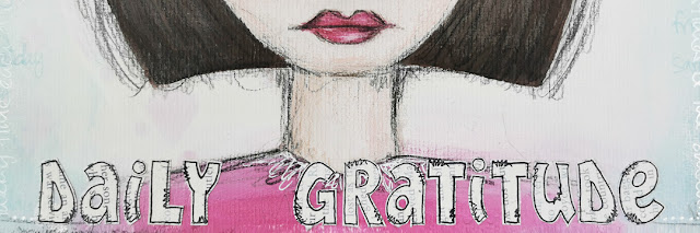
2021 Topic 15: Journaling Gratitude
A
lovely post from Jo where she creates a panel of gratitudes. I am sure
every time she catches a glimpse of this, it will induce her to pause
and reflect.As she says, the thought bubbles no doubt will vary, but I
am sure that having a piece like this nearby is going to have more of an
impact on her daily life than she might expect, in the same way that
affirmation quotes on the fridge do. ~Leandra
Hi everyone, it's Jo Firth-Young with you today, and I'm here to share with you a journaling panel I created.
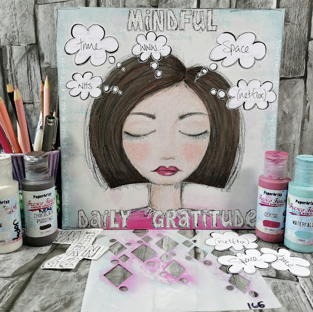
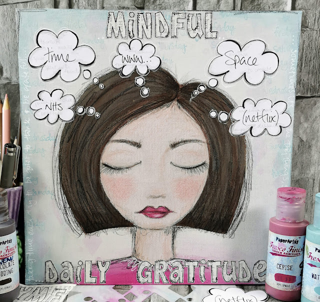
When I first started thinking about this theme I sat down with the idea of creating a small gratitude journal, one that was ongoing and could be added to as and when... but then my mind went off in all different directions - What was the subject? Could it be limited to a week of finding one 'thing' each day to be grateful for? Could it be 10 things I'm grateful for during Christmas/ summer/ my home.... the themes were all going round in my head and so to quieten the noise I opened up my sketchbook (where I do my thinking) and brainstormed quietly for 5 minutes - and this is what came out.... a woman (maybe its me?)...(a very stylised me lol) sitting, eyes closed, thinking.
When I first started thinking about this theme I sat down with the idea of creating a small gratitude journal, one that was ongoing and could be added to as and when... but then my mind went off in all different directions - What was the subject? Could it be limited to a week of finding one 'thing' each day to be grateful for? Could it be 10 things I'm grateful for during Christmas/ summer/ my home.... the themes were all going round in my head and so to quieten the noise I opened up my sketchbook (where I do my thinking) and brainstormed quietly for 5 minutes - and this is what came out.... a woman (maybe its me?)...(a very stylised me lol) sitting, eyes closed, thinking.

Sometimes its good to just sit quietly and listen, think and focus.
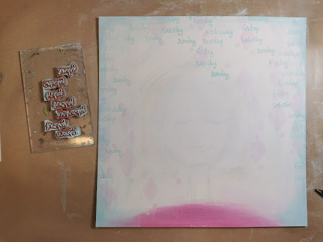
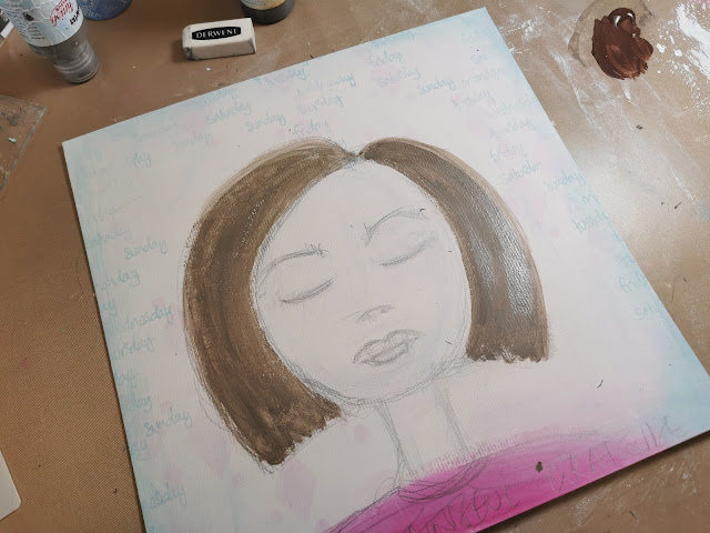
I started with a 10in square panel of mount board (the type used for framing art) - the one I used is cream and has a texture. I sketched out the shape of a head and them washed over the surface of the board with slightly diluted Eggshell Fresco Finish paint. The face is going to be the focal image of the panel and so I want it to be faintly visible through the layers I'll be adding.
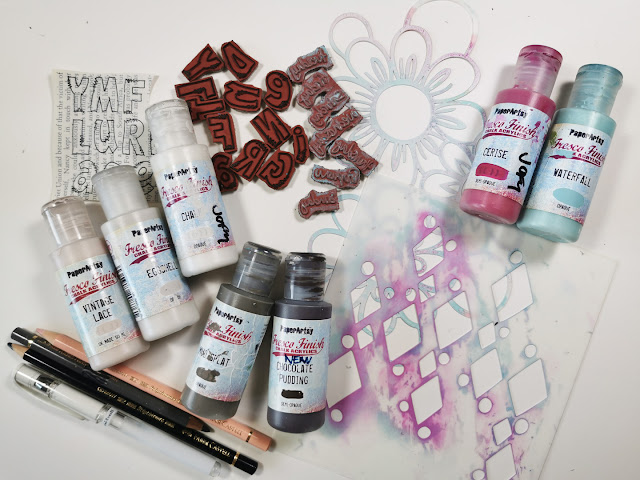
I
wanted the panel to have stenciled details in the background but I also
wanted the panel to be 'calm' (because the woman at the centre is being
calm, meditative) and to achieve that each time I added a layer of
colour/pattern I washed over it with Chalk Fresco Finish - knocking the
pattern/colour back.
In the photos below you can see how I added 2 layers of stenciling using Cerise Fresco Finish paints, each time finished with a diluted Chalk wash.
At the bottom of the head/neck I added a block of Cerise in the shape of shoulders.
In the photos below you can see how I added 2 layers of stenciling using Cerise Fresco Finish paints, each time finished with a diluted Chalk wash.
At the bottom of the head/neck I added a block of Cerise in the shape of shoulders.


Waterfall looks great with Cerise so I dry brushed that on to the edges of the panel.

I like how the words fade in and out of the background when they are on top of the Waterfall used on the back ground.
With
the background finished I moved onto detailing the woman on my panel.
I'm not going to explain in detail how to do this as there are many
tutorials on the internet dedicated to creating faces - I encourage you
to take a look, they are inspiring.
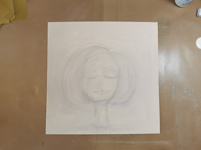
Following the ghost lines of the woman still visible through the painted layers I resketched the shape and details in pencil.
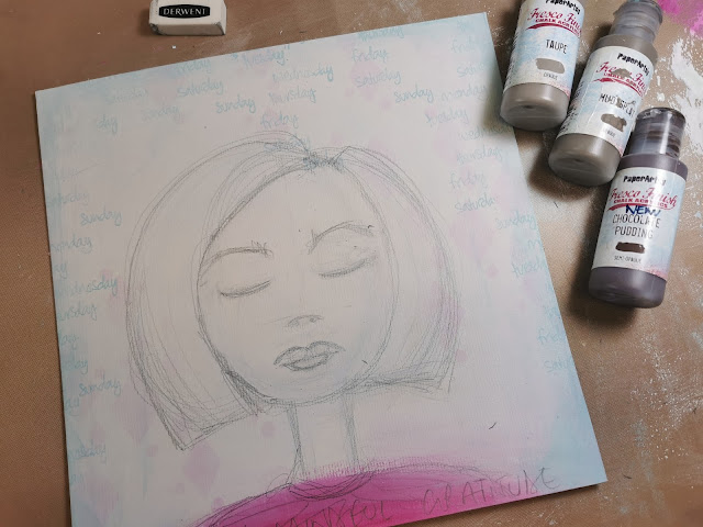
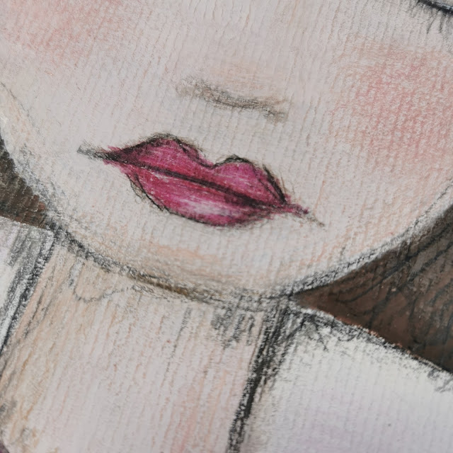
I painted her hair in Chocolate Pudding and Mud Splat, and her skin in Vintage Lace and Chalk.
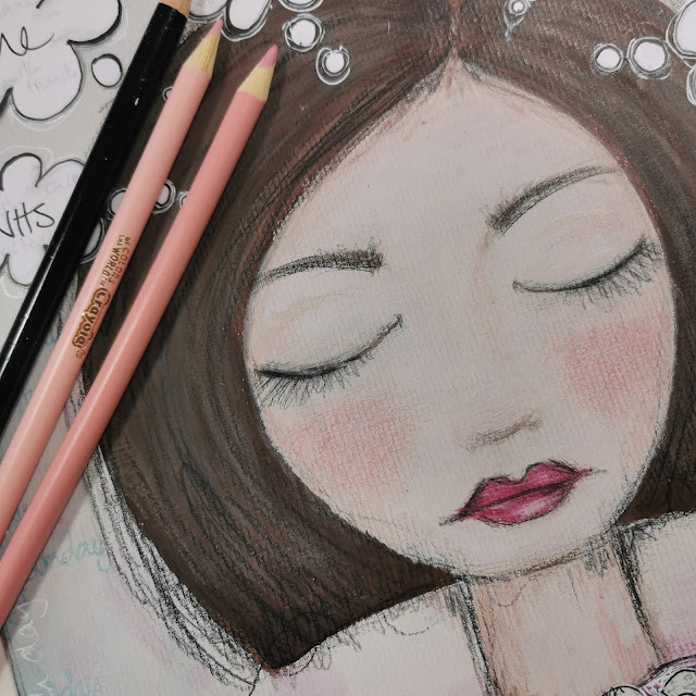
All the details on her hair and face were created with coloured pencils.
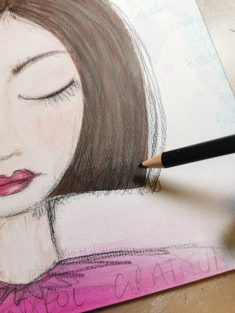
I really like the texture the mountboard gives the piece, similar to canvas.
My
preferred drawing style is quite sketchy so when the main paint colours
were dry I added sketched coloured lines on top of everything.
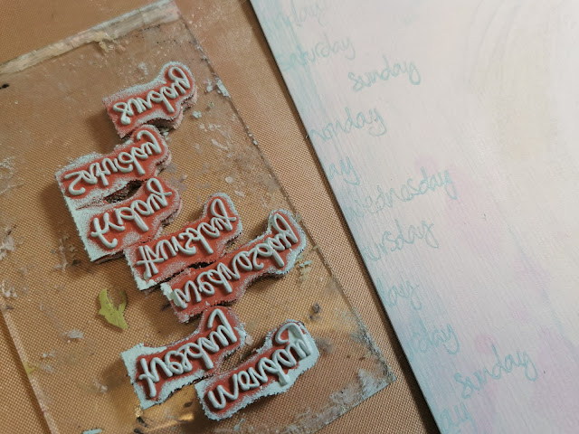
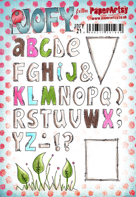
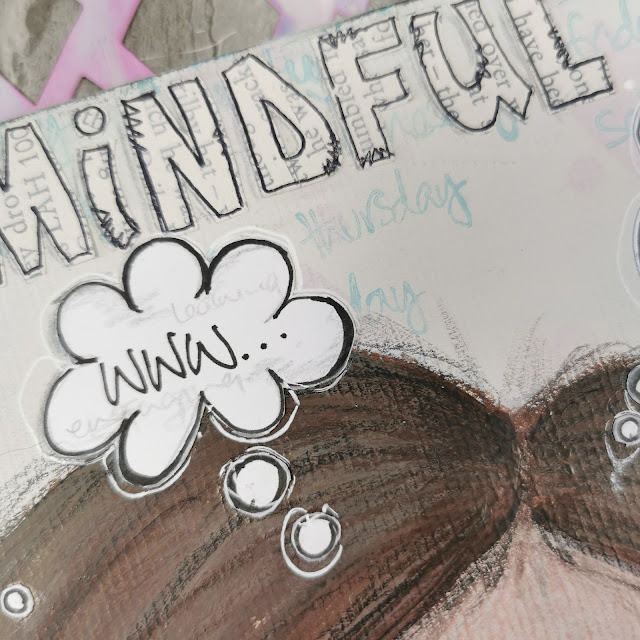
I
always like to add words onto journal pieces - so after trying out
several different alphabets I settled on the one on JOFY21 - really
useful alphabet if you want to add block colour with an outline or as
I've done here patterned paper... I often use book pages but I
specifically chose it for this project to link it to words and thought
that go round in our heads all time.
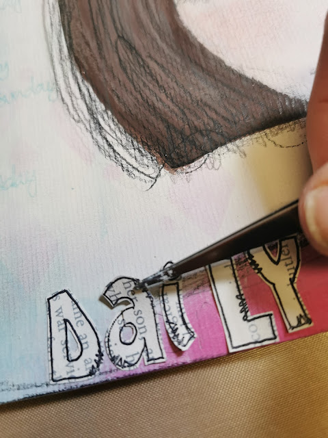
The letters are stamped onto book pages that were washed with diluted Chalk Fresco paint.
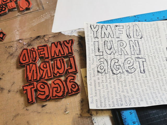
The letters were carefully cut out and glued onto the panel.
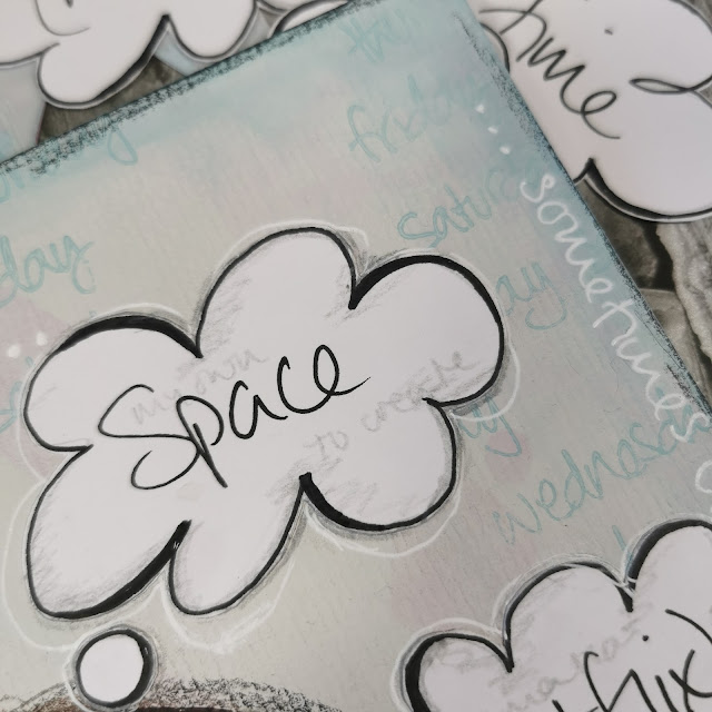
The final pieces added to the panel were the thought bubbles. What to include??
This project had become quite personal so I chose 5 things I'm grateful for - these of course can change on any given day.
A couple of my choices were light-hearted - 'Netflix' for example... though I really am quite grateful for it - it keeps me company in my studio while I'm working by playing my favourite musicals, and music, on repeat! lol
I sketched the bubbles onto Smoothy card, cut them out and added them to the panel.
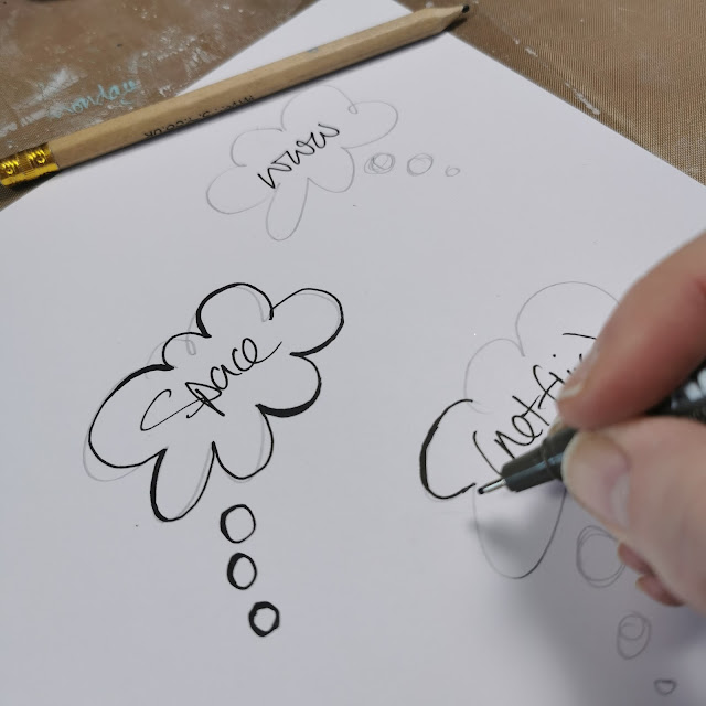
I
wrote the main item in black pen and then wrote the 'reasons' for my
choice in grey pencil so they are there but you'd have to really look
closely to see the details.
Just
a thought - wouldn't it be fun if those thought bubbles weren't glued
onto the background and could be changed each day?! Or if the thought
bubbles were plain, the panel was covered in clear self-adhesive plastic
and then the 'gratitudes' of the day could be written on the bubbles
and wiped off the next day! So many options!
I added some journaling around the edges of the panel using a white gel pen.


I
hope my project has inspired you in some way... maybe to draw some
faces, brainstorm things you are grateful for (lists are good for this, I
love a list! lol) or create a mini gratitude journal.
Finally, I am grateful to PaperArtsy for lots of things, including this blog topic which has been a really enjoyable theme to work on.
This
is my last blog post for 2021, so I'll take the opportunity to wish you
all the very best for the festive season and coming year.
Take care
Jo, x
Take care
Jo, x
Blog: jofirthyoung.blogspot.com
Facebook: JoFYJamboree!! group
Twitter: @jofyjo
Instagram: @jofyjo
Pinterest: @jofyjo


.png)

