2021 Topic 10: My Favourite Colour
We
do love a JOFY mini book, and even better when it's a pink-black-gold
combo! Jo goes through her back catalogue to show just how perfectly all
her stamps can work well together in the background and of course she
also manages to find the perfect focal points to adorn each page
beautifully.
~ Leandra
~ Leandra
Hi everyone, it's Jo Firth-Young (www.jofy.co.uk) here with
you today, and I'm here to share with you a small concertina book I
made using my 'favourite' colour - I say my 'favourite' colour but it
really is so hard to pick just one colour isn't it?!!
I
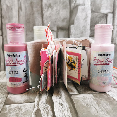
chose PINKS, - including HOT pink - the gorgeous Cerise. Hot pink seems
slightly rebellious - it says 'look at me!' It makes a statement
doesn't it. I've teamed it with Sherbet, Gold and black to quieten it down a little... but not too much. lol
The mini book I created (final size 8x8cm) came together quite easily - I didn't start with any expectations of what it was going to be... but I took inspiration from an even smaller book I have on my desk (I do love tiny 'junk'/art journals!).
It features lots of the small designs that are on my stamp plates and I've been wanting to make a slighter larger project using phrases.
So I gathered up Smoothy card and paints and just started playing - I used lots of bits of 'this and that' - I had FUN making it, no pressure. I used many of my favourite techniques - and all that HOT PINK colour!!
The finished book just makes me smile- it has a really positive feel to it - I chose to feature lots of the little phrases & words that are dotted among my JOFY collection - I wanted to give them their '5 minutes of fame'. lol
I started by creating a master-board on a 13x6in panel of Heavy Smoothy. I painted it with diluted Sherbet Fresco Finish paint, used stencil PS250 to add small spots in Cerise and larger spots in Kitsch Flamingo Distress Oxide.
Then, I added letters (JOFY101)
in Gold Fresco Finish to break up the pink and add a touch of shine to
contrast the matte pink paints. I intentionally left 'open' spaces.
Once all the painted layers had dried I added more details: I stamped blocks of small dots (EM57), and drew around the large dots with Stabilo All pencils in white and black diluting the lines with water.
I folded the panel into 4 x 3in strips, cutting off the remaining 1in strip.
I
realised that 4 rectangle panels didn't give me enough space to work on
- not enough pages, and I thought rectangles might be slightly
restrictive so I cut the rectangles into 8 7x7cm squares - much more
versatile and more pages! win win!
Now
to decide what colour card to mount the squares onto for the concertina
structure. I often try out several backgrounds colours before making a
decision - its definitely worth looking at different options - some
might surprise you! I tested white, black and my firm favourite: kraft.
The different background colours definitely create a different look -
the white is fresh, the black is very dramatic and the kraft gives a
softer look. I decided on black for my book- a change from the white or
kraft that I might normally reach for.
I measured and cut a strip of black card to mount the squares onto allowing for a border to frame each piece.
.... and when all the background details were finished I sewed each panel in place.
Here
are pairs of page with the details of stamps used... details on the
panels are die cuts, stamping, stenciling - created from pieces
cut/created for this piece and from project 'left-overs' - repurposing
bits and pieces. I really like adding all these little details to these
small pages.
'Life is good.... ' is from JOFY46. The numbers on the right hand page are from JOFY88
- this was a 'scrap' piece saved from a previous project (its always
worth hanging on to interesting bits and pieces). These numbers were
part of the planner sets I designed but it great to see them being used
for something else.
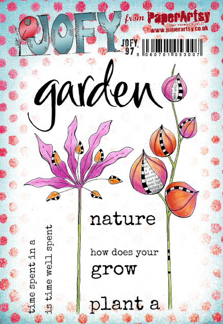
The left hand page features bud stems from JOFY26 and 'Grow' from JOFY97 is part of a phrase but works just as well on its own.
I heat embossed most of the images stamped in black - the gloss of the embossing is a nice contrast to the matte Fresco paints.
The flower on the right hand page is JOFY61, and this page features one of the background stamps I added for more detail on some pages - the white embossing really makes it pop.
'Be a rebel' (great phrase) comes from JOFY50
- the ombre painted word uses Cerise and Sherbet. The flowers on the
right hand page are from JOFY26 (shown above) - I stamped the flowers
directly onto the background and added an additional one for added
interest.
Here are the final two pages featuring JOFY72 (I like how the word 'you!' is accentuated by embossing it in gold), and JOFY102.
Black and pink is such a great colour combination isn't it! and with those pops of gold and white!! Fabulous!
Take care
Jo
Website: www.jofy.co.uk
Pinterest: @jofyjo
Facebook: JoFY Jamboree! group
Twitter: @jofyjo
Instagram: @jofyjo
Teaching dates - ONLINE workshops
28.08.21 Loobi Crafts, www.loobicrafts.co.uk ...Wonderfully Wintery
Every Friday until December: Festive Friday, 18.00 (UK time), in my Jamboree group: Free demo/Card making class


.png)

