Showing posts with label FP011. Show all posts

Wednesday, 9 April 2025

Storybook characters in a hand-stitched book with Alison Bomber & France Papillon stamps {by Alison Bomber}


Hello all, Alison here from Words and Pictures, and I can't wait to share today's storybook with you! It's definitely a labour of love, bringing together scraps and mop-ups with collaged panels, fragments of book pages, multiple stamp sets - both my own and France Papillon's - plus oodles of ephemera, all to create a celebration of storytelling through pictures and words.


I was inspired by those wonderful editions of classic novels where, as you read the dense text, suddenly every once in a while you would turn the page to find a small illustration - usually a fabulously detailed black and white drawing. I loved discovering those visual bits of storytelling illuminating the words. I'm sure that's why I was so drawn to the trio of France Papillon stamp sets I've used here. But I always wished there could be more pictures, and so this hand-stitched book is my way of fulfilling that wish... with more pictures than words!


Given my recent springtime release was also very much inspired by old book pages, adding those botanicals and text textures to France's book illustration stamps seemed like the perfect combination.


Come and turn the pages with me to find out how I've used colours and ephemera (drawn from all my other stamp sets too) to bring the pages and elements together in a harmonious way, and discover the characters lurking within the storybook...


You may have noticed that I'm slightly hooked on the Mattints at the moment, and they play a major role in these book pages. Their transparency brings that gorgeous glow, as well as making it so easy to tint a stamped image with subtlety. And I just loved finding ways to combine my stamps with the vintage delights to be found in the France Papillon trio. 

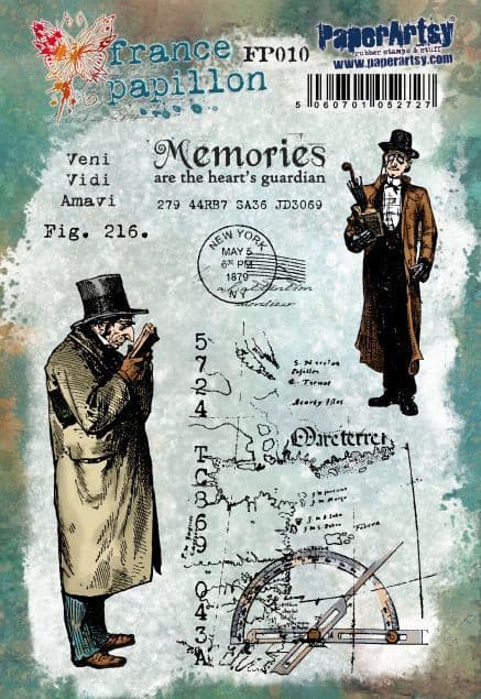
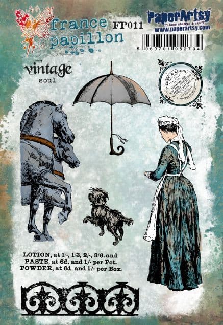
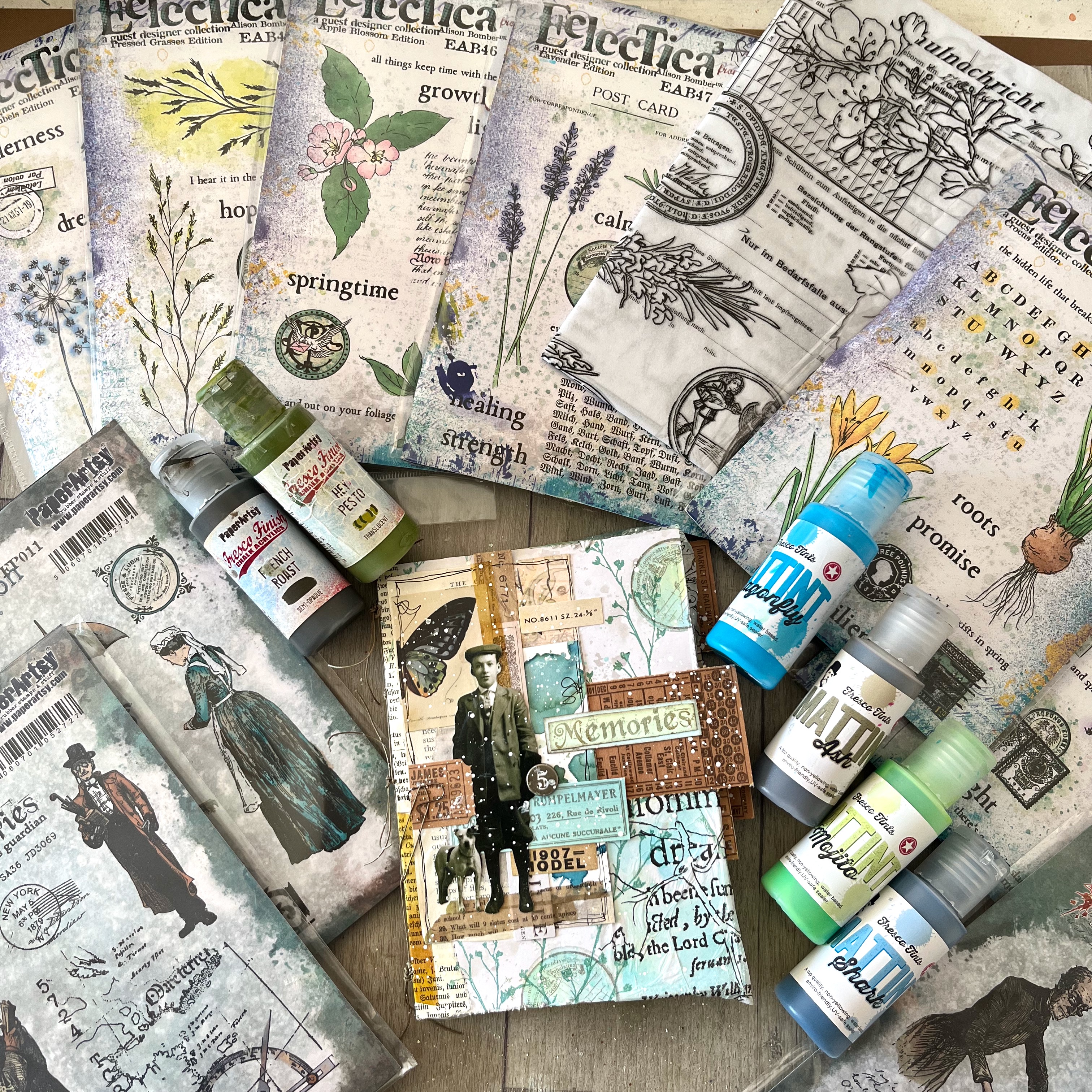
As you can see, I've used a LOT of stamp sets... FP010, FP011, FP012 are the France Papillon ones. The botanical stamping comes mainly from my new springtime sets, EAB45 Crocus Edition, EAB46 Apple Blossom Edition and EAB47 Lavender Edition; with EAB40 Pressed GrassesEAB41 Pressed Umbels and EAB42 Winter Grasses also in play.  

But I've also used ephemera from lots of my other sets - more about that to come down below... and of course all the products are available from PaperArtsy stockists worldwide.


I used a pack of pre-folded cards as the main substrate for my pages, and used Distress Inks to add the splotches and discolouring of aged paper.


I painted some Smoothy Stamping Card with layers of Mattints. I'm slightly obsessed by the new Mojito colour, especially combined with Dragonfly. Together they create gloriously sunlit turquoises, duck egg, tropical ocean tones, with some occasional River Deep thrown in for a deeper shade.


I used that painted card to stamp ephemera drawn from almost all my botanical stamps, from the first of the sets including imagery, EAB24, all the way up to the most recent, EAB47. (The 23 earlier ones were all quote collections, so no ephemera involved!) Thanks to the tonal variations across the pieces of card, each individual piece of ephemera is a slightly different colour, and yet they all harmonise together.


I smooshed some scraps of my Printed Tissue PT08 which were around on the craft table into the same colours.  Since the Mattints also work as a glue, while the colour was wet I was able to stick the tissue straight onto the pages as a first layer.  And (of course) I spattered some of the leftover Mattint onto the pages for extra colour and detail.


That Mattint glow on both the ephemera and the tissue is going to be crucial in bringing the storybook together as we progress...


The next steps were partly done page by page, and partly with an eye on the whole book. I wanted to make sure that the literary characters from France Papillon's sets would appear at fairly regular intervals, not all in a rush, so I had to watch the spacing from signature to signature.


When I say "signature", it's really only one card (not several sheets as you might usually expect a signature to be made up of), but that is four sides of decorative storytelling, so I needed to keep track of which order the pages would appear in. So although the horses above appear to be right next to the maid, this is the outside of the signature, so in fact they will end up several pages apart.

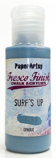
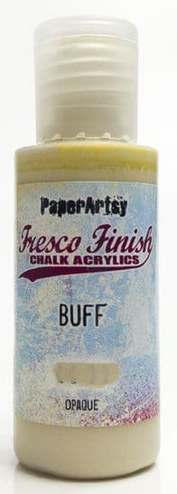
I used mostly Mattints to tint the images. Since they are completely transparent, you never lose the detail of the stamped image, no matter how many layers you put on. I did use occasional touches of Fresco Finish Chalk Acrylic when I wanted a particular colour but I either used translucent paints like Hey Pesto, or worked with washes (mixed either with water or with Mattints) so as not to obscure the stamping.


Earlier, I had created a series of collaged panels on Tim Holtz Wallflower papers, using my Mattint-ed ephemera as well as Photobooth, Snapshots and Paper Dolls. (You can see that whole process - including the full Mattint ephemera-making - here on my YouTube channel.)


That matching ephemera (which I loved so much that it inspired me to use the same ones for this project) suddenly made me wonder whether those panels maybe had a part to play in this storybook - with stories of their own to tell.


I wasn't sure whether the vintage photos would work alongside the book illustration characters - but as soon as I tinted the stamped images, I loved how they looked alongside the collaged panels.


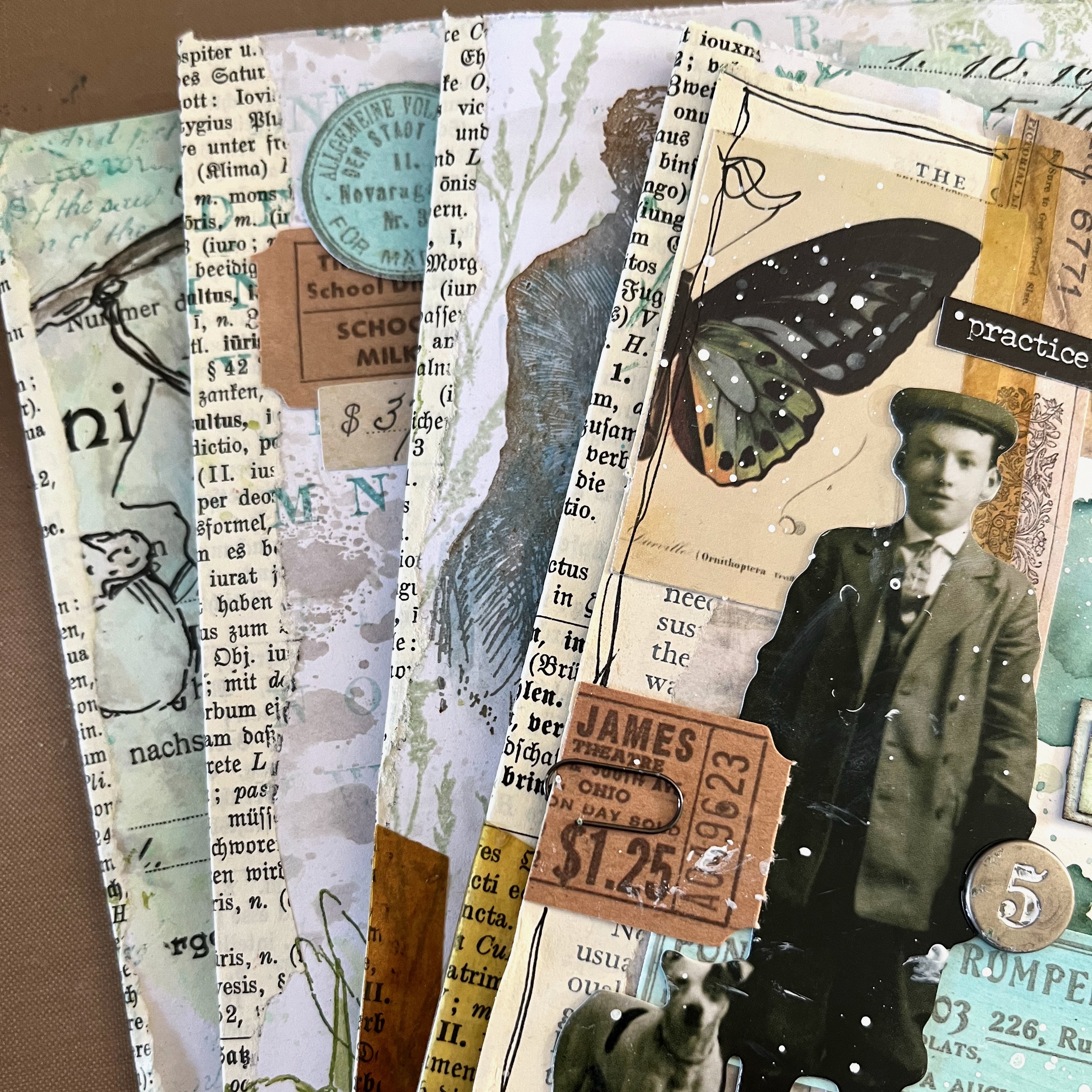
On each page with a tinted image, I started to build clusters of ephemera that echoed the ones on the panels.


And see what a difference the tinting makes, bringing the illustrations to life... Here's that maid with her newly tinted dress (River Deep and Shark, for the most part). It was at this point that I began wondering what she's holding in her hands that she is gazing at so intently - and that's how the stories start to emerge... they start to tell me things.  (More about that further on...)


So then it was a question of mixing and matching ephemera pieces (both hand-stamped and pre-made) across the pages - either alongside the tinted France Papillon illustrations, or added to the collaged panels. That intensifies the sense of them all being part of one cohesive whole... to allow them to "speak to" one another. (How perfect are those horses from FP011 - one "Mattinted" in Nutty and one in Ash?!)


Bits of ephemera were already sticking out over the edge of some of the panels, and I was able to reposition some of the ephemera to help embed them even further into the pages. Sometimes I cut a piece of ephemera in half and used one half with a photo panel and one half with a book illustration, so again the two are drawn together.


So by now, I had four "signatures" - that's to say four folded cards directed front and back on all sides...


... and it was time to take a deep breath and do some stitching to bind the whole thing together!  (These two photos show you all the outside pages... you'll have to carry on to see the inside spreads, and how these pair up together.)


I'd known from the start that I wanted to stitch my signatures eventually, so you'll notice (even way back in those early process photos at the start of this section) that I glued torn book page fragments to reinforce the spine of each card. Not only does that increase the sturdiness of the card where I needed to stitch, but it adds to the old book page theme of the whole project... good, eh?!


I found a number of videos on YouTube demonstrating the "kettle stitch" book binding technique, and followed those, using the book binding thread and needles which I have tucked in my stash. 


I'm very happy with how it came together... there are imperfections in the binding - a bit of wobbliness here and there, but you know me... I'm not that interested in perfection!! 


I'm absolutely thrilled with how this book has all come together. There are some of my stamps and some of France's on every single page... even on the cover. I had plenty of my ephemera there already, of course, and the EAB42 Winter Grasses, as well as the tissue paper in the background. So then, instead of picking one of the (many) large words on my sets, I decided the word Memories, from FP010 was actually a much more appropriate title for the book.


Using the Mattint-ed ephemera pieces as a recurring motif has allowed me to bring together quite different kinds of characters - from photos, from illustrations, from different time periods, and bind them into a harmonious whole.  


This post is already quite long enough, so rather than share all the stories from the book now, I'm creating a full length storytelling flip-through video which should go live on my YouTube channel at the same time as this post goes live.

What I will do now is give you a quick glimpse at each spread you find as you turn the pages.  There will be close-ups to come over on my Instagram grid over the next days and weeks, so keep an eye out there too.


This was such fun to make... a gradual process over several days, adding in bits and bobs that were around on the craft table, as well as creating bespoke elements to bring the pages together.


You don't have to follow my springtime colours, of course... but using something like the Mattint-ed ephemera, in whatever colours you love, allows you to bring a complex project together by having that repeated element involved.


And combining imagery by different designers will always give you a fresh perspective on all the stamps involved, so take a look in your collections to see what you could pair up. You might surprise yourself with how the combinations start to tell you stories!


I hope you've enjoyed this journey through the process, and I hope you'll join me over on YouTube to hear the stories which emerged from each page as I was creating this book inspired by my memories of the illustrated books I grew up with.


I suppose my love of those books, with their dense text and occasional illustrations, is just another example of why "Words and Pictures" is the perfect name for my creative presence online... how the storytelling passes from the words to the pictures and back again. I hope this book brings you as much joy as it does me.

Thank you so much for your company today, and happy crafting, all!

Alison xx


Add clickable links to your blog and social media hangouts, delete what you don't need


Watch out at Stampers Grove and Country View Crafts for workshops coming your way in May 2025!

Thursday, 11 May 2023

2023 Topic 5 : Tinged Blue {by Liesbeth Fidder-de Vos} with France Papillon stamps


Hi everyone!

It's Liesbeth here with you today. 

I just took a deep dive into the color mixing adventure and I can really recommend it to you as well! Go and read everything about Tinged Blue in the Topic Introducion here. This time the starting point is PaperArtsy Fresco Finish-Surf's Up, a medium blue that is easy to take in any direction as you will see in our different Tinged Blue topics from each blogger.

It's so interesting how different the mixing turns out by using the different second colours!
I choose a coloured neutral: PaperArtsy Fresco Finish-Buff , and a warm yellowish beige. I was so curious what would happen when I started mixing these two colours!


My project for using the mixed colours was some altered mouse traps...in fact rat traps because they are big! They are nice as a wall hanging and they can also be used as a memo holder or even a photo holder as I will show you later on. For Quarter 2 our theme is TEXTURE... I will show you two ways to create texture on the project.


For this topic of course the starting point was the two PaperArtsy Fresco Finish paints: Surf`s Up and Buff.


Another starting point for me was these wonderful PaperArtsy France Papillon stamp sets  FP010  and FP011. Oh how I love them! That very vintage style and the backgrounds and texts... just perfect! That's where I ran into a problem... the stamps were to big for my small mouse traps I normally use... so after a long search I found the big rat traps (7,5 x 17,5 cm), yessss! So my intended idea could proceed!


First I studied the colour mixing using PaperArtsy Fresco Finish Surf`s Up and PaperArtsy Fresco Finish Buff. I made a card with ten rectangles and started with the two pure paints on 1 and 10.


I added a small drop of Surf`s Up to a large amount of Buff and painted number 9 with the mix. For rectangle 8 I added a bit more...and so on until everything was filled up.


After drying this was the result! There were two things that particularly stood out to me: Some soft green appeared...beautiful! That actually makes sense because Buff is a bit yellowish, and yes ..as you will know .... yellow and blue makes green! Nice nice nice! Very strange in my opinion is the fact that in the lower row, 6 to 10, much more is going on than on the top row. As you can see, the difference between 6 and 10 is enormous.

A note from Leandra: Surf's up likely to dominate in the 1-5 zone as it has a higher VALUE than Buff (see the topic intro blog post for more on value and saturation), so the more easily it will be able to dominate the mixes in numbers 1-5 than 6-10.  
This is where colour mixing sometimes requires flexibility and instinct vs strict proportion based mixing. Both are valid experiments!
eg 1 part buff to 9 Surf's Up, 2 parts Buff to 8, 3 Buff parts to 7  ..this is the logical way to start your test, but what to do if the results are very similar for all those 3 mixes?  Another option is to wing it (!!) and use a lot more of the lighter colour and very little of the darker colour to get a wider variation. You could start with a big puddle of Buff, add a drop of Surf's Up, paint it out, keep adding another drop of surf's up and paint out the result over and over until you have a wide scale. I admit, this then makes it hard to get back to a particular colour in the future, whereas the logical scientific method of 'parts' allows you to always get back to the newly created colour. I think it is fun to try both methods to see how wide the variation can be with just 2 colours. This is the fun of colour mixing!

I smeared the left-overs of the mixed  paints onto a journal spread. A very good way to see the different nuances with an eye on the end result, and how the colours work together. I loved it, perfect soft look and so good for the vintage look I was searching for.


For my project I decided to use the colours from boxes 2, 6 and 9. I think it will be the very soft look I needed but with a good contrast between all 3 options.


I love the way PaperArtsy Fresco Finish Surf`s Up and PaperArtsy Fresco Finish Buff mix together. With my colours chosen, I am ready for my project!

I planned to make three photo holders/ wall hangings. First I removed most of  the metal parts of the rat traps using a plier. The clamp at the right side will be used again, so I kept the two parts.


After removing some of the metal parts, two holes appeared at the centre of the rat trap. PaperArtsy Grunge Paste is a perfect filler for this kind of things, I always use it as a putty! After drying I covered the traps with some layers of gesso, till the red mouse wasn`t visible anymore.


I found the metal parts way too shiny...not the vintage effect I needed. So first I painted them with the blue PaperArtsy Fresco Finish Surf`s Up. After that I added lots of tacky glue and covered every part with PaperArtsy Rusting Powder, and let dry well. (It's a panacea!)


I soaked the Rusting Powder parts with vinegar and covered the parts with a (soaked in vinegar) piece of paper towel. I let everything dry overnight...ignoring the smell.. ;-)


This is the result of the Rusting Powder, so beautiful! Look at the contrasts with the paints! And now I look at it I think it's texture as well...which is our theme this quarter!


And again: structure onto the wooden planks. Using PaperArtsy Grunge Paste and PaperArtsy Mini Mask PM017 I made this beautiful structured 'windows/flowers'. I had to remove one of the staples because there was no room for the stencil. I put it back in later.


I decided to add even more texture and aging by using some crackle glaze under the paint here and there. (PaperArtsy-Fresco Finish Crackle Effect)


As soon as the Crackle Glaze was dry, I mixed my colours using the two Fresco Finish Paints:
Surf`s Up and Buff.  I tried to recreate the colours 2, 6 and 9 from my sample card.


In a quick and cloudy way, not too carefully, I painted the fronts of the traps and also the metal staples. It became the nice, soft blended background which I was hoping for, and the beautiful crackles appeared immediately. I let everything dry well.


Time for stamping! I stamped the different stamps from the PaperArtsy stamp sets FP010 and FP011 onto a piece of thin tissue paper and tore them out. I chose a brown waterproof ink (Tsukineko StazOn-Spiced Chai), I Thought it would turn out a bit softer, more vintage, than black. As I said before..I never have a plan, so at this stage I didn't know where it would end. I really didn't know if I was going to use everything I stamped...and where...and how.


Onto the rat traps (they aren't rat traps anymore :-) ) I tried to make a good composition with the torn out stamped images and carefully glued them down with some gel medium.


Using a lighter brown (Tsukineko StazOn-Saddle Brown) I stamped some of the texts and other stamps from the two stamp sets here and there directly onto the painted surface.


At this stage, in my opinion, the traps were still a bit boring.. so it was time for my Twists and Turns!


My wall hangings needed a little more contrast and interest in my opinion. A 3rd color, PaperArtsy Fresco Finish Paint, Toffee, saved me! The mid-brown colour is almost the same as the StazOn- Spiced Chai, perfect. 

To match the colours even better I mixed  a bit of Toffee with a drop of Fresco Finish paint Surf`s Up. I painted the edges of the wall hangings with it.


I took one drop of the same mix and watered it down, with lots of water. It needed to be as translucent as a watercolour paint. I painted the stencilled (Grunge Paste) parts and the stamped tissue paper images with it. This was just what I needed to let it pop.


Now let's add some more rust and assemble everything!

I finished the pieces with a hanging hook and some embellishments. First, the picture frame hooks needed a bit of rust. I made a paste of some PaperArtsy Rusting Powder and a few drops of vinegar, mixed them till it looked like paint. I 'painted' the staples and the three hooks with this paste and let it dry a few hours.


As the final decorations I added some metal embellishments and a small bow as shown here below. I put the rusty clamps back in place...ready!


A wall hanging or a photo holder?? Both!


For as long as we've been mixing colours here at PaperArtsy in the wonderful colour topics, I've been doing a lot more with it and I really like it! You will learn to understand the colours and the mixing and I really can recommend it to you too! This lesson, based on PaperArtsy Fresco paint Surf`s Up, was again so interesting and instructive, and above all a lot of fun! And I'm so happy with the new colours I made for this project! 
Dive in and enjoy! Curious to see what you make!

Lots of love,   Liesbeth


More Posts to Enjoy