Showing posts with label Buff. Show all posts

Friday, 31 July 2026

Pocket Shrine "Seth-style" with SA {by Ann Barnes}


Hello everyone, Ann here with you today sharing a folded "Seth-style" pocket shrine using the newest Seth Apter Stamp Release for PaperArtsy. 

I was thrilled to receive the three new Seth Apter stamps from PA HQ. Seth's designs never disappoint; and these newest stamps are some of my favorites! It's definitely worth checking out Seth's PaperArtsy Release Blog created for these new sets, it offers insight into the designs as well as inspiration from the designer himself!


Seth's stamp designs are so perfect for incorporating into backgrounds and creating mixed media abstract art. For this project I wanted to create something meaningful that allowed a few of the designs to become focal points. I decided to make a pocket shrine, combining my love for religious art with Seth's unique grungy, layered style. This is a special piece that can be used for prayer or contemplation. I drew color inspiration from the image of Mary, choosing PaperArtsy Fresco  Chalk Acrylic in Castleton (FF231), Admiral (FF233), Tomato (FF229), Buff (FF96), and Gold Rush (FF204).


Using images stamped onto PaperArtsy Printed Tissue - Blank (PT10), I was able to figure out the shrine sizing. I cut the shrine shape from a piece of primed canvas. Working on the outside surface, I began to add layers of paint first with a brayer, and then with a chip brush.


I started with a layer of Buff (FF96) then built up layers with the colors, each time brushing more Buff on top to create a muted and worn look. Partially stamping different images randomly onto the surface added texture. I stamped in Tomato (FF229) along the fold locations to create a binding appearance. I love how this looks when the shrine is folded.


The interplay of this lined image atop the canvas texture gives the surface a linen appearance. It's a good idea to put the stamps into water after using them with paint, they are much easier to clean.


As soon as I saw the frame image in Seth Apter Set 53 (SA053), I knew it would be amazing in 3D. Stamping into air dry clay allows you to create a relief of the image.


I rolled out the clay onto my craft surface. I kept the thickness to about 1/8". The thicker the slab you create, the longer it will take to dry. Also note that if it is very thin, it will be extremely fragile. Stamp directly into the clay with consistent pressure. (Note: spritz the stamp with water before stamping for easier release after impression.)


You can make various versions of the frame by cutting out different sections. The central opening can be removed or remain intact; while the outside can be decorative or square. There are many variations you can try. Adding color to the raised edges or within the recessed areas allows the design to stand out visually.


Once you select the frame style you desire, the rough edges are easily cleaned up with a small piece of extra fine sandpaper or by using a craft knife to scrape away any excess.


When the pocket shrine is unfolded, the beautiful interior is revealed. I chose the mandala style stamp image to balance the central framed piece. I stamped the image with Ranger Archival Ink in Watering Can onto separate papers and allowed it to dry. I colored the image using watercolor paints, then set it aside to dry.
 

I next worked on creating the main background for the interior of the shrine. I painted the entire surface of the canvas with Castleton (FF231). This color complements the watercolored images as well as the framed Madonna. Using a hardened paintbrush, I added streaks of Buff (FF96). This created a textured effect adding interest while also softening the appearance. The patterned areas were created using the repeating diamond shape stamp, and gold embossing powder. This surface makes me think of a wallpaper design.


With the main interior background complete I wanted to focus on the pocket. This is where the outside surface becomes an interior surface. To close the edges securely, I stamped some twill with the tread-like stamp. The twill ribbon was narrower than the stamp, which allowed me to create a unique pattern. I secured this around the right and left sides of the pocket with glue.


I wanted to add a special detail to the top edge of the pocket. This was created by stamping and embossing the DNA-like pattern onto a piece of paper then fussy cutting around the design to create a unique "Ric Rac" piece. This piece was trimmed to the correct length and attached to the pocket just below the red stamped edge.


I stamped out the bubble letter phrases onto paper with Ranger Archival Ink in Cobalt. Then using a small circle punch, I punched out the circled letters to form the word MARIA. These were glued in place along the base of the pocket.


When the two watercolor panels were dry, I added gold details with a metallic pen as well as some gemstones to embellish. I then attached them to each side panel with French knot stitches at all four corners.


I want to make the outside closure flap very special. To do this, I emboss the radial circular stamp in gold. Red stitches follow some of the rays upwards accentuating the design and mimicking the attached flaming heart Milagros.


On the inside of the flap, I added pieces of thread to balance the stitched threads and glued an accent piece at the center.


I love how the different patterns interact, can you spot at least 6 different stamps in the detail image above?


The frames I created are truly beautiful. I am looking forward to using the extras in different projects.


The connections between the "DNA strands" created the perfect spot to attach additional Milagros.


Here is a close up view of the stamped twill used to secure the pocket sides.


I made a few cards that can be tucked into the pocket, for a prayer or special intention. I love the way that the designs look embossed in gold and colored with watercolors.


I love the way this turned out. I have so many ideas for using these new stamp sets from PaperArtsy, and look forward to sharing more! I can imagine creating a pocket shrine to hold a treasured coin or good luck piece to carry with you. I think I might try my hand at making some of the "bits" Seth shares on the blog. There are so many possibilities! If you are interested in grabbing any of the newest stamp sets, there is a list of stockists on the PaperArtsy site where you can find one that's located in your area. Hopefully you are inspired to get creative.

I'm so happy you stopped by,  Ann xx


Thursday, 11 May 2023

2023 Topic 5 : Tinged Blue {by Liesbeth Fidder-de Vos} with France Papillon stamps


Hi everyone!

It's Liesbeth here with you today. 

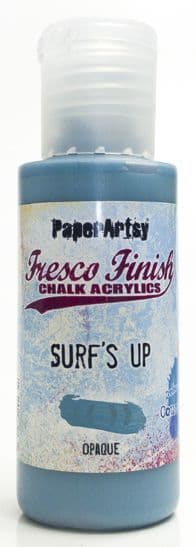
I just took a deep dive into the color mixing adventure and I can really recommend it to you as well! Go and read everything about Tinged Blue in the Topic Introducion here. This time the starting point is PaperArtsy Fresco Finish-Surf's Up, a medium blue that is easy to take in any direction as you will see in our different Tinged Blue topics from each blogger.

It's so interesting how different the mixing turns out by using the different second colours!
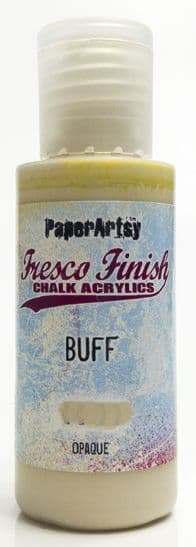
I choose a coloured neutral: PaperArtsy Fresco Finish-Buff , and a warm yellowish beige. I was so curious what would happen when I started mixing these two colours!


My project for using the mixed colours was some altered mouse traps...in fact rat traps because they are big! They are nice as a wall hanging and they can also be used as a memo holder or even a photo holder as I will show you later on. For Quarter 2 our theme is TEXTURE... I will show you two ways to create texture on the project.


For this topic of course the starting point was the two PaperArtsy Fresco Finish paints: Surf`s Up and Buff.


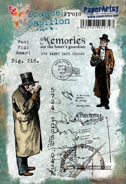
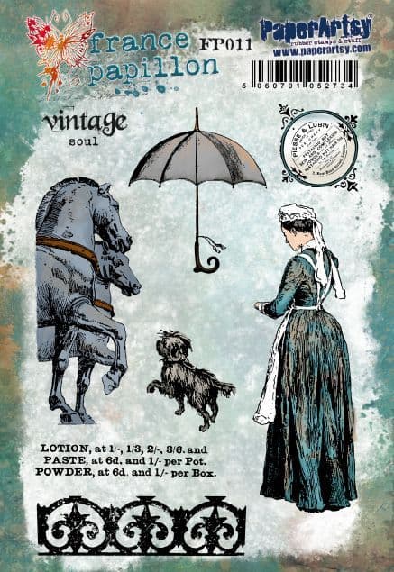
Another starting point for me was these wonderful PaperArtsy France Papillon stamp sets  FP010  and FP011. Oh how I love them! That very vintage style and the backgrounds and texts... just perfect! That's where I ran into a problem... the stamps were to big for my small mouse traps I normally use... so after a long search I found the big rat traps (7,5 x 17,5 cm), yessss! So my intended idea could proceed!


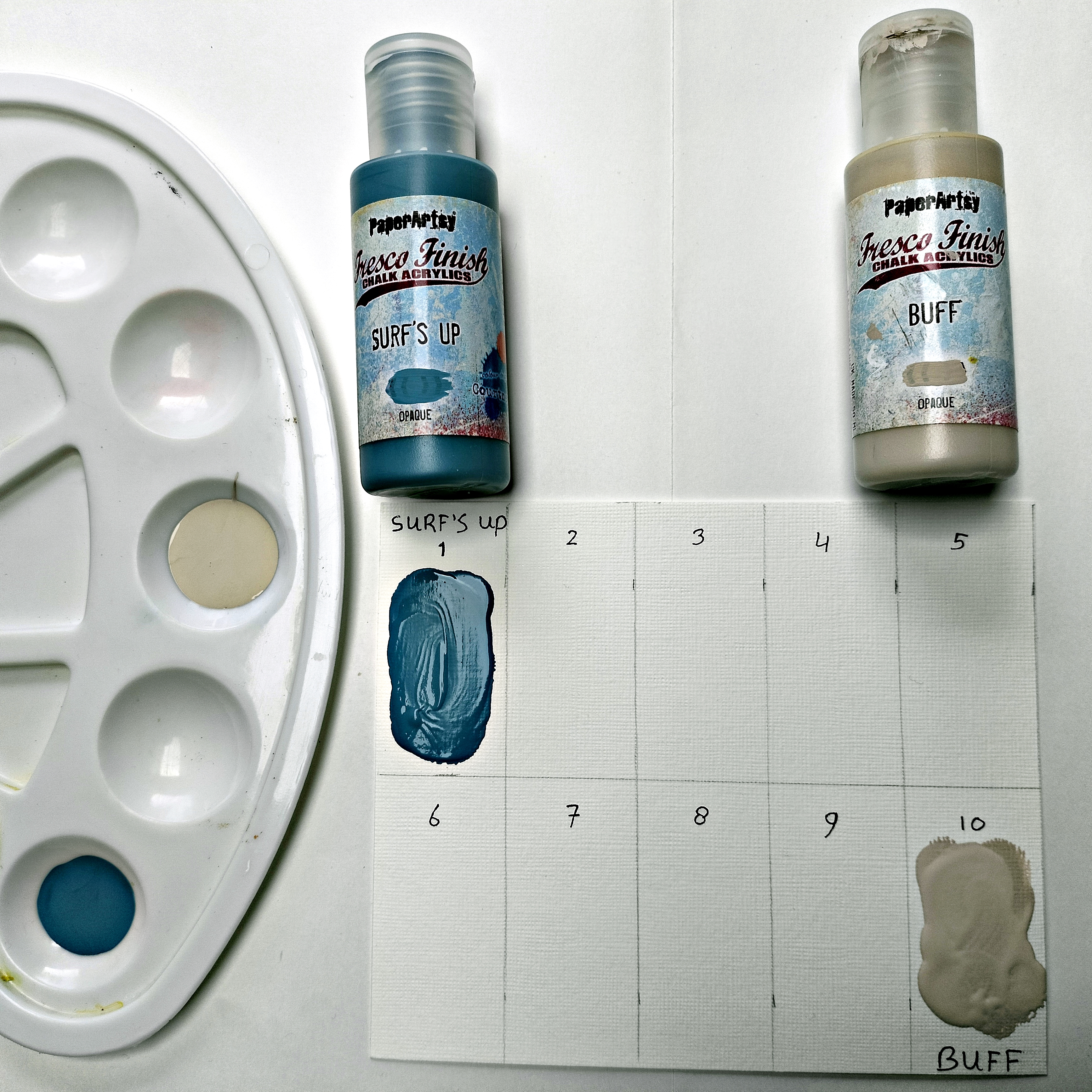
First I studied the colour mixing using PaperArtsy Fresco Finish Surf`s Up and PaperArtsy Fresco Finish Buff. I made a card with ten rectangles and started with the two pure paints on 1 and 10.


I added a small drop of Surf`s Up to a large amount of Buff and painted number 9 with the mix. For rectangle 8 I added a bit more...and so on until everything was filled up.


After drying this was the result! There were two things that particularly stood out to me: Some soft green appeared...beautiful! That actually makes sense because Buff is a bit yellowish, and yes ..as you will know .... yellow and blue makes green! Nice nice nice! Very strange in my opinion is the fact that in the lower row, 6 to 10, much more is going on than on the top row. As you can see, the difference between 6 and 10 is enormous.

A note from Leandra: Surf's up likely to dominate in the 1-5 zone as it has a higher VALUE than Buff (see the topic intro blog post for more on value and saturation), so the more easily it will be able to dominate the mixes in numbers 1-5 than 6-10.  
This is where colour mixing sometimes requires flexibility and instinct vs strict proportion based mixing. Both are valid experiments!
eg 1 part buff to 9 Surf's Up, 2 parts Buff to 8, 3 Buff parts to 7  ..this is the logical way to start your test, but what to do if the results are very similar for all those 3 mixes?  Another option is to wing it (!!) and use a lot more of the lighter colour and very little of the darker colour to get a wider variation. You could start with a big puddle of Buff, add a drop of Surf's Up, paint it out, keep adding another drop of surf's up and paint out the result over and over until you have a wide scale. I admit, this then makes it hard to get back to a particular colour in the future, whereas the logical scientific method of 'parts' allows you to always get back to the newly created colour. I think it is fun to try both methods to see how wide the variation can be with just 2 colours. This is the fun of colour mixing!

I smeared the left-overs of the mixed  paints onto a journal spread. A very good way to see the different nuances with an eye on the end result, and how the colours work together. I loved it, perfect soft look and so good for the vintage look I was searching for.


For my project I decided to use the colours from boxes 2, 6 and 9. I think it will be the very soft look I needed but with a good contrast between all 3 options.


I love the way PaperArtsy Fresco Finish Surf`s Up and PaperArtsy Fresco Finish Buff mix together. With my colours chosen, I am ready for my project!

I planned to make three photo holders/ wall hangings. First I removed most of  the metal parts of the rat traps using a plier. The clamp at the right side will be used again, so I kept the two parts.


After removing some of the metal parts, two holes appeared at the centre of the rat trap. PaperArtsy Grunge Paste is a perfect filler for this kind of things, I always use it as a putty! After drying I covered the traps with some layers of gesso, till the red mouse wasn`t visible anymore.


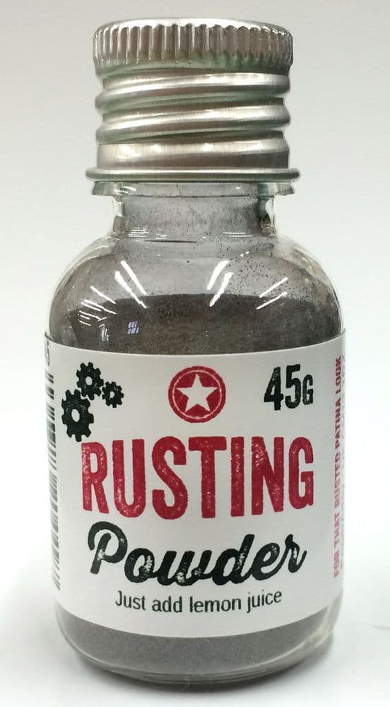
I found the metal parts way too shiny...not the vintage effect I needed. So first I painted them with the blue PaperArtsy Fresco Finish Surf`s Up. After that I added lots of tacky glue and covered every part with PaperArtsy Rusting Powder, and let dry well. (It's a panacea!)


I soaked the Rusting Powder parts with vinegar and covered the parts with a (soaked in vinegar) piece of paper towel. I let everything dry overnight...ignoring the smell.. ;-)


This is the result of the Rusting Powder, so beautiful! Look at the contrasts with the paints! And now I look at it I think it's texture as well...which is our theme this quarter!


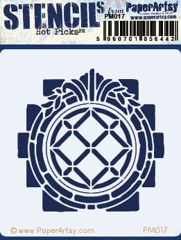
And again: structure onto the wooden planks. Using PaperArtsy Grunge Paste and PaperArtsy Mini Mask PM017 I made this beautiful structured 'windows/flowers'. I had to remove one of the staples because there was no room for the stencil. I put it back in later.


I decided to add even more texture and aging by using some crackle glaze under the paint here and there. (PaperArtsy-Fresco Finish Crackle Effect)


As soon as the Crackle Glaze was dry, I mixed my colours using the two Fresco Finish Paints:
Surf`s Up and Buff.  I tried to recreate the colours 2, 6 and 9 from my sample card.


In a quick and cloudy way, not too carefully, I painted the fronts of the traps and also the metal staples. It became the nice, soft blended background which I was hoping for, and the beautiful crackles appeared immediately. I let everything dry well.


Time for stamping! I stamped the different stamps from the PaperArtsy stamp sets FP010 and FP011 onto a piece of thin tissue paper and tore them out. I chose a brown waterproof ink (Tsukineko StazOn-Spiced Chai), I Thought it would turn out a bit softer, more vintage, than black. As I said before..I never have a plan, so at this stage I didn't know where it would end. I really didn't know if I was going to use everything I stamped...and where...and how.


Onto the rat traps (they aren't rat traps anymore :-) ) I tried to make a good composition with the torn out stamped images and carefully glued them down with some gel medium.


Using a lighter brown (Tsukineko StazOn-Saddle Brown) I stamped some of the texts and other stamps from the two stamp sets here and there directly onto the painted surface.


At this stage, in my opinion, the traps were still a bit boring.. so it was time for my Twists and Turns!


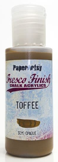
My wall hangings needed a little more contrast and interest in my opinion. A 3rd color, PaperArtsy Fresco Finish Paint, Toffee, saved me! The mid-brown colour is almost the same as the StazOn- Spiced Chai, perfect. 

To match the colours even better I mixed  a bit of Toffee with a drop of Fresco Finish paint Surf`s Up. I painted the edges of the wall hangings with it.


I took one drop of the same mix and watered it down, with lots of water. It needed to be as translucent as a watercolour paint. I painted the stencilled (Grunge Paste) parts and the stamped tissue paper images with it. This was just what I needed to let it pop.


Now let's add some more rust and assemble everything!

I finished the pieces with a hanging hook and some embellishments. First, the picture frame hooks needed a bit of rust. I made a paste of some PaperArtsy Rusting Powder and a few drops of vinegar, mixed them till it looked like paint. I 'painted' the staples and the three hooks with this paste and let it dry a few hours.


As the final decorations I added some metal embellishments and a small bow as shown here below. I put the rusty clamps back in place...ready!


A wall hanging or a photo holder?? Both!


For as long as we've been mixing colours here at PaperArtsy in the wonderful colour topics, I've been doing a lot more with it and I really like it! You will learn to understand the colours and the mixing and I really can recommend it to you too! This lesson, based on PaperArtsy Fresco paint Surf`s Up, was again so interesting and instructive, and above all a lot of fun! And I'm so happy with the new colours I made for this project! 
Dive in and enjoy! Curious to see what you make!

Lots of love,   Liesbeth