Showing posts with label ESA25. Show all posts

Monday, 13 March 2023

2023 Topic 03: Focus on Seth Apter {by Keren Baker} with Seth Apter Products


Hi everyone, Keren here today with a little forage into sewing using Seth Apter's wonderful stamps. I was interested in incorporating different sewing techniques as well as some other things I'd been wanting to experiment with. This blog post for me was going to be more about the journey rather than the final destination.


It turned out that I totally love natural dyeing but not using brown tones so I'll be on the hunt for blues, pinks and greens instead! It also made me want be more artistic with my sewing as opposed to my usual relatively clean and simple style.


I've recently been looking at Catharine Ellis and Caitlyn Irwin and enjoying learning about dyeing fibre and fabric with natural elements like onion, pomegranate, eucalyptus and more. So although I wanted to sew with Seth's stamped images, I wanted to create a fabric colour and also try and fashion a different substance to sew onto (but more about that later). It turns out that onion skins and toilet paper actually make fabulous raw ingredients. Let me show you why!

Here's what I started with- all (except the Gold) being Fresco Finish Chalk Acrylic paints in Seth Apter colours. I actually only ended up using these: Butter, A Bit Fishy, Green Patina, Toffee Apple and Stardust.


I also gathered toilet paper, threads, white mercerized cotton and onions.


I decided against just one project, wanting a selection of tags to act as resource for when the mojo goes missing!


To begin with, it was time to dye! Remove all the onion outer papery skins (I mixed red and yellow onions but really wished I'd had more red and therefore ended up with a more pinky hue. Add enough water to cover the fabric you're using. As I was stamping onto the fabric, I chose mercerized cotton which allows for a more crisp end effect. In order to prepare the fabric, you need to 'scour' it by washing it on a rinse and spin. Now heat the water until you achieve a desired colour.


To keep an even colour, you need to strain the skins and if you use some muslin, you'll usefully also have that dyed for another project.


You'll end up with a coloured dye. Pop it back into your chosen boiling implement (which ideally will be stainless steel and reserved for dyeing) and heat again.


I wanted an ombre effect so only dipped a portion of the fabric and kept splashing up dye intermittently. The fabric will dry a slightly lighter colour so you need to keep that in mind. Dry naturally and you are ready to use it.


The other preparatory steps were to do some basic paper casting. Super easy and a great way of adding texture that's lightweight to any project. Grab these supplies:


Spray water over the stamps. It's helpful to have them on an acrylic mount. Grab your toilet paper- it doesn't matter if it's embossed paper as it will flatten out. Add a layer, spray that, add another layer, spray that too. I used 3 sheets. Make sure it's really wet,(but not sopping) and gently push down into the grooves of the stamped image. Press carefully so not to tear the paper. Leave to dry.


Once totally dried, remove from the stamp, trim and you end up with some amazing casts. Just be mindful that if you add too much moisture or wet substance, it's likely to flatten again.


My fabric once dried was a little disappointing. I loved the ombre effect and the texture before ironing but didn't love the colour. I loved the paper casts and couldn't wait to use them. Now I needed to add these elements to the project tags and get sewing.
 

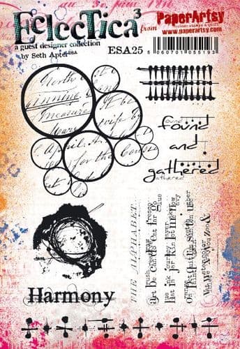
Time to stamp. I grabbed two Seth sets: ESA23 and ESA25.


Stamping using paint is easy enough but application is key. I found it easiest using a foam applicator (some inexpensive makeup sponges) and pouncing gently onto the stamp. A good even coat and an even pressure onto the fabric will give great results.


You can see how intricate the images are and the quality of the rubber stamps. I love that Seth's stamps are abstract enough for you to imagine them as different things. I also imagined the larger image as a cabbage too! I added the lines with circles as flower stalks and their parallel positions fitted in well with our overarching theme of 'Tracks'.


I had some linen type fabric for doing hand-sewing. Because it's quite rough, a stamping platform was of massive help here. I used Archival Ink and re-stamped 3 times to get a decent density of black colour. I wanted to build my stitches like brick work and the lines were easy to trace with stitches. Stitched thread 'tracking' around the outer shapes.


One of the elements that surprised me was how with 2 or 3 layers of stitches, the fabric started to bow upwards, as if embossed. I thought it might be interesting to highlight that, adding wadding to the reverse to protect and enhance the curve. I could then add some double sided adhesive layers to affix onto a tag.


In my attempt to find muslin when straining, I'd inadvertently picked up some fusible stabiliser. The fabric with the 'flowers' on seemed bare and uninteresting and I thought if I added some green to the top of the interfacing, I could simply iron leaf shapes onto the stems.


As I looked at the sewn tag, it too seemed unfinished. I grabbed some Matt Duralar which I knew would be great stamped and sewn on, and it added that extra dimension that was missing.


Now I needed to add some little details and finish off.

I found incorporating the paper cast flowers really challenging. I needed some colour to contrast them against but equally they seemed too plain to not add colour to them too. I dry brushed some of the colours, carefully blending those that would mix to nice new colours and then added some Stardust in the opposite direction, having a tartan style in my head. The grey knocked back the 'brights' a little too. Adding black embossing powder helped with the textural combination.


Dry brushing paint worked well with the flowers. I did go a little overboard and should have stuck just to the edges. If you flick the edges a little, the layers will start to separate which makes the finished flower a little more dimensional. You can see where I've stitched in the centres. The stamped sleeve of Duralar seemed to help ground the design.


I rarely have 'found' objects- I guess I should look for them more, but as I was trying to finish off the circles tag, I wanted to add some marks (Seth's love of found objects and mark making hadn't been lost on me!) and just dumped the bottom of my white gel pen into the paint and just 'stamped' it around. It echoes the other circles and felt like it helped tie the opaque sleeve with the rest of the tag.


My giant tag was languishing. Adding some French knots and mounting it on wadding then sewing on my machine gave it more structure but I felt like I'd lost the subtlety of the painted flowers. It was done though, so I had just to finish it by mounting on some strong cardboard.


In artistic endeavours, you never love everything. Were it not for the fact I'd learned so much creating the flower tag, it'd probably have ended up in the 'bin of rejection'!!! Here's the three, side by side!


I learned two new techniques, that I will be exploring more. What happens when you add Infusions onto the stamps before or after wetting? What's the final result on the paper casting? What shades can I achieve by dyeing with everyday plants and vegetables or fruits around me, and how can I incorporate them into my art.

But also, I really didn't like the final massive tag with the paint stamped flowers. I nearly used the floral panel to make a journal cover and I'm sorely disappointed that I didn't as the crisp edges of a die-cut journal would have looked much better. I love the faux tartan-esque brushing and will definitely try that one again. 
I was really inspired by Seth's love of mark making and will try and remember to pick up random objects off my desk to add into my projects ;-)

Keren x


Saturday, 30 October 2021

2021 Topic 13: Tiny (News) Print with ESA {by Jenny Marples}

    2021 Topic 13: Tiny (News) Print

Making a scene from non-scene type images is a clever stretch of any stamps. Jenny has been experimenting with some of Seth Apter's new stamps and made a fabulous wall of words. She's got some great tips for making your stamping look metallic and creating more natural looking foliage and flowers.
~ Keren

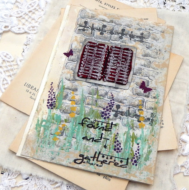
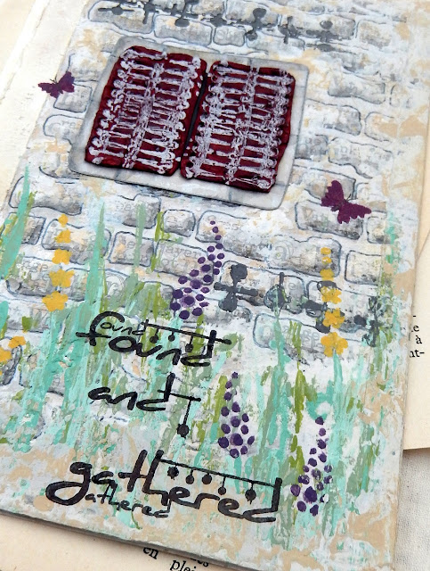
Hi everyone, it's Jenny (Pushing The Right Buttonswith you today, and I'm here to share with you a new journal page that features images from one of Seth Apter's new releases. 

I am a huge fan of Seth's designs particularly because they are so often based on the architectural and structural features he sees around him every day in NYC. Looking at them from a different perspective they could also represent things seen in and on buildings in other parts of the World, like a cottage in rural France for example...


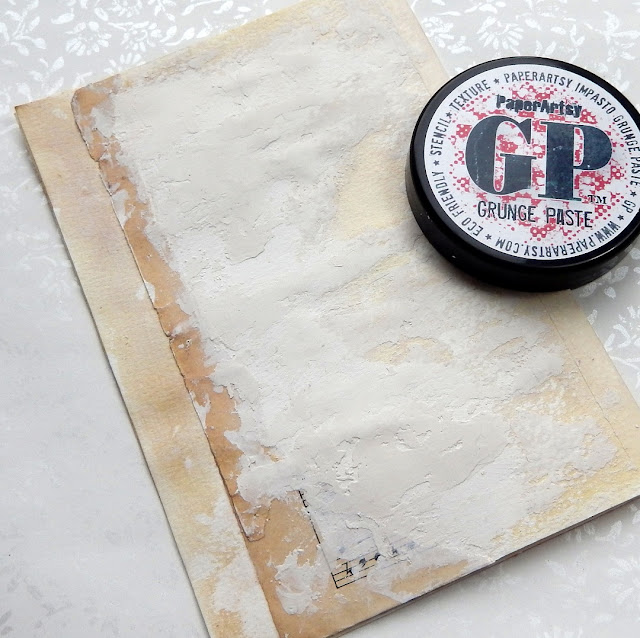
This piece begins with the edge of a torn piece of manuscript and some PaperArtsy Grunge Paste, all designed to give the feel of the side of a rustic building.


Apply Sand, Stone, Heavy Cream and Chalk Fresco Finish paints in layers (working from dark to light) with a spatula to blend the manuscript and Grunge Paste together.


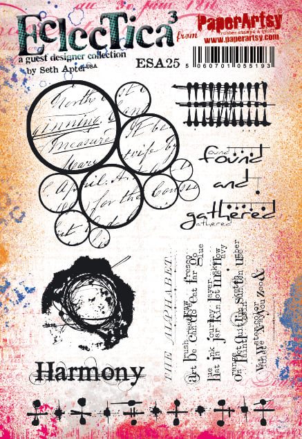
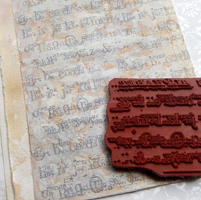
Seth's 'The Alphabet' text stamp from his new ESA25 stamp set was the original inspiration for this whole piece - to me the way the letters and surrounding tiny text have been grouped look like uneven brickwork.

  
Repeat stamp 'The Alphabet' (minus its title section and final line) using a pale grey permanent ink, knowing the uneven layer of Grunge Paste beneath will give the stamping a worn feel by missing parts.
 

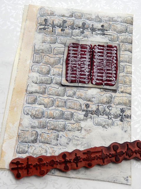
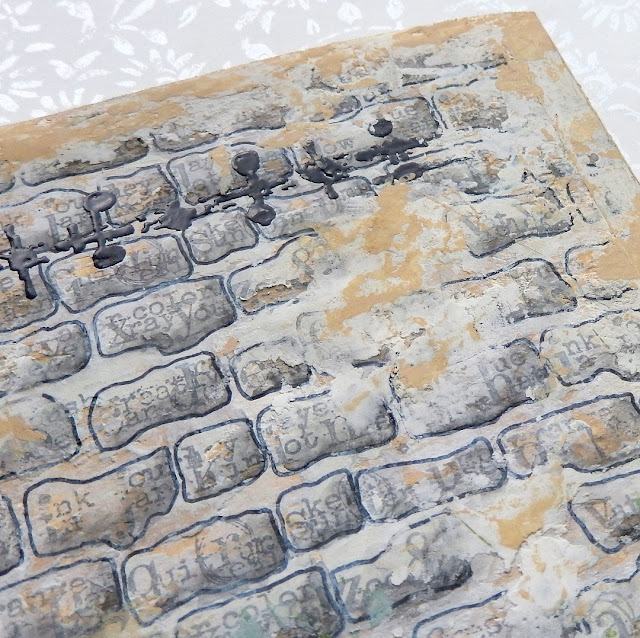
Use the grouping of the letters as a guide and draw around them with a permanent marker (black or dark grey are perfect for this). I would suggest practicing on a piece of scrap of paper so you can work out what you want your 'bricks' to look like.
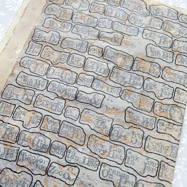
 
 
Add some shading to make the bricks look more realistic - I used a watercolour pencil along the bottom and left-hand side of each brick, blending out the shading with a water brush. At this point you can reapply patches of Grunge Paste to break up the pattern a little and tone down the lines around the bricks if they are too prominent with some more paint.
 

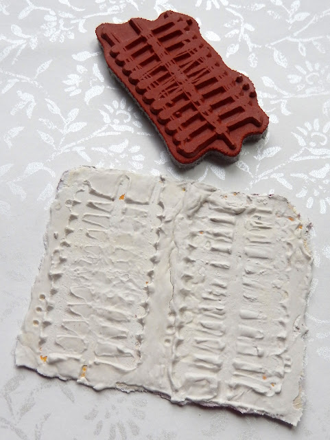
This second stamp from Seth's set immediately reminded me of window shutters. To recreate them start by applying a thick layer of Grunge Paste to a piece of card. Allow it to start to dry a little then push the stamp into the paste to create an impression. Two hints; first, if it doesn't create the right impression use a wet spatula to smooth out the paste and try again. Second, make sure to spritz your stamp with water before plunging it into the paste and wash it as soon as you've finished to remove excess paste.
 
 
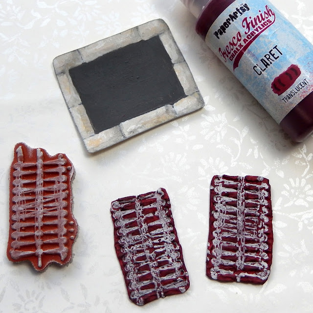
When the embossed paste has dried paint it and then re-stamp with a contrasting permanent ink (I used a white StazOn Pigment pad for this). You can make a 'mount' for your completed shutters by drawing brick shapes on a slightly larger piece of card, painting them with the same paints as the main wall. It's worth painting the centre of the mount too since some of it may show when your shutters are glued on top.


Older walls often have metal ties inserted into them to prevent them from pulling apart and ultimately falling down! Another of the stamps from Seth's set is perfect for recreating those. Try clear embossing over your stamped 'ties' to give them a metallic look.
 
 
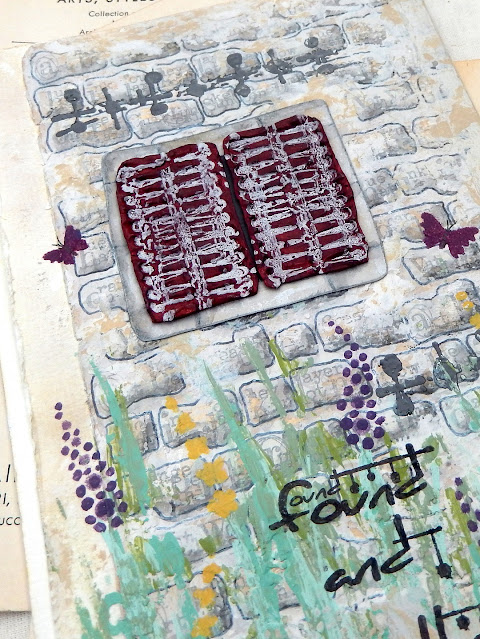
With the building 'constructed' it's time to add some prettiness and colour. One place to start is with Kay Carley's stencil PS080 which helpfully includes little butterflies and dragonflies as well as the grasses and flowers found in a rural border. Use a mix of green shades for a more realistic feel.


After starting with the stencilled greenery you can make it even more 'wild' and unstructured by dipping a wooden skewer into the various green paints and adding pointed lines over the top. I also added extra detail to the flowers following the positioning from the stencil.


It's often only when you get to see the 'almost complete' stage of a project that you can take a step back and consider if it needs any adjustments. In this case with the walls looking too grey I went back over the edges with a little more Grunge Paste and followed up by adding patches of the Sand coloured paint.


The window panel was glued into its final position, a little over from where it was originally planned.

 
To help draw the eye around the finished page a little better, a couple of the tiny butterflies were stencilled in place using a mix of the Claret and Grape paints. You can draw in the tiny details like the antennae with a fineliner pen.


I found when it came to stamping the phrase 'found and gathered' from Seth's stamp set it didn't quite fit around the flowers. To make it work I stamped the first two words independently of the third, moving that one a little further over to the right.


Here's a reminder of what the finished piece looks like;


Take a look at the images in your stamp sets with fresh eyes to see what they bring to mind. It may be something you've encountered on adventures abroad or even something much closer to home. You don't need to draw an entire building or landscape to capture the feel of those surroundings.

Thank you so much for stopping by.