


Hi everyone,
It's Asia here with you today (Lemon Creation Art) here with you today.
I would like toshow yçou how I created an art journal page on black background. We do not usually use black papers for our projects, but lately I got to loke creating on black and playing with opaque colours. Some of these colours look better then others on the black background and I am always happy to experiment! That's why the topic Monochrome spoke to me straight away. PaperArtsy has so many opaque acrylics, which are just perfect for it. Plus, there is an addition of Topography theme this quarter and I am crazy about letters and numbers! In all- just a perfect theme for me.

Today I am going to show you some of the opaque purple colors, make an art journal page perfect for beginners, but with some cool technique for advanced artists as well and tell you about the common problems when working on a black paper.


Here are the supplies I will be using today, but let me first start with the paints and my black paper.
The first thing while working on a black paper is to choose well your colours (in my case one colour, so it was even more important to choose well). Why I choose purple? I love purples and I have to say that PaperArtsy has a lot of opaque purples, so it was just a question of finding one and get the most of it.
To this end I decided to do the swatches and I strongly advise you to do the same when working on black paper. As you know the colors will look differently on black and a lot of them will not even be visible. That's why the opacity of colours is so important here- the more opaque colour, the better will be visible on black paper. So chose wisely and you will create surely a beautiful art!

Out of all thses beautiful purples I decided to go with Berry Nice Fresco Finish Acrylic- I love this particular shade of purple and I found it really opaque and, well, sort of cute :) Cute goes nicely with grunge projects. It will soften the effect of grunge a little and as it is quite bright, it will be a good contrast to black. I will also add a little bit of white with Snowflake Fresco Finish Acrylic.


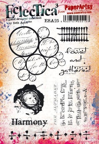
Of course I can't live without some beautiful stamping and my choice fell today on Seth Apter's stamps: ESA35 and ESA23- amazing choice of grunge!


For grunge project a little bit of mess is necessary. That's why I will start with some random stamping in the background. I will use parts of both stamps and for stamping I will use Snowflake Fresco Acrylic. The stamping will not be perfect, as it will be done with acrylic paint, but it will create grungy background.

When stamping with acrylics you can either use brush to add the paint to the stamp as I did here (the stamped image will be more precise), or you can just kind of "dump" the stamp into a pool of paint and then stamp it onto the paper (image will be quite blurry and messy). One more thing you need to remember when stamping with acrylics is to wash your stamps in the soapy water straight away, to avoid permanently damaging them.

Here are some examples of my acrylic stamping- as you can see the images are a little bit messy (what I was aiming for anyway), but also quite visible (you can still see the letters). When doing grungy stamping, you do not really need to keep your stamp on the acrylic bloc, you can just as easily keep it in your fingers and just stamp this way.

Numbers and letters are my "go to" very often when doing grungy backgrounds, so since I have in my stash another one of Seth's stamps- ESA24. I used a part of it to add more interest to the page.

I did the same with part of his other stamp- ESA23.

If you are wandering what is missing, it's splatter, of course! I had some leftover paint and it was just enough to creat some beautiful splatter.

Now, let's move to the focal point, or rather few focal points.

For the focal point (points) I will be using the circle elements from Seth Apter's stamps: ESA35 and ESA23. Circles are such a beautiful form to work with and since Seth's stamps are definitely on the grunge side, they will work perfectly with my background. This time I decided thought to stamps them not on the black background, but on the background coloured in purple.

This colour- Berry Nice Fresco Finish Acrylic- is just so amazing on the black background and so vivid!
When the background is completly dry, I will emboss it with WOW white embossing powder. The white powder will be contrasting nicely with white stamping on the background (stamping is very mat, while embossing has a glossy feel to it). Thanks to that and the stamping on the purple paper, the focal points will be well visible.

Since I was not sure which elements I will use as focal points, I stamped and embossed few of them. This way I will have a choice.

And of course the last part of this process was to fussy cut them all.


Even though I made my focal points, I was thinking that there is something missing.I wanted to add more purple paint to the page and make the focals a little bit more varied. I was not totally sure if I am making the right decision, but I decided to, once again, do some stamping with acrylic paint. This time with Berry Nice Fresco Finish Acrylic and the smallest part of the stamp ESA35.

I think it was a good decision. The stamping worked really well and it gave a little bit of different feel to the whole project, which you will see in the close-ups. Sometimes it's really good to mix up techniques to create different layers. Here I mixed embossing and stamping with acrylics, stamping on the black background and on the purple one. These are all simple techniques, but at the end the effect is just so cool. And grungy.

Time for the nicest part of the project- putting it all together! I love this part and today was no exception. There were moments during this project when I was not so sure if all will work at the end ( too much grungy stamping in the background? Too many focal points? Not enough focal points??? ), but now, looking at the finished page in frony of me, I am trully happy.
But before this happiness happened, there were still some steps to take to finish it off.
Firstly I placed my fussy cut circles on the page and tried few arrangements until I was satisfied with it.

Of course I ended up not using all of the fussy cut elements, but it's always better to have too many, then not enough! I cut off the part of one stamped circle (it is a nice thing to add some elements coming a little bit out of the page, it gives more interest to the whole project).

A little bit of purple splatter:

And a little bit of white thread placed under one of the circles. Plus a glue to hold it all together.

Here is the finished page:


I do believe that when making any kind of grunge project, you do not have to stress too much. Maybe this is why I love it so much! In this case I was happy to make it on black background, as I feel that black gives more of this grungy feel. Plus, I had to use some kind of typography elements on the project and this is one of my all time favourite elements to go to when I am stuck with my background, or when I just fancy adding some random numbers or letters. But as I mentioned earlier- working on black can be tricky sometimes. The choice of color you use on the black background is very important, so is the making of swatches beforhand. You need to be sure that your colour will be visible on the paper. Opaque Fresco Fisnish Acrylics will do the job beautifully! Translucent paints won't work on black and you may also get problems with semi-opaque colours, so just make your life easy and go straight for opaque paints (PaperArtsy acrylics has the opacity of colors mentioned on each bottle at the front, so you can be sure what you are using).
The most difficult part for me while making this project (and any other project on black background) was taking photos. My black art journal paper has a mat finish to it and even despite that a lot of my pics finished in the bin! But it is a question of habbit and I am getting better when taking photos (at least I hope so!). Also, in the period of the year when Sun is nowhere to be seen, working with black paper could be difficult. So do not be afraid to turn the page around, turn the light around and take few pictures, just to be sure you going to get at least one which is beautiful. I can tell you honestly- it's worth it! Despite all of this small issues, black journal pages are so beautiful and fun to make!
So just get a piece of black paper, create and share with us your amazing makes!
Happy crafting!
Asia


Facebook: https://www.facebook.com/profile.php?...
Instagram:https://www.instagram.com/lemoncreation_art/
Pinterest:https://www.pinterest.fr/LemonCreationAsiaMarquet


.png)
