Showing posts with label EM52. Show all posts

Thursday, 17 August 2023

2023 Topic 8 : Master Wheel - Double split complementary shade {by Floss Nicholls} with Seth Apter stamps


Hi everyone

It's Floss with you here with you today.

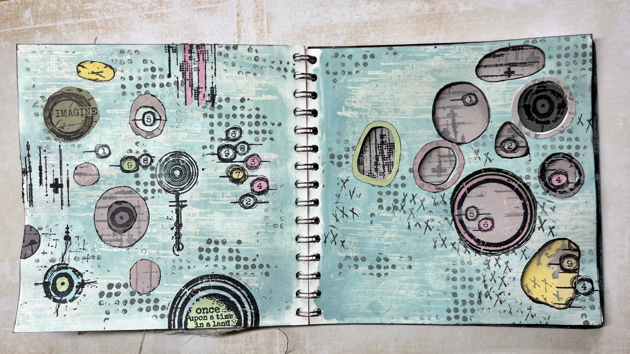
I've been having fun playing in my journal with double split complementary colours this week using the 2023 Topic 8 colour combo: Aqua Duck Egg FF199, Candy Floss FF70, Butter FF129 and adding Little Black Dress FF19 to gain shades of the of the many combinations on the colour wheel.  With this quarter's transparency theme in mind I decided to use apertures through the page as there's nothing more transparent than an open window and so I created lots of holes to peek through. I really had to be mindful where I placed designs so that they'd work over two pages...here's how I got on...


Naturally, it's difficult to show all four of the pages I created in one 'finished project photo' when working in a journal, so let me explain what I did and why I did it, working up to showing you the outcomes over four pages...


I was excited to start using the new Seth Apter mini stamps EM73 and EM79 along with his ESA35 stamp set, EM52 and the EM40 stamps as I knew that I could create some great textures and features with these.


Before I started working in my journal I needed to look at what this topics colours; butter, aqua duck egg and candy floss would make when mixed together to choose which combination I would use.


I liked the option of the double split complimentary selection as I could add more interest by having more colours involved that I knew would work well together having both impact and subtlety. I chose number 6 on my wheel as the base colour and matched it up with the two segments either side of it's direct opposite. The diagram below in the middle picture of the top row will show my choice.


A more detailed explanation of the double-split complementary colour wheel and the benefits of using this selection written by Keren Baker can be seen either here... 2022 Topic #8: Split complementary or also beautifully explained by Dounia Large here 2023 Topic 08: Master Colour Wheel - Topic Introduction. Both are well worth a read.


Having selected my colours from the colour wheel, I then needed to mix them into another wheel using different amounts of little black dress FF19 to create shades of each of the colours.  I found this exercise very therapeutic and would recommend doing this if you ever lose your creative spark and need to get back into your art but don't know what to do. 

I always mix an equal amount of all three colours together when I create my colour wheel to create what can be a more muddy shade. This mix can be seen below on the right hand image with 1+5+9 written inside the box.  I find it useful to do this as I feel that the 'total mixed colour' tends to harmonise a piece of art by pulling all the colours together .


I was choosing between split complementary...


...and double-split complementary, which as you know I went ahead with...


Breaking an empty page is often considered to be one of the hardest thing to do when creating art and so I used ESA35 and a WOW clear matt embossing powder to put some basic transparent texture onto the double page spread.


Then I used a dry sponge to add my first colour onto the double spread; I used the tertiary No8 segment without black for the colour base. I added texture using the dots from stamp set ESA35 using the same colour but with Little Black Dress to add a contrast with it's darker shade. Now the first page was underway...time to turn it over to prepare the other double spread.


I used the section 3 toned mix for the base colour of this double spread.  As you know, I like to add plenty of textures into my art and so I used EM79 and Rangers distress archival ink in Hickory smoke over the other journal spread to add interest to a flat page. Note that I am now going to be working over two spreads simultaneously. 


I started laying out some of the rubber stamps and drew rough circles to mark where I was going to carefully cut my apertures out using a scalpel and a cutting mat between the pages.


Keeping the colour wheel to hand, I stamped a whole batch of tissue papers with a selection of the stamps I was using to give me plenty of choice when it came to adding details. (It also gives me plenty of fodder to play with at a later date too!) I painted the reverse of the tissue paper in some areas making sure that my paint mixes matched those on my wheel.


I also painted some block colours and stamped over them using the same double-split complementary colours and stamp sets.
 

Drawing through the holes onto the printed coloured paper allowed me to get the exact shapes I needed.  I use a Pilot Frixion pen to do this as it can be erased easily by gently heating it gently with a heat gun or hair dryer which is much quicker and less damaging to the surface than an eraser and pencil.


Using the apertures from the page that closes over this place your designs and check to see whether they show what you'd like to see through the holes.  I like to hide some of the designs so that both pages are not in replica. 


Having seen how the colours work together through the holes, I thought that I'd like to bring more detail and colour onto the page and so using the Frixion pen once more I traced through the hole to match the opening of the aperture then rough cut a ring to edge finish the hole in another shade.


Now that I had most of the pieces glued into place I wanted to bring it all together.  At this stage I thought a lot of the designs were just floating on the page and it needed tying together.

Whilst I was deciding what detail to add to the pages, I used a scrap piece of paper between the pages so that I could ink some of the apertures that did not have a coloured ring around them. This gave a little more definition and contrast.


Using the little stitches stamp from ESA35 and Rangers distress archival ink in Hickory smoke I added the little crosses to the first page spread...
 

and to the second page spread along with the dots on line stamp from the same ESA35 set using a darker shade from segment 3 of the colour wheel. These were my final outcomes...


Lifting the page slightly will show any areas that need trimming off to make the apertures neater...


I especially enjoyed the challenge of setting the designs behind the apertures as well as at the same time being able to see elements of it peeking through.  I still have not decided if this is 'done' yet.  I think I may revisit it to add some hand stitching to accentuate some of the little crosses but I would need to be super careful with the reverse of the page with the apertures cut out...


It was a fun project to do and colour mixing is always interesting with the amount of colours you can make using just 3 paints...or in this case four.  I hope this has inspired you to cut holes out of your pages and reach for some of your favourite stamps to peep through them!

Until next time, enjoy your creative time

Love
Floss x x x 


I have several classes going on throughout August and Sept including a mixed media creative wellness tag day on the August bank holiday monday especially for those of you who work hard all week and don't get much time off for weekday classes. (in person in East Sussex UK)

If you need to plan ahead...then I have two full day mixed media classes running back to back on 31.10.23 and 01.11.23...check the website to see the difference between the two days.


Tuesday, 14 January 2020

2020 #1 Love is in the Air: Layers and Poetry with ESA minis {by Lotte Kristensen}

2020 Topic 1: Love is in the Air


I adore this kind of journaling spread. The bravery it takes to follow your instinct and go with the flow. As Lotte says herself in this post, it can be hard to identify what it needs, and sometimes, if you just step away, when you come back you will instantly see what needs to happen next. I love how she knocks it back with Grunge paste, and then stamps with the infusions. All the layers end up the perfect setting for the stamped words! Nice one Lotte, and thanks for sharing your creative process so perfectly!
~ Leandra

Hey everyone, Lotte here and *my* love in the air is the delicious new selection of Seth Apter mini stamps, together with lots of lovely layers of (also) new Fresco Finish paint, plus Grunge Paste, *and* Infusions - oh yes!!  You know, I never really got why they use a 3rd century martyred saint to celebrate St. Valentine's Day...... 


Okay, so first off, I used a brayer to put on a coat of Gold Rush Fresco Finish onto my journal pages - I have loads of them prepared with strips of old magazine and book pages, bits of masking tape etc, to make the page a bit heavier and textured, so it can take loads and loads of paint and water and everything else I prolly throw at it.  Before it was completely dry, I used a baby wipe to rub off some of the paint for a mottled effect:


Next, I used a bit of sequin waste to stipple some Blue Bayou Fresco Finish around the edges:


Next, I used a small gel plate to brayer on some Blue Bayou - you can either dip the stamp in the paint, or brayer it on, but DO make sure to clean it off instantly!!


Then I stamped randomly onto the pages:


Next, I used Orange Blossom Archival Ink pad to stamp more random impresssions:


And a little close up:


So, at this point I thought it looked a bit too bright, so decided to add some Grunge Paste, some through sequin waste, and some just with a palette knife:


And *then* I got another of my favourites out - a Stabilo All pencil, which I used to scribble around the (dry) grunge paste:


Then it was time for some spritzing with water, to let the Stabilo pencil colour run (use a small brush to move it around if it doesn't go quite where you want it) 


...at this point I also sprinkled on some Golden Sand Infusions:


As there are a lot of circles in the Apter stamps, I decided to make some of my own by using my fingertips with the Infusion and pencil:


I remembered that you can also stamp with Infusions - I think it was Ruth Mescall who I first saw do this technique - so I spritzed some water on the gelli plate, sprinkled some Infusions on and stamped randomly (again!!) onto the pages:


After this was all throroughly dry, I used some of my ancient alphabet stamp sets to set out the quote from Emily Bronte's poem 'Spellbound' - I think the wintery colours suit the words perfectly: 'The night is darkening round me // The wild winds coldly blow // But a tyrant spell has bound me// and I cannot, cannot go'.


Well, that's it from me - one thing I thought I'd mention is that when you do multiple layers like these, half way through it *always* looks like a dog's dinner (poor dog!) but the beauty about doing pages like these is that you can re-work them until you're (as) happy (as can be) - sometimes it's good to leave the spread for a couple of hours or even a day, and come back to it with fresh eyes.

Until next time!

Lotte 

Instagram: Alice Overground