Showing posts with label EM49. Show all posts

Monday, 1 June 2026

3 Things - Write Your Story {by Liesbeth Fidder-de Vos}


Hi everyone, it's Liesbeth with you today for a 'With 3 Things' challenge post.

This feature on the PaperArtsy Blog is where 3 identical items are sent to 3 members of the PaperArtsy Blogging team.

We have no clue what PaperArtsy HQ is going to send, the whole idea of this challenge is to do something crafty in our personal style with these 3 items.

We can incorporate other PA products into the mix if we feel it is necessary.

So let's take a look at what I received from PA HQ ...


This time three of us received some wonderful PaperArtsy-Seth Apter products: the three mini stamps Seth Apter Mini 017 (was EM49), Seth Apter Mini 065 (was EM137) and Seth Apter Mini 069 (was EM141), Seth's printed tissue paper PT06 and Infusions - The Sage


Products with a beautiful bold, edgy look — I immediately imagined a large art journal spread. All three items would be perfect for that!

Lets take a closer look at what I made ....


Using the three stamps and Tsukineko Versafine Clair - Golden Meadow and Avocado I started my first layer into an A4 journal


Later on I used the stripy stamp (Seth Apter Mini 065) to create some structure. Using a palette knife, I spread some PaperArtsy Fresco Paint - Chalk here and there and pressed the stamp into it. I then stamped the picked-up paint onto another area. I repeated this several times across the entire page


At the end, I also filled some empty spaces with the stamps and Versafine Clair inks

Lets take a closer look at what I did ....


From a sheet of tissue paper, I tore various pieces, motifs, and text, and I cut out all kinds of circles. At this stage, I never know exactly what I will or won’t end up using


My second layer, after stamping, was glueing down small torn pieces of tissue paper. I always love to use PaperArtsy Fresco Finish Matte Glaze for it, works perfect!


For the top layer, I used many of the circles, the text, and even the beautiful “branding marks” from PaperArtsy that are printed in the lower corners of the tissue paper. I painted the back of the pieces that needed to remain clearly visible. That way, they really stand out

Lets take a closer look at what I did ....


Anyone who thinks PaperArtsy  Infusions – The Sage only produces green straight from the pot is in for a pleasant surprise — just look at that explosion of colour…there's brown, green, blue, yellow, rust..greens.. such a joy every single time! I sprinkled some of the powder here and there and then sprayed it with water


The entire spread before adding the circles, text and ,PaperArtsy corners`. Here you see how the paint works as a resist. I love this old, weathered look


To my surprise, unplanned, I created a sky, clouds, and bushes :-)


A big picture of a big journal spread


A detail of the finished piece


Some finishing touches I did: Using a white gel pen I made some accents, like the white of the eyes and the lines on the letters. I also made shadows at one the bottom right sides of the circles and splattered some watered down paint (PaperArtsy Fresco Paint - Gold) with a fan brush


I also used the white gel pen in and around the circles here and there, and smudged it out with my finger


This was so much fun to create, and now I am so curious what the other two girls are going to make with exactly these three same products.
I loved doing this and I hope we will inspire you, have fun!

Liesbeth XX


Instagram: Liesbeth_Fidder
 

Tuesday, 14 April 2020

2020 #7 Under the Sea: Stardust and Magical Things with ECL {by Lynn Good}

2020 Topic 7: Under The Sea


Lynn has judged the mood perfectly and has created something magical to help lift our spirits. Love how she's created a mermazing (sorry!) watery background with stamps and stencils that aren't sea-themed. Just shows how far a little ingenuity can take you.
~ Keren

Hi everyone, it's Lynn Good (memories on the page with you today, and I'd like to share with you an art journal page that I have created for this weeks theme "Under the Sea".

This is probably my favourite way to create at the moment - an art journal page with layers on layers using stencils, stamps and paint.


When I started I was not sure what I was going to do, but with I knew I had the stamp set from Clare Lloyd (ECL11) and the colour blue.  At the moment with the way the world is, I thought a little stardust and magical things would lift the mood!

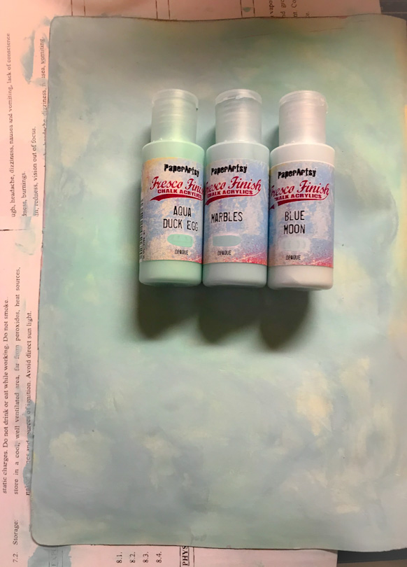
I started with 3 light colours - Blue Moon, Marbles and Aqua Duck Egg and covered the page using a baby wipe.


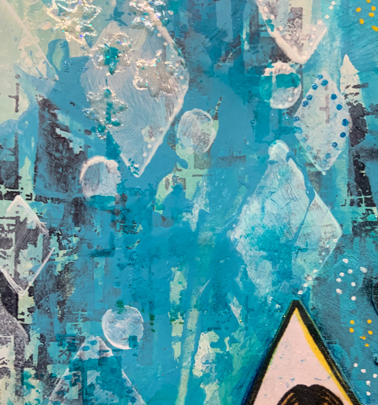
I have then added a brighter Fresco Acrylic Paint Colour - Smurf - through the Paper Artsy Stencil by JOFY PS166


It is strange process when you think about it - we add colour and then like in the next step, we use a lighter colour to push it to the background!!!!  I have used Fresco Chalk Acrylic Snowflake with a spatula.  I have then applied the Stamp EM49 which is one of Seth Apter's mini stamps (love this stamp as it is so versatile)  I then stamped with black Archival Ink.


And yep - we do it again - use colour to push the stamps into the background.

I have used the Fresco Chalk Acrylic Smurf (the same as in the stencil)  I find it is more pleasing to the eye if we reuse the same colours.


A final layer and then we will call the background done!  I have used the same stencil and Snowflake paint.  


I then stamped the image onto Paper Artsy Super Smooth Cardstock and coloured with Copic Markers.  I did the same with the other images.


I then collated my page and put some final touches on: outlined the page with black ink, put paint pen dots on the layout and stamped the stars which I have highlighted with embossing powder. These stars are around the layout in a shimmer and yellow but the shimmer ones are harder to see in the photo.


Here are some close ups:


I hope that this has given you some inspiration to create - to find a happy moment in these uncertain times. 

Lynn x


Tuesday, 14 January 2020

2020 #1 Love is in the Air: Layers and Poetry with ESA minis {by Lotte Kristensen}

2020 Topic 1: Love is in the Air


I adore this kind of journaling spread. The bravery it takes to follow your instinct and go with the flow. As Lotte says herself in this post, it can be hard to identify what it needs, and sometimes, if you just step away, when you come back you will instantly see what needs to happen next. I love how she knocks it back with Grunge paste, and then stamps with the infusions. All the layers end up the perfect setting for the stamped words! Nice one Lotte, and thanks for sharing your creative process so perfectly!
~ Leandra

Hey everyone, Lotte here and *my* love in the air is the delicious new selection of Seth Apter mini stamps, together with lots of lovely layers of (also) new Fresco Finish paint, plus Grunge Paste, *and* Infusions - oh yes!!  You know, I never really got why they use a 3rd century martyred saint to celebrate St. Valentine's Day...... 


Okay, so first off, I used a brayer to put on a coat of Gold Rush Fresco Finish onto my journal pages - I have loads of them prepared with strips of old magazine and book pages, bits of masking tape etc, to make the page a bit heavier and textured, so it can take loads and loads of paint and water and everything else I prolly throw at it.  Before it was completely dry, I used a baby wipe to rub off some of the paint for a mottled effect:


Next, I used a bit of sequin waste to stipple some Blue Bayou Fresco Finish around the edges:


Next, I used a small gel plate to brayer on some Blue Bayou - you can either dip the stamp in the paint, or brayer it on, but DO make sure to clean it off instantly!!


Then I stamped randomly onto the pages:


Next, I used Orange Blossom Archival Ink pad to stamp more random impresssions:


And a little close up:


So, at this point I thought it looked a bit too bright, so decided to add some Grunge Paste, some through sequin waste, and some just with a palette knife:


And *then* I got another of my favourites out - a Stabilo All pencil, which I used to scribble around the (dry) grunge paste:


Then it was time for some spritzing with water, to let the Stabilo pencil colour run (use a small brush to move it around if it doesn't go quite where you want it) 


...at this point I also sprinkled on some Golden Sand Infusions:


As there are a lot of circles in the Apter stamps, I decided to make some of my own by using my fingertips with the Infusion and pencil:


I remembered that you can also stamp with Infusions - I think it was Ruth Mescall who I first saw do this technique - so I spritzed some water on the gelli plate, sprinkled some Infusions on and stamped randomly (again!!) onto the pages:


After this was all throroughly dry, I used some of my ancient alphabet stamp sets to set out the quote from Emily Bronte's poem 'Spellbound' - I think the wintery colours suit the words perfectly: 'The night is darkening round me // The wild winds coldly blow // But a tyrant spell has bound me// and I cannot, cannot go'.


Well, that's it from me - one thing I thought I'd mention is that when you do multiple layers like these, half way through it *always* looks like a dog's dinner (poor dog!) but the beauty about doing pages like these is that you can re-work them until you're (as) happy (as can be) - sometimes it's good to leave the spread for a couple of hours or even a day, and come back to it with fresh eyes.

Until next time!

Lotte 

Instagram: Alice Overground