Showing posts with label Focus on Seth Apter. Show all posts

Tuesday, 26 December 2023

PaperArtsy Blog - 2023 Year in Review {Quarter 1, Topics 1 to 3}


Season's Greetings from PaperArtsy HQ,

We hope you are relaxing after the crazy-busy lead up to this holiday period, and perhaps now is the time you get to chill a bit. For us, it is a chance to look back at the year that was, and remind you of some of the wonderful posts our bloggers have shared over the year!

This year, we changed up the blog structure a little, we added a theme to arch over the 3 topics of each quarter. We try to offer 3 types of topics: they might be project, colour or designer focused.

Dounia has selected some posts from Topics #1: Shrines, #2: Tetradic colours, & #3: Designer Focus on Seth Apter. It's agony choosing just a couple of posts to showcase each topic; there are just so many that really are incredible creative offerings! If you want to seek the entire topic, then she has included links to the topic intro, and you can go from there to look back at each of the posts, you might even like to leave a comment.

Get ready for a bit of bling, brightness, and blooming good fun as we look back on the first 3 topics of 2023!

Leandra


As mentioned above, we added quarterly themes as a 'red thread' across the topics for an additional layer of fun! It is a new tool for us (and you) to guide the creative process and spark inspiration. We hope they may prompt you, and our bloggers to try new things.

For Quarter one the theme was 'Tracks' which can be interpreted many ways: mark-making, eg. the tracks your tools leave in your art; paths, trails or perhaps maps; in a more literal sense it could be following railroad tracks; it could also relate to travel and adventure. Let's not forget more abstract meanings: following in someone’s tracks, or creating your own, going off the beaten track… The possibilities are vast! You can discover a few more, and a lot of eye-candy in the theme intro post. Our amazing bloggers did not disappoint in coming up with their own version of tracks, here are few examples:

Claire Snowdon's set of altered cards is a great example of tracks as mark-making. They are sprinkled in all the layers of the beautiful background. Be sure to check her original blog post to learn about her process and management of colour. I love the contrast between the grungy background and the simple and sharp focal elements. Her chosen sentiments can also be interpreted as building a path for yourself and reminding yourself to keep on track!


Jenny Maples took 'following a track' literally with a journal illustrating the buildings and birds seen along a walk in her town. She also added some mark making for good measure! These elements really help bring interest to the quiet areas of her pages to balance the focals. I love the contrasting mix of textured background, sharp buildings and whimsical birds. She makes it all work together! All the other beautiful pages are also shown in her original blog post


Renata Peley chose to go with 'tracking'. It could be an animal, a celebrity or your progress but in her case, it is fairies! She made a beautiful fairy tracker kit with all you might need in your search for the elusive magical creatures: reference portraits, instructions and even a vial of fairy dust! The creativity and attention to detail in her project is amazing! Discover all the elements of this intricate project in her original blog post.


Celebrating the new year, the first topic of 2023 was SHRINES here on the PaperArtsy Blog! Shrines are present in most cultures and religions, in an incredible range of size, styles and uses to honour gods, saints, ancestors. From pagan offering boxes crafted from natural materials to the intricate and bejewelled or metal embossed catholic reliquaries, everything is possible. 

Nowadays, personal shrines are popular among makers, a way to honour, preserve and display crucial pieces of our life. This topic was an opportunity to explore what we deem sacred or significant enough to be worthy of a special artistic display. For more artistic and crafty inspiration, check the Topic intro post!

Let's start with this modern and funky triptych by Etsuko Noguchi, inspired by Japanese spirit shrines and her history with PaperArtsy. That substrate certainly immediately brings 'shrine' to mind. Perfect for bird royalty! And how fun and fresh is this colour palette, playing on the complementary purple and yellow to make the birds pop! This shrine is intricately embellished on both sides so be sure to visit her original post to see al the details.


Perhaps you missed this series of matchbox mini shrines by Riikka Kovasin? A very personal piece inspired by Finnish mythology while also celebrating the members of her family. I love how she experimented with polymer clay to create these amazing half-erased stone icons partially hidden by greenery. So evocative! Her original blog post is certainly worth a read as the Finnish folklore tale is fascinating, plus a chance to peek inside the shrines - quite a surprise!


Let's not forget this beautiful fabric shrine by Victoria Wildings. She was inspired by Catholic pocket shrines to make to remember her mum with a deeply personal project, using mainly upcycled materials. To decorate it, she beautifully translated JoFY stamps into embroidered flowers contrasting nicely with the denim. It is such a labour of love so be sure to check her original blog post to see all her work.


In 2023, we are continuing our exploration of the colour wheel and all the possibilities it offers. As a reminder, in 2022, we had already covered:


Source: Alex Guzman


After exploring 2-colour and 3-colour schemes last year, it was time to discover 4 colour combinations within the realm of Tetrads. These are composed of two pairs of complementary (opposite) colours. You can see below this creates 3 different types of schemes, with varying levels of contrast and harmony: 

Source: Alex Guzman

This allows for endless possibilities, especially when using a non traditional colour wheel. However tetrads can be a bit troublesome to balance than with 4 colours to juggle, so be sure to check the Topic intro post for a lot of tips and tricks and some picture inspiration.

Ellie Knol chose rather classic starting colours: Yellow Submarine, Blueberry and Claret for her red. She then selected a 'skinny rectangle' scheme. In a skinny rectangle, there are the 2 pairs of complementary, and therefore contrasting colours, but they are right next to one another, allowing for subtle variations. The contrast is then between the warm and cool groups, rather than between the individual colours.


Ellie kicked off her project with a gel printing session. Be sure to check her process in her original blog post! The resulting prints were elevated in these notebooks covers. The colour contrast between the mainly warm warm print and the cool background is quite characteristic of tetradic colours in general and the skinny rectangle in particular. I love how she used the blue of her palette to create shadow and depth in her print and focal images.


Liesbeth Fidder-de Vos extracted a classic rectangle scheme from her wheel, made unique by her choice of muted non-primary starting colours: Key Lime (greenish yellow), Wisteria (purple) and Butternut (orange). The whole wheel is full of subtle, original tones! The rectangle is the most classic (and easy to use) tetrad; the four colours are quite distinct and contrasting but will still harmonise well.


Liesbeth used her colours to bring to life this very dimensional tunnel card. Each layer is mainly one of her chosen colours. This separation by layers is a good way to avoid clashing colours.  Her use of little touches of additional colour then brings everything together. The more you look at it, the more you notice all the textures and subtle details! Pictures of all the layers and, technical details and more are in her original blog post, so give it a read!


Martha Ponsanesi went a step further in wheel-customisation and chose a neutral, Nougat, as one of her starting colours, adding Berry Nice (purple) and Coral. Look at that wheel! She then chose a balanced square scheme full of soft and delicate colours! Among the tetrads, the square has the most colour contrast, with two spaces between all the colours. It creates palettes with a lot of 'pep', softened here by the creamy opaque Frescos that the Nougat creates.


With this beautiful palette, Martha built pages for a mini photo album. She went full production chain so be sure to check be sure her original blog post to see all the elements and pages! I love how she played with the different colour combinations inside her square scheme. She used one main colour per page with the others as accents. It is another great way to balance tetradic colours without your project looking gaudy or too busy.


Another new development on the blog for 2023 was to shine a spotlight on our amazing designers and their unique and varied styles. It was a chance to share with you more about their backgrounds, discuss their crafting philosophies and discover their design process. We invited our bloggers to explore the designers, and asked them to put their twist on the collection.

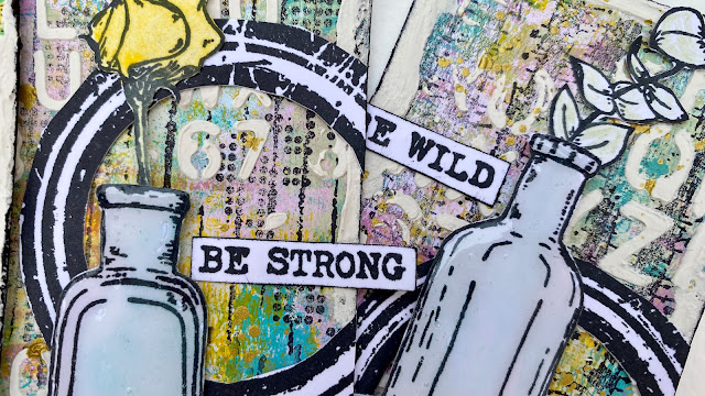
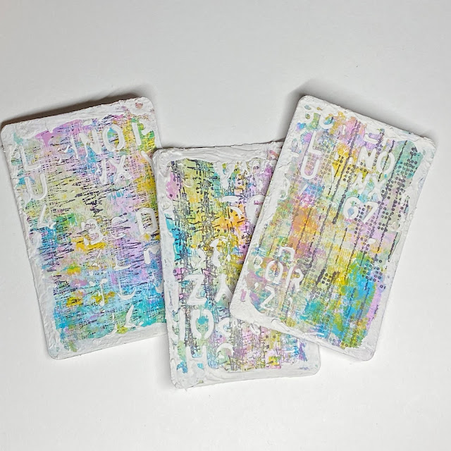
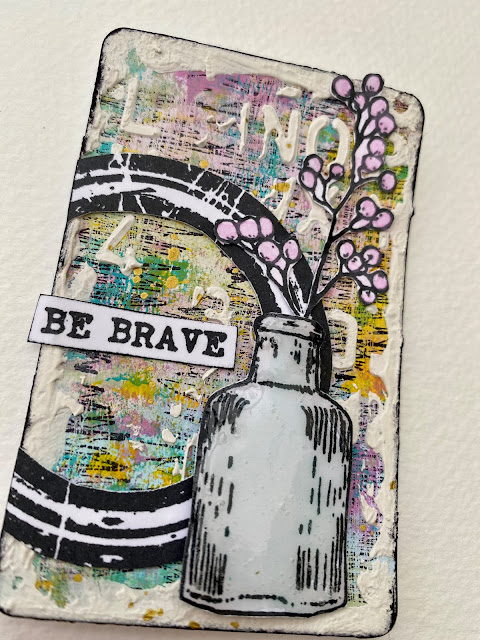
Already a confirmed artist, Seth Apter entered the PaperArtsy designing family in August 2016 and now has more than 35 A5 stamp sets, 30 minis and 30 paint colours, with 4 more coming early 2024. His grungy style is loaded with abstract elements, inspirational quotes and versatile textures - instantly recognisable. Learn all about his artistic start, his inspiration, and his creative process in the topic intro post as well as his live interview with Mrs PaperArtsy. Now let's see our bloggers' interpretation of his products!

We love this assemblage by Renata Peley. It was a project outside of her comfort zone, exciting to see our bloggers try a new groove! The 3D aspect caused her quite a bit of trouble but she prevailed! I love the attention to detail: every element is beautifully planned and finished. Go check her original post for a better look at all the amazing layers!


Going in a different direction, and proving Seth's products can be colourful and very feminine, what about this scrapbook layout by Asia Marquet? She certainly shares Seth's love of circles! I love how she manages to combine soft colours with bold designs and grungy elements with glitter. Keeping white space helps the striking portrait integrate with the rest of layout. Be sure to learn all of Asia's composition tricks in her original post.


Finally, I hope you did not miss Keren's sewing experminets: dyeing and paper-casting. what an eye opener to the possibilities! I know she was not a fan of the final colour of her dyed fabric but I personally love this colour palette with its soft contrasts and pops of colour. Each of her tags is a mini project with its own journey and techniques making her original blog post well worth a read!


Well, wasn't that a fabulous array of wonderful creativity!? We are so spoiled by our blogging team and the lengths they go to creating their projects. I hope you can appreciate the time they put into each piece, but more importantly, how much they enjoy what they do while creating.

We'll be back in a few days with more highlights from the PaperArtsy Blog, hope to see you again!

Monday, 20 March 2023

2023 Topic 03: Focus on Seth Apter {by Claire Snowdon} with Seth Apter Products


Hi everyone, 

It's Claire Snowdon here with you today. 

I've been enjoying some creative time lately making smaller pieces of art for a change. This topic is all about Seth Apter - but I decided to have some fun and do a Seth Apter/Scrapcosy mash up post!  I'm really looking forward to sharing with you how I combined these two very special designers. 


I really loved creating using these playing cards as my starting point - I think they are just the perfect size to showcase these beautiful Scrapcosy flowers and vases.  I went for a slightly grungy look in the spirit of this being a Seth Apter topic!  However I have definitely managed to add in a more feminine twist on your typical grunge project.


I started out with three playing cards and used my brayer to layer up PaperArtsy Fresco Finish Chalk Acrylic in Fuzzy Cactus and Cerulean.  I always feel using the brayer is a great way to start to break up that plain white background and just get some colour down. 


Once I had the PaperArtsy Fresco Finish Chalk Acrylic down on the cards in Fuzzy Cactus and Cerulean it soon became clear to me that these two colours alone were not the look I wanted - so to inject some more colour into my project I added Lily The Pink and Yellow Submarine.


I choose the Yellow Submarine for it's translucent qualities - it adds an amazing pop of colour to any project but without obscuring the layers underneath.


I added the additional two colours to my playing cards using the brayer.  Then to soften the background and get rid of any remaining white spaces I added some water to the remaining paint on my craft sheet and applied it gently to the cards using my fingers.


The Yellow Submarine really adds that pop of brightness - and there are much more muted versions of Lily The Pink, Cerulean and Fuzzy Cactus fading into the background which I think adds extra depth.


I stamped out a couple of the images - one from Seth Apter ESA35 and one from Scrapcosy ESC39 and started to play around with the composition.


Using stamped images in this way and layering them up on a project in various different compositions is one of my favourite ways to create any project - it allows you to visualize how the project will come together and what looks pleasing to the eye.
 

From my composition experiments I decided that using the amazing circle stamp from ESA35 was the one element I wanted to use across all three cards to unify them.

I stamped all my chosen images out from both ESA35 and ESC39 and cut everything out.  I wanted tiny pops of colour - but nothing too bright that could detract from my background.  So I used watered down paint from the same four colours to give the images a little bit of colour and take away some of the stark whiteness.


Time to add a bit more interest to these playing cards.....Seth's stamp plates always have the most amazing texture stamps - and I used one of each type of texture from ESA35 on each card.  I stamped them using a drier inkpad as I didn't want a really bold black background stamp being the focus.  These are my version of tracks running down the cards - which complements the current blog theme!

To add even more layers and textures I used Grunge Paste and stencil PS271 and then smooshed more Grunge Paste around the edge of each card to create a Grunge Paste border.


Here is a closer photo to show the texture that is achieved using a combination of Grunge Paste - which gives a 3D effect - but also by using the texture stamps designed by Seth.  Building up the layers is a great way to add additional interest to a project.


So these are the finished cards!  To bring everything together I edged the cards using blank ink and added some gold splatter.

I covered the vases in Glossy Accents to give them a really glass-like finish.  Then adhered all my elements to each card - using a combination of glue and 3D foam pads for extra dimension.

The finishing touch was a sentiment added to each card using Scrapcosy ESC39.


Here are some closer photos of each card on it's own - even though they are small I still think I've managed to fill each one up with plenty of interesting features and texture! 


This was such a fun project to make - I really enjoyed creating on a smaller format.  The idea of 'feminine grunge' really appealed to me and I hope you'll agree that I managed to pull it off!  Combining Seth and Scrapcosy's stamps was maybe not an obvious choice to start out with but I feel they work well together and this mash up of designers is maybe one you could try out for yourself. 

Claire x


Thursday, 16 March 2023

2023 Topic 03: Focus on Seth Apter {by Renata Peley} with Seth Apter Products


Hi everyone, it’s Peley Renata with you today and in this blog, you can see me struggle, you can see me squirm as I do a project way out of my comfort zone. As perhaps some of you know, I am mostly comfortable with doing art journal pages, with little to no dimension. And now I challenged myself to make a very dimensional and somewhat abstract 3D project in combination with some fun stamps designed by Seth Apter.


Of course, it wasn’t pain and suffering. You know, a bit of a personal challenge builds character. And if I’m going to be completely honest, I did enjoy this project and now that I let go of my fear of this type of 3D bulky and layered projects, I’m probably going to make them again from time to time.

Anyway, as the quarterly topic is “Tracks”, I decided to make my project in a manner of a riddle, and you have to follow certain tracks and clues to find my secret message. This idea got me quite immersed and had lots of fun figuring out how it would work.


I guess a lot of you who are PaperArtsy fans are also familiar with the work of Seth Apter. He designed quite a selection of stamps and colors for them. And even more, he has a unique and recognizable style, and my task was to make a project in that particular style. Of course, that doesn’t mean to simply copy his work, but rather to be inspired by it and add some personal touches. And in truth, being inspired by his work wasn’t that hard.

To get a better picture of Seth Apter’s work, I went for a bit of research on his web page. If you visit his page and click on the “Artwork”, you can get a clear image of his art approach. Now what’s left to do is to try to incorporate his style with my own, together with the PaperArtsy quarterly topic.

The second step after the research was to go and see what kind of papers and items I could gather up from my stash, and start formulating a strategy to approach my somewhat developing project idea.


Now, don’t get intimidated by my selection of items. You most certainly don’t need all these. Anyway, at the end I won’t use even half of them. These were just gathered up to get my imagination flowing.

Over the years I have become a passionate collector of little metal charms. And I always think: “Oh this one looks versatile/pretty” or “I’m sure I’m going to need this one sooner or later”, but the truth is, I almost never use them, so I made a promise to myself to use a few of them in this project.


Have you ever heard of the infinite calendar? It’s basically what its name says, a calendar which you move manually every day in order to keep track of the date and you can use it every year over and over again. If you are curious, you can just look it up on Pinterest and there you can find several versions of this calendar. I was inspired by the round version, to make my first “clue” piece. The starting point for this element was the stamp set from Seth Apter (ESA31).


If you take a look at this stamp set, it has this gorgeous round design with several circles with letters. So, what I did is to take a heavy weight paper (300gsm) and applied a mix of PaperArtsy Fresco Finish Acrylic Paints: Buff (FF96) and Squid Ink (FF56). When the paint was dry, I stamped the previously mentioned stamp three times and heat embossed it with black embossing powder.


After cutting out three circles of my stamped images (each one smaller than the previous one), comes the tricky part. Now, I’ll let you on a little secret, I genuinely dislike designing precise and working 3D elements, so I asked my husband for a little help. What I needed is to craft an element which will hold my circles together and have an opening through which we can see one letter from each of the three circles. On the image below you can see what we came up with and what my husband drew for me. 😊


The next step was to cut out the drawn shape and connect the elements.

By the way, you know how foam tapes are sticky on the bottom, but on the top, they have that smooth paper, which you are supposed to peel off? Well, in order to prevent my circles from sticking to each other and to spin more smoothly, between each of them I put a piece of a foam tape, without removing the protective layer from it. Meaning, it sticks to the lower circle, but it leaves the upper part non-adhesive and smooth. That provided the buffer area for a smooth rotation of the circles.


With that, all the elements were ready, so I just pierced a hole in the middle of the circles and connected them all with a metal braid. Here you can see the finished result.


This rotating circle is supposed to be one of my focal elements. But now I wanted to make another important piece. A secret box with a message. My box was actually an empty matchbox, but of course first I had to paint it. For this I decided to use once again PaperArtsy Fresco Finish Acrylic Paint Squid Ink, but also Black Dress (FF19).

At this point my box looked rather plain so I decided to embellish it a bit with one of the mini stamps designed by Seth Apter (EM55). I just stamped the image with the archival ink, without caring about getting a perfect impression. Then once again I just had to add another small detail and this was a tiny bit of the PaperArtsy Fresco Finish Acrylic Paint White Fire (FF121). And when I say “a tiny bit” I really mean a tiny bit as I just put a very small amount of paint on a toothpick and rubbed it over the surface of the box. It is a very subtle detail and it can be seen just under certain light, but I think it really looks nice and it gives it a more metallic look. Oh, and I also used White Fire on the black piece of my rotating circle.


In order to make the box open more easily I attached to it a tiny metal clip on one side. Now for the content of the box I had a tea-dyed notebook paper and I stamped another one of the Seth Apter mini stamps (EM65) on it. This was to serve as my “secret” message. And just for the fun of it, I also put a small metal key next to it.


With these two elements crafted, it was time to start thinking of a composition and another round of checking for items that I could incorporate in my project.


I must admit, at this point I was very confused with how to proceed. I started to doubt the size of my originally planned substrate. I also felt that all those goodies that you saw me assemble at start aren’t appropriate, or just not enough. It was time for me to take a break and wait for a new day to start with a fresh brain. And guess what? The next day I sit at my crafting table and did some fumbling and tumbling…and again came up with nothing. It was time for some more research. I went scouring Pinterest, my fellow crafters Instagram accounts and of course Seth Apter’s web page and finally some ideas started to form.

I realized that I wasn’t troubled just by the size of my substrate, but also by the oval shape of it so it was time to consider some other options.

Years ago, my husband was into some furniture-making, so we still had some wood planks of various sizes stashed around. There I found some smaller boards that finally helped me to start going again.

I took a few narrow boards, but I wanted to alter their color a bit. As I decided to stick to my original color scheme, so again I took PaperArtsy Fresco Finish Acrylic Paints Squid Ink and Little Black Dress. But I didn’t want to just cover whole boards, instead I put the paint only on the edges of the panels, so it would look something almost like burnt wood.


Now the question was how to connect the wood planks. The idea was to use a furniture stapler gun as it would contribute to the whole grunge vibe, but apparently, I am one of those people who can’t find stuff in their own home, so I had to find another solution.

First, I thought just to glue the boards to each other, and it was not a bad solution, but I wanted something a bit more special. What I did was to yet again ask my hubby for some help. He drilled 16 small holes in my planks so that I could connect them using a bit sturdier thread. For each connecting point we made four holes so that I could connect the wood in an “X” shape, as you can see on the image below.


When connecting the planks, you can decide how you want to align them. I chose to make them just a little bit off, but I did pay attention to use one plank that was a bit shorter than the others, so that in that place I could put my matchbox with the message. I glued one side of the matchbox to the lower side of my shortest wood board.


At this point I decided to build up one more element before I start concentrating on my layout. On the stamp set PaperArtsy Seth Apter ESA31, you can see those two stamps with vertically spelled words and since they very much appealed to me, I decided to use one of them. When I was searching for my possible substrate, I also found these mini 5-10cm narrow wood panels which were just the ideal size for stamping my words. I prepped the panel with PaperArtsy Fresco Finish Acrylic Paints Buff (FF96) and Squid Ink (FF56). When the paint was dry, I stamped and heat embossed the word ‘document’ with black embossing powder. And here is how it turned out.

Now with my substrate and a few important elements finally complete, it was time to start thinking about the composition. And guess what? This turned out to be the most challenging part of my project yet. I had two considerations. First, I really liked the look of my wooden boards and wanted to be sure they are not completely covered with the elements that I planned to layer on top. Second, I didn’t want just to pile my elements randomly, I wanted to give it all some meaning and sense.


I know that making a layout shouldn’t belong to the twists and turns section of the blog, but if we are being honest, for me making this layout was all about twists and turns of actions. I think I made about ten possible layouts over several days until I finally found one that I was happy with.

The idea was to have a few different types of papers layered on top of each other, with a random but still sensible look about it. I also wanted to implement a few of those metal charms that I mentioned at the start, my rotating circle, some heat embossed gears that I made from Seth Apter’s stamp set ESA12 and such.


I wanted to go slowly and gradually with this. First, I adhered my little word panel in the top left corner and two small cork material squares on the right side which I had from who knows where. It’s also worth mentioning that, while building the layout I mostly used a double-sided tape and put it only in the middle of the paper elements so that later on I would be able to tuck in some other bits and pieces if I wanted to.


At this point, I just wanted to layer some papers. I stamped a few of them with Seth Apter’s stamps, two were book pages and on the picture below you can see how it looked so far.


Now I finally wanted to start using my collected metal charms. Originally, I first thought just to adhere one of them with glue but in the end I decided to spice it up a bit and screw in my charm instead.


At this step I came to two realizations. First, that I have completely covered my little secret box, which in fact wasn’t my original intention. After all I thought I managed to decorate the matchbox rather nicely but as it seems that it will stay a secret between you and me. 😊 And the second thing was that I had to start using something resembling some clues to finding my secret box. I decided to use some darts and arrows discreetly pointing in the direction of the box. Here you have multiple options. You can draw those arrows, cut them out by hand or like me, use some metal dies. In the end, I used two different die sets designed by Tim Holtz to embellish my project. Those dies included some numbers, arrows, paper folder and that lovely frame that I used for the word “wonder”.

Oh, and look how pretty are those gears from the Paper Artsy Seth Apter stamp set ESA12 that I heat embossed in copper color.


At this point, my project was going nicely. Layers were formed and some details were added, so now I wanted to attach my rotatable circle. Do you remember those two cork material squares that I previously used? Well, I had one more of those and I used it to lift up my circle so it would be more comfortable to rotate it.


After attaching the circle, the last element that I wanted to add was a little paper folder. Inside it I have tucked in a few papers and I have also embellished the folder with a stamp and some mini paper clips. And that was about it. I had some idea of adding a few more elements like a wire piece, textile or some more charms, but I decided to resist that urge so my project wouldn’t become overcrowded.


Well…I have quite a few thoughts about this project. Even now after completing this whole blog post, my brain doesn’t stopping thinking about all the other things that I could have implemented. Also, I enjoyed my two interactive elements of this piece, but I would have liked it if I could have figured out one or two more, but maybe that is just too ambitious.  

All in all, so far in my ‘crafty’ history, this project was the biggest challenge so far and I am so happy that I faced it and managed to find a way to make a project that I like. It gave me a feeling of success and it gave me some courage to experiment more and try new things. I would also like to advise you as well to go out of your comfort zone because that is when we learn the most. Anyway, what’s the worst thing that can happen? Make a project you don’t like? So what? We all have in our closets a few projects that we are not so proud of. 😊

Renata 💜