


Heippa everyone! It's Riikka from Paperiliitin blog here today to share my project for the "Shrines" topic with you. I enjoyed doing this project so much on so many levels! To tell you the truth, at first I was a bit adrift when reading the topic as I thought about the topic as quite religious or biblical. After some googling I got really intrigued and pitched for two different projects for this topic. After that I ended up actually combining the two a little and drew inspiration from Finnish mythology as well as some personal links.

The most enjoyable part, except of the actual creating, was getting to know the Finnish mythology a bit better and the origins of the study of it. I did a lot of reading for this and it really spoke to the academic side of myself. While I was drawing inspiration from my Finnish roots, why don't you take a deeper look in the mythology of your own country or home town? This project is easily altered to match different pantheons and landscapes just by changing the color scheme. Let me show you how I have made these and you can see for yourself.

I was pitching for two projects, like I said, for this theme. The other involved the monthly theme of tracks through tracing Finnish folklore and the other concerned tracking each family member's own favorite stories, making a more personalised project. In the end I combined the two. As you will disover, the outside of these box projects are inspired by the Finnish national work of epic poetry called Kalevala, numerous stories of old deities, while the box interiors follow the personal taste route and are unique to each person of my family. Let me explain this a bit further, but, in order to do that, I need to tell you about Kalevala.
Kalevala is a collection of poems gathered and edited by Elias Lönnrot. While he did change some of the poems so that the book has a cohesive story, most of the material is gathered from the Eastern Finland and serves as a recording of Finnish oral tradition of passing the stories on through each generation. The stories tell about the old beliefs and contain, for example, advice for marriage. The persons Elias Lönnrot listened to, while gathering the data, were called "runonlaulaja", singer of poems, so all the verses have a certain rhythm to them. Even though the poems were gathered from different regions, the metre was always the same. The long word is trochaic tetrameter but it's also simply known as Kalevala metre. This kind of text is immediately recognizable, at least to Finns.
Kalevala starts with the story of creation and it's main protagonist, Väinämöinen. He's a masterful sorcerer, a demigod and powerful singer. While he's also the first man and brings life to the barren world, even he sometimes needs help. Further in the story, when he needs to build a ship out of metal, he lacks three powerful words for the spells and seeks those from Antero Vipunen, a long dead giant that has turned into stone. After some ordeals Väinämöinen receives the words he needs.
That's what I set out to do - creating some 'Anteros' to guard the valuable items inside them, like those powerful words Väinämöinen needed. During the process I also realized the possibility of including the powerful words in the mix, but more about that a bit later, in "Twist and Turns".
If you want to know more about Kalevala, here's the link to Wikipedia page (link) but also to Kalevala Society (link). The latter has great resources to learn more about the characters in the Kalevala (link) and also a synopsis of the whole epic (link).

As I was int4nding to re-create a worn stone effect, I chose quite a monochromatic color scheme for my paints and went with Mud Splat (FF61), Little Black Dress (FF19) and Snowflake (FF15). I also picked up some sturdy cardboard and a stencil (PS311) and the stamp set (EGL09) by Gwen Lafleur. I had thought of this stamp set, as I was thinking of using sandy colors on top, because the characters made me think of Africa. I then realized that I could turn these tribal style images into anything I wanted simply by replacing the sand tones for something a bit 'closer to my home, like a version of granite and gneiss. You too could adopt a color scheme ingenious to your geographic area, and turn these characters to fit th tales of your nation.
The box idea was there from the start - something neutral on top but then a blast of color inside, revealing a surprise. So, even before I started creating the boxes, waiting for the stamps to arrive, I asked each of my family member to bring me a little trinket or something they could imagine inside a shrine box and also to choose a color from the PaperArtsy color chart I have. They didn't have to explain why they chose a particular thing, it just needed to be an important one to them, some kind of an amulet or talisman in a way, binding the inside back to the shrine theme of this topic.

The first thing I set out to do was the "Anteros", the stony faces. I was considering which surface coupd be used for this and while my first idea was just plain paper, a more dimensional substrate started to intrigue me. Air-drying clay seemed a bit too fragile and heavy, but polymer clay had several advantages, so I chose to go with that. At first I was going to choose just one color, mid grey one, but my co-worker, who's a wizard with polymer clay, had just made a sample out of tinted, translucent clay with acrylic paint running like little streaks across the shape. That seemed to be a perfect way to get a stony look to my Anteros!
After asking a few words of advice from my co-worker, I set out to try this wonderful technique. I divided a block of translucent clay into four segments. Two of those I kept in their original translucent color but the other two I colored using alcohol inks. I colored one part with black, hoping to get a grey result and one with a rusty red. My aim was to make a surface resembling granite. That's the most common rock in Finland and also our national rock. But as you can see even from the photo below, the inks reacted with the clay and results were a greenish tone and a pale honey. As this was my first go, I thought that maybe the bake will then reveal the true color, but learned after getting the pieces out of the oven that it wasn't the case. While the colors did change during baking, they still weren't grey and rusty red.
After coloring the pieces and really kneading the clay to get the colorants evenly dispersed, I cut the clay into tiny pieces for the next step.

To get those streaks of color running through the mass I added some Fresco Finish paints to the mix. I chose first the Mud Splat (FF61) but it seemed a bit monotone, so I added some Snowflake (FF15) in there as well. I first added some of the little pieces into a pile and then added acrylic paint on top before adding more polymer clay pieces. The idea was to coat each individual piece of clay with the acrylic before adding it to its comrades.
When I then had slowly added all the little polymer clay pieces into one pile, I made those into a big ball, really squeezing the pieces together so they would stick and then started to roll the mass into a thin sheet.

After rolling the polymer clay into a thin sheet, I pressed the stamps (EGL09) to the clay and cut them out with a blade. I was going for an organic kind of shape, a piece of stone with a carved face on top.
After I had all the four faces stamped into the rolled sheet of clay, I then turned the rest of the clay into small pebbles. I thought I'd use those to decorate the boxes, to add a bit of dimension to them. I then put everything onto a baking tray and hardened the clay according to the instructions. A word of advice from my colleague - it's always better to bake the polymer clay in lower temperature and longer time than exceed the recommended temperature. Too high temperatures can cause the clay to "burn" and change colors.

After baking it was time to see what I had accomplished! While the greyish tone with streaks of clay peeking through had a nice, stony look, I was hoping to get some translucent layers showing. To get riemove some of the paint from the top surface and reveal the actual clay underneath, I used wet sanding to just get the top off. At the same time I sanded around the edges of the emblems, too, just to get a more rounded, worn look. Tracking back to Finland - most of the bedrock here is smooth and sanded as the ice masses pressed and moved across this area during Ice Age. This worn effect is what i was going for.
As you can see from the photo below, the colors didn't change much during baking, so I didn't get the grey and red I was hoping for. But in the end I'm actually pleased that I got these tones! The overall look of the project is better with muted, green tones than the rusty red in the mix! And in a way I got gneiss, another Finnish rock.

After sanding, you could still make out the faces in the stones but I wanted to highlight them a bit more. I was thinking about rock paintings and carved out symbols. While I set out to do Anteros, stone giants, these little disc-like things started to remind me of amulets. So, in way the boxes in the end had an amulet both inside and on top.
I was contemplating the color to use to highlight the markings for quite a while. The color of the rock paintings in Finland is red, but that brought back the issue of the greenish looking stones. I was fearing the contrast would have been too much. So, instead of following history here, I chose black as it just heightens the shadow and thus reveals the pattern.
I covered the whole stony surface using Fresco Finish Little Black Dress (FF19) and then wiped the surface clean, leaving the paint in the grooves from the samp impressions. Even though I had used the very fine sanding paper and the surface wa smooth, the clay was still a porous and pulled in black in other areas as well as the stamp grooves. Again, a lucky incident as it toned down the jade look of the "stones".

Now I had my main elements for the boxes done so I could turn my attention to the actual boxes. For those I did an experiment. I was pondering whether to have boxes with double, folded down sides or just plain ones. While the one without the fold was much easier to do, the folded down version looked so much better so I decided to opt for that. I wrote down the measurements for myself for the actual pieces. If you want to make exactly the same size boxes, the box measures 7 x 11 x 2 cm when done and the sleeve is a bit bigger to allow the box to go smoothly inside. It's 7,2 x 11 x 2,1 cm. Naturally you can use ready boxes, too!
I also decided that I would make the top, the sleeve piece out of sturdier, heavier cardboard so that it would give more support to the little Antero sleeping scene on top. But the boxes, they could be made from thinner cardstock as it was easier to fold and with the double edges, they would still feel firm.

Even though the color of the little stone faces wasn't was I was planning to achieve, I was very pleased at this stage how they turned out. And like I mentioned earlier, in the long run I think the greenish tone fit the project even better than the rusty red would have!

I was originally planning to use ready-made matchboxes, but the faces were just too big for regular, little matchboxes. Or they would have fitted on top, but as I had already this image of a forest floor in my head, I needed to find bigger boxes. I rummaged my stash but didn't have appropriate substrates and after visiting both a craft store and a grocery store in search of some boxes, I decided just to make them. I mean, a matchbox styled box isn't that hard to make as you get away with doing just one actual box and the other part is the wrap-around sleeve!
As I had made the test versions already, it was then easy for me to start the actual boxes as I already had the measurements figured out. First I concentrated on the sturdy sleeve part of the box. For these I used a 350 g cardboard. I cut the pieces out and then scored the folds. The whole piece measures 11 x 21 cm and has score-lines at 7,2 / 9,3 / 16,5 / 18,6 cm, measurements stated from one side. This makes it into a 7,2 x 11 x 2,1 cm sleeve for the box.

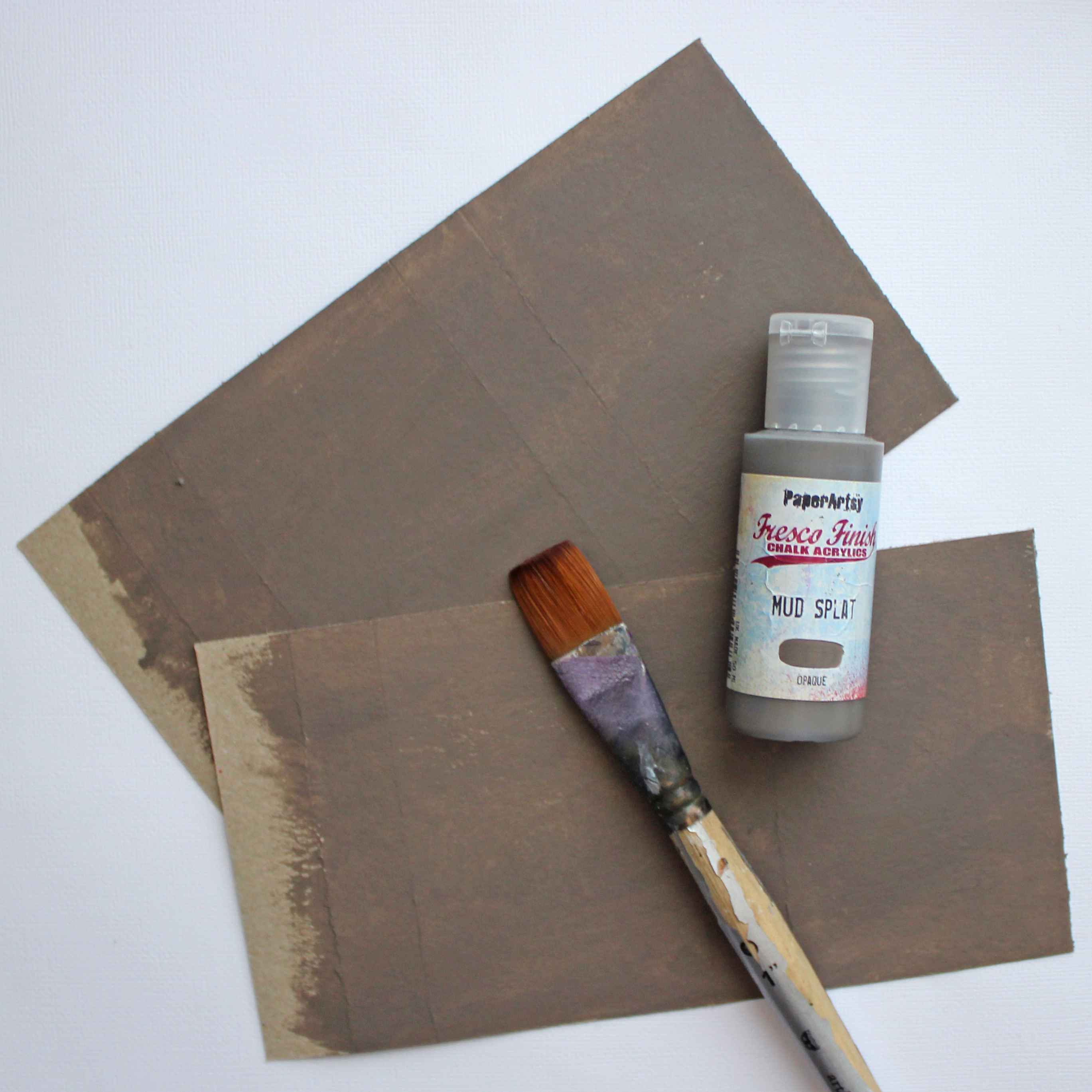
After cutting and scoring the four pieces ready I then painted them using Fresco Finish Mud Splat (FF61) paint. This was a nice, neutral, earthy color I had used in a previous stage as well, so everything would be matching. It also is a nice shade to represent both earth or dirt and rock.
I used a broad brush to add the paint. I could have achieved a smoother surface with even paintlayer with a brayer, but I didn't mind if the kraft colored cardstock was showing through in places. Just more visual texture that way!
On top of the, more or less, even paint layer I then added some markings. When I saw this stencil (PS311), it felt just perfect for my project! The different signs and letters reminded me again of those rock paintings but also the magical symbols on top of Sámi drumm. Sámi people are indigenous people of Finland, now inhabiting mainly the Northern parts of the country. When thinking of Väinämöinen and his powerful singing, I've always somehow started to think Sámi shamans.
I included the symbols to the piece using the same colors I had used so far with the rock faces - that is Snowflake (FF15), Mud Splat (FF61) and Little Black Dress (FF19). I applied a little bit of each color to my palette and dipped the sponge in a couple of colors, letting them mix on top of the project. Some of the markings are thus more prominent than others. I also made a couple of layers using the stencil, moving it around so the signs started to morph into each other a bit, making just a varying stone surface. I also added some splashes on top to mimic the grainy look in granite - just with different colors.

After drying the paint layers, I then assembled the sleeves with double sided tape and then gave the edges a bit more dimensional feel by adding some dark paint to them. I partly used Little Black Dress (FF19) here but also mixed it to Mud Splat (FF61) just to make sure the edge wouldn't be totally black and resembled more like a shadow. I used a sponge to define the edge with the paint as it was the easiest way to make sure the shadowing wouldn't be just a painted line.

The sleeves now ready for embellishing, I then turned my attention to the actual boxes. For those I used 200 g cardstock. I first cut a 14,8 x 18,8 cm piece out of the cardstock and then scored all around in 1,9 and 3,9 cm widths. I now had the creases for the edges ready. I then just had to cut out the excess pieces out of each corner - the three little (almost) squares. I also cut the flaps, that I would turn and glue inside the sides loose at one side. Not sure you can make out the cut in the bottom left corner there in the picture below. It's the remaining little square, cut from the left to the edge of the crease.

Bases now again cut and scored, I then painted the inside parts. I later questioned and thought about my solution to paint the flaps at this point, but reasoned it probably was due to the fact that I was pondering weather to add a stencilled pattern to the inside parts as well. In the end I decided against it, mainly due to amount of colors it would have required. Let me explain.
As I wrote in the beginning of the story, I let each family member to choose their color for the inside of the box. Naturally this then resulted four different paints, and that was partly the point, too. To have each box personalized, to have a own story, own track to each one. When thinking of adding a stenciled pattern inside, I didn't want a high contrast, just a mild pattern, going nicely with the existing color. My first idea was then to grab a color similar to the one chosen as the base color but that would have needed one or two colors more to each box and the end result would have been 15 paint bottles! Only now, writing this I come to the obvious solution of using the black and white mixed with the chosen color to create a shade and a tint of the color... But, you can do that! If you want to add the symbols to the inside the box, too, color it flat, add the stenciling with a shade and a tint of the chosen color and then put the box together!
In the picture below I have shown you the places to paint the inside color - the middle part of the other side and the outer flaps on the other side. The one on the left is painted with Forget Me Not (FF155), making up the shrine box for my husband's special trinket and the one on the right with Granny Smith (FF108), a color my apple-loving older daughter chose for her box. Not seen here are the color my younger daughter chose for her shrine, Deep Sea (FF198), and the woodland tone that I opted for my own box, Pine Grove (FF143).
Another solution to have a colorful surprise inside the box is to use colored cardstock, that way you don't have to use that many paints. Choose a color the recipient likes or let them choose their own, make the box and then just paint the outside part to match the tones of the sleeve. Or you can line the inside of the box with cut out magazine pictures meaningful to you and in the right color scheme.

After letting the paint dry, I then assembled the boxes using both craft glue and double sided tape. I used glue for the little flaps, turning inside the sideflaps and double sided tape to adhere each inner flap in place. That is those colored in the last step. If my words don't make any sense, you just have to make your own little box and see the form in 3-D.
After assembling the boxes, I then painted the outside using the same base color I used for the sleeves, Fresco Finish Mud Splat (FF61). Of course you could first assemble the box and then paint it, if you don't add any patterning inside and find it more easier that way!


Now that I had my boxes done as well as the focal points, I thought came to my head. Tracking back to the actual story of Antero Vipunen, Väinämöinen got the powerful words to complete his spell from the giant. The story differs a bit, depending on the source, but in one case Väinämöinen got either swallowed or deliberately went through the giants mouth to his belly, caused him a great belly ache and thus got the three missing words or luote to finish his spell. I was already planning to put the meaningful little trinket to each box, but what if the giant could also hold a special, powerful word inside? It is close to the change of the year, too, what if you could write down a word for the whole year inside and change it when needed or fetch it to give you strength?
With this in my mind, I set out to make little envelopes to each box. I had saved the extra cardstock pieces left for the assemblage of the boxes and turned out I could make out the extra pieces out of those. So in case you're redoing these with same measurements, one A4 sheet per box is enough. The envelopes I made measured 6 x 8 cm when ready, so I cut a 13 x 13 cm piece out of the cardstock together with a 5,5 x 7,8 cm piece to make up a card to go inside the envelope. I then added a score line to the 13 x 13 cm piece in 1 and 7 cm in length-wise and 1,5 and 9,5 cm in height-wise. Cutting out extra pieces then got me a shape with 1 cm side flap, 1,5 cm bottom flap and 3,5 cm cover flap. I hope the picture below helps! The upper piece is cut and scored version, the one in the bottom has the excess bits cut away.

I then put the little pockets together using double sided tape, painted them with the same color as the inside of the box and stamped the corresponding face to each. The corresponding here meaning the same character that was going to be placed on top of the box. The stamp set I used was by Gwen Lafleur (EGL09).

I really love how I could include a more precise image of the character this way to each box! It felt really appropriate that the top one was a bit shrouded in mystery, worn by time and natural elements or even by the worshiping hands, but the one on the inside was crisp, showing all the details, hidden from the view.

At this stage I had a lot of elements, so it was time to bring them all together. First I adhered the stone faces on top of the box-sleeves. I placed them to the center of each box and then added the self-made little pebbles to make the composition fuller. I used a regular craft glue for those, but if you're meaning to carry your little shrine with you, I'd suggest using gel medium.

While I wanted the faces to be the main feature on top of each box and was planning to add some "moss" to them, I felt that something was lacking. Two pictures then emerged from my mind's eye - other of a Finnish forest, with coniferous trees and other, from "Koirien Kalevala", a children's book by Finnish illustrator Mauri Kunnas, who made a canine version of the epic. In that picture Vipunen is a huge stone giant with a little fir tree growing on top of his nose.
Luckily I remembered seeing a little branch punch in my visit to the craft store, trying to find the boxes, so that came handy at this stage! I punched some little fir tree branches out of green cardstock and treated them with the triplet of paints I had been using for the sleeves - Snowflake (FF15), Mud Splat (FF61) and Little Black Dress (FF19). I added only a little bit of paint to each tiny shape with a sponge, just to transform them from the solid color cardstock into something more fitting to the over all look of the boxes. After drying the shapes I also crumbled them a little bit they wouldn't be so nice and perfect.
If you don't own a suitable punch, you can always just cut out some shapes or use actual branches instead. I'd recommend using twigs or thin branches instead of branches with needles as they tend to drop when the temperatures change. Or you could add some faux branches in the mix as well! Another suitable branch variant might be blueberry sprigs, too.

Then it was time to turn that stony surface into more of a forest rock. I first added the little branches I created and then added some moss here and there. I say moss, but this was not picked from forest, instead just finely chopped green yarns and threads. I used a mix of yarns I happened to have, but you could do this with just one color, too. I just thought the multitude of colors and variation of materials would look more mossy-like in the make.
To attach the finely chopped pieces I used craft glue. I added the glue here and there and then used a brush to spread it a little. After that I just sprinkled and pressed the clippings in place. After letting the glue dry thoroughly I then brushed the excess pieces off.
There's also flock available in the craft stores that could work well too.

After getting the top done, it was just to add the most important parts in place - the little envelope and the trinket. I slipped the envelope to the bottom and then made a little nest for the amulet or trinket to snugly sit inside the box. In doing so I thought about Mielikki, a goddess of the forest, wife or Tapio, the forest god. Mielikki's delight was to decorate the forest and help baby birds if they had fallen out of the nest. In ancient times, if you wanted to be on the good terms with the forest, you could go around exclaiming how beautiful the forest was as this then made Mielikki happy and she gave you berries, mushrooms and small game. For elks or other bigger game you then needed to please Tapio.

I couldn't tell the reasons for the amulets inside the shrines even if I wanted to, but I can share what they are and then tell the story of my chosen trinket. There's a little toy camera, a pick, a coin and a piece of crab shell in the boxes.
The last one on the list is mine. I picked that up while we were in Denmark, visiting a beach next to North Sea. You see, I love the sea, but the sea around Finland is a bit different to the vast open seas. The Baltic Sea is so small that it doesn't have the tide, maybe also partly because of the narrow Danish gulfs regulating the water flow. So, whenever I visit a land next to a vast open sea, I want to enjoy the high and low tide. And stare into the horizon and see it curve. As here the most times you're then staring into multitude of islands or to distant shores of Estonia or Sweden. Being near the water, seeing how the waves churn and to hear the roar of ocean makes me calm, re-energizes me. So, for my love of the ocean and the open seas, I chose to put that piece of crab shell into my box. It's a little visual reminder of a state of mind, of a bigger thing, quite appropriate for a shrine.


Yay, you got to the end! I feel that this topic really unearthed a writer in me! I tried to edit my flow of words, though, but I found it fascinating how somany ideas and little connections you could achieve in one project.
Like I wrote in the beginning, I drew inspiration from my culture, my national folklore epic. A forest or stone giant is a repeating theme, though, so you might be able to use this inspiration exactly like this. Or maybe you just love the forest and want to depict that! But in case you can't find a common ground with an earthy giant and your own culture or mythology, you can always tweak the project. Maybe there's a connection to sea, lake or other body of water? Then you could use more blues in the make, changing the color palette to match water and add sea foam instead of moss. Or maybe you need a sandy look or perhaps more colorful one? Think about the heritage in your own country or home town and how to translate that into a little keepsake. Something like this might also be a wonderful little thing to spark ideas and inspiration when you feel stuck! Maybe ask a friend to add some words inside the envelope instead of placing them there yourself?
In the course of the step-by-step I've tried to mention ways to use what you have or make things easier. Like instead of building your own box, you could use a ready-made one. Or instead of painting the inside, use colored cardstock. But I didn't mention that if you don't want to try polymer clay, you could use other options, too. Especially if you're making this piece on top of a mint tin or other metal container, you could use air drying clay as the metal holds the weight of the clay better than paper. Or if you are working on top of lighter container, try paper mache, you can event make that yourself! Or if you feel adventurous, you could even apply a layer of PaperArtsy's Grunge Paste (GP190), wet your stamp with some water and press the stamp to the paste. Then clean your stamp thoroughly and let the paste dry!
The advantage of using polymer clay, though, is that you can make your own amulets out of it. While creating the embellishments for these projects and the pebbles, I did make one amulet for myself, too. I just pressed the great harlequin styled pattern from the stamp set (EGL09) to a piece of rolled polymer clay, added a hole and then baked the piece. After sanding it like the Anteros here and adding the paint, all it then needed was a piece of cord.
Thank you so much for stopping by today! I really hope this project has inspired you! Have a great start to the new craft year 2023!
xoxo Riikka


Blog: Paperiliitin
Facebook: Paperiliitin
Instagram: Paperiliitin
I'm keeping a free Facebook live in my Facebook page on Saturday January 14th. I'm using some PaperArtsy products in it. Here's the link to the announcement post should you want to know more and join! (link)


3 comments:
Hei Riikka! I am Leanra’s friend and a neighbor. Originally from Nurmes. Wonderful job!! Päivi Louvel
Hi Päivi! Thank you so much! Leandra mentioned you, great to meet you this way!
Rikka, what a joy it is to read your thoughts and process for creating this project. I’m intrigued by your venture into the mythology and ancients parts of your motherland. Your shrine boxes are inspired and go so far beyond a small box to hold a beloved piece. The different colors of the clay and how you created them is wonderful information and the use of your stamps and paints an in-depth tutorial. I hope to create a similar project following English and Irish lore, but many of your techniques will be useful in other projects, as well. And your amulet necklace is a bonus indeed. I’m so glad Seth Apter introduced us to you. You are a true artist that creates from the soul!
Post a Comment