Showing posts with label 2023 Quarter 2 Texture. Show all posts

Thursday, 28 December 2023

PaperArtsy Blog - 2023 Year in Review {Quarter 2, Topics 4 to 6}

Season's Greetings to you from PaperArtsy HQ,

It has been a crazy year here at PAHQ as we continue to adjust to life in France. We are feeling much more settled this year, and took time over summer to enjoy many of the 'Nocturne Marche' (evening markets) where a village comes together to eat, drink and dance in the warm summer weather. Many of the people who visited us this year were treated to this experience - only available in July and August when most of France is on holiday! Many of them here in our stunning South-Western corner of France.

We loved being back at our favourite show in Paris early spring: Version Scrap. It has always been one of the most enjoyable consumer shows to exhibit at, and one that we have exhibited at for every event except for the 2 just before and after covid. Sadly it is not on offer for 2024, but never fear, we do have events planned to be held on site here at PA HQ, so keep your eyes peeled for news of those happening in Spring 2024! It has always been my dream to host events here, so we cannot wait to bring that vision to pass!

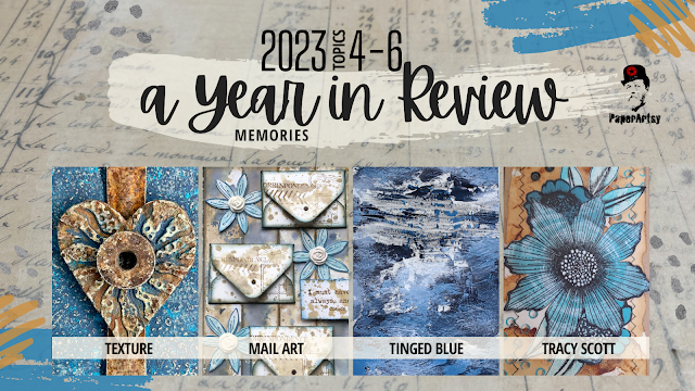
It's time for Part 2 in our instalment looking back at highlights from the PaperArtsy Blog in 2023. The theme overarching Topics 4-6 was Texture, and ohhhh how those of us with a penchant for mixed media love to add some texture to our layers, be it with pastes, papers or numerous other tactile layering options.

We have chosen posts from Topic 4: Mail Art, Topic 5: Tinged Blue, and Topic 6: Tracy Scott Designer Focus to share with you for this review. It's pretty hard to select just a few posts to showcase from each topic; our bloggers offer such a variety of ideas. If you are a regular blog follower, you will be aware how many incredibly creative ideas are on offer each week. Everything is linked below for you to head back for a deep dive into each post.

Get ready for blast of inspiration!

Leandra 


Our second theme for 2023 was Texture. this is a pretty easy and normal element to add into your work, especially if you are a mixed media buff! Sometimes having a brief helps narrow down the direction you might take in your creative journey, or helps you break a blank page. Here's the link to the Theme intro post... with plenty of ideas about how texture might be used in your creative exploration. 

While we are celebrating texture, here are a few amazing interpretations of this quarter's theme from a few of the blogging team...

I love this panel by Amanda Pink. She has stamped into PaperArtsy's Grunge Paste with various Tracy Scott mini stamps to create 9 segments which in combination make the whole background for this project. Sanding back through the dried paint to the paste was yet another contrast and added to the overall grunginess on offer. We love how she used a stencil as a template for the heart focal. If you would like to better understand how this came together, check out her  post here!


What about these fabulous envelopes created by Floss Nicholls? She used infusions onto cartridge paper - a sucky surface really pulls the colour in, and the ghostly looking stamped images were created by using bleach on her stamps.

The contrasting labels were made from fabric which had gesso randomly spread on the surface along with stamped script. The layers of PaperArtsy Printed Tissue are yet another gorgeous textural contrast thrown into the mix! Read all about it in her original post.


We were really pulled into the #cubemailproject highlighted by Martha Ponsanesi. Not only is the cube itself a texture, but by adding shiny embossing powder, gel printed paint layers and grunge paste, she made the cube surface tactile too.  Her original blog post is well worth a read!


Mail Art is something that has been around for generations long past, and as we become more entrenched in a digital world, we find that using our postal service for hand written and decorated papers or envelopes, is a beautiful, touching way to communicate with people you know in a very unexpected way. Getting something like these through the post is a happy mail day indeed! You can find the Topic intro post here with a wonderful look at the history of mail art, how it evolved and how varied it can be!

Jenny Marples has a super power- making books! For this Mail Art themed post her pages were formed from Post cards and envelopes tinted with Fresco Vanilla paint. Jenny is a big fan of Lynne Perrella stamps, and into this project was added many of the postage-stamp style designs Lynne has within her range. A nod to texture within the lacey layers is a perfect embellishment. You can see her blog post here!


Rikka's artistic background informs her creativity in many directions, and for this post she created postal buttons/ brooches. Not only did the frilly-fabric layers offer the touchy-feeley factor, but she also had collaged layers of postage stamps, and used Scrapcosy botanical stamps on tissue,  back-painted with frescos as the focal. But ohhh don't you think that gold postage partial-frame is an eye catching delight! Lots to enjoy
. Read all about it in her post here.


It's pretty cool when you can make something out of nothing - a talent many crafters love to exploit! This is a classic amazon envelope that has been altered beyond recognition! Crackle painted and stencilled layers, mini envelopes, Jofy Flowers, and some Alison Bomber words always add the perfect finishing touch.  Nikki Acton uses the classic blue/brown colour combo for that scrummy vintage vibe. Her original blog post is here if you would like to see more.


Topic 5 of 2023 was another colour exploration - Tinged Blue. We have been keen to show you how you can get more out of your paint colours by using a light or a dark colour to tint you paint into more colours. Using what you have to hand to create a wider range of colour is a big part of colour exploration. 

For this topic each blogger was allocated 'Surf's Up' Fresco as the core hue from which light to dark colour values were created using other fresco paints. This exercise was to show how your range can vary so much depending on the companion colours chosen for mixing. We don't often deliberately create light to dark values, so this was the challenge for the topic. We can create tints of a hue with white, and shades of a hue with black, but if we chose alternative colours to tint with we can make more new hues to play with too. You can read the Topic intro post here to get a better understanding where we offer a deeper explanation of these ideas.

Let's pick a couple of posts to highlight this process more clearly

Renata Peley worked with Surf's Up and Little Black Dress to create the classic shades as shown below. Look at those deep inky blues, aren't they fabulous!


Renata uses this colour palette on a canvas with Grunge paste underneath. In her blog post she tested different GP effects with texture tools and paint applied in different ways. Having chosen one of these background effects, she had created the perfect opportunity for a stormy background, with texture highlighted perfectly by the various shades of blue with white highlights. Check her original post here.
 

Liesbeth Fidder-de Vos chose the warm Seth Apter colour Buff for her mixer, and as the yellow dominates within this beige, in her test strip below, you can clearly see green emerge when mixed with Surf's Up. Isn't it surprising the range of colours she actually is able to develop with Buff and Surf's Up? Just 2 colours offering so much more! This is why we are so keen to share with you how to get more from the paints you have to hand, it adds value!


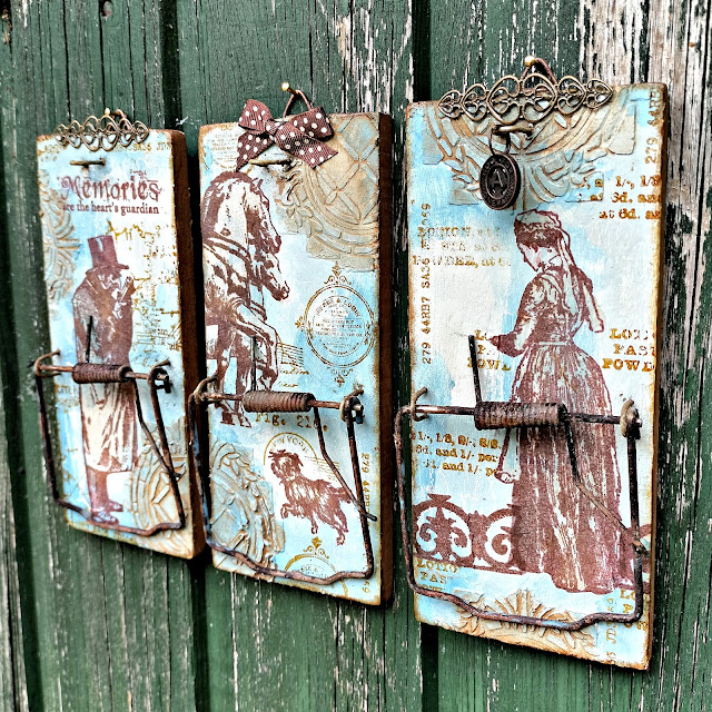
Liesbeth made altered rat traps with her new paint colours (!!!) that stencilled texture adds an interesting backdrop. The metal components were all rusted with PaperArtsy Rusting Powder, and that chimes in perfectly with the ink colour she used for the stamped images - these are all France Papillon designs. If you would like to see more of this post, you will find it here.

Heading in a softer direction, Victoria Wilding used Stardust with Nougat and Surf's Up to make triple layered butterflies for a frame-based project. You can see below her tests with each of the colours.


This is a gorgeous project to have on display, and keeping the colourway simple and structured is one way to restrict your choices so that you stay within a boundary. Sometimes more is not more, particularly for interior decor items where colours are often neutral, this approach can offer flexibility for display options. Here is the link to Victoria's original blog post.


Taking the 2 colour-mixing concept in a bolder direction, Alison Bomber chooses a light colour with Antarctic, and Green with Magic Moss. These 2 Fresco colours mixed with Surf's Up creates a gorgeous range of colours that chime beautifully with her rosemary stamp set.


I love how she has used a selection of the paint chips in her project too ...


You can read about Alison's post here, and she also shared more recently in one of her 'Fun Friday' lives a colour mixing explanation in our Facebook Group PaperArtsy People here, where she explains how to make watery versions of the colours which is often her preferred way to use our paints. Don't forget Alison is a 2024 Fodder School tutor, so keep an eye on her this year as she has lots of fresco and stamping tips to share.


For the final topic featured in this round up, we shine the spotlight on Tracy Scott, our designer who loves bright bold and geometric designs. Tracy always astonishes us in how she manages to create interesting and unexpected things with her products. She has only been art journalling since 2014, and we think her style is particularly unique. Perhaps this is because she has found her own way with paper crafting from the get-go, rather than be heavily influenced by the craft sector. If you would like to read about Tracy's creative journey and how she came to work with PaperArtsy, you should head to this link  

Our bloggers were charged with the task of using Tracy's products in ways that Tracy would not ... let's take a look at how they got on!!

Mags used her love of rust to inform her colour choice with a pop of blue to contrast. The tag envelopes are made from PaperArtsy Crunchy paper, which she has sewn at the edges. In fact adding stitching is the method she used to add texture to this project. You can read all about it in her blog post.


Also, I hope you did not miss this gorgeous booklet by Jennie Atkinson. Her blog post is well worth a read! Jennie is a textile queen, and uses Tracy's stamps in her typical muted colourway. She freestyle machine-stitched over the stamp design to create a re-interpetation, and added colour with watery Rusty Car Infusions.


Finally Autumn Clark loves to make gorgeous cards, and often adds stitching to the borders. She used torn sections of a Tracy Scott  lace booklet page which offers an amazing texture contrast, and PaperArtsy infusions are the colour of choice for these backgrounds. Read more here in Autumn's blog post.


Well, wasn't that a gorgeous selection full of interesting details. We know many of you love these end of year round up posts, and we so appreciate our bloggers who put their amazing twist onto our products.

Don't forget you can follow us year round on Instagram, or come and join our Facebook group PaperArtsy People

We'll be back in a few days with more highlights from the PaperArtsy Blog.

Sunday, 26 March 2023

2023 Topic 04: Mail Art - Topic Introduction


Hi everyone,

We are very excited for this topic to get going, as behind the scenes there has been idead flying as to how we could do a community challenge for this topic...more on that later... so read on !

This  topic invites you to play with everything mail related. Embellished letters, envelopes and postcards have been around since the beginning of writing, adding meaning to the words with images. The practice became an art movement in the 1960’s, with a focus on interacting with the postal services and their iconography,  and is still active despite the general fall in popularity of 'snail' mail.

More than just sharing news and information, mail can be conceived as forging links between people and distance. Not to mention the joy of receiving a little personal art work in the post!

While mail art is commonly agreed to be something you pop in the post, for this topic, we are sharing with you some wider possibilities. 

  • as explained, typically mail art is a project, either a decorated letter/envelope, or a postcard put through the postal system 
  • mail art can also be art that incorporates postal imagery as the main theme of a project: postal stamps, post marks, ‘par avion’, etc. 
  • Postal supplies can be used as substrates: envelope books, altered vintage postcards, postcard binders, old letters, postage stamps etc. 
  • The wider topic letters and correspondence can be explored, maybe a box to store precious letters, faux postage, personalised stamp sheet retracing your life etc.
  • 3 dimensional objects too that link to this theme, mini postboxes made from postal themed papers and more are also an extension of this concept.
No doubt there are many other ways to interpret this topic that we haven’t thought of! Think outside the (letter) box, we are looking forward to what you come up with. We hope to inspire you with all sizes, types and styles of projects.


Mail Art historically, might have been happening long before you may have realised! Mail art is free and accessible to all people. For an item to be truly considered mail art, it must pass through the postal system, ensuring the sender loses control of their creation, entrusting it to the postal system, and the receiver is surprised to get a non-conforming item in the post. The natural wear and tear that occurs enroute, is all part of the fun, especially the postage mark 'cancellations' the postage stamps -proof that the item has been posted from afar.

This French presentation of Mail Art by Raymond Balestra includes historical examples of early decorated letters.

In this document, linked, it explore the increased interest in the 19th century of postal art, within both letters and postcards. There are some guidelines, the address must be clear, the item sent should not incur a charge to the recipient, the item should be clear of sharp or perishable elements, and the size should not exceed 1metre x 60cm 

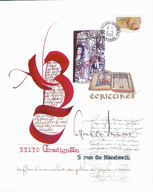
Follow the link below this image, by artist Didier Triglia, and you will land on a gallery of his mail art created from 2009-2014. With over 600 pictures, it's quite extensive! His quirky animal-human creatures are quite fascinating, lots of posca pen love within his work, bold colour and designs.

Fictional or not, creating a work of art on an envelope has been pushed to the extreme here to create the impression of something created decades ago.  I'm sure Mr Painter on Paintbrush street would be thrilled to receive this beauty!


What a beautiful arrangement! The actual design, layout, arrangement is a typographical feast. Different fonts, colours, layers along with a mix of hand written and typed elements leads your eye all around this composition.

Addressing a letter with personal touches can make the receiver feel extra special!


A play on both texture and light, once this box is formed into a cube ...would it survive the postal system? This is one one of the entries in the #cubicmailartproject on Instagram. Someone asked the same question, and got the answer; yes all are arriving intact! I guess its going to be dependent on the card strength and the interior support, but lots of fun for sure!I t looks like an open challenge for 2023. How pretty is this die cut mandala!


Cubic Mail Art Project  hosted by Diane Beauchamp.  You can Check out all the entries for the #cubicmailartproject on instagram. This entry above is by Eni Looka

Another mail art call that is open is being hosted by the inter-Art Foundation in Romania. The focus is to highlight the role of women in 21st century society, with attention on the need for women's roles in contemporary communities to be positively represented. They hope that civilised societies can all recognise women's rights, and freedoms, and they are calling for artists globally to send mail art dedicated to Women, as a symbol of life. Deadline July 1st 2023, format, max A4 size. Selected pieces will be exhibited from August 11th.   


The terms mail art and postal art are generally used to represent the same thing. Even the post boxes have been given a makeover below ...

This letter celebrates the coronation of King George VI, complete with Windsor postmarks!


Texture on this letter too with embroidered flowers and some collage, I'm sure a postal worker would have been amazed back in 1966, but now would this get stuck in the automated sorting systems?


Clusters are such fun to make, and these are perfect little embellishments for any mixed media project. Stitched, glued or stapled together, they are little bundles of joy!

Eve Adamson

Ohhh but how small are these postage stamp houses??? With chimneys!!!


These boys are off for a surf, they might get a bit soggy, Maybe they can dry out in the Hawaiian sun....


Using postage stamps to make the collage itself, very Mary Poppins! And what a riot of colour!

A stamp at the very centre of this piece of art, from which the art emerges ...

Postal jewellery, Lick and stick?? They do look reinforced, perhaps a resin layer to strengthen?

Luise Heinzl a junk journaller, shares in this video how to alter vintage postcards by cutting windows into the card and adding extra elements, backgrounds, stitching, tags etc


The various elements related to correspondence are wonderful substrates for any mail art project: vintage, or new envelopes, papers, correspondence, postcards are all fair game to create a new project. 


So many ways to build a book of envelopes! Here are 3 different ones: Accordion by Undercover Classroom, Spined by Cloth Paper Scissors, and Folded Line by Playful Bookbinding.

If you are a Pintrest user, this page might be of interest to you with many ideas pinned by Florence Cathala .


Moving onto actual elements directly related to the topic of mail, here are some fun little mini envelope clusters made from scraps, stamping and ink. How fun these are to add to any mail related project?


And of course faux postage is so much fun to create yourself too, from any media, maybe even fabric scraps.


Teeny tiny collages with postmark cancellations and butterflies as the common link.


Or even a Sara Naumann postal stamp might float your boat! Sara i one of our designers who frequently adds postage stamps and cancellation marks to her stamp designs.

With the most recent PaperArtsy minis collection, Leandra made this journal spread - postal themed.


Looking back on the PaperArtsy blog, we have tackled this topic on 2 occasions previously
you can check out those topics here 2019 Topic #3: Mail Art 2016 Topic #24: Mail Art


It makes complete sense, that as a mail art topic, we should collectively create some mail art to send to each other! This quarter we are partnering with the lovely Victoria Wilding from our blogging team, and she has cooked up a #paperartsymailartswap

The process to get involved in the #paperartsymailartswap  
  1. Sign up here to participate.
  2. Follow @victoriawildingscreates and @paperartsy
  3. Create a piece of mail art to send to Victoria: a postcard (6x4"), a tag (#8) or a journal page/ spread (no more than 7x10"), making sure to use a PaperArtsy product. Send the item off on it's travels through the post, to arrive with Victoria by1st June 2023 (you will receive further details of how to do this after you register here).
  4. Upon receipt of your entry, Victoria will send by return a handmade piece of mail art, made just for you
  5. A challenge winner will receive a mystery box form PaperArtsy to be announced 4th June 2023
All mail art entries will be added to the journal Victoria has made in this blog post. When the challenge closes, she will share a video of the completed journal.

As entries are received, they will be photographed, and shared via IG, added to a highlight

Please use the hashtag #PaperArtsyMailArtswap on Instagram or use the album on the PaperArtsy People Facebook Group to share your entry. 

If you wish, you can download the following #PaperArtsyMailArtSwap labels at each link for your: postcard or tag, or an envelope to put your journal page in.

A huge thanks from us to Victoria for organising this challenge, and we really hope you are inspired to join in!

From all of us here at team PaperArtsy, happy mail art crafting!


As always, even outside the challenges, we love to see what you are up to so don't hesitate to tag us on Facebook, Instagram @paperartsy , Twitter, or post in PaperArtsy People Group on Facebook. We really love to hear about how the blog topics have inspired you, so don't be shy!!

Saturday, 25 March 2023

2023 PaperArtsy Blog Quarter 2 Theme: Texture

Hello, Dounia here to present the theme for the spring 2023 quarter!: TEXTURE.

To compliment our monthly topics, these themes are, we hope, another invitation to invent and explore. It is so interesting to see how our different bloggers interpret these quarterly themes in their projects and we are sure you will discover something you will want to try! These themes are purposefully kept very open, so they are compatible with all manner of projects and styles. The theme will be incorporated with the topic, by each of our bloggers in their posts. This will be the underlying 'red thread' adding an extra layer! We can't wait to see what you make of it!

For this second quarter, our theme is : TEXTURE and will apply across the next 3 topics (Mail Art, Tinged Blue and our designer focus will be Tracy Scott). A concept you might be familiar with after Quarter 1. This introduction post will mainly explore different ways to think about texture and suggest techniques. We hope to spark new ideas and remind you of older ones. Indeed this blog is an amazing archive and texture has been tackled frequently before from lots of different angles. In addition to some great eye candy, this post is also full of links for you to go down a texture rabbit home! But first, this is the word cloud our bloggers were given for inspiration.


This title might seem a bit contradictory as 'Texture' often first evokes relief and bumps but I wanted to start you with something else to tease your creativity: Visual Texture.

Tumblr

We encounter visual texture every day in prints, patterns and colour variations. It is an essential tool to create interest and the impression of dimension in strictly flat techniques like drawing and doodling.


Brush strokes, splatters and blots are amazing vectors of texture when working with wet media. Have a look at this amazing ink textures collection by Elhen. You can also take a peek at 2015 Topic #8: Sprays and 2022 Topic #16: Splosh on the PaperArtsy blog for more wet inspiration!


Flat does not prevent layering! Gel printing allows you to build complex layers, playing with transparency, patterns and marks, and your result is still smooth!

Gel-plate techniques have really spread among the crafting community in recent years, but if you want some more inspiration and information, check this Gel printing techniques collection by Carolyn Dube.


Isn't this texture delicious? Leandra is the queen of brayer background techniques! Discover other takes on this essential tool on the paper Artsy blog with 2019 Topic #2: Brayers.


How about a little bit of pizzaz? Smooth and shiny, foiling is perfect to lift a project and provide eye-catching texture. Futher exploration on the PaperArtsy blog in 2018 Topic #20: Foiling.


Lots of other techniques are available to create flat texture, the list is far from exhaustive. Here Amanda used here favourite - cracks, but also some clever patterning. For some contrasting options, take a look at 2016 Topic #7: Resists on the blog.


Now going a bit deeper into the mixed media possibilities, a great way to create textures is using different substrate materials. Each brings their own colours and patterns and react differently to inks or paint for infinite variations!


Look at this collage by Carol Rhodes!  Wood is already a texture by itself, bringing warmth and grain. Just the difference between end grain and long grain gives an idea of its versatility! It is particularly great contrasted with the coldness and smoothness of metal for example.


Fabric, fibres and lace come with their own texture and patterns. From subtle weave to coarse knotting, everything is possible for smooth layers or great touch contrast. You just want to run your hands other them! Velvet is a particular sensorial experience. How about a velvety texture without using fabric? Check this Flocking video by WOW Embossing Powders.


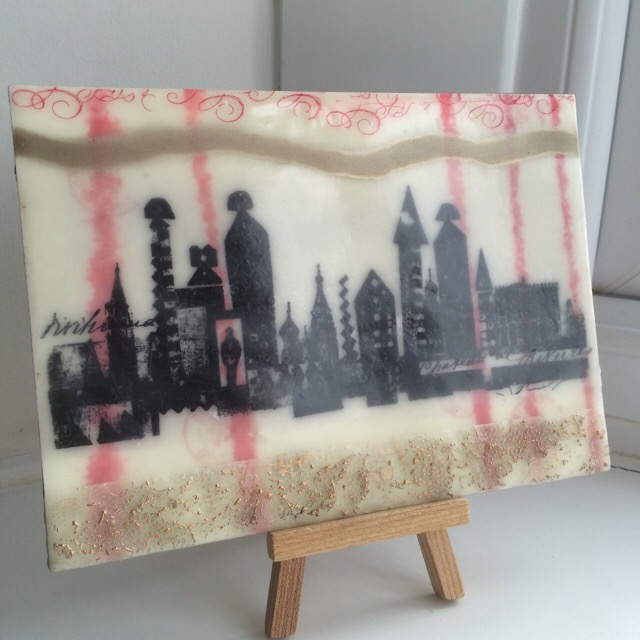
Wax has its own special look and feel: soft and satiny, warm and hazy. Perfect for dreamy images with a delicate shine, it creates it very own atmosphere and is a great base for multiple texture techniques.


Playing with difference in shininess is a great way to create texture, even when you piece black, like Pierre Soulages. For this, PaperArtsy Matte, Satin and Gloss mediums are your friends. Leandra and our bloggers did an extensive exploration in 2015 Topic #15: Gels and Mediums.


Clear Tar Gel is its own beast, creating raised texture, stringy and spontaneous. It dries a bit squishy with a nice slow bounce for a true sensitive experience. Other materials can give you that textural softness: crafting foam, faux leather or bubble stickers. But if you want a true squishy friend for these hard times, nothing beats making your own:

JoFY


After having chosen your materials, you can now shape them to create texture. Take this amazing piece by Tara Donovan, made of recycled acrylic. Don't you want to jump on it? Explore this collection of her works, they are so versatile and striking and always made of recycled materials.


You are not up to making room-sized sculptures?  Lots of options are still available to you. I am sure you have a stash of die-cuts and chipboard pieces... perfect for a texture piece!


This is a true building exercise, working only with relief and paint texture to create a whole scene. A great way to stretch your composition muscles!


Dry embossing is another great way to create texture. We now have our precious embossing folders but you can also emboss with everyday (flat) items like string, coins washers etc.... Just lightly spray you paper with water before hand to give it some more elasticity.


Folds and pleats create wonderful texture and patterns, and not just in fabric! Yes this amazing piece by  Gunjan Aylawadi is only made of paper, her work is a true marvel of patience and precision.


More achievable, this page by Tracy Scott beautifully mixes folding and colour for an impactful result (psst, it's a class...)


More random and spontaneous, the king of crinkling is tissue paper! Also those little ridges and canyons are perfect to retain colour for a unique texture. We love it  and already features it in 2018 Topic #19: Tissue Paper.


For more organic folds and drapes, a little bit of help is generally needed to stiffen your paper or fabric. Be sure to check 2016 Topic #6: Liquid Sculpting Medium to learn all about this technique and its possibilities!

Donna Ruff

Now if you are feeling a bit more destructive, fire is another great option. Just be sure to control it!  We already played with artistically destroying paper on the blog in 2017 Topic #18: Torn, Ripped, Burned (PaperArtsy is not liable for any accident or injury sustained during this practice, yada yada).


Finally we get to what is often our thought when hearing texture: rough surface, gain, dips and bumps, all that goodness! Here again, the techniques and tools are many and varied so you should be able to find the one that fits you.


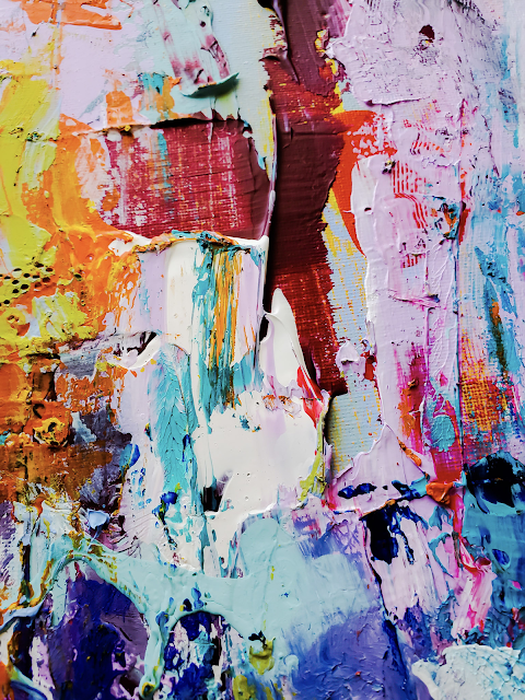
Painting knifes have been around for a long time! They are often a bit intimidating but can yield incredible and versatile results. Do not be afraid to experiment and have fun!


Another great staple of the crafter toolkit is embossing powders. They create raised surfaces and can be built to amazing texture. And the colour selections are now near infinite, even before making your own mixes!


If you built thick layer of embossing enamel you can create all type of textures, using it with stamps, embossing folders or mark making tools. In the same idea, resin and clay are also great mediums for added dimension and texture. Get some ideas in 2017 Topic #6: Resin and UTEE.

Jenny Marples

Finally, texture paste! They even have texture in the name! Lots of versions are now available: fine to coarse, with sand, with fibres with glass beads! Our favourite in of course our very own Grunge Paste. It is so versatile! Leandra demonstrates some of its uses in this Grunge Paste masterpost but be sure to also check our bloggers twists on it in 2015 Topic #6: Grunge Paste!

I hope this has given you plenty of food for thought as to a range of ways we can interpret and experiment with this theme TEXTURE. As our bloggers create over the coming 3 months, their posts will touch on this theme alongside the monthly topic.

Perhaps you might like to join us over in our friendly Facebook community 'PaperArtsy People' to see what others are up to with their PaperArtsy products, and maybe also using the content we share on the blog as inspiration.