Showing posts with label JOFY125. Show all posts

Wednesday, 20 December 2023

2023 Topic 12: Designer Focus: JoFY {by Jo Firth-Young}


Hi everyone

Jo (jofy.co.uk) here with you today. Christmas can be a busy time so its nice to take some time out of the hustle, bustle and 'hohoho' to sit and create. When I began thinking about this blog post I knew I wanted to create something festive so to get me in the mood I turned on the Christmas tunes and festive films. Do you do the same?

I settled on creating Christmas cards using one of my new Christmas stamp sets JOFY131- but because I've used the main image (the wreath) quite a lot already I wanted to focus on the smaller images in the set. The  single berry motif is really versatile (cut off the holly leaves and it can be used all year), the tag is super cute & it would be shame not to use the teeny tiniest stamp I think I've ever designed (the berry 'centre') in some way!


I like to combine different elements when making cards so I gathered up a set of bold word dies, stencils for gel printing, paints and stamps (of course!) and started making what was needed to create the patchwork/collage cards I had in mind.


I began by selecting paints from the PaperArtsy Fresco range that reminded me of a 1950's Christmas colour scheme - colours that inspire me.

Pinterest is a great resource for colour schemes - lots of images to suit and inspire themes and projects like the one shown below. Its a wonderful colour resource.


The overall plan was to create gel printed papers, painted stamped motifs and die cut elements that I would assemble into patchwork backgrounds and assembled clusters on greeting cards. 


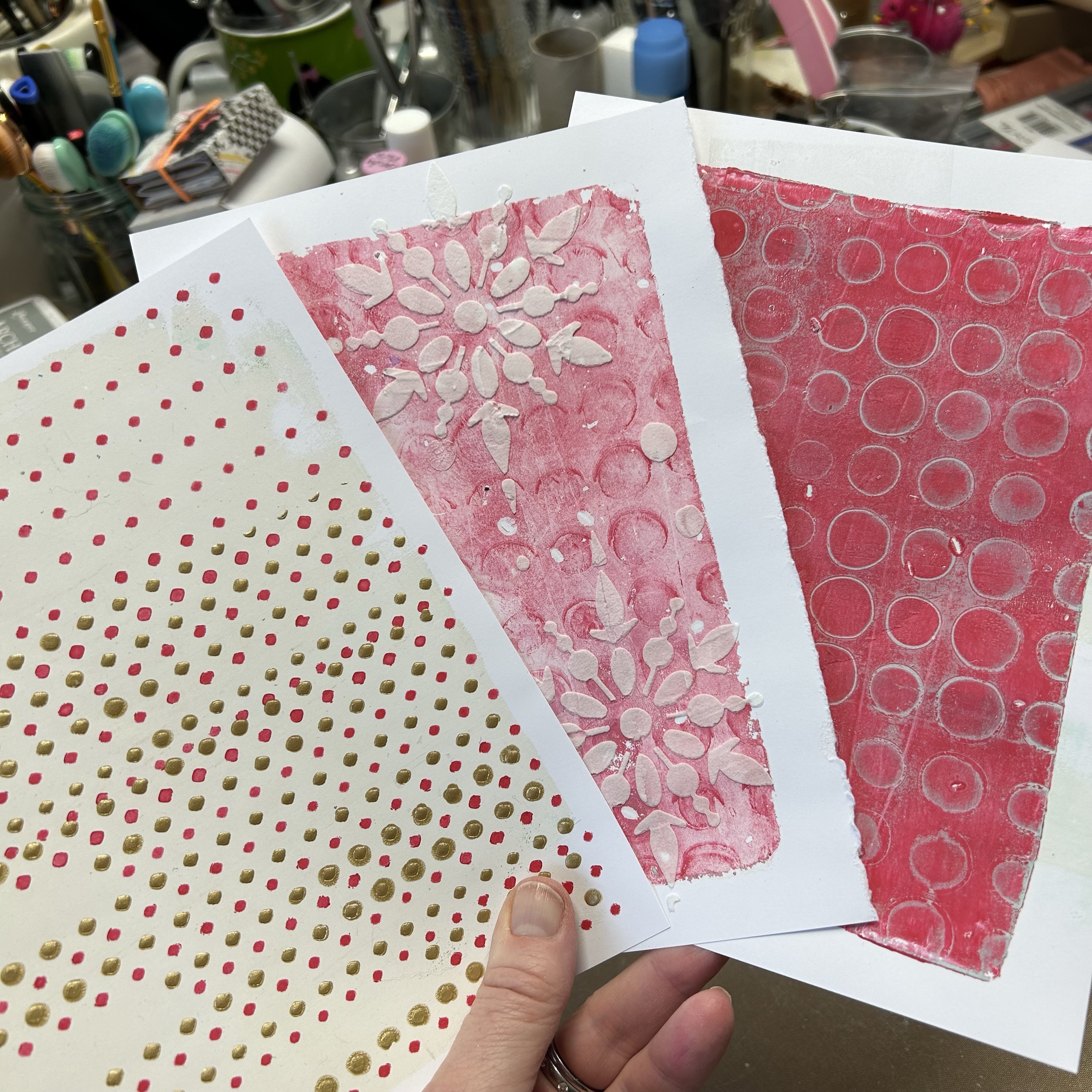
First I created bespoke background papers by pulling plain and patterned gel prints and adding stamping and mark-making to break the patterns up and make them 'daintier' and more detailed they needed this as they would be cut up in to small pieces.
I wanted the papers to mix and match so I used the above colours for background and details.


I printed lots of backgrounds, here are a few... I didn't use all of them for these cards but that's ok - they'll be used or upcycled for other projects.


Clean up/ghost prints are great as they often have lovely texture as shown above. I over-stamp prints with a background stamp (like this one from JOFY125) and use inks rather than paint (eg Crimson Archival ink).


This is a lovely background stamp - looks especially great when stamped and embossed in Gold, as shown below.


The Red Lipstick Fresco spotted print on a Cloud9 background (below) was quite bold so I tried to soften it by added painted spots and red & gold mini stars/flowers....


I printed a selection of pages:

.... in cream/gold... the Gold Fresco paint is fabulous when its gel printed!!


...and Aqua Duck Egg/ Caribbean Sea...
 

I added to detail to these gel prints by stenciling on top (PS313) and adding white dots (Cloud9 and Snowflake):


Stamping and embossing in white detail embossing powder gives a lovely crisp pattern:


I took the photo below while I was making the cards - its the pile of 'discarded'/waiting to be used bits and pieces - I loved how they looked together. Seeing different elements together like that can be quite inspiring. The dies ('Big Tidings' by Tim Holtz from Sizzix) were cut from gold and white cardstock - those 'neutral' colours would work really well with my colour scheme... and the gold card links nicely with the gold embossing and paint detail added to the gel prints.


I really like this way of creating - messing around with all the elements to see how they look together, which background papers work best and cutting and stamping other elements where necessary to add to the look/design of the cards.

Here are the cards I created - lets start with the 'pink' ones. Each of the cards features the berry motif painted in shades of pink/red, and a tag.


The addition of a wreath die-cut (Sizzix) give the card focus, and somewhere to place the berries and other embellishments. Embossing the pink card stock added texture to the piece.


I love how the white embossing looks against the kraft backround - so crisp and dainty at the same time.


Paint splats make great snowflakes don't they! lol The tag on this card is cut from a block of text I created by repeatedly stamping the word block from JOFY131.


Here are the 'aqua' cards:


The size of this word die allowed me to layer the die cuts and stamping on this card.


The panels of paper on this card have been attached with machine sewing - a similar effect can be achieved by hand sewing a simple running stitch or by drawing a stitched line with a white (or black) pen.


This is my 'less is more' card - I'm so happy with how it turned out.  Its big (7x7in), the metallic glaze stenciled snowflakes on the front are subtle and it has a lovely fresh look.


The 'Noel' die cut lays over an aperture allowing a peek into the interior of the card.


My creations aren't all cards - I had small bits and pieces of each of the background papers leftover and, as I don't like to see those go to waste,  I planned out a grid style greeting card on a black card base...


but I wasn't keen on that so I transferred all the pieces to a page in my grid journal- much nicer! (a grid journal is a great way to keep all those lovely bits and pieces out of the rubbish bin!)

And, as I still had pieces remaining, I made a grid inspired card too!


I embellished this with a wood snowflake, the greeting block from JOFY128, and a gold embossed print of the background stamp from JOFY125


There were even smaller scraps I couldn't see go to waste either - perfect for creating a little christmas tree to fit on a wood slice!! Great little project to add to a gift, a table setting or to hang on the Christmas tree.


I loved working with the bespoke papers I created, & teaming them with dies and stamps - I STILL have pieces left over!! The more I made the more I was inspired to change it up: add different greetings, add a snowflake here and there - slightly addictive - in a good way! Its fun to see how many cards can be created from relatively few supplies.


I encourage you to gather your supplies, turn on your Christmas tunes, wear your Christmas sweater if it will get you in the mood (lol) and get making!!!  Take a look at the smaller motifs in a stamp set and see what you can create with them - you'll be surprised!!

Finally - HAPPY CHRISTMAS!!  I wish you all the very best for the festive season - enjoy! See you next year.

Thursday, 30 November 2023

2023 Topic 12: Designer Focus: JoFY {by Renata Peley}


Hi everyone, it’s Peley Renata with you today with a fun and crafty little project. A long time ago, when I just started doing mixed media, very soon I realized how beautiful and magical this world is. And instead of being a responsible grownup, I spent many nights browsing the internet for some amazing stencils and stamps. Even now I remember seeing the PaperArtsy line the first time, but the first designer that draw my eyes was JoFY, with her whimsical and colorful designs. And that’s when I started assembling my early Christmas wish list. Luckily my husband fulfilled my desires and bought me two gorgeous stamp sets. And those two stamp sets were some of the first ones that I got in my now beautiful collection. So, I thought it was fitting that I make a project highlighting some of Jo Firth-Young’s beautiful stamp sets, that she released this year.

You know that feeling, when you feel like crafting, but don’t have the mood or time to commit to a whole art journal page, or any larger mixed media project? Well, for such occasions, what’s better than creating tags or artist trading cards. Though it is also a really fun format to work in and a perfect format for experimenting. This time I won’t be experimenting much, but I do promise some fun and good time.  


Recently we visited my husband’s parents and that place is like a treasure trove. I almost always find something that inspires me to create a project. They have some amazing vintage items, just laying around the house and collecting dust, but also some items that they got as an advertisement. And that’s precisely how I found my substrate and inspiration. On one of the shelves, they had an incomplete deck of cards with some company logo on the back. They weren’t vintage, or too pretty, but you know we crafters always find a way to make stuff look more interesting.

Now the two things came together for me: an old ugly deck of cards and new, gorgeous JoFY’s stamps.


Now that I had my main items for this project, I just had to figure out how to make them work together. But also, not to forget this quarterly topic: Typography. To be honest, the whole idea developed really fast, but soon I will tell you more about it.


Not long ago, in my previous blog, I was talking about my junk journaling crafting phase. That was the time when I was searching for ideas to make all sorts of fun pocket inserts. And one of my favorites was making something like specimen windows…or at least I think that’s how they are called. Anyway, that is what I have planned for this project, just in an artist trading card format.
The first step for this was to make windows in my cards. This took a couple of attempts as first I tested making windows with some of my cutting dies. None of them really fit my imagination so at the end I decided to create my own custom windows.


Those three cards on the left are the ones I cut using cutting dies, but the rest were the ones with my own measurements. I already said that my cards had an ugly back, so I decided to take two cards and adhere them back-to-back. In between two cards I would put JoFY’s stamped designs. To help the cards’ windows fit well and stay in place, using blue masking tape, I attached two cards to each other and cut them at the same time using a craft knife.


I cut out altogether ten cards, creating five atc bases this way. I planned to make three or four only, but you know the saying: “Two is one and one is none.”, and I was expecting to mess up up at least one. 😊

Anyway, now the basic frame for my cards was done. Simple enough, right? But now on to the second stage: making the middle layer and focal interest.

I originally intended to stamp on a plain thin paper or vellum (which I still think would look gorgeous), but then the typography topic came to my mind. So, I thought of a paper pad that I had for ages. This one is from Docrafts – Papermania: Bookprint. It is a very old paper pad and I can’t find it anymore for sale, but it looks something like this: one side has usually text in various fonts and languages with or without images, but the other side is plain white. Which was perfect as I needed one side to be blank so I could do some stamping. If you don’t have such paper pad, there are alternatives. Either book pages (sometimes if there is an end of a chapter, the other side of the page can be blank) or take a paper and stamp text on one side.


 For each card, I chose a different paper, just for fun. Of course, the next thing to do was stamping. My chosen stamps were PaperArtsy stamp sets by Jo Firth-Young (JOFY125 and JOFY126).


I cut the papers from the paper pad roughly to the size of the atc’s and drew in the outline of my window with light lines and graphite pencils, so that I would know where to stamp precisely. I stamped most of the stamps with a stamping platform and Ranger Archival Ink in Jet Black color, but again, there were some stamps that I didn’t want to stamp fully. For those cases I used Pigma Micron brush pen in black color.


As you can see on the image above, I really liked the stamp with those two insects on a tag, but I didn’t want the tag outline. Of course, you can solve that either like me, with partial stamping, or with some masking tape. Two ways but the same result.

Additionally, I stamped those two mini tags, and drew in some numbers using Pigma Micron pen again. I did try to imitate the style of Jofy’s numbers, but I’m not really sure how successful I was. :) 


Very soon, all four papers were stamped in the same way and it looked something like this:


Obviously, the next step was to color my images. As the paper on which I stamped was very thin, I didn’t dare to go with any heavy medium, so I opted for Prisma Premier colored pencils.


I always enjoy adding some subtle touches to my images so I thought to add a bit of shine to my colored insects using Art by Marlene Special Effects Glamour Glitter in Gold color.


I was happy with how the images turned out with bright and bold colors, but also with that touch of shine. Now obviously it was time to start making my artist trading card sandwich.


Originally, I imagined the cards with clean designs and bright and bold colours. I don’t know why, but at this point I started feeling attracted to an idea of adding just a tint of brown and making my cards look…not so neat and new. Anyway, let me show you what I mean.

First, I applied just a touch of the Antique Linen Distress Oxide ink by Ranger, using an ink blending brush. I applied the color on both sides of my paper but also on the cards.


After that, using Vintage Photo Distress Oxide ink I added some discrete interest using a text stamp from the PaperArtsy stamp set by Jo Firth-Young (JoFY102). The effect was very subtle, but I really liked it this way. Also, I added a bit of the same ink on the edges of my cards and windows.


Now was the time to assemble my sandwich, going something like this: on the back of one of the cards, I adhered the paper with the stamped image, over that the acetate and finally I adhered the second card.


I repeated the process for all the cards and in my opinion, they looked really pretty. But I still felt like something was missing.


For better or worse, very often I can’t resist adding small details. This time, one of those details was adding some more texture and interest using cutting dies. The die set that I found perfect for this set of cards was from Sizzix and Tim Holtz, called Specimen.


For each card, I made one embellishment and adhered it using a paper glue.


This was the moment when I decided to stop before I spoil the cards. Though I was considering adding some more interest using either dry, pressed flowers or some die cut florals. Maybe even a piece of thread…but not for me this time. 😊

Oh and a bonus fun fact, as the paper that I used for stamping is very thin, when I turn my cards towards a light source it becomes semitransparent and I can see the both sides of the paper. 


So cool, right? :) 


This was one of the projects where the idea and inspiration came easily. It all went smoothly and I was happy with the result. But when I try to make something like this next time, I will try either stamping directly on acetate, or use vellum paper. Also, I might really go for using pressed flowers and threads. Perhaps even add a metal charm as well. These are just some ideas for you or me to play with next time.

Anyway, this was my last blog post for this year, so I will use this opportunity to in advance wish you all a Merry Christmas and Happy New Year!

Renata 💜

If you enjoyed this process, but some technicalities are still not clear, or if you are a more visual type (like me), I have also prepared a full step by step tutorial for this project on my YouTube channel.