Showing posts with label PS155. Show all posts

Thursday, 15 September 2022

2022 Topic 13 : Fabric {by Autumn Clark} with Tracy Scott stencils


Hi everyone, it's Autumn Clark from SewPaperPaint with you today, and I'm here to share with you some fabric covered travelers notebooks I created from scratch using a selection of stencils designed by Tracy Scott.  I love Tracy's fabulous stamps and stencils and thought it would be such fun to use them to design my own artsy material.  I hope you will find this process interesting and will be inspired to print some fabric of your own!


I thought long and hard and hard about this topic and how to represent it with Tracy's gorgeous designs, and though I could have used stencil brushes and painted the fabric directly, I knew that would take much more time and take some of the spontaneity out of the process.  But if you don't have a gel printing plate, I would encourage you to try that method, because I'm sure the results would be amazing. 


My first step, which I always love, was to choose a color palette with my PaperArtsy Fresco Finish Chalk Acrylics.  This time I picked a range of brights, including Captain PeacockSargassoSlimedBananaPrawnBougainvillea and Cloud Nine.  I knew I wanted to work with some vivid, happy colors, and since they were I made them do a little dance for you!  I hope these cheery colors alone will inspire your creativity!


I gathered some torn pieces of soft, pre-washed cotton fabric and my 8x10" gel printing plate.  I wanted a layered look and picked quite a range of PaperArtsy stencils by Tracy Scott, including PS126PS155PS160PS189PS199 and PS322


Now, this may seem like quite a lot of stencils, but as you will see in the video below (or HERE), I worked quickly and was able to get a lot of interesting color combinations and varied patterns throughout the process.  I tried to speed it up a little, but not make you nauseous!  Ha ha!  The whole process took me about 35 minutes.  My advice is not to overthink your layers and to work quickly and intuitively. 


Now for a closer look at how those stencils altered the fabric...This piece showcases PaperArtsy stencil by Tracy Scott (PS210) as the focal image.


The next sample shows PaperArtsy stencil by Tracy Scott (PS125) among the layers.   


Finally, the third piece shows PaperArtsy stencil by Tracy Scott (PS089) in that gorgeous Bougainvillea!   



As you can see from the video, I added some base colors, then layered the stenciling.  Next I assembled my covers I needed to construct a sturdy base so I cut a piece of cardstock to 8 1/2 x 7 3/4" and scored at 3 7/8, 4, 4 1/8, 4 1/4, 4 3/8, 4 1/2, 4 5/8".


I used a glue stick to adhere my fabric to the scored card (directly to the card, not the fabric).  Then I used a pencil and a clear ruler to draw 1/4" border around the cardstock as a cutting guide.  I would have used a rotary cutter, but I was out of sharp blades, so I used my fabric shears.   Alternately, I could have folded a larger allowance before stitching for a more finished look along the edges, but I really wanted that artsy feel with the frayed edges. 
 
 
Once my edges were trimmed, I took the pieces to the sewing machine and stitched a double border around the edges and frayed the edges thereafter.

 

At this point I folded my covers to see what the result would be and decided to add in a little contrast.  I picked Tracy Scott mini stamp 64 (EM64) and used PaperArtsy Fresco Finish Chalk Acrylic in Cloud 9 (FF149) for my stamping.  I considered using Little Black Dress, but was afraid to overpower my backgrounds.  I brayered my paint onto my wee gel printing plate and used it as a "ink pad" for stamping. 


To finish my journals, I used a pamphlet stitch with black waxed linen, but let the cords come out (rather than be hidden in the center).  I used these threads to tie on a piece of sari ribbon to use as a wrap closure.  I attached some painted wooden beads to the ends of the waxed linen.
 
 
I was really happy with the white stamping over the patterns.  I like the softness, but as I said omitting the gel printing plate and stenciling directly to the fabric would produce richer colors.  I always tend to tone colors down a bit, as a personal preference.  And it was a really fun printing session using a new to me substrate.
 
 
The pink background is shows the stenciled colors a bit differently and I really like the effect.  I only wish I had used Tangerine so that one of my journals had an orange background.
 

Now I will using my stamps to alter the pages within my journals!  It's been fun to let stencils shine on the covers though!


It's not often that I use primarily stencils in my work, because I am a crazed stamper!  Ha ha!  But I hope this post has given you some ideas on how to maximize your stencil stash in a new way. There is an entire group of posts on the PaperArtsy blog dedicated to stencils, which you can find HERE.
 
Also make sure to scroll through the current topic, fabric, for many ways you can use your stenciled cloth, whether it be another book cover design, an artsy pillow for your studio, or a wall hanging.  I wonder have you printed fabric before?  We'd love to hear your thoughts in the comments.  If not, I certainly hope you'll give it a try.  What fun awaits!  It's been such fun sharing with you today and I look forward to next time.

xx, Autumn


YouTube: SewPaperPaint
Facebook: Autumn Clark
Instagram: @sewpaperpaint
Pinterest: SewPaperPaint 

Sunday, 7 August 2022

2022 Topic 11: Stamp Mash-up {by Renata Peley} with Tracy Scott, Nicci Battilana and Scrapcosy stamps


Hi everyone, it's Peley Renata with you today, and I'm here to share with you a very feminine and vintage art journal page I made using products designed by three very talented ladies: Tracy Scott, Nicci Battilana and Scrapcosy.


When we start making an art journal page or any sort of artsy project, we all draw inspiration and ideas from various places. We can get inspired by color, by image, by something we saw or who knows what, it can be completely subconscious. I for one really enjoy costume movies, so it won’t surprise you when I tell you that for this art journal page, I got my inspiration from the girl stamp, in the latest release by Nicci Battilana. I right away thought of her as a duchess, as this royal, elegant lady, living in her 16th-17th century castle, sipping tea and reading poetry.


To be able to better decide on the size of the background paper, this time I decided to start my project by preparing the images first. I colored the girl and the brooch from the stamp set ENB11 by Nicci Battilana, and some flowers and a butterfly from the ESC23 stamp set by Scrapcosy.
On the image below you can see me coloring, while my image is fixed on the stamping platform. The reason behind that decision is that my watercolors were a tad bit opaque as they were pastel shades, and they dimmed the black outlines of my images. So, after coloring one image I just re-stamped it in order to bring back some of that firm outline.


After coloring the images, I fussy cut them and with a black brush pen I went over those white edges. Maybe I keep repeating myself, but I really do think this is a very important step. It helps the cutout images to look better and it gives a bit of a shading effect. My advice is not to be lazy, don’t rush and do those tiny details because at the end, those details are what raises your work to the next level.


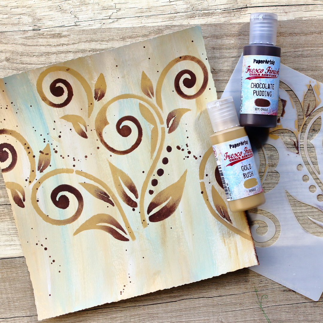
As you can see, my images were prepared and it was time to start working on the background. For this, I chose several PaperArtsy Fresco Finish Acrylic paints in shades of brown. Starting from the brightest, my chosen colors were: NougatSandGold Rush and Chocolate Pudding. Also, when considering the color scheme, I like when my background contains some of the colors that are present in the images. I think it makes the whole project more cohesive. For that reason, I decided to include a small amount of blue color (Paper Artsy Fresco Finish Acrylic Paint Smurf) in my background as well, since it can be found on my girl’s clothing.
Oh, and I forgot to mention that I cut my base paper in a way that it would have deckled edges. I felt like that contributes to the “old paper” look and gives it more a vintage effect.

As working with acrylics can be a quite messy process, I moved on to work on my glass mat as it is much easier to clean.


I personally really enjoy the looks of the brush strokes, so I decided to mix my colors directly on the paper. I started with the brightest shades, and slowly added darker ones. The good thing when working with acrylics is that you can mix and keep adding the colors until you reach the desired result. And if you are not happy with how it turned out, it means you are just not done yet. In the worst case, just put on it some white gesso and start over. With acrylic paints, it’s hard to go wrong as long as you respect color theory.


As soon as the base color was done, I took the Tracy Scott stencil PS155. This time I didn’t want just simply to stencil in one plain color but instead, I opted in for some ombré effects. I wanted the stencilled shapes to be a bit darker in color so I was switching between PaperArtsy Fresco Finish Gold Rush and Chocolate Pudding. I was always making sure to cover with a masking tape the areas that I didn’t want to accidentally put in the paint. Also, on purpose I didn’t stencil in the lower portion of the background, since I knew that area would later be covered with the flowers anyway.

Oh and of course I put some splatters as well. You can see on the picture that I added splatters in Chocolate Pudding color, but on later pictures you can see that I added some pinkish ones as well, since I had that color on my flowers.


One more thing that I enjoy doing for my art journal pages is darkening the edges of the paper. I think it helps pull the viewers eyes to the focal point and honestly, I just feel my page is incomplete without it. For that, I again used the Chocolate Pudding color.


At this point, both my background and my images were ready and it was just a matter of assembling it all together. The first thing that I did was to adhere my page to a black background. There is no particular reason for it this time, I just enjoy how it looks. For this purpose, I used double-sided tape. But adhering my page to the background just felt too plain, so I decided to spice it up a bit and add a bit of a lace to one side.


Now I have a confession to make. At this point I started to worry my project would be just flat and boring. I felt like I was missing that special something to it. After a bit of brainstorming I realized that I liked that bit of lace at the edge so much that I just had to put it somewhere else too on my project. And at that moment I had this idea. As I said at the beginning, I imagined my girl to be a duchess, so I wanted to further embellish her royal outfit. First, I gave her some shoulder epaulets with the same lace that I already used for this project, and then using skeleton leaves, I gave her a Medici collar.

A bit of bonus info is that a Medici collar is a type of ruff that was worn in the late 16th and early 17th century. It stands upright in the back of the neck and it is open in the front. It was introduced by Marie de’ Medici after whom it was named.


I wanted this project to have dimension, so for the majority of the elements I have used a foam tape. And then, when it comes to the final touches, sometimes I have a hard time stopping myself. Anyway, tell me how can you imagine some royal lady without her pearls? Well, I couldn’t, so I added them on her epaulets and made her necklace to be a pearly one. I also added some glitter on certain parts, like duchess’ jewelry and collar, flower centers and the butterfly.


I forgot to mention that before doing all of these extra embellishments, I prepared my silhouette brooch. I used Glossy Accents to give it that glassy effect and I also put there some pearls, so it would better match the rest of the project. The other thing that I prepared was my quote. The sentiment came from the same stamp set as my duchess and I heat embossed it on a black piece of cardstock.


While I had Glossy Accents on my table, I used them to add a few water looking drops on my flowers and to add some dimension to the roses in the duchess’ hair. And I guess I had to stop myself from adding more details. So here is how it all looked at the end.


As I mentioned, at some point I started to worry this project would look too plain, but then I got this idea to use the lace, skeleton leaves and pearls and I got so excited that I had a hard time stopping myself from adding too many details. Sometimes all of us feel like our project is missing something but then again we fear adding more because we are afraid that we might ruin what we made so far. My advice – don’t be afraid! Art journaling is supposed to be fun and to bring joy. What can help if you feel stuck is to walk away, do something else for a bit and then come back. That almost always helps me to get a new perspective and idea.

Anyway, I hope you enjoyed my process and that you like the new stamp set from Nicci Battilana. And take a look, she has some other amazing stamps and stencils in her latest release as well. 😊

Renata 💜


Facebook: Peley Renata
Instagram: @renata_artjournaling