Showing posts with label MN74. Show all posts

Thursday, 19 August 2021

2021 Topic 10: My Favourite Colour with Minis {by Jennie Atkinson}

  2021 Topic 10: My Favourite Colour


There are always some classic colour combinations, and a soft blue and sepia are one of those combinations. Jennie uses colour with such a delicate touch, and you can see from this post how she manages a deft touch and uses white space cleverly too, with the steps explained in detail here today.
~ Leandra

Hi everyone, it's Jennie (Live The Dreamwith you today sharing my favourite colour ..... well actually two favourite colours! 

It will probably come as no great surprise that my favourite colour is tea dye. No matter whether I am creating something vintage or more modern, there will always be some tea dyed paper, lace or flowers somewhere in the mix. It is always a great base for any PaperArtsy stamps but also goes well with other colours too. And so I have added in another favourite - turquoise. My little pot of A Little Bit Jaded Infusions has been my go to so many times. 

I recently used some rather thick watercolour paper and decided to cut some up to make a journal. This is my first double page spread and I have used PaperArtsy Minis as background stamps, as individual layers and the main focus.


This detail shows a little more clearly how the text stamps have been used both in the background and for the layers.


And I have followed through with the same stamps on the opposite page but with less layering.


And the colour all came from this little pot of Infusions:


There is a bit of a French theme going on here! These are some of my most used Minis and all work so well as either background and focus stamps:


MN 45                                        MN79                                        MN23


MN74                                    MN72


MN85                                MN75


They are a good size for using up scraps of tea dyed copy paper - sometimes straight edged, sometimes torn.


And I use a selection of dies to cut different styles and tags. 


It also makes it easier to isolate individual words or parts of the stamp.


And so to the journal pages. I started with some old French text paper and Sara Nauman's stencil.


This gave me a good base for then adding the Infusions. I do use a lot of water which is why this really heavy watercolour paper is so suitable. I just keep spritzing and mopping up until I have the colour I want. I also like to move the Infusions around so it settles into the areas of the stencilled texture paste.


A Bit Jaded (no longer available)

So many of the Minis make superb background stamps - I find it easiest to ink the area of the stamp I want and then use my fingers to press the image onto the page.


It is easy to isolate small parts of the stamp - the postage frank on the larger stamp and the small flourish on the text stamp as this detail shows.


Once dry I was able to layer my pieces, adding in some additional embellishments to compliment the colours.


As I had used dies to cut my focus pieces I was able to also cut some light card so they were a bit more robust for layering.


The first two pages complete for my new watercolour journal. I may concentrate further on the French theme and include memories of a trip to Paris and our cycling holidays in France. These stamps are just a super size for this small page (approximately A5) and useful for both general journalling but also scrapbooking memories. 

So do check out the Ink and the Dog Minis ! There is an amazing range of text, sentiments, flowers, feathers, background and travel themed stamps to name but a few. 

Jennie x

Blog: Live the Dream
Instagram: atkinsonjennie
YouTube: Jennie Atkinson
  

Tuesday, 8 June 2021

2021 Topic 7: Stamp Mash Up JOFY, EEG, ESN, I&D minis by Helen Chilton

  2021 Topic 7: Stamp Mash Up: JOFY, EEG, ESN, I&D Minis


It's fascinating how diverse images can meld so perfectly. Using an almost tropical colour palette and some beautiful stencilling, Helen has created a wonderland garden full of beauty. With some clever reversing tips plus some super glossy blooms, you might want to dig out your magnifying glass!

~ Keren

Hi everyone, it's Helen with you today, and I'd like to share with you my mash up project. I love doing these as you have so many stamps to choose from but that can also be a disadvantage as you're spoilt for choice.
With this project I was going to do something totally different, using very different JOFY stamps. However when I'd made the background it looked too tropical for what I was planning so I went through my stamps again! Actually it worked in my favour as I could make the Sara Naumann birds a focal point as well (plus I love those stamps).


Brayer two colours on to start with, if you brayer one layer over another while it's tacky it also pulls some paint off leaving an interesting texture.


Love this stencil and have used it in all directions.


I've chosen a circular pattern for the next layer - by chance it fits in well with the stamped and cut out circles later although I can't claim to have planned that far ahead!


I finished with zigzags and those large leaves; I can see that stencil becoming one of my favourites.


Use the Minis to stamp in paint - you've already built up six layers.


I used a Stamping Platform for the flowers simply so I could go back over the outlines once I'd painted them. Be careful with this stamp as it's easy to get ink on the open spaces.


The gloss glaze used here just gives the flowers a lift. While it's wet you can also add the beads to the centres.


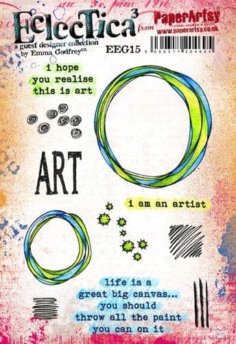
I was thinking of creating a sun with this stamp of Emma's but in the end cut out the middle and used it as a frame and a perch for the birds.


Using black paint to stamp these meant I got a really intense image. As it's a silhouette stamp I just cut it out and painted the back to get my bird to face the other way.


Playing around with the layout, I added some smaller cut out circles in blue and yellow. I was going to use the pink again, but it was too much.

To finish, I used the Minis to frame the whole board - the script is lovely and loopy and the circles echo the circle frames.


Finish off with the text, stamped on a matte background to contrast the glossy flowers.


I love the contrast of the black paint with the bright background - it really stands out. In fact, apart from the flowers and text, I've used paint to stamp everything here - it gives a good opaque image, yet at the same time I'm not worried about it being perfect. The whole idea is to give an impression. Using all these different stamps has once again been great fun. If it's too daunting to have completely free rein, limit yourself to four designers as is done here. You could try pulling together the designers that seem most different for an even greater challenge!