Showing posts with label PS061. Show all posts

Monday, 15 September 2025

Woodland Wanders with Lynne Perrella stamps {by Mags Woodcock}

Hi everyone, nice to be back with you again

Mags here with you today.

This year on the blog, we have free rein to do a deep dive into a PaperArtsy product ranges of our choosing. For this post I have been exploring two fabulous Lynne Perrella stamp sets

Today I'm looking forward to sharing with you how I use a faux wood slice to create a woodland plaque with lots of texture and dimension within the layers. Lots of PaperArtsy products came out to play and it was fun to use several products to add colour in a variety of ways.


 I used Grunge Paste (GP190) combined with some Fresco Finish Chalk Acrylics and Just Walnut Infusions (CS25) to add texture and vintage colour to my project. I also used quite a few Mattints to colour my stamped image, and I share how I achieved a lovely skin tone. 


 As you can see here, I chose some neutral colours along with a couple of greens to combine with the Lynne Perrella stamp sets.(LPC047 & LPC048) The stencil is by Kay Carly (PS061) and was the obvious choice for a delicate botanical feel. As it turned out, I didn't use the plain tissue or Fresco Finish Chalk Acrylic, Snowflake , but instead stamped directly onto my faux wood slice


I'll take you through the other supplies I used, as I use them.

 
I wanted to add quite a lot of interesting detail to the background of my project. So I started by stamping the lavender foliage from Alison Bomber's Lavender Edition stamp set (EAB47) available from a PaperArtsy stockist. I used Ranger, Archival, English Ivy to achieve a lovely crisp images


The background was a little bright for my liking so I sponged on Nutty (MT02), Fern (MT03) and Ash (MT10) Mattints, available from a PaperArtsy stockist , working in a circular direction to follow the wood grain. Using the Mattints to add colour as well as seal the surface allowed me to colour the leaves with Fern followed by a touch of A Bit Jaded Infusions (CS02), The Mattints stopped any bleeding of the Infusions outside the stamped lines


I wanted to use some Grunge Paste to add texture to the background, so mixing it with some Fresco Finish Chalk Acrylics , Magic Moss (FF130) and Castleton (FF231),available from a PaperArtsy stockists , achieved the colour I wanted.


I applied the coloured grunge Paste through the Kay Carly stencil, working in from the edges of the wood slice, and using various parts of the stencil to add variety. When the Grunge Paste was completely dry I brushed on a coat of diluted Just walnut Infusions (CS25) to add a vintage feel.


Whilst gathering supplies to possibly use on the project, I came across some gorgeous MDF leaves. They were perfect to add some more dimension. I used a sponge to add a base coat of Fresco finish Chalk Acrylic, Buff (FF96), followed by a mixture of Buff and Magic Moss. A touch of Castleton mixed into the mixture created a slightly darker shade, which I added to one edge of the leaves.


Continuing to add colour to nature themed elements, I had some chipboards that I thought would look lovely. There was one large circular piece that I wanted to include, plus some smaller elements. I used A Bit Jaded Infusions mixed with water and decanted into a spray bottle, and randomly spritzed the chipboards. I didn't actually use the large circular element in the project, but it will await it's turn to shine.


I was really pleased with all the elements and background I had created, It was now time to move on to the focal image for the project, and also decide on the colours to use. I had a couple of ideas, but as we all know things can change as we progress with a project.

My initial idea for the focal area of the project was to stamp out the two faces from the stamp sets, fussy cut them out, then layer them up to give the simpler one a "Beehive" hairstyle,  adding in the embellishments I had created. I experimented with this idea, but soon realised it didn't work to my satisfaction. I put my thinking cap on and soon realised that what was needed was a contrast. A contrast to the organic leaves, birds, feathers and other items.

I stamped the image from LPC048 on to Smoothy Card (SCA4) using Ranger Archival, Jet Black and created a panel with the image in the centre. The straight lines of the panel were just the ticket for adding in that much needed contrast.


Just Walnut Infusions came into play once more, to add a vintage vibe to the stamped image. I used a large brush to add a wash and then when it was dry, added a few extra splatters.
I coloured the face with watered down Ladybug Mattint (MT12) available from a PaperArtsy stockist and the cheeks with full strength Ladybug.


Now was the time for a big decision, which other colours to add to the image. I toyed with the idea of yellow, or green, but in the end Dragonfly Mattint (MT07) won the day. It would give the image the much needed pop of colour.


My focal image was taking shape very nicely, but it needed something to lift it from the background. I had always planned to mount it on something, but exactly what took a while to decide. I tried book pages, kraft card, and stamped card, none of which looked right. it was at this point I came across some small panels of wood veneers. They were just right for my purpose, only one problem, they were too small. After a bit of playing around I came up with the idea to layer up two panels to form a solid base for the image. Splitting the two remaining panels and distressing the ends before overlapping them worked perfectly.


It was now time to bring everything together on my wood slice background. I had some mini wood slices in my stash of possibilities, these were perfect to mount the focal panel on.


I used foam tape and Heavy Gel medium to layer up the focal panel on the slatted wood panel. This allowed for embellishments to be tucked in between the layers easily later.


I loved how everything was coming together and couldn't wait to add more. As always, I think it's the little details that make a project

The birds in the stamps were crying out to be used in the layers surrounding the panel. but also featuring on the nest, these were also coloured using Mattints, Glow (MT01), Nutty (MT02) and Dragonfly (MT07). I also added some grey board butterflies which had a base coat of Buff followed by a coat of Dragonfly Mattint, and the eyes from the face on stamp set LPC047 added


Coordinating buttons added some much needed colour to tie in with the Ladybug . A coat of Matte Glaze took away the annoying shine for a more vintage look


As you can see here, layering up the elements made the project multi dimensional and added lots of interest and texture.


The face on the seed packet stamped image was distracting so I covered it with some buttons from another stamp in the set, using Glow and Ladybug Mattint, and Just walnut infusions to add colour.


Colouring the white feathers from my stash was easy , I sprayed with just Walnut infusions and left to dry.


I have loved creating this project with all the little details. I hope you enjoyed seeing how it came together. I can imagine a set of tags or a journal cover using the elements and stamps I used in this project.

Take care and happy crafting................. Mags x 


Facebook: @Mags Woodcock
Instagram: @Mags Woodcock


Sunday, 27 March 2022

2022 Topic 05: Stamp Mash-up {by Renata Peley} with Zinski, Kay Carley and Hot Picks stamps

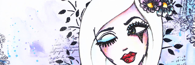
Hi everyone, it's Renata Peley with you today, and I'm here to share with you a new art journal page that I made, with a sneak peek of a stamp set from the upcoming release by Zinski Art. This coming week PaperArtsy has 4 releases for your pleasure, and these large ZinskiArt faces are the first of those tomorrow, Monday 28th March. 

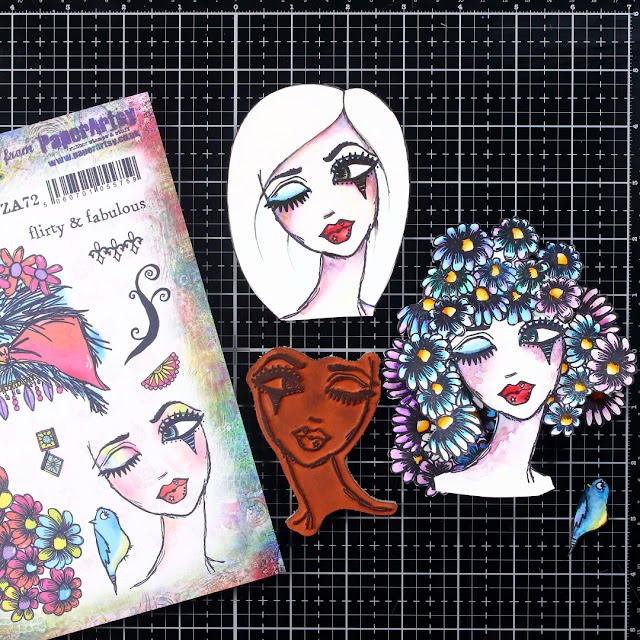
In my opinion, the girl from the Zinski Art stamp set ZA72 is so feminine, flirty and a bit mysterious that just by looking at her, she inspired me to make a page in exactly that kind of style. For me, the mix of blue and purple colors gives such mysterious and a bit magical feeling, and my chosen stencil by Kay Carley and Hot Picks stamp give my project that feminine and floral feel.


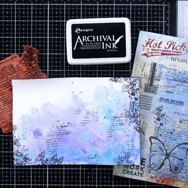
As I said before, the color scheme for this project was decided in my head as soon as I looked at the girl in the Zinski Art stamp set, and I also knew that I will use the Fresco Finish Acrylic Paints by Paper Artsy, but what kind of background did I want? Well, what goes better with the mysterious and flirty feeling than the lose watercolor look, I thought, and with that I started working on my background.


I put my chosen colors (PeriwinkleForget Me Not and Smurf) on my craft mat and prepared a glass of water. For paints to mix in a way the watercolors do, I had to wet my paper, as well as dilute my acrylics with a lot of water. When blending colors, I always tend to start from brighter colors and slowly add darker shades until I achieve the desired result.  And, of course, when the base color was done, I had to add some splatters, because I just couldn’t resist. For that I used the same colors as for background plus some opaque white color (Snowflake).


Now that I laid down my colors, I wanted to do some stamping and for that I chose the HP1301 stamp set. Since, as mentioned earlier, I wanted a feminine feel, I decided to stamp the script and flowers from the stamp set. I placed the flowers a little bit more toward the edge of my paper to give it sort of a framing.


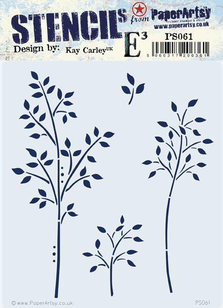
The next step for me was to introduce a stencil from Kay Carley. The stencil of my choice was PS061 as, in my opinion, it adds more to the floral feel of my page.


For a bit, I was debating on which stencil technique I should use, but at the end I decided to go with the heat embossing. As I've seen, some people dab the ink pad directly over the stencil, but I prefer to pick the watermark ink with the ink blending tool and dab it through the stencil that way. I think this option is better if you wish to keep your watermark ink pad clean, though mine isn’t as pristine as I would like it to be.


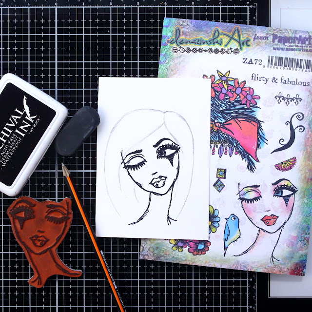
With the heat embossing done, I considered my background finished and the time came to work on my focal image. For that I chose the soon to be released stamp set ZA72.

This stamp is honestly really cool because it gives so much possibilities for varying the elements. I was playing around for a bit, as I will show you soon, but at the end I decided to give my girl some hair, so I freehand drew it with a pencil at first and when I was satisfied with the looks, I reinforced my drawing with an archival ink pen.


I mean there are just so many options. If you decide to draw her hair, you can go crazy with it. You can do long hair blown in the wind, crazy hairstyles, simple ones, realistic ones, or you can use the stamp set as it is and give her a gorgeous flowery hair.


To be honest, my original idea was the flowery hair and I loved it, but at the end I decided to go with the other one only because I felt that my background was busy enough and the flowery hair would just overwhelm it. Anyway, depending on your background, you can choose which way you want to go with the hair. And let’s not forget that there is one more hair style included in the stamp set as it is.


Like many of you, I like adding little quotes or sentiments to my art journal pages and I found the perfect one for this page included in the stamp set. I did the heat embossing once again on this project. On the picture below, you can see that I decided to heat emboss with white embossing powder on a black cardstock and for that it’s really important to prep the cardstock with some baby powder so you won't have the little white speckles all over your text strip.


For this project, I decided to go with a bit thicker black frame, so I just glued my page on a piece of a black cardstock. I have some other art journal pages like this floating around, and one day I might just bind them all together. And with enough of a black frame, I won’t have to pierce my project for the page binding.


I was thinking to remake this project at some point. My plan is to go with a bigger piece of paper for the background, so I will have enough space to go wild with the hair making. I feel that with stamps like this, there are just so many options for combining the elements. And this also applies for some other stamp sets by Zinski Art that will be released at the same time as this one. So, my advice to you is to go crazy, let your imagination go wild and most importantly have a lot of fun.

Renata


Facebook: Renata Peley