


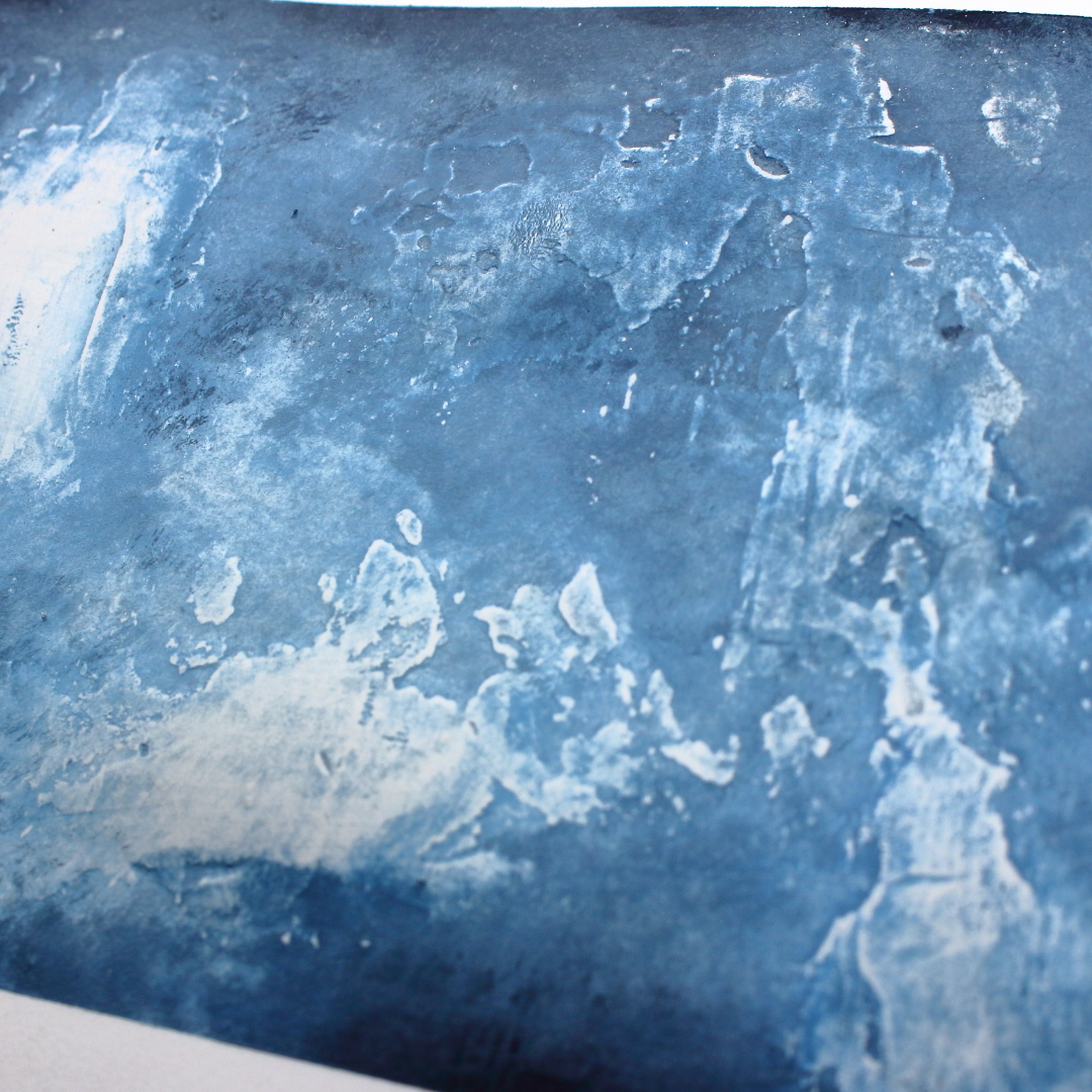

In contrast with the previous experiment, I applied Grunge Paste while making sure that my textures would be as rough and bumpy as possible.

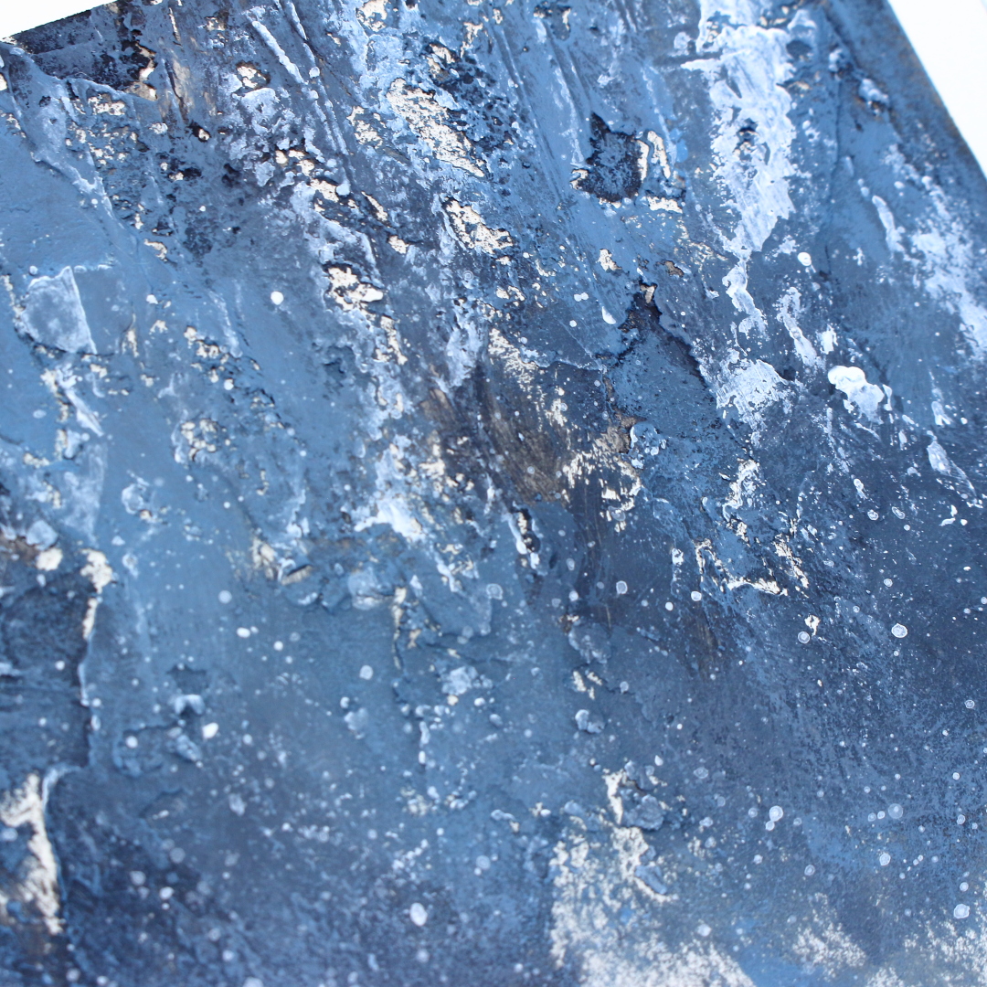

Once
again, I have applied a very thick layer of Grunge Paste and made deep,
vertical impressions on it. While drying the Grunge Paste, I have noticed that
it doesn’t bubble up under the heat as some other texture pastes might. Some
people like this effect while others don’t, so it is just something to be aware
of.
(TIP from Leandra: Grunge Paste is very stable when dried with a heat tool because it is clay-based, not plastic! Generally it is plastic products that will bubble. However, if you want to create cracks and fissures in Grunge Paste, spritz the GP generously with water while it is wet, then use your heat tool to dry the GP fast. The underlayer will dry first because the water stops the very top section from drying. As you dry you will see cracks appear, and sometimes you might also get bubbles, this just depends on the heat tool intensity that you use, the thickness of the GP, and the amount of water you mist)


Another cheap way to make interesting
textures is to use paper napkins or tissue paper. I have separated the layers
of my napkin and used only one layer. It is very thin and delicate. I used
matte medium to adhere it while making sure to wrinkle my napkin and make as
much texture as possible.


You all know how important the size of your
focal image is compared to the substrate. And since I am very bad at eyeballing
the sizes, I decided to first make the focal image before choosing my canvas.
The whole inspiration for this project for me
came from the PaperArtsy Hot Picks stamp set HP2102. So, the first step was to
stamp this image. I decided to give it a more astral look by heat embossing the
circle around the girl on a vellum paper with gold embossing powder, then I
embossed the girl on simple white paper with black embossing powder.


I
really don’t understand why it is that way for me, but very often I feel these
kinds of projects incomplete without a word or a sentiment. I could have
completed my project before placing the image, but as soon I added the picture,
I felt the text become necessary.
And
what has to be done, has to be done. For the text, I just chose the word
“imagine” which comes from the PaperArtsy Stencil PS100 designed by Sara
Naumann.


Well
guys first of all, this was a very long blog post so thanks to all of you who
stayed with me until the end. This was such a learning process for me, so I
really do hope I managed to pass some of this knowledge to you as well. And to
be honest, my head is still spinning. First, if you just look at those shades.
The beauty, the richness of color that we achieved… and then we have those
gorgeous textures which even more accentuate the colors… I mean, I know it is
silly to self-praise but I just love everything about this project. I enjoyed
experimenting, playing, learning and I enjoy the end result. The next level for
me is to try to replicate something like this on a bigger scale and make a
larger canvas (again in blue color as it is one of my favorites, just perhaps
experiment with making shades with a different blue color) and see how I deal
with texture making there.
Anyway, I hope you enjoyed my creative process and that I have managed to inspire you to try some experimenting with colors and textures as well.
Renata 💜


