Showing posts with label ESN61. Show all posts

Thursday, 16 June 2022

2022 Topic 09: Leftovers {by Kate Yetter} with Sara Naumann stamps


Hi everyone, it's Kate (Kate Yetter – Musings, Tea and Drippy Paintwith you today, and I'm here to share with you a mini journal centered around the beach. It's that time of year where we all need a place to document the memories from our summer holiday and what better place than a handmade album/journal.


Some might call me a pack rat when it comes to saving every last piece of scrap/craft paper but I call it frugal. Supplies are expensive and I am all about using what is on hand. Since I already have the basics such as stamps, paints, stencils, etc, I have a good starting point. My goal for this project was to construct this journal from leftover bits on my desk. So if you have a pile of scraps you can't bear to throw away, follow along.  

Keeping with the beach theme, I chose blue and green as my main color scheme and used pinks and browns as supporting colors.


I had a large variety of leftover scraps to incorporate into my journal including stamps, tissue paper and die cuts. 


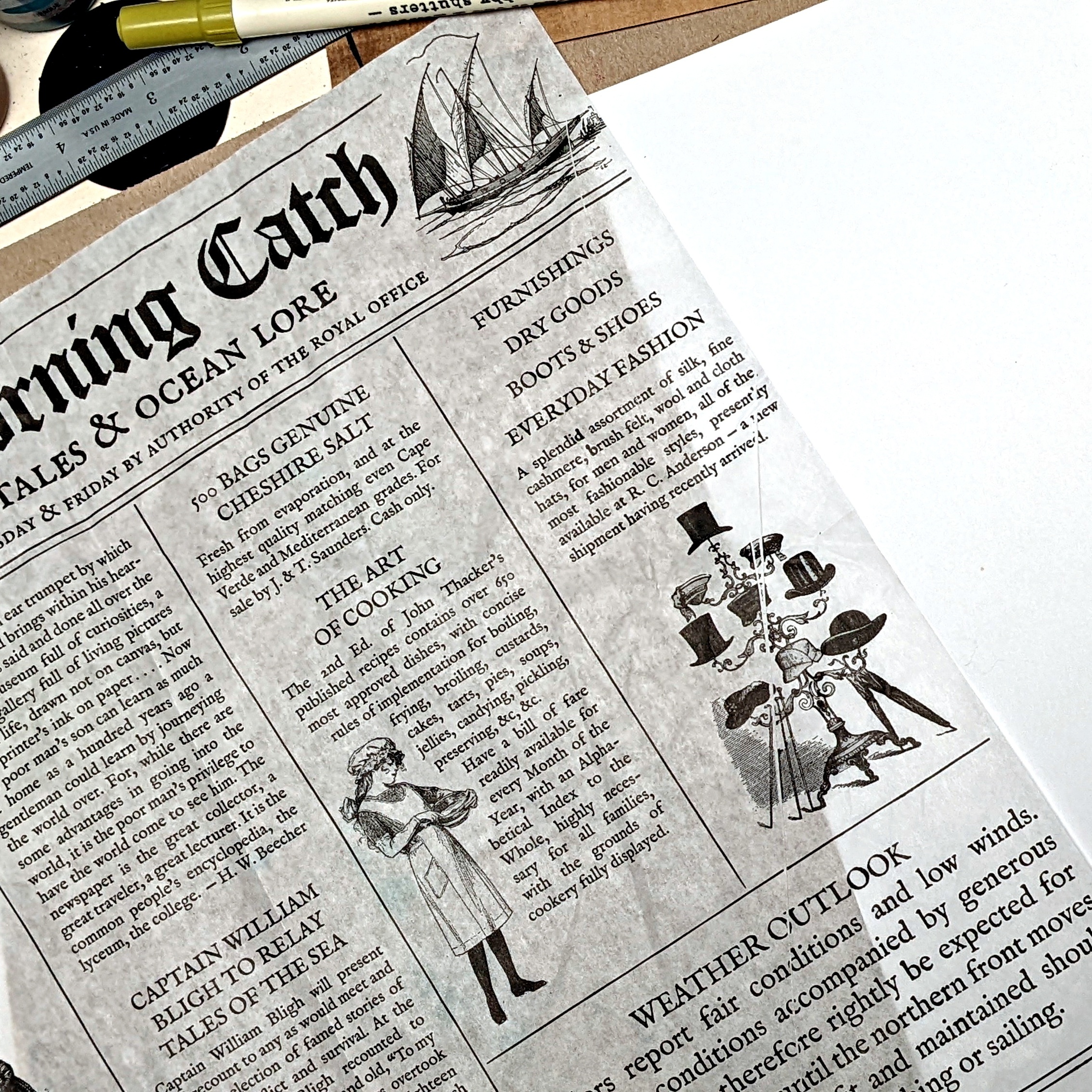
These paper bags were leftover from school lunches last year. I am finally able to put these bags to good use as the base of my project. 


I made a small booklet as an embellishment, using a bag from a gift shop souvenir. 


To construct the album, I attached the paper bags using masking tape. Because I kept the background of the page inserts white, I wanted a contrasting background on the album to make the pages pop. Instead of painting the whole page, I used black gesso just around the edges. 

 
To create the album cover, I used leftover printed tissue paper that wrapped a souvenir. I glued a portion of the tissue paper to a white background.

Infusions create a beautiful color pop and texture against the tissue paper.


When it came to the actual journaling part, I decided to challenge myself and try something different. When browsing online for inspiration, I was inspired by journals that were clean, organized and flat, without a lot of layering. This is very different from my usual style as I love tons of paint, texture and layers. Since the background was all white, I had to strategically  place my journaling and stamps so that there were not a lot of white gaps.


I repurposed PaperArtsy tissue paper as an embellishment at the bottom of the page. At the top, the hand lettered title was painted with Fresco paints. With a ruler, I drew lines to section off areas and then I found stamps I liked that fit in the area, almost like a puzzle. The small amount of collage that I did do, was scaled back to only a few items.


On the journaling spots, I used a ruler to draw lines so I could keep the text straight. This worked especially well when placing text around images. After I finished writing, I erased the pencil lines


As you can see, I used various PaperArtsy stamps throughout my layout. I classify them as leftovers as they were sitting on my desk, unwashed from a previous project.




I always love a challenge to use up my leftovers, think of it as creative time as well as cleaning your desk. While I really enjoyed the "clean" look to this journaling style, I found that I didn't use as many leftovers as I hoped due to a lack of layering. Maybe next time I can mix the two styles to get the best of both worlds.

Kate

Tuesday, 7 June 2022

2022 Topic 08: Split Complementary Colours {by Etsuko Noguchi} with Jo Firth-Young's stamps


Green – Grey Tones
Main Colour: Soft Green
Complements: Salmon Orange, Pink Purple
Type: Twist - unusual grey-blue softens the entire wheel
Created from Frescos: Lemon Meringue, Prawn, Glacier Ice


Hi everyone, it's Etsuko (My favorite things) with you today, and I'm here to share with you a Mixed media 'Junk Journal' project that for our current 'Split Complimentary' colour wheel topic.

Rather than mix up the colours suggested in the colour-wheel above, I decided to choose existing colours from the PaperArtsy Fresco range that were similar but a bit deeper in tone. To Prawn I added Sour Grapes and Niagara Falls to represent the split complementary concept.


When I saw Jo's new stamps, I had the idea to make the Junk Journal using fabric. And I wanted to make a junk journal incorporating fabric and see how this colour wheel might change if the same colour and different materials were used. 


The first thing I did was to decide on the paint colour wheel theme, and I chose these three paint colours for me. My main colour was PaperArtsy Fresco Finish Chalk Acrylic - Niagara Falls (FF205), and with it's split complimentary colours being Sour Grapes (FF115) and Prawn (FF98). One of the split complimentary colours nominated is a little more yellow than Prawn, but the gauze fabric is coarse and i expected the colour would be lighter when painted, so the Prawn was used as is, another close options could have been Peach Nectar.

I painted the fabric to see how the colours would look. I used gauze fabric so that the paint would look soft in colour and fabric would not become stiff after painting. You can also add textile medium to your paint for washable permanence and softness on fabric, useful if painting clothing, not so important for journal or fabric art. 


First of all I using JoFY set 113 and 114 (JoFY 113JoFY114) and JoFY mini 54 (JM54) with PaperArtsy Fresco Finish Chalk Acrylics as shown below and Snowflake (FF15). 


On a heat mat, the paints were spread thinly with a palette knife and stamped onto each piece of cloth, and some cloth was dipped in paint diluted with water, dyed, and allowed to dry. As you can see in the photos, some of the colours do not resemble the colour wheel, but in reality they are almost the same, but the colours in the photos change depending on the location and time of the subject, which is really difficult. 


I want used JoFY114 large flower as a focal point on the front cover, I then stamped JoFY114 in Niagara Falls (FF205) on the gauze fabric and also I stamped Sara Naumann set 61(ESN 61) script in Ranger Archival CornFlower Blue from above.


The painted fabric was used for the petals, stitched and cut around the petals using an embroidery frame to create the focal point and other printed fabrics were patched to create the background. I added the sentiment of JoFY113. On the spine I made tassel from leftover and used them as decoration.


Now prepare the window for the first page, the small JoFY114 flowers printed on the acetate with StazOn Pigment Snowflake, made a hole in the lace page, glued the acetate from the back.


Next I made JoFY113 tulip peeking through the window. Snowflake (FF15) and Niagara Falls (FF205) painted through PaperArtsy Stencil by JoFY (PS250) on the raw fabric, 


I painted the tulip used Niagara falls (FF205), Sour Grapes (FF115), Prawn (FF98) these three colours and a touch of Mustard Pickle (FF148) as a highlight.  


I made the frame by placing a piece of fabric dyed in Niagara Falls underneath the painted tulip, and stitched a small flowers from JoFY114 on the background the page.


The small page inside was made of paper clay with JoFY114 stamped on it too look like a seashell specimen, finger painted in three colours and finished with gold wax.


I embroidered JoFY113 tulip on this narrow rectangle page although I did not use three colours. 


I though pocket page was nice, then I made a pocket to put a tag in.


I printed Snowflake and Niagara Falls on the leftover paper through PaperArtsy Stencil by JoFY (PS136 and PS250) to create the background and printed JoFY113 tulip on a book page and coloured it.


I made the pocket using various of laces. JoFy114 flower painted and stitched.


Finally I made a patchwork page using the main colour and the two split complementary colours print fabrics. Each fabric was Sashiko stitch with the same type of colour embroidery thread, and the seams are embroidered to give a little depth to the printed I then decide on the pattern to be placed in the rectangle. The flowers made in the previous photo was cut with a thin cotton for quilting on the back and sewn to make it little fuller. JoFY 113 sentiment was embossed in black powder on the white painted fabric, cut and sewn then finished page.
  

I used JoFY114 and ESN61 stamps for the front and back covers and simply made in the main colour Niagara Falls.


This slightly smoky colour wheel was a combination of colours that I rarely use, but it was a lot of fun with this project and I wanted to continue exploring this further it. Please share with us for your creations using these color wheel on PaperArtsy Instagram or in the Facebook Group 'PaperArtsy People'.

Thank you so much for visiting here.
Etsuko xxx


Facebook: Etsuko Noguchi
Instagram: Pxienest
Pinterest: Etsuko N

More Posts to Enjoy


