


Hi everyone, Amanda Pink (p1nkart) here with you today.
Since I moved house inaut umn last year I've been trying to get my new place all set up to make it feel like 'home'. I'm slowly getting there and although I have a few pieces of art on display I still feel there's a need for a few more so I thought this Scrapcosy topic would provide me with an ideal opportunity to make a new piece of art for my new place!

I like creating art 'on the block' as the sides of the block give a bit more creative space. They are also super easy to wall hang or if preferred they can sit on a surface as a piece of table art. So today I'm sharing a mixed media art block that has a touch of 'grunge' combined with some delicate water-coloured imagery!! Two contrasting styles that I think on this occasion came together in harmony!
Our current overriding theme is 'Hidden' so within the overall design of my art block there is a little something hiding away waiting to be revealed to give a second piece of art!
Hope you'll join me to find out more .


Scrapcosy has so many fabulous stamps and stencil designs it wasn't easy selecting which to create with but in the end with regards the stamps I opted for Scrapcosy stamp set 31 (ESC31) and Scrapcosy stampset 41 (ESC41). I thought they'd give me a good mix of imagery and words that I could pick and choose from to play around with. Words, flowers, butterflies are always so versatile aren't they?
I could see any of these stamps working well with 'a brick wall' backdrop so I picked out PaperArtsy stencil by Scrapcosy 375 (PS375) which led my 'grungy heart' to reach for my PaperArtsy Grunge Paste (GP190). You can't create bricks (all be them faux bricks) without some grunge, right? Some PaperArtsy Infusions (Just Walnut, CS25) too. Maybe some PaperArtsy Rusting Powder? Mmmm, maybe not ! Although I wanted some grunge, this time I didn't want to go full on grunge!
I didn't initially plan to use PaperArtsy Stencils by Scrapcosy: 374 (PS374) and 191 (PS191) but they turned out to be welcome additions.
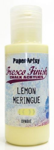
My colour palette was very much influenced by my new place so as it's currently quite neutral/ monochrome I went with PaperArtsy Fresco Finish Chalk Acrylics (Chalk FF83, Stone FF59, Slate FF84, and Little Black Dress FF19) adding in just a splash of colour: PaperArtsy Fresco Finish Chalk Acrylic (Deep Sea, FF198).
In addition to these supplies there were the substrates including the large and small Art block which you'll see and I'll mention throughout this post.

The background of my art block was to be a brick wall so that's where my creativity began.
I applied PaperArtsy Grunge Paste (FF190) through what I'm calling the 'brick wall' design that's on PaperArtsy Stencil by Scrapcosy 375 (PS375). This design isn't could very easily be used for other things and in other ways.
Laying a stencil down on card and holding it in place on a flat surface is much easier than 'wrestling' with it on a raised surface like an art block so I worked 'off the block' on PaperArtsy Heavy Smoothy.
To help avoid movement/ slip of the card or stencil while applying the PaperArtsy Grunge Paste (FF190) I adhered the card to my work surface with a small piece of Sizzix Sticky Grid and kept the stencil in position with masking tape.
(Apologies for the two colour tapes! The purple tape is low tack tape which was better to use in places as the stencil design wasn't quite the same size as the card panel so had to be taped to the card as well as the work surface. Low tack tape lessened the chance of the card ripping or marking when the tape was removed !)

I had to reposition the stencil to extend the brick wall to cover the size of the card panel I was working on but it's design made it super easy. All I had to do was simply place the design over the last line of bricks I'd created and I was set to continue.
N.B: Be sure to dry the first round of stenciling before repositioning or you'll end up with squished bricks!!!

No doubt you spotted the 'little holes' in the bricks? I like stamping into PasterArtsy Grunge Paste (FF190) using detail stamps but thought this time instead of using stamps I'd use a ball tool. Ok, probably not 'stamping' as we know it...more 'poking' ;). No precision was involved, My 'poking' was all very random and care free! A fun way to create some marks in the bricks! Great for stress relief too !! ;)


I started with an all over coverage of PaperArtsy Fresco Finish Chalk Acrylic (Chalk, FF83). Using a stencil brush with a pouncing action allowed me to get the paint in between all the peaks and troughs of the PaperArsty Grunge Paste (FF190) stencilling with ease. Quick and easy too !!
As PaperArtsy Fresco Finish Chalk Acrylics have a drying time of what I call 'Now' (super quick no waiting around) by the time I'd finished painting the panel with PaperArtsy Fresco Finish Chalk Acrylic (Chalk, FF83) I was able to start dry brushing it with PaperArtsy Fresco Finish Chalk Acrylic (Stone, FF59). Dry brushing allowed me to catch the base colour in some places not others to give nuances of colour, light and shadow all be them very subtle. Again quick and easy too!
Painting in the 'cement' was the most time consuming but I didn't mind at all as I find intricate, fine line painting relaxing and focusing. A way to zone in and forget the 'outside noise' so to speak. Using a Rigger brush made it much easier too. If you haven't got a Rigger brush and you want/ like to paint fine lines/ detail/ intricate patterns I would definitely recommend investing in one. I wouldn't be without mine!
Alternatively, if this kind of painting is not your thing you could always try switching up my order of creativity and paint your card panel with the cement colour first then proceed to stencil the wall. If you did it that way you would need to reposition the stencil over the bricks in order to paint them. The results may not be exactly the same doing it this way round but pretty sure they'd be similar!

I kept within the lines on the whole but didn't stress if I slipped over as I also purposely smudged the cement painting out onto some of the bricks. This helped to make them look a bit more grungy / weather worn and also emphasise some of the brick 'poke holes'.

Although I was pleased with how the brick wall was looking I still felt it needed 'grunging' up a bit more but as I mentioned in the intro not too much. I thought PaperArtsy Infusions (Just Walnut, CS25) would give me just the extra touch of grunge I was after.
With PaperArtsy Infusions being water reactive and the brown and colour crystals they are made up of reacting at different rates I thought they'd allow me to control the level of grunginess. I felt they did !
If the PaperArtsy Infusions (Just Walnut, CS25) were looking too dark I simply added water and / or wiped / dabbed dry. I was also able to drip and move them around the areas I wanted them (primarily the corners and sides of the panel) with ease.

I realised while making the brick wall that I would need another as I was thinking of taking the wall around the sides of the large art block and maybe also carry it onto the smaller art block too so I hit repeat to make another that I then cut into strips.

Pleased with how the brick wall panels and strips were looking at this point I moved on to the focal image and the hidden art.

First the focal image for the main art block.
I felt painting some pieces of PaperArtsy Heavy Smoothy with PaperArtsy Fresco Finish Chalk Acrylics (Chalk FF83, Stone FF59) would maintain continuity of colour throughout the project.

While considering the overall design of my finished project I knew I needed a relatively small focal and as I love the 'daisy' on Scrapcosy Stamp set 41 (ESC41) that's what it was to be.
I thought it would be good to 'spotlight' it in some way as this would help draw the viewing eye in which is what a focal is all about, right?
The larger circle on PaperArtsy Stencil by Scrapcosy 191 (PS191) gave me just what I needed.
This stencil gives you both the circle stencil and the circle masks. Either could be used but I used the mask, simply placing it in the middle of a piece of painted card and drawing round it lightly with a pencil.

I stamped the 'daisy' within it ! What a beauty and even before its coloured !

To water colour the flower I carried the brown of the PaperArtsy infusions (Just Walnut, CS25) from the brick wall through to the focal and introduced a splash of colour with PaperArtsy Fresco Finish Chalk Acrylic (Deep Sea, FF198).

I went a bit left field mixing up what would probably be the expected colours of the flower and the leaves but that's what's so 'liberating' about creativity isn't it? If you want brown flowers and blue leaves, stems, flower heads that's ok!

More than happy with my painted flower I felt the surrounding areas of the circle were looking rather 'empty' so some subtle stencilling using one of the designs on PaperArtsy Stencil by Scrapcosy 374 (PS374) in the same colours as the flower helped resolve that.
Usually I would really think about/ consider my choice of stencil but in a bid to free myself from my 'overthinking' I just went on a whim that it would work ok with the flower. I think it did ! Are you an over thinking creative too?

A black micron pen helped emphasise the previously drawn 'spotlight' circle.

To finish the flower focal panel I adhered it to matt board to give it some rigidity, added some faux Micron pen stitching for a touch of extra detail inside the 'spotlight' circle and distressed the corners and sides very lightly with Tim Holtz Distress Oxide (Black Soot).

The Hidden Art!
My overall design was such that a small square art block would sit centrally on top of a larger square art block. The flower focal would cover the top of the small art block hiding what was beneath and in order to reveal what was hiding the flower focal needed to be removable but at the same time it needed to stay firmly in place until removed.
So I trialled an idea out to see if it would work and it did.
As the smaller art block would be reversed and used as a window frame I measured the dimensions of the window, took those measurements to card to draw out what would in effect when cut and scored be an open top box.

I painted the open top box and a MDF panel which it will be adhered to with PaperArtsy Fresco Finish Chalk Acrylic (Little Black Dress FF19) in keeping with the colour of the large and small art block.

So what do you think might fit into the window of a small window frame ? Why a butterfly of course! ;).
I always welcome the opportunity to feature or include a butterfly in my creativity and as butterflies are said to signify hope, love and new beginnings I thought it was a perfect choice given this piece of art is for / inspired by my new place.
She was watercoloured with the colours used so far: PaperArtsy Fresco Finish Chalk Acrylic (Deep Sea FF198) and PaperArtsy infusions (Just Walnut, CS25) along with some delicate touches of PaperArtsy Infusions: Rusty Car (CS17).

I thought some of the words on Scrapcosy Stampset ESC41 (ESC41) would be great to include somewhere on my project.
The stampset comes with the words all partially joined together so they can either be used as you see them on the carrier sheet or a simple scissor snip will allow you to use each of them on their own. That's what I did as I wanted a couple of long strips of words: 'Live, Love, Laugh' aswell as some single words: 'Pause', 'Breathe', 'Relax'.
I know I'm going to be reaching for these words a lot in my creativity - a great selection in a general, versatile font that I reckon would lend itself to any style of creativity.

The tiny small diamonds on PaperArtsy stencil by Scrapcosy 374 (PS374) helped fill in the gaps between the words on the long strips, also offering the suggestion to 'pause' when reading the words.

I was now ready to start bringing everything together.

The large art block in situ already makes my new place feel more like 'home'!

Now for some close ups starting with the flower focal.
This was adhered to a back matt board panel then mounted onto the black MDF panel/ open box 'insert' I'd made. It fitted snugly within the window of the small frame to hide what's beneath.

Some script stamp triangles topped with some Tim Holtz Ideology hitch fasteners decorate the corners of the black MDF panel/ open box 'insert'. They also help when removing the flower focal.

Carrying the brick wall down and around the sides of the main art block aswell as up and around the sides of the small art block help bring the 2 together and gives continuity throughout the whole project design.

The 'Live love Laugh' word strips covered one row of bricks perfectly both above and below the flower focal.
(I hadn't realised that when I was cutting the strips . Serendipity, hey? )

Let's lift the flower focal to see what's hidden beneath....

A butterfly of course .... giving a second piece of art !

The script stamp from Scrapcosy stamp set 41 (ESC41) stamped very lightly in Ranger Archival ink (Jet black, Coffee) nestles in the window complimenting the background colours. In the centre a small black disc on which the butterfly rests, her thorax embellished with some pieces of Tim Holtz ideology .
The single words placed around the frame with the addition of part of a quote from Scrapcosy Stamp set 31 (ESC31): 'Pause, Breathe, Relax with the Butterflies'! Oh how I'd love to!

I really have enjoyed making this artblock/s and I'm happy with how it all turned out.
I love the idea of having an hidden element behind the focal which in this case gives a second piece of art. I may have used a stamped butterfly to hide but that could easily be switched up for something else: a treasured photo or a precious keepsake maybe, or how about using the hidden space as a place to keep something like keys safe??
Thanks for stopping by today/ tonight
Creative Wishes
Amanda
Creative Wishes
Amanda
x







.jpg)


.jpg)


.jpg)

.jpg)
.jpg)


.jpg)
.jpg)

.jpg)
.jpg)
.jpg)

.jpg)
.jpg)
.jpg)
.jpg)


.jpg)
.jpg)
.jpg)


.jpg)

.jpg)
.jpg)
.jpg)
.jpg)
.jpg)
.jpg)
.jpg)
.jpg)




