Showing posts with label ESA02. Show all posts

Saturday, 18 September 2021

2021 Topic 11: Twinkle Twinkle with ESA {by Jenny Marples}

   2021 Topic 11: Twinkle Twinkle


With a really achievable 'painting over an image' technique from Jenny, this lovely fairytale inspired page has layer upon layer of lovely ideas. The twinkle of stars from embroidery and a night-time paint effect adds a clever emanating glow
~ Keren

Hi everyone, it's Jenny (Pushing The Right Buttons) with you today, and I'm here to share a collage piece which took a decidedly fairy-tale twist as the Twinkle Twinkle theme pushed through. 

Seth Apter stamps were used to enhance the main image, picking up on the theme and helping to suggest what may be around it rather than needing to draw in the whole scene.


Continuing to focus on architecture I experimented with a different method for creating the focal image of a window, one which doesn't require you to draw the initial image.


Before we take a look at that let's begin with the collage style background which made use of stamps from two of Seth Apter's stamp sets, ESA02 and ESA18.


Having kicked off with layers of manuscript, white gesso, asemic writing in pencil and brown ink I wanted to add some stars to evoke those that might be seen in a night sky. To give some control over where they would be on the page I stamped the stars onto wet strength tissue using Sour Grapes Fresco Finish Paint before applying this to the background with a generous amount of matte gel medium.


To emulate the look of bricks on the edge of a tall building I stamped Seth's interconnecting blocks border in a continuous strip down the centre of the page using a dark blue ink.


It's always good to add extra layers and textures to build a 'frame' around your focal image and draw attention to it. I'm sure I am not the only one to have an ever-growing collection of unused scraps which can be called on to do this. Try dividing those scraps into colour families and putting them into transparent page pockets so you can find them more easily. I chose some leftover teabag paper stained with Limoncello Infusions and a crumpled piece of tissue that had turned brown on the edge.


Now for the window; I wanted to try painting over a printed image rather than drawing one this time. Several years ago I took a photo of this window on a visit to Auxerre in France. After printing it onto photocopy paper I stuck the image onto card with matte gel medium and applied some Grunge Paste around it to replicate the look of an aged wall. The photo was taken during the day but I wanted to make it look like night had fallen so I began by adding a base layer of Slate Fresco Finish Paint around the bricks framing the glass. Alternate layers of Baltic Blue and Slate Fresco Finish Paints were then applied on top, with less and less paint used each time until I had the depth of colour required.


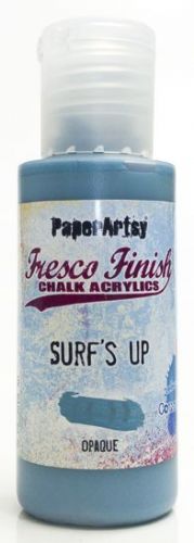
The bricks around the window were painted with Surf's Up Fresco Finish Paint, dry brushed and edged with more of the Slate to deepen the colour. In my original photo the walls around the window were 'pebble dashed' with no bricks exposed. To leave it this way made the window look like it was floating so I added some bricks beneath to emulate those stamped onto the background, giving them the same paint treatment as those around the window. Finally the dark glass in the window was over-painted with Sand Fresco Finish Paint to make it look as though a light inside the building was shining through. I added extra highlights with an iridescent gel pen and Snowflake Fresco Finish Paint, also applying tiny touches to the bricks and window ledge before outlining the main elements with a fine black pen.

 
To add an extra touch of texture I coloured some cotton fabric with Wolf Eye Fresco Finish Paint before over-stamping it with the large text stamp from Seth Apter's ESA13 stamp set in Iceberg Fresco Finish Paint.


Prior to adding the cloth and window pieces to the background I layered them together and hand stitched the three stars around the window. Once in place on the collage background splattered the whole piece with dilute Snowflake Fresco Finish Paint to give the impression of a starry night sky - it was at this stage that the collage turned from having a simple architectural feel to one that looked more like an illustration in a fairy tale book.


Going with this fairy tale theme, and as a way of finishing the piece I stamped a phrase from Alison Bomber's EAB16 Magic & Wonder stamp set onto card and cut around it before mounting it at the base of the window.


Here are some final photos of the finished piece.


If you feel less confident with drawing a window I hope you have a go at painting over a printed one, remembering to take time to build up the layers of paint and drawing around the finished elements to make them stand out. And if you are then going to add your painting to a background try using your stamps to suggest other parts of the building and surroundings.

Thank you so much for stopping by.

Friday, 10 May 2019

2019 #7: Turquoise & Purples with ESA [By Amanda Pink}

2019 Topic 7: Turquoise


It's always lovely to welcome a new face to our pool of fabulous bloggers, and today we have Amanda Pink here to share some painterly fun with Seth's stamps and Fresco Paints. This stamp set of vintage circular items seems to have wide appeal sine its launch earlier in the year, and Amanda pairs them beautifully with shades of turquoise and purples and plenty of texture too! ~ Leandra

Hi everyone, it's Amanda (ink-a-pink) here with you today, and I'd like to share with you my project for the current topic: Turquoise. 
I have created an 'art panel' that has colour, texture, layers and dimension. It can be multi- purposed - either displayed as a piece of art, used as a book/ journal cover or as I often like to do be given instead of a card - what I call an 'art card'.


I wanted the Art panel to have some sturdiness so a PaperArtsy 5"x7" Heavy Grey/ Whiteboard panel provided the ideal substrate. I covered it with strips of tissue tape, as I find covering a blank surface with something, be it pen marks, doodling, text, tissue tape etc is a good way to kick starting creativity and lessens the chance of 'white fright', 'blank page' syndrome.


The print on the tissue tape was a little bold so I reached for the gesso, stippling to create texture and tooth...


... before introducing some grungy texture here and there courtesy of PaperArtsy Grunge Paste.


I combined the topic colour Turquoise with Purple!! Now Purple is not ordinarily a 'go to' colour for me but I thought it would be good to step out my comfort zone and although a little hesitant I was encouraged the combo would work ok when I recalled seeing the two colours looking good together at a wedding reception I attended some years ago. 


I also added a couple more colours to the mix to compliment and accent. The full palette of PaperArtsy Fresco Chalk Acrylic Paints I worked with was Turquoise, Eggplant, Hint of Mint, Snowflake.


I love painting with a palette knife as I find it allows for a more random application as well as a gradual build up of colour which results in some interesting layers of colour and texture. 


I used some of the stamps from Eclectica (Seth Apter) Collection ESA02, ESA04 and Eclectica (Courtney Franich) ECF04 with Ranger Archival inks (Green Patina, Blue Violet, Cobalt) to add further detail and interest.


The rectangular text stamp from ESA04 was ideal as the words that make up the stamps are all colour names- two of which are 'turquoise' and 'purple'! What are the chances?? Some careful placement of the stamp ensured 'purple' made an appearance!


However 'turquoise' got lost in the midst (upper left) but I know its there and hopefully you will trust my word!


There are also some dots and lines using stamps from both ESA02 and ECF04. 


I used Eclectica (Seth Apter) collection ESA12 to create all the elements for the focal feature.

6 of the 9 stamp designs were stamped multiple times on PaperArtsy Smoothy Super Smooth card using Turquoise and Eggplant fresco chalk acrylic paint. I chose to stamp the elements with paint as oppose to ink as I wanted to carry the true background colours through to the fore to compliment and enhance not distract. So lots of stamping, cleaning stamps throughout and then lots of fussy cutting!! Please note, if you are stamping with paint it's advisable to clean the stamp immediately after use. 

All of the focal feature elements are double or triple layered to give some rigidity. Some are adhered flat to the background, whilst others are raised to give dimension...


... and some sense of movement with the rise and fall. 


The elements are embellished with either eyelets or brads.


Additional features to help balance and bring the overall design together are a Spellbinder/Seth Apter Steering Wheel die that frames the stamped gauge.


Some side accents, all of which are stamped with the small stamp from ECF04 and embossed with Emerald Creek/ Seth Apter Baked Textures( White Blizzard). 


After finishing the art panel I had some of the stamped images from ESA12 hanging around so created a couple of CAS cards. They were super quick to make thanks to all the 'project excess' I had lying around my desk. 

Stamps used are from ESA12 and ESA02.


Fresco Chalk Acrylic paints used are Turquoise and Eggplant


I enjoyed stepping out of my 'colour palette' comfort zone to create my 'Art Panel' and I loved creating and building up all the layers, texture and dimension be they from the mediums, the paints or the stamps I worked with. I'm looking forward to playing around with the stamps some more and trying out some of the 'sparks of inspiration' I had (and there were quite a few) whilst I was creating with them this time and I'm sure I'll be mixing up the colour combinations too. 

Thanks for joining me today/ tonight
Keep on Creating
Amanda x

Blog: ink-a-pink
Instagram: @kynapi10
Pinterest: PinkArt

Friday, 8 March 2019

2019 #3 Mail Art: Mono-printed Envelopes with ESA {by Alison Hall}

2019 Topic 3: Mail Art


Mail Art is so entirely unique and tonight's beautiful envelopes from Alison are certainly no exception. The multiple layers of other papers give a wonderful textured base for her smorgasbord of colour.

Hi everyone, it's Alison Hall aka Craftytrog with you today, and I'd like to share with you a couple of mono-printed, stamped and doodled envelopes. 

I love building up layers, using collage, adding paint with stamps and my Gelli Plate, and finishing with pen marks, doodles and paint splatters. This technique creates a lot of depth in a piece of art.


Here's how I started. I covered an A4 and an A5 envelope with lots of paper scraps that I had lying around on my desk. There's a book page, music sheet, ledger page, coffee filter, newspaper, and under-paper. All sorts!


Then, using an 8x10 inch Gelli Plate, I started to add colour and design to the envelopes.
The Seth Apter stamps that I used were ESA02 and ESA11.


I used the Gel Plate and stamps to mono-print the envelopes, and also used the Gel Plate as a palette to add paint to the stamps, and stamp on the envelopes.


I used some of my favourite bright shades of PaperArtsy Fresco Finish Chalk Acrylic, Slimed, Cerise, Caribbean Sea, and also Twilight and Snowflake for dark and light highlights.


It's looking a bit crazy at this stage!


From ESA11, I used the spring stamp to add detail to the edge of the A5 envelope, and created a light space for an address using the grid stamp and Snowflake Fresco Finish Acrylic. 

As you can see in the photo below, I added paint pen outlines, doodles and splatters.


On the A4 envelope, I used ESA02's scratched rectangle stamp to add detail on the edge, and the diamond pattern to create the address area, before finishing with outlines, doodles and splatters.


I was about to take my final photos, when I decided to add some highlights with Gold Fresco Finish Acrylic. I think I was influenced by the fact that I'm currently reading a historical novel set in India. I was thinking of beautiful, colourful saris and Maharaja's palaces!

I used the end of a paintbrush to add dots and metallic shading.


If you have a Gel Plate, I would encourage you to go wild with design and colour and decorate an envelope. If you don't have one, you can still use stencils, stamps and paint to create an abstract piece of mail art. Using collage materials as a base, creates another layer to increase the depth in your artwork. You can still see pieces of collage peeking through in the photo above. I look forward to seeing your mail art inspired ideas linking to PaperArtsy social media feeds.

Alison x

Facebook: Alison Hall
Instagram: @craftytrog