Showing posts with label Crackly Tissue Paper. Show all posts

Sunday, 11 January 2015

2015 #1 Box Canvas {by Leandra}

2015 Topic 1: Fragile Papers

Hi everyone Leandra here, 

Tonight I've got videos and lots of pictures for you! I'm brayering left right and centre to show you Part 3 of the brayering series (lots of colours and lots of stamps this time), and then using the results and my Fragile Papers to make a gorgeous feature flower with the adorable Ellen Vargo Eclectica stamps.

If you want to see more ideas using the brayer, and Ellen's stamps, then please go and check out Ellen's blog, she really is the brayering guru! She uses bold bright colours with her wonderful stamps to great effect! Stunning backgrounds which end up quite different to my more soft pastel versions, yet using similar techniques.


Step One: 
As you probably realise already, if you've followed my brayering video series (video 1 here, video 2 here), brayering colour is such a quick, un-messy way to alter card, paper, even fabric. I'm not much of a purple girl, but I do love an ochre/ eggplant combination, and that is the gist of what I had in mind to do.

So first up we need to brayer shades of ochre colour onto our book page. I try to create depths of the same or similar tones with Toffee, Vanilla, Haystack, Caramel and Pumpkin Soup. Then stuck it onto a 4x6" Box Canvas with Ranger Multi Medium (Matte)

NB. A video showing how to make this ochre BG, is at the foot of this post.


Step Two: 
Well, its not like me to plan things to this extent, but the ideas were whizzing in my head too fast, and I just needed to commit to one of them. I grabbed some Prima Bellies, EEV10 flower stamp, and some charms. Then feeling a bit scatterbrained, I had the good sense to take a photo and thus committed to a plan.


....and then quickly, before I could change my mind, slapped Pansy (fantastic high coverage opaque) onto the bellies.


.... and then added the obligitory Bora Bora by dry-brushing to add interest and depth. Not one to drybrush once, I also dry-brushed Eggplant, Squid Ink, Mermaid and Snowflake

It is certainly true that the more layers you add, the happier you will be. More is more when it comes to dry-brushing! Of course, it won't end here, the finishing touch will eventually be Treasure Gold...but which one?? You'll find that out later...


...and then a quick check that the purple tones are looking good next to the ochre tones...


Step Three: 
Onto Ellen's lovely flower stamp set.
First up I grabbed the background I made in Video 2...see there was a masterplan all coming together in this blog post!
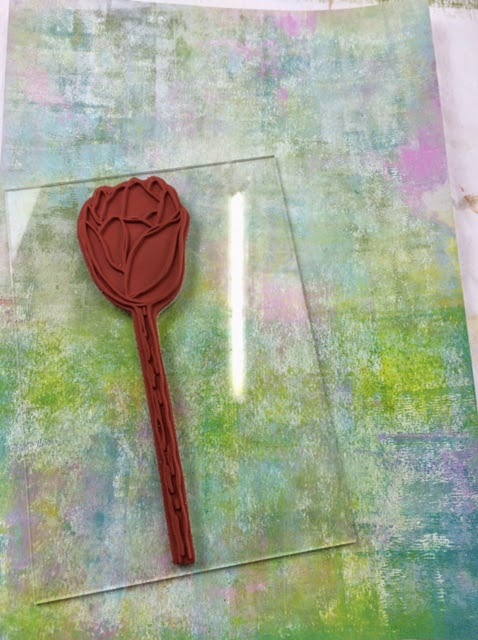


...and then stamped it in Archival Coffee Ink, a bit softer than Jet Black, nice with the Ochre too. Cut it out; this forms a nice base for what is to follow. I added some depth of green to the stalk with Hey Pesto and a tad of South Pacific.


...and slotted the flower into place on the canvas.


Step Four: 
As I said at the start, brayered and layers of the stamped Waxed Tissue Paper is the focal point of the flower head. 


Check out the video below to see how the paint was layered on the tissue with the brayer, and then I used a variety of stamps: EEV02 (scratchy), EEV06 (Spots), ELB04 (bold solid flowers), HP1304EZ (large script), in numerous Fresco Chalk Acrylic Colours to build up a striking and very easy to achieve, fragile paper.


Step Five: 
Now the background is made, I'm going to stamp it 6 times to make a layered flower head for the canvas, with Coffee Archival Ink. Heat set quickly, sometimes ink bleeds on tissue if you leave it for a bit. 


... like this..


...and then cut them something like this so the layers expose those sitting behind.


Step Six: 
Now it's just a matter of layering the tissue carefully with a touch of glossy accents as a fast glue, and tiny foam pads to add dimension. And always finish things off with a tickle to the embellishments of Brass Treasure Gold.


Here's a video showing the ochre background being made (back in Step One), and the tissue layers, plus a few finishing touches to the project with Fancolour Water Soluble Pens (the student version of Fibralo Pens)


And finally ... here it all comes together.


I hope you have been enjoying the fragile papers, and the new look to the blog? More fragile Papers projects keep on coming this week, I hope you can find some time to have a play yourself, and show us what you can do with Fragile Papers.

Leandra

We would love you to join in with challenge #1: Fragile Papers. If you are inspired by any of our guests who have blogged on this topic over this fortnight, then please join in and link up your creativity HERE

All links go in the draw to win a £50 voucher to spend on products of your choice from the PaperArtsy online store. This link will close 17:00 (London Time) Sunday, Jan 18th 2015, winner will be announced 2 hours later at 19:00.

Wednesday, 5 February 2014

Door Hanger {with Hot Pick Stamps by Sue Carrington}

Hello, it's Sue here and tonight's project is a door hanger and I've used the fabulous Hot Picks stamps. I love making these and have several on my door knobs around the house ! 


I started by painting it with Vintage Lace and when dry I stamped the lace from the Hot Picks 1212 set onto tissue paper and added it to the hanger.


I also stamped the scissors on to tissue paper and added them in the same way. I painted some Crackle Glaze over some areas, dried it off then added the top coat of Spanish Mulberry. I carried on stamping but now direct on to the hanger using black Archival ink and also Vintage Lace. I knocked the colour back slightly using a baby wipe and then added some more Vintage Lace.


I then mixed some Claret and French Roast and painted some lace. This mix of colours makes a gorgeous deep purple !


I layered the lace onto a piece of cotton fabric that I frayed before painting with Vintage Lace. I did some more stamping using the Mini 44 script stamp and Vintage Lace. I then painted some Heavy Smoothy Card with Vintage Lace and stamped the images from the Hot Picks 1212 and 1213 sets and cut them out. 


I stamped the sewing room sign onto another piece of Heavy Smoothy Card and sponged around the edge with some Spanish Mulberry.


I painted all of the embellishments with Spanish Mulberry apart from the little resin rose which I painted with Vintage Lace and just rubbed Spanish Mulberry over it. To finish I added some buttons.

Hope you've enjoyed today's project, see you again next month! 

Sue

A huge thank you to Sue from PaperArtsy HQ. It's nice to see you again Sue. I am sure this is a decoration that many of us would like to have in our homes. The colours are so delicious especially the purple that you created. I think I may be in love with that scrap of lace. It is good to see Vintage Lace being used. This colour is warmer than white, and with just a hint of pink it is perfect for that vintage feel.


If you would like to join in our weekly challenge with any of this week's guests who have blogged since Sunday night, then join in to link up your creativity HERE you will go in the draw to win PA stamps of your choice! You need to link your entry by 17:00 (London time) Sunday 9th Feb 2014

Wednesday, 20 March 2013

Linda Cain #3 .... Believe Canvas

"Hi everyone.... I watched Leandra’s fabulous video with stamping on Crackly Tissue Paper and had to try it. So here’s my take on it"!


I started with a gessoed 4 x 7 ¾ inch canvas from my stash. I started with Sky all over the canvas. Then I used a piece of Cut-n-Dry Foam to add Inky Pool and Eggplant to the edges. 


 Using Versafine Black Onyx Ink I stamped the "Balloon Boy" from the Lynne Perrella 018 set onto the Crackly Tissue Paper and heat set. 

LP018 


The next step is all completely up to you and what you want. I used different colors to paint the back of the stamped image. The face, the hands and any highly defined areas are first painted with Snowflake to keep the image sharp eq. the "Believe" and script signs, and the sash. All the other colors are filled in as you like. Then you can flip it over and add the translucent and semi-opaque paints in glazes like on the face and Believe portions of the image. I HIGHLY recommend you watch her video. I cannot do the technique justice with the written word.

One tip from the video is to use plain water on a brush and run it around the image where you want to tear it out. It only takes a moment and you can then easily tear the image out and pull a cool feathery edge around it. 


 When you’re happy with the color on the piece, I added Snowflake to seal it from the back. 


Flip it over and use the Sky paint to paint all around the figure….I should have taken a picture here, but sadly, I didn’t. This is probably the most detailed painting you’ll have to do. But it will be worth it. Then since I didn’t have any Satin Glaze like Leandra used, I used Glue-n-Seal with a brush to add a layer onto the canvas, then a layer to the back of the stamped image. Now you lay the image down onto the canvas and smooth the area with your brush.

The very cool thing about this paper is how sturdy it is. You can lift it up, reposition it, lay it back down, push the bubbles out, whatever, and it doesn’t tear. Amazing!
I added some of the Sky paint around the center section to blend it in.  When dry, I sanded the edges. I love how the different colors come up with a wonderful distressed look. 


The next layers are stamps with inks and some with paint. I used Guacamole with the tiny Numbers Mini 23,


 and the larger Numbers Mini 22 were stamped with Snowflake


 I dried it with the heat tool very gently so as not to get it too hot.

The more layers of the sealer you use, the shinier it becomes and the better the definition of the stamped images, in my humble opinion. 

Hope you enjoy this, and let us know if you have any questions.

I will be back tomorrow evening with one last project to share with you all.

Leandra Says: Yes you are so right about the sealer! The magic paint lady explained it to me. She says that a layer of satin or gloss will get more 'glossy' with each layer, and thus reflect more light back to our eyes off the paint particle. This also enhances our perception of colour, so if it is shinier, it looks much brighter to our eyes as more particles of light are reflected back. Once gloss sealed, our matte paints can look like a completely different colour palette.Good to know!
Also paint is a 3D particle (compared to inks which are not), so light is reflected off it in multiple directions, that is why you can paint a whole room the same colour, but depending on how the light from the window hits the walls, and is reflected back to our eyes, you perceive it looks like completely different shades.

On other sadder news, our Crackly Tissue paper has become a bit of a crisis situation for us here at PA HQ. It seems like the supplier has ceased manufacture.We have been working like mental for the last 2 weeks to try and find an alternative product, but so far we cannot find anything that comes close to what we had, so for now, until we resolve this, the item is discontinued. Sad times, but we are still working on it!

Gillian Says: This is just gorgeous Linda, love the deep shade of blue and the white stamping gives the illusion of so much texture.

Wednesday, 13 March 2013

Helen Chilton #3 Zipped Up Triptych


"In this project I've had great fun using the translucent paints with masks. I originally had in mind a circle design, all overlapping, but then I tried out this scribbly mask (Webbing Template by Crafters Workshop) which I bought ages ago but have never really used, and it was perfect. So, it's worth having a go with lots of different designs just to see what they look like".

I've used blue and green paints here because I knew they'd blend well, but any of the translucents will work. Go for a combination that you like. I've gone for just two layers of paint and one mask, but really, once you get going, you could try several different patterns and colours layered up on top of each other.


Prep your Wooden Icon Triple substrate with the Snowflake paint.


Using stamps from the Vintage Collection ID03 and Hot Picks 1213 and 1214
HP1213


Stamp the "Tailor" image onto white Crackly Tissue Paper and lay over the wet paint:

When dry, stamp the other images, masking where necessary.
Lay the mask over one corner and start sponging through the design with theLimelight paint


Don't use too much paint on the cut 'n' dry or it gets very blobby. It's also useful to spray the back of the mask with a removable adhesive as this helps keep it in place. Repeat until the background is covered. {I just looooove that colour! }

Then reposition your stencil twisting it slightly and sponge through with BeachHut.

Next I started to paint the main image, painting over the top of the tissue paper.

However I didn't like it very much, especially the flowers, but no problem ....

I just stamped the image onto tissue paper again, painted the colours on the back, let it dry and then covered the back with Snowflake like this.

You can see from this that the tissue paper is so translucent that if you wanted a mirror image you could just use the pic that's come through on the back (only exception is if there's text).

Then just line it up exactly with the image already on the triptych and stick down with Satin Glaze.

Love those button corners - the black ink works really well with the bright zingy colours.

Next I thought I'd try the mask technique using opaque paints (in this case Mermaid and Guacamole). After I'd stencilled I then added stamping in black but didn't like the effect too much - the green made it too much of a 'camouflage' pattern which I didn't like so I whipped out the sandpaper again and sanded it right back to give a softer effect.

Still not quite happy (the black was too strong, but of course, being StazOn Ink, it was also permanent!) I then dipped the sandpaper in Snowflake paint and rubbed that over the top.

and then picked up a credit card I'd been using and scraped in some Limelight highlights:

 {Much better}

To finish off I stapled an open ended zip to each side using a staple gun. The zip itself was too long but I just cut off the top and put staples close to the zip teeth to stop the zipper shooting off at the top! 

Then add a few stitching embellies which can all be painted to match. 

I'll be back tomorrow evening with one more project .... remember that plastic card!!!

 Helen!

Remember if you want to play along with the GD challenges this week, click HERE to share/upload your project.

Leandra Says: Love the zip!! And that squiggly stencil is a pretty cool stencil too...a girl can;t have too many stencils now can she!!

Gillian Says: Fantastic effect from the sand paper/paint and I just love that crazy stencil pattern.