Showing posts with label Sue Carrington. Show all posts

Monday, 30 April 2018

2018 #8 Book Box Revisited with EDY {by Sue Carrington}

2018 Topic 8: Boxes


We're kicking off the new topic of Boxes with our newest stamps from Darcy which are still filtering their way through to our stockists. Sue has used them perfectly within the niche on the front of this recycled book-box. Take a look! ~ Leandra

Hi everyone, it's Sue here (StampingSueStyle) with you today, and I'd like to share with you a book box that has been given a new lease of life.

Sometimes projects just don't turn out how I thought they would and when I finished this book box the first time round it fell into this category and got put away in disgust. So when thinking about boxes and what the options were, I had a rummage through my craft room and spotted this box and decided to give it a revamp.


First thing was to take everything off the box and get back, as far as I could, to the original state. This proved slightly tricky as whatever the glue was that I used the first time round it was extremely tough ! 


The original design included a plastic mesh that was glued to the front and back, I couldn't remove it all and the pieces you can see on the book spine are the remnants.


What the mesh did do, however, was to leave a wonderfully textured finish. The colour inspiration came from seeing Double Denim, Terracotta and Mahogany Fresco Chalk Paints together, such rich colours and I really liked how they sat together.


I gathered together shades of Fresco Finish Acrylic chalk paints in soft blues; Ice Blue, Venice Blue, Double Denim and Midnight and blended the colours, layering each one in turn, working from light to dark. For the warm colours I used; Pumpkin Soup, Terracotta, Autumn Fire, Mahogany and finally French Roast.Some of these paints are from a mix of new and older Seth Apter boxed paint sets.


The stamps that I've used are from Darcy's latest set EDY21. When I saw these images I immediately thought of the "Adams Family" and the photo of the family standing together, so I wanted to created something along a similar vein, with the images standing together in front of their house. These images were relatively easy to cut out and once painted and positioned they were glued down. I used Faber Castell Pitt Pens to add extra shading and some Acrylic ink and Bombay ink to add some splatters , as it was looking too neat ! 


Sometimes it's good to revisit past projects, I for one have a lot that are just stacked in boxes as I'm too sentimental to throw them away but I don't have the space to display them, and there are still plenty that need to be revamped. I need to decide what to do with the inside of this box but at least now it has made it into the light again. 

Sue

Blog: www.stampingsuestyle.com
Twitter: Ink_and_me
Instagram: carringtons22


We always hope that you  learn something interesting from our blog

Our creative team love to read your comments so much, so please take time to let them know you've been inspired!  

You must complete step 1 AND 2 to be entered into the draw. 

To join our challenge:
1. Leave a comment on the Topic Introduction Post and go in the draw to win a PaperArtsy Apron. 
2. Make something arty relevant to the topic, and link your creation from any social URL (eg. Instagram, Pinterest, Blog Post etc) sharing your original make to this challenge page.

The current topic link Topic 8: Boxes will close 17:00 (London Time) Sunday, May 13th 2018, and the winner will be announced 2 hours later at 19:00.

Saturday, 31 March 2018

2018 #5 Nautical Colours: Mini Book with Minis {by Sue Carrington}

 Topic 5:  Nautical Colours


Sue has created a delightful book with beautifully decorated covers, the colour scheme is so soothing, what a perfect holiday notebook this would make! ~ Leandra

Hi everyone, it's Sue here from Stamping Sue Style, and I'd like to share with you a project using the beautiful Nautical colour theme. These colours work so well together and the word 'nautical' also naturally brought to mind the idea to use nautical themed stamps as well.


I wanted to make something that was the optimum size for using the Mini stamps and decided on making covers for a small book which I would then bind. 


I've used White/Grey board for the covers and cut some watercolour paper down to size and made several signatures.


Following some Pinterest research on the colour scheme I gathered together assorted colours of Fresco Finish Acrylic paints -  Antartic; Lake Wanaka; Sage; Stone; Taupe. Pieces of book paper were glued to the covers and coated with glue, once dry the layers of paint were built up using a baby wipe. 


I used the 'bumping' technique with Kim Dellow's 036 stencil which worked really well, almost creating the impression of a wall. 


Before using the texture paste I stamped Mini 93 onto a Post It note and cut out the shape, not too close to the stamped image. 


The texture paste was spread over the cover and the Post It Note, which, when removed,  would leave a flat area to then stamp the image. While the paste was still wet some Art Stones were sprinkled on top.


The same techniques were used on the back cover, when the paste was dry I used a Pitt pen to add some shading around it. 


To bring it all together I used the Coptic binding stitch and added the text on the front from Alison Bomber's 08 set.

This colour theme is so beautiful it's worth stepping out of your comfort zone to give it a try even if you're a strong colour person. I loved making this little book, everything just seemed to click, especially the masking off with the Post It note. 

Sue

Blog: www.stampingsuestyle.com
Twitter:Ink_and_Me


We always hope that you  learn something interesting from our blog

Our creative team love to read your comments so much, so please take time to let them know you've been inspired!  

You must complete step 1 AND 2 to be entered into the draw. 

To join our challenge:
1. Leave a comment on the Topic Introduction Post and go in the draw to win a PaperArtsy Apron. 
2. Make something arty relevant to the topic, and link your creation from any social URL (eg. Instagram, Pinterest, Blog Post etc) sharing your original make to this challenge page.

The current topic link Topic 5: Nautical Colours will close 17:00 (London Time) Sunday, March 31st 2018, and the winner will be announced 2 hours later at 19:00.


All links go in the draw to win a PaperArtsy creative apron. Please make sure we can contact you as a prize winner - it helps if you share your contact info from the platform you opt to use.

Good Luck! If you have any questions, don't hesitate to ask!

Sunday, 11 February 2018

2018 #2 Seth's NEW Fresco paints: Bits 'n' Pieces box with Minis {by Sue Carrington}

2018 Topic 2: Seth's NEW Fresco Paints


PaperArtsy HQ intro to the post / and the blogger... 

Hi everyone, it's Sue here from Stamping Sue Style with you today, and I'd like to share with you a project using the gorgeous new Fresco Finish colours from Seth Apter.

I fell in love with Fresco Finish Acrylic Chalk paints a long time ago. I love everything about them from the translucent and opaque qualities to the fabulous range of colours. This project is total indulgence with lots of stencilling too !


Sometimes it's good to use a limited palette as it stops you creating the same style/colour theme that you normally are drawn to. So, armed with Seth's new colours, a handful of Mini's stamps and only Snowflake as the contrast, I set about stencilling and layering.


I've used pages from an old book as the base layer, coated with Glue 'n' Seal, this forms the perfect base for layering up Fresco Finish Acrylic Chalk paints. The 'Bumping' technique is a big favourite of mine and as the new colours are mainly opaque they're perfect. I used the Scrapcosy stencil 049 with Double Denim as the top colour for the above text. 


The base layer of paint,  Butter, was added with a baby wipe, as was all of the layering of the colours. When I used Magic Moss, although it's opaque, it really brought out the gorgeous yellow of the Butter base coat. To get some colour into the crackle I used some Satin Glaze mixed with Double Denim, let it sit for about a minute then wiped it off.


I needed to let the sentiment stand out against the background so I blocked out the colour with some Snowflake Fresco Finish Acrylic paint.


I really loved how the colours blended together and Hydrangea Archival ink, which I used to stamp the Mini's, blends with Double Denim beautifully. 


I originally hadn't added the binding and lace on the rear of the box but when I came to edit the photographs it jumped out at me that there was something missing. I stamped the binding with Mini 65 using Hydrangea Archival ink and painted the button with Snowflake Fresco Finish Acrylic paint. All these stamps are available here, they are roughly credit card size stamps.


The script stamping just adds that extra little detail. The flower that I stamped here I didn't like so I tried to wipe it back with a baby wipe which resulted in a shadow type effect. I quite liked it so it got to stay !


I'm closing with the same photograph as I started as I really like the overall effect of the Seth paint colours and the layers of stencilling. The pop of white is a delicate touch and really lifts the whole piece. This new colour set from Seth is really beautiful and I can see them featuring in a lot of my future projects !


Blog: www.StampingSueStyle.com
Facebook: Sue Carrington
Twitter:Ink_and_Me
Instagram:
Pinterest:


We always hope that you  learn something interesting from our blog

Our creative team love to read your comments so much, so please take time to let them know you've been inspired!  

You must complete step 1 AND 2 to be entered into the draw. 

To join our challenge:
1. Leave a comment on the Topic Introduction Post and go in the draw to win a PaperArtsy Apron. 
2. Make something arty relevant to the topic, and link your creation from any social URL (eg. Instagram, Pinterest, Blog Post etc) sharing your original make to this challenge page.

The current topic link Topic 2: Seth's Frescos will close 17:00 (London Time) Tuesday Feb 20th 2018, and the winner will be announced 2 hours later at 19:00.


All links go in the draw to win a PaperArtsy creative apron. Please make sure we can contact you as a prize winner - it helps if you share your contact info from the platform you opt to use.

Good Luck! If you have any questions, don't hesitate to ask!

Wednesday, 1 November 2017

2017 #16 Rust: Rusty Burlap Panel with EKD {by Sue Carrington}

2017 Topic 16: Rustification


Another take on how you can use Rusting Powder in this post. All you need to remember is rusting powder needs something to stick to, so you can generally secure it with glue, but Sue tries another option that works really well too! Check it out


Hi everyone, it's Sue Carrington with you today, and I'd like to share with you lots of rust ! 

Those or you who know me will wonder why on earth I chose a rust themed post, it is true that my relationship with rust powder has been very much love / hate and not necessarily in that order. The problem is I love the effect of rusted projects, the added texture and depth of colour is just wonderful. So not to be beaten, I have persevered and the project I'm sharing with you today is the result of that perseverance !


I attended a workshop over 18 months ago now with the lovely Lin Brown and it was all about rusting fabric. I had mixed results at the time but really fell in love with the effect. One of the things I wanted to try was stamping onto fabric then using the Rusting Powder and I wasn't disappointed  


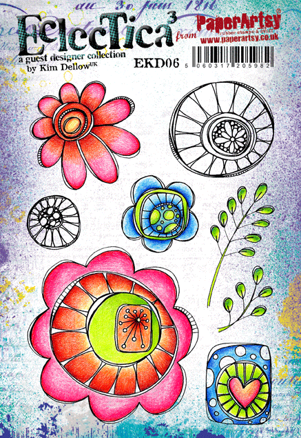
The above shows how well the Rusting Powder clings to the Versamark Ink which I've used with a stamp from EKD06. I've stamped onto Egyptian Cotton fabric and then sprinkled on the powder and spritzed with vinegar. No dilution, just vinegar. I've found that this gives me the best results. I left this overnight and the result the next day was wonderful ! 


Although the rusting does bleed (which I think is fabulous) you still get a really, quite sharp stamped image. In fact I was quite amazed at the level of detail that could still be seen. 


For the leaf I used a stencil from PS048, the process was repeated and I loved the result of the powder drying quite thick in places. I wrapped this piece around a piece of Stampbord to give it some dimension. I used some scrap pieces of Burlap and sprinkled with Rusting Powder and spritzed with vinegar. I also did some dry brushing with South Pacific Fresco Chalk Paint


The 2 smaller leaves are from EKD05 and I think I was a little over zealous with the Rusting Powder but when I saw the faint veins on the leaves I loved the effect, such a contrast from the darker rust areas. The flowers from EKD06 were stamped onto watercolour paper and initially was just an experiment, but the paper sucked up the vinegar and left a really clear stamped image. I used watercolour paints to just add a hint of colour to  them. 


 EKD05
 EKD06


You can see on the butterfly from EKD05 how much detail is captured by the Rusting Powder. I also stamped onto some Burlap to see how that would work using the delicate leaf stamps from EKD06. It worked a treat ! You may have gathered that by now I was stamping onto pretty much anything to see how the rusting would work. It does get very addictive ! 


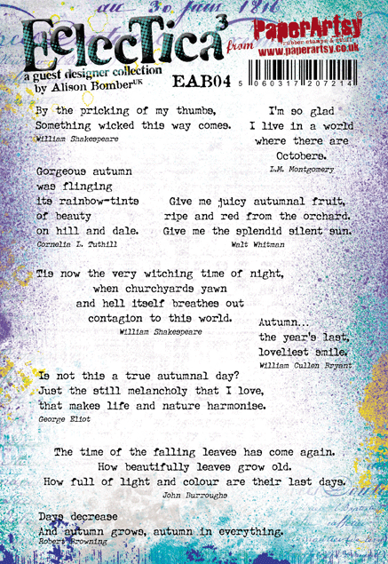
This final shot covers 2 birds with one stone as it not only shows the text I used, which is from EAB04...


... but it also shows my favourite piece of stamped, rusted fabric. The rust didn't seep as much on this piece which I guess all depends on how much powder I sprinkled. I added some splats of Snowflake Fresco Chalk Paint and some metal embellishments to finish off.

If you've never used Rusting Powder before I would recommend you jump in and have a go. The results are never exactly the same and when you leave something to 'cook' overnight it's exciting to see the results the next day, and you will be addicted !

Sue

Oh this is fantastic Sue, I did not know you could use Rusting Powder this way so perfectly with stamps and versamark!! I love it. I guess the Egyptian cotton, being so fine, gives an awesome surface for the versamark ink to grab onto with the rusting powder, and you are right, once rusted, it does seem to fuse to the surface too - very handy! ~ Leandra


We always hope that you  learn something interesting from our blog. Our creative team love to read your comments so much, so please take time to let them know you've been inspired!  

Why not join our 2-weekly challenge by blogging your create response to the current topic and link it here?

The current topic link Topic 16: Rust will close 17:00 (London Time) Sunday, Nov 12th 2017, and the winner will be announced 2 hours later at 19:00.

All links go in the draw to win a £50 voucher to spend on products of your choice from the PaperArtsy online store.