


Hi everyone
Ellie Knol from PAPER-STAMPS-COLOR here with you today.
I want to concentrate on a 'wonky bits' style with JoFY stamps as people seem to enjoy that at the moment; I do for one!
In JoFY's stamp sets are lots of versatile images that are easily fussy cut; I will use them as fodder. Do you know what fodder is? Read on and you will find out.
The first theme this quarter was tags, and the overall theme typography. My aim is to add these in my project too. Follow the pictures and see where I've incorporated them.
First things first: I need a book to store these fussy cut images!


I chose to mainly use the beautiful Jo Firth-Young Stamp Set 127 (JOFY127), but will eventually add fussy cut images into the book from other stamps sets. More fodder!

So what can be used as fodder?
Another word for it might be: 'stash' to be used later on, on a project.
I made a list, I've used the first 6 on the front cover of the recycled book.
Another word for it might be: 'stash' to be used later on, on a project.
I made a list, I've used the first 6 on the front cover of the recycled book.
- colorful (gelliprinted) papers
- fussycut images
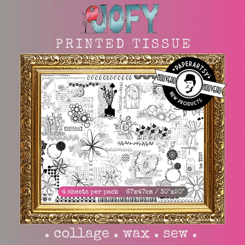
- printed tissue paper like JoFY Printed Tissue PT03
- dried leaves and flowers
- books to recycle
- words and quotes
wooden / paper / grey board alphabets
wooden / paper / grey board alphabets
backgrounds
rub-ons
magazine text and pictures
diecuts, also from colored or text papers
found objects
ephemera
brads and other embellishments
threads and fabrics
Fabric lace and lacy/ structured papers
etc
Fabric lace and lacy/ structured papers
etc

I stamped the pictures that are fussy cut easily of all my JoFY stamp sets (twice) onto some sturdy paper with a black ink.
So the fussy cutting began....
.jpg)
An example of a fussy cut image used on an art journal page; yes it's featured on the page I used as inspiration for my previous post with EAB!
.jpg)
I love how this has turned out.
.jpg)
On this second art journal page I used the fussy cut flower from JOFY127, the stamp set featured in this post. I made this page a while ago, and it was the inspiration to create fodder for future use.
.jpg)
I adhered a laser copy of this gelliprint to the covers of the book.
.jpg)
I am so happy I used a copy as I messed it up. Read on to find out what I did (wrong).
.jpg)

The cover looks so pretty.
I try getting a nice composition with a few fussy cut images....
.jpg)
.. lots of possibilities!
.jpg)
... lots of images to choose from.
.jpg)
While creating this project I suddenly had to be without contact lenses for 3 weeks, and I had to pause this as I couldn't see much. JUST before that situation, as a final touch, I added a layer of watered down gold mica creative paint. When it dried I knew I made a mistake; it was yellowish all over, and the paint was not as transparent as I'd hoped.

I adhered another copy of the gelliprint and covered it with two layers of PaperArtsy Fresco Finish Satin Glaze, otherwise the paper might absorb too much moisture in the steps to come, and also it acted as a better base for the crackle I want to apply in a future step.
.jpg)
When dry I applied PaperArtsy Fresco Finish Crackle Glaze through PaperArtsy Stencil by JoFY (PS396) with a palette knife.
.jpg)
I air dried the crackle paint, then lined the stencil back up, and applied a mix of 50/50 PaperArtsy Grunge Paste and Fresco Finish Chalk Acrylic (Snowflake, FF15) with a palette knife.
.jpg)
Then the magic happened. There's not as many cracks as I hoped for, but I kind of expected this to be the case. Grunge paste , being so thick, is logically going to be more complicated to crack than a thinner product like paint, so potentially not as 'crackable' as Fresco Paints, and the surface area of the stencil pattern was not that big. But the mix of the 2 produced this result, what do you think?
.jpg)


This, adding finishing touches, is always my most favorite part of a project.
I try to balance dark and light to create depth and interest.
It needs a bit more color.. I sponged Worn Lipstick Distress Ink - to areas and sprayed it with water.
.jpg)
.jpg)
No.. it needs Infusions!
Infusions - Royal Blood; dried with a heat tool:
.jpg)
.jpg)
.jpg)
.jpg)
Back to the fodder: here you see JoFY Printed Tissue PT03 adhered to some edges.
I am not sure whether I will use all of these fussy cut images, though. The dried fern leaf has been adhered and covered with watered down bookbinding glue.
I am not sure whether I will use all of these fussy cut images, though. The dried fern leaf has been adhered and covered with watered down bookbinding glue.
.jpg)
LOTS going on.. I know, but I like it!
White splatters... extra color added to the images, white border around the dried fern leaf and around the gelli print as a frame.. also 3 small tags..
.jpg)
Where's the typography?
.. the word 'timeless', stamped script in the background, and of course the script from the Printed Tissue!

... and the flower head needed more yellow as a final touch!
.jpg)
I have some useful fodder! For future projects!
.jpg)
.jpg)

I'm sure you've noticed that I kept going, not sure whether it would work, messing up a background and continuing with a new idea. Sometimes a project has to go through an ugly phase, to end up being a very unique project, prettier as envisioned in the first place, and very personal.
Creating or collecting fodder is timeless.. I find inspiration in them, and sometimes use them years later. Just imagine a creative space without fodder.. it would be a quite boring space.
Keep saving and creating fodder! Look at the list (above in the post) and save it all!
A start could be creating a book with just stamped and fussy cut images; as shown in this post.
Find the background and project for these fodder images later, maybe years later. Easy..
Have fun!


.jpg)


