Friday 27 October 2023

2023 Topic 11: Monochrome {by Mags Woodcock} with Orange & Tracy Scott stamps


Hi everyone

Mags here with you today.
I'm happy to share a second project for the typography theme, this time using a monotone colour palette. I have always loved using  simple colour combinations in my work, I also love to use rust. So what better way to combine the two then this month's topic.

I enjoy creating in my many art journals, it's so very relaxing. It also allows me to experiment and play with supplies and techniques without worrying about the results. With this project my idea was to recycle a children's board book into a sturdy journal with a limited amount of pages. The plan was to use the same papers throughout the book, but vary the look of the pages. Typography played a big part in this project, not only for creating the papers, but also using book pages and magazine clippings.


I enjoyed creating lots of patterned and printed papers to use in my journal, but also creating some rusty numbers to add to the cover and pages. I hope this inspires you to have a go.


Before starting the project I visited one of our local charity shops to buy a couple of second hand children's board story books, the type with just a few pages. The pages were nice and sturdy, perfect for my needs.

The next choice was colour. Having already decided on Stamps (TS065 & TSmini06) and stencils (PA stencil 208 & PA stencil 209) by Tracy Scott, Fresco Finish Chalk Acrylic Firebird (FF210) seemed to fit the bill. It would carry the monotone theme through the project when combined with the rust I was planning to create using the Rusting Powder (RP45)


I was excited to get started on creating the papers to use in my new journal and discovered a new (to me) technique which I fell in love with.
Whilst I knew I could create lots of tints, tones and shades of orange using the Firebird (FF210), Little Black Dress (FF19) and Chalk (FF83) Fresco Finish Chalk acrylics, I intended to primarily use just the pure unchanged colour for a "pop" in amongst the neutrals.


I wanted to create lots of patterned papers to use in my new journal, here are just a few of the favourite techniques I used. It's handy to remember that the papers needed to be fairly thin, so not to add too much bulk to the pages. I recently discovered unprinted newspaper. It's thin and ideal for gel-printing, adding paint to and using in collage, this and copy paper were my go to.

My first papers were created by laying a Tracy Scott stencil (PA208) onto half a sheet of the plain newspaper and applying PVA through the stencil with a sponge. Working quickly before the glue dried I pressed the opposite side of the paper onto the stencil (thus sandwiching the stencil between the paper) and then removed the stencil. Again whilst the glue was wet, I sprinkled on the PaperArtsy Rusting Powder (RP45)


When completely dry, I tipped away the excess powder, placed the paper in a shallow plastic tray and sprinkled on vinegar.


I was after a good variety of papers to use with lots of fairly bold patterns to mix with the book pages which have a smaller visual pattern. With this in mind I used my Gel plate to print a few black and white papers. 

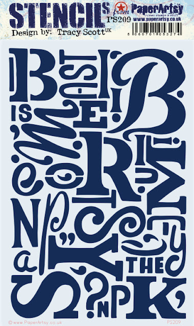
I brayered on a layer of Fresco Finish Chalk acrylic, Little Black Dress (FF19)  I placed on another Tracy Scott stencil (PS209) and used a sheet of the newspaper to remove the paint through the stencil. Removing the stencil then allowed me to pull a second print from the plate. I had to remember to place the stencil face down so the letters were the correct way round.


I also had an idea to create some papers with a lot of colour impact and so used a stencil by Sara Naumann (PA stencil 271) along with the Firebird Fresco Finish Chalk acrylic. Whilst the paint was still wet I sprinkled over clear embossing powder, tipped away the excess and heated gently to create a lovely glossy raised texture.


The next idea I had for creating interesting papers was nearly a failure, but thankfully I kept adding layers and it turned out to be my favourite by far.


I experimented with a rubbing of the stencils, a little bit like a brass rubbing technique. To continue with the monotone topic, I chose to use Monarch Orange Ranger Archival mini ink pad for the first layer. Placing the book page paper on the top of the stencil (PA208) and gently but firmly applying the ink with the ink pad while moving consistently in one direction from top to bottom gave the best results.


Now for a bit of depth to the paper. By moving the paper slightly and repeating the technique with the Ranger, Archival Jet Black ink pad, a new pattern emerged. It was at this point that I thought to myself "oh no, what a mess !". I had forgotten that I had recently reinked my ink pad and it was very juicy. There was a lot of black ink on the paper!


Thankfully over the years I have learnt that in mixed media art sometimes it just needs one more layer before the surface is ready. This was a case in point. Rather than give up, I decided to add some white. I popped the stencil on the top of the paper and used a White gel pen to outline the numbers. I love how the stark white contrasts with the blurred orange and black ink.


Having created some striking bold papers, I now moved onto image transfers. I have had mixed results in the past and this time was no different. Not through the choice of materials, just through lack of experience and practise.  I achieved some passable results which were ok for what I was after. I am sure I will get better with practise.

I chose to use Little Black Dress Fresco Finish, laying down a layer on my gel plate, adding torn scraps of text from a Vogue magazine and pressing well. Once I removed the magazine scraps the text was visible on the plate.


Once this layer was dry I added a thin coat of Firebird and pulled a print. As I say, not perfect but I learnt a lot about the process for future reference.


I had used up some of the paint from my brayer on to my gel plate and spare papers, so had several blank sheets of painty papers to play with. Using a white gel pen again and the stencil gave me more dramatic papers.


I also used Tracy's stamp set (TS065) to add visual texture to different book pages and blank papers overlapping some of the images and using second generation stamping.


The final step for this part of the project was to sand down the pages and cover of the children's board book and cover with book pages.


I was now ready to start the next stage of the project. I had a lovely array of papers to play with. I especially love those stencil rubbings. I will revisit the image transfer technique and hone my skills some more, but for now I am very happy with my results. Read on to see how I use lots of these papers plus some gorgeous Tracy Scott printed tissue (PT04) to create my "messy mixed media " journal pages.


When creating this type of journal page I tend to add torn scraps of papers in a fairly random way. In this journal I decided to explore other ways to add the papers, but for the first page I went for my usual method.

Using matte medium as an adhesive I attached torn pieces of my papers to the second two page spread in the journal. I seldom start on the first page in a journal, I like to create pages throughout the book rather than starting at the front and working towards the back. I did keep in mind the visual balance of the pages, but not too obsessively.


Where the papers overlapped the edges of the pages it was easy to trim and sand them back to neaten them. I was aiming for the pages to have a more cohesive look, and used a spatula to add random patches of Chalk Fresco Finish Chalk acrylic (FF83)


It was now time to add some stamping; concentrating on areas that needed detail and interest. I used stamps from Tracy's set (TS065) which includes text and numbers as well as letters and patterns.


I was happy with the way my pages were shaping up but they needed a focal point. The Printed Tissue designed by Tracy (PT04) is a recent release and has so many fabulous images. I decided it was ideal to provide my focal points. I copied Leandra's technique for painting the reverse of the tissue with Fresco's, using Firebird on some areas

Then when it was dry adding a coat of Chalk . Because Firebird is a translucent paint adding the Chalk brightened the way it looked on the front of the tissue and made it opaque


I used decoupage medium to attach the tissue to the page, adding some unpainted mandalas from the tissue on the edges and corners.


My pages looked good and were almost finished, but I thought they needed some words. I had found some interesting phrases in the Vogue magazine whilst looking for text for the image transfers. They seemed to fit with the look of the page and the journal in general. I do have a stash of found words, but these were bolder and more fitting somehow.
 

I was enjoying working in this unusual journal and loved the chunky feel of it.


 As I said at the beginning of the blog post, I had always planned to create more journal pages within the board book. I had several ideas planned including using strips of papers in a horizontal format. The techniques were the same as the previous pages apart from the initial layout of the papers. I loved the result and the found words were perfect.


Another two page spread had a grungier feel with a smaller amount of the Firebird and orange. You can see I stamped some circles using a mini stamp by Tracy (TS mini 06)


The last page was a twist on the horizontal strip page, this time the strips were placed vertically and the focal point was a very strong Firebird coloured butterfly from the printed tissue.


I think my favourite pages are the first I created, with the large flower. I wonder which you prefer?

As I looked through the pages in my journal I could see things that could do with a few finishing touches, just to make them stand out more.

I added some details to the large flower and mandalas on the first page with a white gel pen


The words and flower needed a little shading around the edges so I used a soft pencil and smudged it out with a cotton bud. I worked my way through the pages adding these little details.

Now my journal was almost finished. It just needed the cover decorating. I wanted to keep the design fairly simple, as there was so much going on inside. I decided to create some rusty number embellishments.

I had experimented with this technique before and wanted to perfect it. I mixed equal amounts of Grunge Paste (GP190) and gel medium. Laid a stencil  (PA208) on a sheet of Crunchy Waxed Kraft Paper (WKPA5) and applied the Grunge paste mixture through the stencil.


I removed the stencil and sprinkled over Rusting Powder to cover the paste. When it was completely dry the excess was brushed off . I added vinegar to the stencilled numbers to activate the Rusting Powder and left it to do it's thing overnight.


Because the paper had a waxed coating the numbers were easy to remove  by gently heating the paper on the reverse and peeling it from the numbers. I found a spatula helped with the process. I now had rusty numbers to add to my front cover. 


As I said, I wanted a fairly simple cover design, adding a few stamped scraps of paper along with the rusty numbers was the basis. The finishing touch was adding some stamped circles using Tracy's mini (TS mini 06) and some more magazine clippings.


I loved creating this fun and chunky journal and I will definitely be completing the second board book I bought. Maybe with the faces from the printed tissue, who knows. I have a ton of extra papers to play with now and learnt a few new techniques along the way. I know for sure I will repeat the stencil rubbing technique with different coloured ink pads. Which technique did you like the best ? Keep a look out in the PaperArtsy People Facebook group for more ideas using those papers, I can definitely see some tags in the near future.
I would love to see where you take these ideas, please tag me when you share in the group.
Happy crafting......Mags


Facebook:https://www.facebook.com/mags.woodcock

.


2 comments:

TAM said...

Stunning artwork, so much to look at, thank you for taking us through the process ��

Anonymous said...

Fantastic post great techniques xx