Hi everyone
Ellie Knol from PAPER-STAMPS-COLOR here with you today.
Playing with product is always so relaxing to me, and a challenge at the same time.
This topic (TAGS) had me thinking about all the great MDF tags I have in my stash to be teaching one of my workshops on.
They are ready with white watercolor paper (with a torn edge) on it.
I added a layer of gel medium to it for this project.
This topic (TAGS) had me thinking about all the great MDF tags I have in my stash to be teaching one of my workshops on.
They are ready with white watercolor paper (with a torn edge) on it.
I added a layer of gel medium to it for this project.
I decided to get these MDF tags out and have a play, and I actually had a clear vision of the crafty steps I would take on them.
I wrote the steps down, and followed them, and thought this would prevent me from doing something else altogether along the way. I was wrong!
My actual project gets shown in the section "Twists and Turns" because of that, and I ended up with 4 projects instead of one. Not a bad thing, lol.
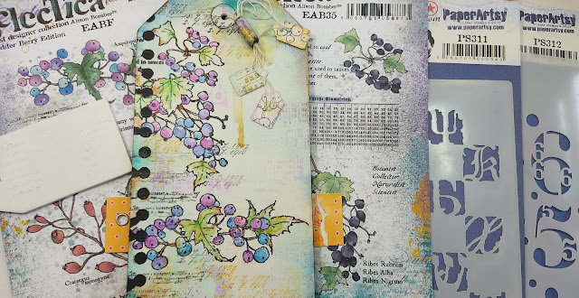
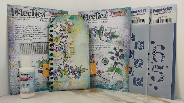
The stamps I was going to use are Alison Bomber Fodder School Stamp Set (EABF) and Alison Bomber Stamp Set 35 (EAB35).
Both stamp sets determined the style of the project for me. Colorful of course, an abundance of berries and as a bonus a tiny taste of autumn to go with it.
Both stamp sets determined the style of the project for me. Colorful of course, an abundance of berries and as a bonus a tiny taste of autumn to go with it.
Leaves with a touch of a rusty color before they start to fall, filling up the lawns; mixed with golden colors to resemble the softer glow of the autumn sun.
As TYPOGRAPHY is the overall theme for the 4th quarter of the year, I chose to use two gorgeous stencils : PaperArtsy Stencil (PS311) and (PS312)
Gathering all the supplies and a plan on paper was the way to go for me. Before starting the actual project I decided to play in my art journal first. It always gets me into an arty flow. The journal page only needed a few steps to make me want to start playing on the tag right there and then. I wrote down the steps to keep myself on track.
Follow along: this was a huge plunge I took; certainly it will not go wrong!?
Using the colors and steps used so far on the journal page, I started on a blank tag.
Coloring the background with Twinkling H2O's ...
.jpg)
First challenge arises as the stamped images disappear into the background visually.... white PaperArtsy Fresco Finish Chalk Acrylic (Snowflake , FF15) comes to the rescue, but there is another issue.. in the colored areas the sponged numbers are not visible anymore... now what?
.jpg)
I took a break to think it over... did I think these berries could be the focal point? Or will they be OK in the background?
.jpg)
Plan B... maybe add a white tag to the mix?
.jpg)
Back to the drawing board:
I know I made another mistake: in the initial step I changed the color from yellow to orange: it makes it too visible in my opinion; too much!
I know I made another mistake: in the initial step I changed the color from yellow to orange: it makes it too visible in my opinion; too much!
.jpg)
I decided to start on a new tag and change the order of the steps a bit.
Stamped the berries ...
Distressed the tag edges...
Added Twinkling H20 color to the berries
And green to the leaves...
Time to see how it sits with the journal page ...
Some yellow rust is required, but first some stencilling this time in the purple ...
Can I still save the first project?
An attempt: white gesso to knock back the coloring in the background, embossing paste through a stencil; sponged yellow.
No, for now I will leave this tag the way it is.. when it is finished I will share it in the FB group, the Journal page as well!
Adding finishing touches is the most enjoyable part of any project as far as I am concerned. This is the part where everything comes together.
I added background stamping in different colors ..
A close-up of the drip of sunshine yellow...
A bead made from fragile paper, burned with a candle on the edges, stamped and colored and heat embossed three times in clear...
.jpg)
A recycled clothing-tag added to the back for another yellow touch and to emphasize the focal point...
Enjoy the pictures, some close-ups of the coloring too!
Enjoy the pictures, some close-ups of the coloring too!
You can definitely tell that I struggle with CAS techniques. Details are important, but when to stop?! Should I just've tossed the first one in the trash bin? I am glad I tried, and will not toss it.
Why did I share it anyway? To show you that not every project works out the way we want it to.. and that's OK! Enjoy the process.. keep playing and learn from mistakes; that is called experience!
I am going to play some more with all these stamps and stencils, make some fodder for my fodder books to play with in the future!
I'd like to encourage you to share your makes in our FB group! Maybe show your struggles so others can learn too!
Facebook: https://www.facebook.com/EllieKnolCrea/
Instagram: https://www.instagram.com/ellie.knol/
Pinterest: https://nl.pinterest.com/ellieknol/


.jpg)
.jpg)

.jpg)
.jpg)
.jpg)
.jpg)

.jpg)
.jpg)
.jpg)
.jpg)
.jpg)
.jpg)
.jpg)
.jpg)
.jpg)
.jpg)

.jpg)
.jpg)
.jpg)
.jpg)
.jpg)
.jpg)
.jpg)
.jpg)
.jpg)


3 comments:
Love these stamps and the colours you've used - beautiful
Gorgeous work. Love the layers. Please tell me where to get the colour palette seen at your picture.
These are absolutely lovely, Ellie - I loved seeing the journey, and I adore wherer you ended up!
Alison x
Post a Comment