Showing posts with label 2015 Topic 14. Show all posts

Monday, 25 July 2016

2016 #14 Shadow Box Frame {by Ruth Mescall}

 2016 Topic 14: Colour mixing

Hi everyone Ruth here.

Tonight I'd like to share with you this evening with a post about mixing and using complementary colours.

I love experimenting but frequently play safe with my colour schemes and use colours near each other on the colour wheel. I find monochromatic and analogous palettes really pleasing to my eye but wanted to get a bit more savvy in using opposite or complementary colours in my work as I've had mixed success probably more by luck than design!

I admire Dina Wakley's use of white space with pops of colour and thought I'd try and combine this modern fresh look with beautiful vintage Ink and the Dog mini images. These are a perfect size for ATC's, but in this instance I've used a playing card size which is slightly narrower to create my 'When I grow up' shadow box frame.


Step One: The images and background stamps I've used are Ink and the Dog  Mini 03Mini 04Mini 11Mini 12Mini 23 and Mini 29 and I thought a blue and orange colour scheme would work best with these. 4 strips of Smoothy stamping card have been base coated with Snowflake fresco acrylic paint, then I used the gorgeous Glass Blue which is a translucent and mixed a little China in to give some opacity. The technique I've used is the card scraper technique or faux printed look (see Kim Dellow's you tube video here). I scraped less on each piece as I went along.


Step Two: I decided to make a monochromatic background for one of them (far left) and then use blue and a blue green to complement the orange. For the monochromatic one, I've also used white -snowflake to create tints and black - Little Black Dress to create shades which I used to stencil some circles on. I've already knocked back the one on the far left with snowflake to create a more subtle base for the stamped images and create more white space to rest the eye. 


Step Three: Where I've usually gone wrong in the past is in trying to use equal amounts of all the colours, so this time I've made the second one predominantly blue, the third green and the fourth orange, all with small amounts of the other colours still in there. 

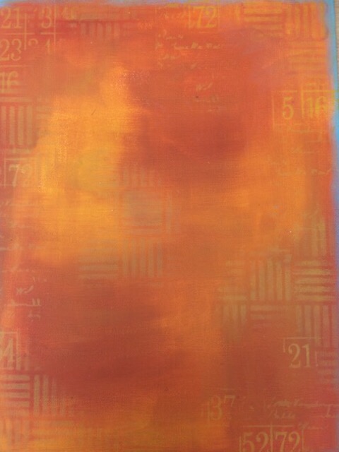
For the blue green shade I used Caribbean Sea mixed with a little Captain Peacock. The blues and greens overlapping were fine but the orange, a mix of Yellow Submarine and Tango didn't, mainly because it's a translucent, so they look like they have been mixed together. So to get around this I brayered white over some areas before I added the orange. I had also been scrapping any remaining paint on to brown gummed tape to use around the outside of the box, this was inspired by a recent Jo Firth Young post here.


Step Four: Next to see where each image looked best before stamping in Cobalt Blue archival Ink. Once trimmed I used Treasure Gold in Florentine around the side of the card.


Step Five: The frame was  a sturdy box I'd salvaged and coated in snowflake. I added some stamping to the border before adhering.


Step Six:  I masked off and stamped a border strip on the inside in blue archival to match the outside border. To create depth and visual interest I used foam pads and small tubes of card to support the cards at different levels.


Think this is my favourite image, I even managed to get a touch of orange on the starfish.


I really enjoyed exploring this topic, creating something vintage with a fresh twist, something I want to keep developing. I've generally felt I had a good eye for colour but found it interesting referring to the colour wheel and seeing what I think of as orange or blue/ blue green isn't always the true colour but slightly further around on the wheel and why it could alter your final result. Blues seemed to suit the sea theme but you could try the opposite, orange and yellow orange to complement a blue, or use other complementary colours such as red and green, violet and yellow. Enjoy exploring the colours you have and see what beautiful hues you can create. 

Ruth x

Blog

Ruth this is such a great explanation of complementary colours, and a really great tip with the snowflake layer before the orange. Love that tape idea too! Thanks so much for sharing, particularly on a colour combo that can be a tad tricky to execute! ~Gillian

We would love to see how you interpret this Colour Mixing topic by linking what you make to our 2016 Challenge #14: Colour Mixing, on this page HERE.

All of our bloggers love to see your twist on their ideas,  particularly if you were inspired directly by their post. 

All links go in the draw to win a £50 voucher to spend on products of your choice from the PaperArtsy online store. The Colour Mixing link will close 17:00 (London Time) Sunday, Aug 7th 2016. The winner will be announced 2  hours later at 19:00.

Saturday, 8 August 2015

2015 #14 Blooming {by Lin Brown}

 2015 Topic 14: Flowers

Hi everyone, Lin here this evening to share a project with you using my latest release of stamps. Those of you who have known me for a while will know that designing stamps is relatively new to me and the whole flower thing is far removed from the art, that until recently, I would have made. Yes, I love my flower stamps and yes, I have thoroughly enjoyed and embraced the bright colours of the Caribbean that initially inspired these flowers, but now I am ready to see if I can combine my love of a more artsy style and my new stamps....here goes!!!


Step 1: Working on three pieces of 10cm square white/greyboard, I used a plastic card to scrape some Squid Ink Fresco Finish paint on the white side of the board, deliberately leaving some white space. While this was still wet, I then scraped some Nougat over the top which I then dried with a heat gun.


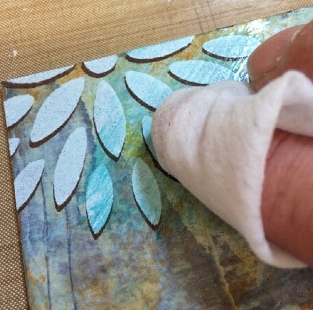
Step 2: I used a baby wipe to apply a thin layer of Lake Wanaka over the top, which I also dried.


Step 3: Now for some translucent colours. A tiny amount of Tango and Limelight added randomly with a baby wipe really made the background start to come alive, it was looking a bit frosty before these colours were applied.


Step 4: With my boards all lined up in a row, I used Chocolate Pudding through my stencil PS005.


Step 5: Using Lynne Perrella's bumping techniques (slightly off-setting the stencil over the first layer of paint) I added a layer of Antarctic Fresco. This technique still makes me smile!!!!


A close up of the bumping...you can see why opaque paint is necessary for the top coat, and if you put light under the dark it looks blurry, so dark underneath seems to work better.


Step 6: After giving some considerable thought as to what to do next, I decided that the flowers would probably look better if they had a tad more colour, so I added some Beach Hut.


Step 7: Then came the scary part! I cut each of my three squares into four, giving me twelve pieces in total.


Step 8: Arranged them in a design that I liked. 


Step 9: Added some additional stamping with Cornflower Blue Archival ink.


Step 10: My original idea was going to be stamping sections of the flower heads from plates ELB22, ELB23 and ELB24 directly on these squares. After giving this some careful consideration, two things sprang to mind...

The first was that the colours I had earmarked for the flowers were translucent colours and wouldn't show up terribly well over the background I had created. 

Secondly, having made a background that I really quite liked, I didn't want to risk spoiling it, so I decided that my best option would be to use the tissue paper trick and stamp and colour all my images on tissue first. I would then be able to stick them to the mini boards with Matt Medium. By doing this, I could play around with placement before committing myself to a final design.

ELB22,

ELB23

ELB24
Step 11: I love how the tissue just blends in with the background.


Step 12: I used Pumpkin Soup and Brown Shed to paint and decorate a canvas board, which I edged with Bora Bora.


I'm pleased how this project turned out. The hardest part was actually deciding what colour to paint the canvas board!!!! 


Here's a close up shot so that you can maybe see how all the layers works well together. In case you are wondering, the quote is from ELB05.


I'm sorry this post turned out to be a bit of an epic, but I do hope it has inspired you to try something like this for yourself.
Lin

Ohhh we love this, especially that you mixed up and rearranged the squares, makes for a really interesting background. Great tip for using tissue paper as the stamping base, it really does make the colours true and vibrant. ~Darcy

We would love you to join in with challenge #14: Flowers.

If you are inspired by any of our guests who blog with us over the fortnight (July 26 - Aug 9th), or perhaps you want to just do your own thing with flowers...then please join in and link up your creativity HERE

All links go in the draw to win a voucher to spend on products of your choice from the PaperArtsy online store. The Flowers link will close 17:00 (London Time) Sunday, Aug 9th winner will be announced 2 hours later at 19:00.

Friday, 7 August 2015

2015 #14 Notebook Holder {By Clare Charvill}

2015 Topic 14: Flowers


Hi everyone Clare here. Many of you may know me as a paper girl but I also love getting out the paints , inks and PaperArtsy stamps and getting really creative from a blank canvas. With the flower theme in mind the project I have to share with you is a refillable notebook holder. I've been making a few of them for a craft fair and thought I'd adapt the style to incorporate a bright and cheery panel using JOFY stamps. Here's how it came together. 


Starting with two chipboard covers and spine, and two sheets of the greenish 12 x 12 paper from the Paparartsy Chatsworth collection I covered the binder, added faux stitched detail using the stamp from JOFY26 and a few sections of the caterpillar border from JOFY37 stamped on white card and painted with Tango, Limelight and Autumn Fire paints. I added a hint of Metallic Glaze to the Limelight dots for a hint of shimmer. 

JOFY26

For the panel that fits in the cover frame I started with a piece of white smoothy card cut to size and blended Green Olives and Buff paints together to give a light to dark effect. When dry I stencilled on the spiky flowers from Stencil 11 (JOFY) with Metallic Glaze and stamped base image (JOFY37) over the top using black ink. I re stamped the image twice onto white card along with a couple of caterpillars ... love that little chappie, a string of caterpillar border (not shown) and a few of the smallest flowers from JOFY mini 34 and coloured them all using a paint brush and water puddles with Hey Pesto, Autumn Fire, Tango and Limelight. The dots on the mushrooms are cut from the Caterpillar border and used a white sharpie to ad flower centres. Once dry I added all the elements over the original stamped image, raising the flower heads on foam dots and threading the caterpillar through the flower stems before sticking them in place. 

JOFY37
JOFY mini 34 

The tag was made from shrink plastic, painted with Autumn Fire and Tango paint and tied onto the flower stem with one strand of natural twine. 


With the panel finished I stuck it in place using a good quality double sided tape and then added all the paper pieces to the inside of the holder to make the pocket pen holder and note book section. 


To finish off the inside of the binder I added one string of the caterpillar border, a caterpillar to the left hand pocket a ribbon strip and pen loop painted with Tango paint and the sentiment from JOFY37 above the notepad. I also used a strip of painted ribbon to cover the paper join on the back of the holder. 


I really enjoyed putting this project together and love how the colours pop off the paper. They make great gifts too. 
Thanks for looking, 
Clare. 

You can find me on my blog mycreativespirit and Facebook at MyCreativeSpirituk

Thanks Clare, wonderful to see your work back here on the blog. This is the happiest notebook holder ever, who could resist keeping this in their bag.We especially love the way you have added dimension to the flower heads.  As a gift, so perfect; a real treasure to receive. 

We would love you to join in with challenge #14: Flowers.

If you are inspired by any of our guests who blog with us over the fortnight (July 26 - Aug 9th), or perhaps you want to just do your own thing with flowers...then please join in and link up your creativity HERE

All links go in the draw to win a voucher to spend on products of your choice from the PaperArtsy online store. The Flowers link will close 17:00 (London Time) Sunday, Aug 9th winner will be announced 2 hours later at 19:00.

Wednesday, 5 August 2015

2015 #14 Scrapbooking with Flowers and Texture {by Jennie Atkinson}

2015 Topic 14: Flowers

Hello everyone! I am absolutely thrilled to be here with you all on the PaperArtsy blog. My name is Jennie Atkinson and my blog is Live The Dream and yes I do believe I live the dream! I live in Shetland, the most northerly island in the UK  (cold and windy at times but fabulous!) and my blog has been my link to the outside world and the opportunity to meet like minded stampers and crafters and of course to follow blogs, such as Paper Artsy, which have been my training ground ... not being able to get to workshops and craft events.

I love all aspects of stamping, inking, scrap-booking, art-journalling and mixed media work but I suppose my style is mainly vintage shabby chic. Those of you who know me know that I love making my own handmade flowers, this being borne out of the frustration of  never having the right kind of flower to hand and the disappointment of buying them on the internet.  So sharing a project with you on the theme of FLOWERS is just perfect for me !


Tonight I am sharing with you a mixed media scrapbook layout using some of my own flowers, but also one of my own photographs. I have recently taken up photography and am still in the very early stages.


When I saw Sara Naumann’s Wisdom stamps (ESN07) with the words 'Photographie Illuminating My Heart' I knew I had to use this stamp plate for my layout.


I used some strong linen style cardstock and got some texture on the page with texture paste and stencils and adding some tissue tape around the edges here and there. I had an idea where the photograph was going at this stage, but nothing else! Everything then got a coat of gesso.


When the gesso was dry I mixed some watery puddles of Fresco Finish Pansy and Spanish Mulberry on my craft mat and added them with a paintbrush slowly at first as it is always easier to add more than take it away. I kept spritzing with water, mopping up and then drying with a heat gun until happy with the colour.  I used Pansy on a mesh stamp here and there adding the paint to the stamp with a paintbrush. I also added splatters again in both Pansy and Spanish Mulberry.


With Jet Black Archival Ink I  used the music stamp from ESN07 and a vintage text stamp (one of those lovely freebies which Leandra is always so generous at popping into one’s parcel). Although somewhat randomly  I do try and keep these within the area of the photograph. Once I was happy with the background I used a sewing machine to attach it to the backing cardstock. I find this the easiest way of attaching the two pieces and I have added more stitching in various places as further texture.


I then started to put together the embellishments.  I used more of the stamps from ESN07 for my text and embellishments stamping with Watering Can Archival Ink and made some roses from white cardstock edged with grey ink.  There is a tutorial for these flowers on my blog HERE.  The leaf chippy was painted first with Sage Fresco Finish and then crackled with Crackle Effect and Snowflake. And then it was a case of layering everything around and under the photograph which is raised off the page on a large piece of greyboard. When everything is stuck down I usually finish off with some dry brush gesso here and there to tone everything together, especially on the metal and buttons.


I love the way the Fresco Finish paints merge together and give such a lovely light effect on the linen cardstock despite being such strong colours.  They are always my go to paint for covering chippies and the Crackle Glaze never disappoints! 

Sarah Naumann’s ESN07  stamp plate also provides wonderful opportunities for subtle stamping on the background as well as elements for layering.

I always wish I had planned things out a little more from the start. The photograph I was using was initially 4 x 6 but was too overpowering so I had to make it smaller which did expose more of the coloured areas on the background. Some gesso helped but I still think it is a bit heavy in the centre of the page.

When I teach scrapbook workshops here in Shetland I always show how turning the same design 90 or 180 degrees can make another great layout! Sorry there is no rotate button for you to try it out!

I do hope this might have inspired some of you to have a go at a mixed media scrapbook layout if you haven’t already done so. And also you might look at some of your smaller stamps in a whole new light.

If you are interested in seeing more of my flower tutorials please do visit my blog Live The Dream. You can access them either on the top bar or from scrolling down the side bar.

Thank you so much to the team at PaperArtsy for inviting me to share a project with you tonight – it has been such an honour!

Jennie


Ohhhhh Jennie, I do love how on the face of it your beautiful Scrapbook LO looks minimalist, but when you see how you have gently built layers, colour, textures, and embellished perfectly with such a fabulous eye for composition and placement, it's clear that you have put a lot of thought into this. Such a peaceful and elegant piece! Frame it! 
So lovely to have you share with us tonight! Thankyou! ~Leandra 


Bloggers and followers...we would love you to join in with challenge #14: Flowers.

If you are inspired by any of our guests who blog with us over the fortnight (July 26 - Aug 9th), or perhaps you want to just do your own thing with flowers...then please join in and link up your creativity HERE

All links go in the draw to win a voucher to spend on products of your choice from the PaperArtsy online store. The Flowers link will close 17:00 (London Time) Sunday, Aug 9th winner will be announced 2 hours later at 19:00.

Monday, 3 August 2015

2015 #14 Large Flower {by Wanda Hentges}

 2015 Topic 14: Flowers


Hi everyone!!! Wanda here, joining you this evening with a post for the Flowers theme. I thought it would be fun to make a large flower to hang on the wall but, was it ok to make an enlarged copy of a stamp. After emailing Leandra the answer was, yes, it is, as long as it's a one time thing and not for making multiples for commercial gain.


I stamped the flower from ELB24 onto white cardstock and, using a laser printer, enlarged it as much as possible but it still fit onto an 8 1/2 x 11" piece of paper.  I made 5 copies onto white cardstock.

ELB24


I cut out 2 complete flowers, 2 flowers with just the center petals, and one flower that has just the "front" center petals.  As I started cutting the last one I realized that since there was just a bit holding each petal onto the center that I would probably manage to tear them off before I was done ... So I stopped and coated the back with Golden gel medium. I just brushed it on not bothering to get it really thin and smooth as I wanted the extra strength. Once it was completely dry I finished cutting it out. You still have to be careful not to "overcut" between the petals but it worked well for strength.


Fresco Finish paint was used to add color. I started with one of the large flowers and quickly painted all the petals with blueberry and then began painting each petal separately using china, lavender, smurf, wisteria, and snowflake. I didn't blend too much allowing brush strokes to be seen.


Here is one flower with all the petals painted. I painted the other flowers in much the same way except on the other large flower I didn't paint all the way to the center.  It was going to be the bottom in the stack and it wasn't necessary. Honestly it was probably only necessary on one of the full center petals pieces and the front center petals piece but I painted them anyway.  


I only painted the actual center on the front center petals piece. I mixed chocolate pudding and squid ink and painted the whole center and then using a texture tool added spots of toffee.  I've had this tool for years and years.  It was bought at a rubber stamp convention when they used to have them in Iowa. I don't remember what it was called but it has a plastic mesh stuff glued to the end of a finished wood stick. 


If this was going to be a gift, I would have painted the backs of all the flowers but I'm keeping it.  I intend to hang it in the bathroom so I wanted all the flowers to be sealed and I did this by painting them, front and back, with satin glaze.  The satin glaze also brightened all the colors and gave a fabulous finish to the flower!!!!  To give added dimension to the petals, working on a foam pad I used a stylus tool to puff the paper forward.  I could have worked it to be more smooth (which I did with the painted center) but leaving the lines added a more realistic look to the petals.  I stamped the quote from ELB24 onto a scrap of white cardstock with Archival Ink jet black, cut out the words and glued them to the painted center and then painted the center again with satin glaze. Using a Posca paint marker I went around all the petals on all the flowers except for the one with just the front center petals. To give more variety to my layers I stamped text using Minis MN61 onto the ends of the petals on one of the complete flowers and one of the center petals flowers. I left the front center petals flower without marker or text.


MN61

I attached all the flowers together just in the center with foam mounting tape.

To make a hanger for the flower I used 2 cardboard circles that I had and some craft wire.  I twisted 2 pieces of wire and glued them between the circles with heavy gel medium, clamping them together and allowing them to dry.  I then attached the hanger to the back of the flower being sure it would hang with the words upright.  


Once they were all attached just in the centers, I thought it needed more so I carefully lifted the front petals and added dots around all the petals of the next layer using a white Posca pen. I then added the white swirl to the front petals holding my breath and hoping I wouldn't mess it up... success. Finally I glued each of the very front petal with a blob of gel medium behind the center of the petal. They needed to be glued so they wouldn't flop when the flower was hung up but I wanted them to keep their dimension and shape.  


I LOVE how this came out!!!!  Bonus... my husband also likes it, yay!!!  This could be done with any color or how about making a flower and each layer is a different color group.  That would be really pretty and fun!!!  I hope you have a chance to get painty or inky and create something for the current Flowers Challenge.  

~Wanda

You can find me on my Blog and also on Facebook, Twitter, Instagram, Google+ and Pinterest.

A quirky piece of art to grace any wall space Wanda, love the enlarged multi-dimensional petal layers and the white highlights. So glad it has the tumbs up from hubs too. Thanks for sharing your creativity with us.

We would love you to join in with challenge #14: Flowers.

If you are inspired by any of our guests who blog with us over the fortnight (July 26 - Aug 9th), or perhaps you want to just do your own thing with flowers...then please join in and link up your creativity HERE

All links go in the draw to win a voucher to spend on products of your choice from the PaperArtsy online store. The Flowers link will close 17:00 (London Time) Sunday, Aug 9th winner will be announced 2 hours later at 19:00.