Showing posts with label embossing powder resist. Show all posts

Friday, 20 June 2025

Piano hinged journal with PaperArtsy Products {by Ann Barnes}

Hi everyone, it is Ann here today, and I am so happy to be back with you again.

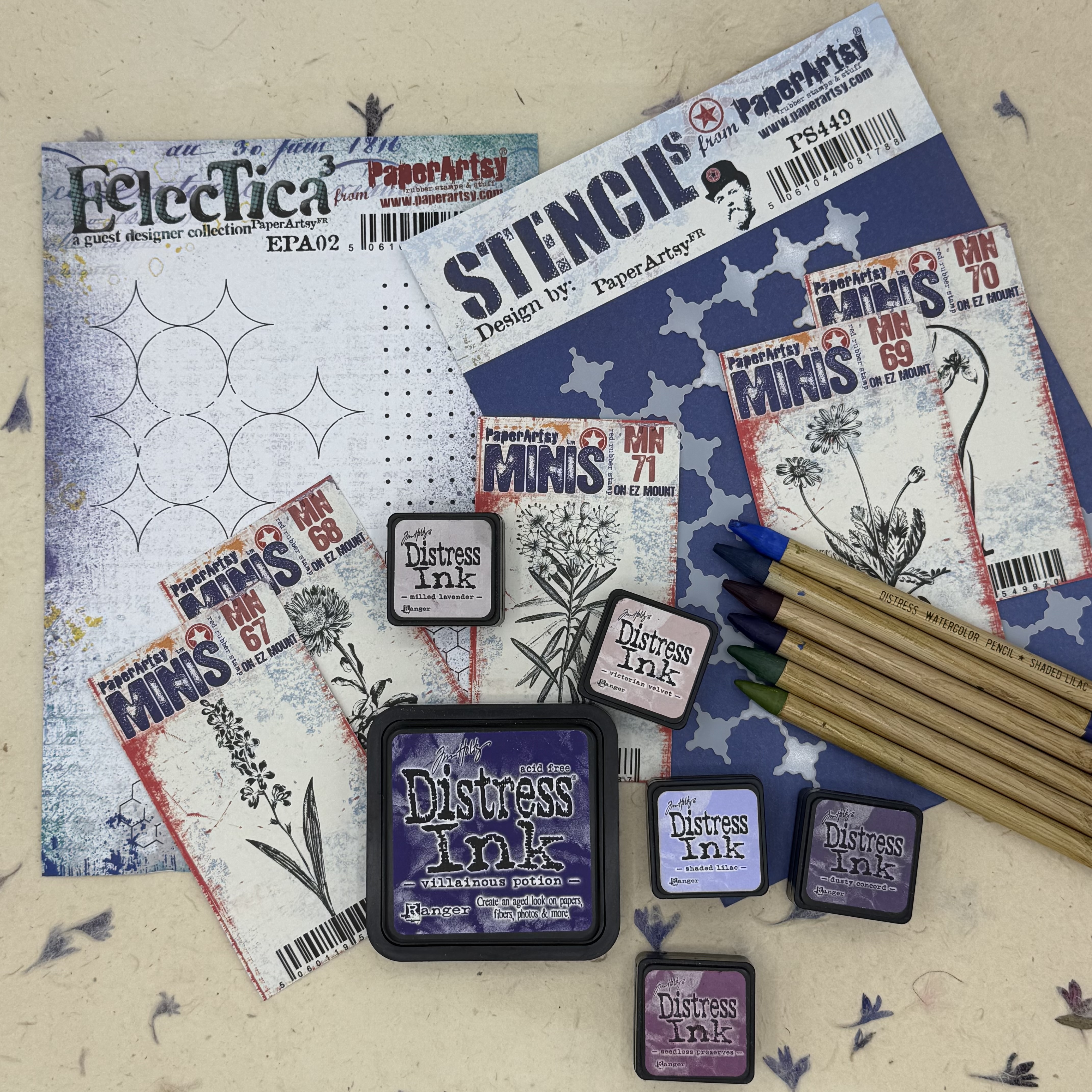
This year on the blog, we have free reign to do a deep dive into a PaperArtsy product ranges of our choosing. For this post I have been exploring the PaperArtsy Eclectica products (EPA02, PS449). These stamps and stencils were released earlier this year (January 2025) and have a really nice mixed media vibe. I just love using them in backgrounds to create some graphic interest. For this project I have paired them with a few of the PaperArtsy: Ink & The Dog Mini stamps, botanicals in particular. List of PaperArtsy stockist can be found here.

Today I'm looking forward to sharing with you how I used the same stamp to achieve both positive as well as negative image for a background. I also explored different ways to create a watercolored stamped image. Mostly, I enjoyed playing around with these wonderful stamps (and stencil) and created a fun botanical bound journal.


I love incorporating natural elements into my work, and the PaperArtsy Ink & The Dog mini stamps (MN67, MN68, MN69, MN70, MN71) led to the idea of using a natural floral stem to create the binding for my journal.

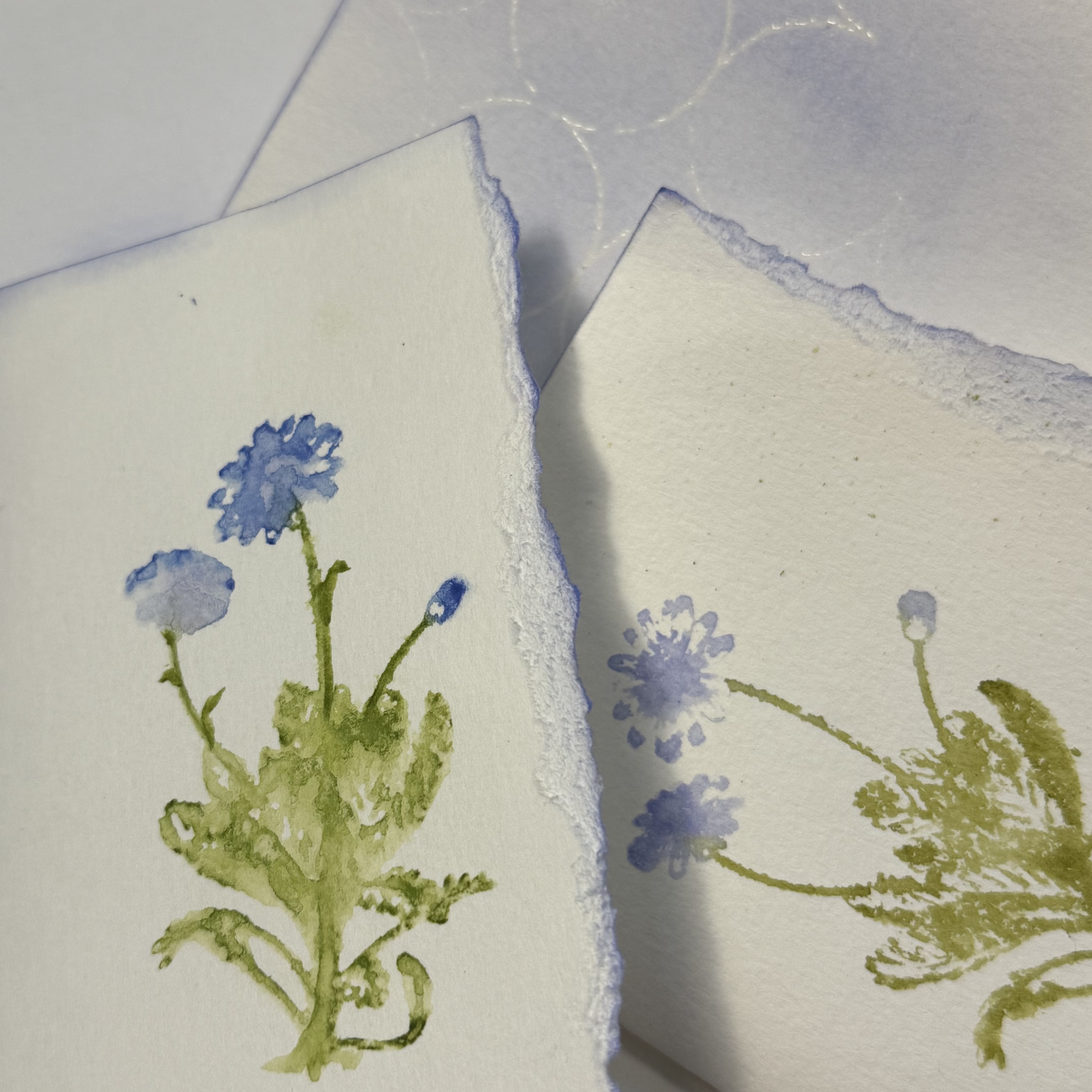
Using water reactive inks and flooding the inked stamps before pressing to create the image created such a beautiful watercolored look. Depending on the amount of water I spritzed, I could create a watery abstract or a detailed impression. These variations on the same stamp design resulted in a lot of interest!


My original plans for this journal involved focusing on one of the PaperArtsy Ink and the Dog Mini floral stamps, but I had a difficult time choosing just one, so I used all five, giving each design its own signature within the book.

My neighbor has a wildflower garden at the street that I pass each day. When I gathered my supplies to create this journal, I remembered seeing some of the same flowers in the garden. These were predominantly purple and so the color scheme was born. When lavender and iris flowers were also in the stamp collection, I knew that this color scheme was meant to be. While any type of water reactive medium could be used, I focused on primarily the Ranger Distress palette.


When making a handmade book, one of the initial steps is deciding the size. This includes the number of pages. Since this was my first attempt at making a piano hinged book, I wanted to keep it fairly small. This also worked well since I was using the mini stamps. Each Signature of the book contains three folded pieces of standard watercolor paper. There are five signatures, one for each of the flower designs.


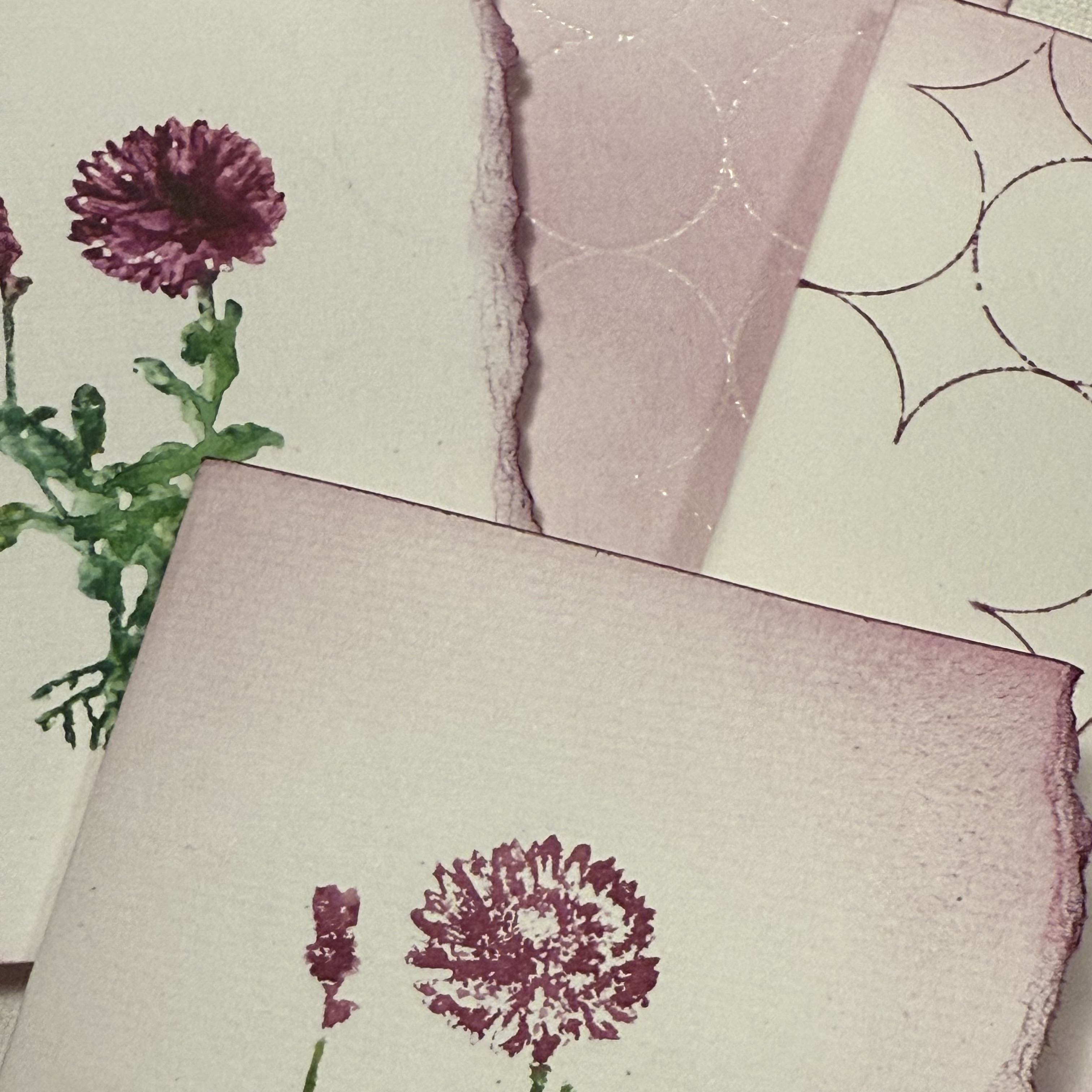
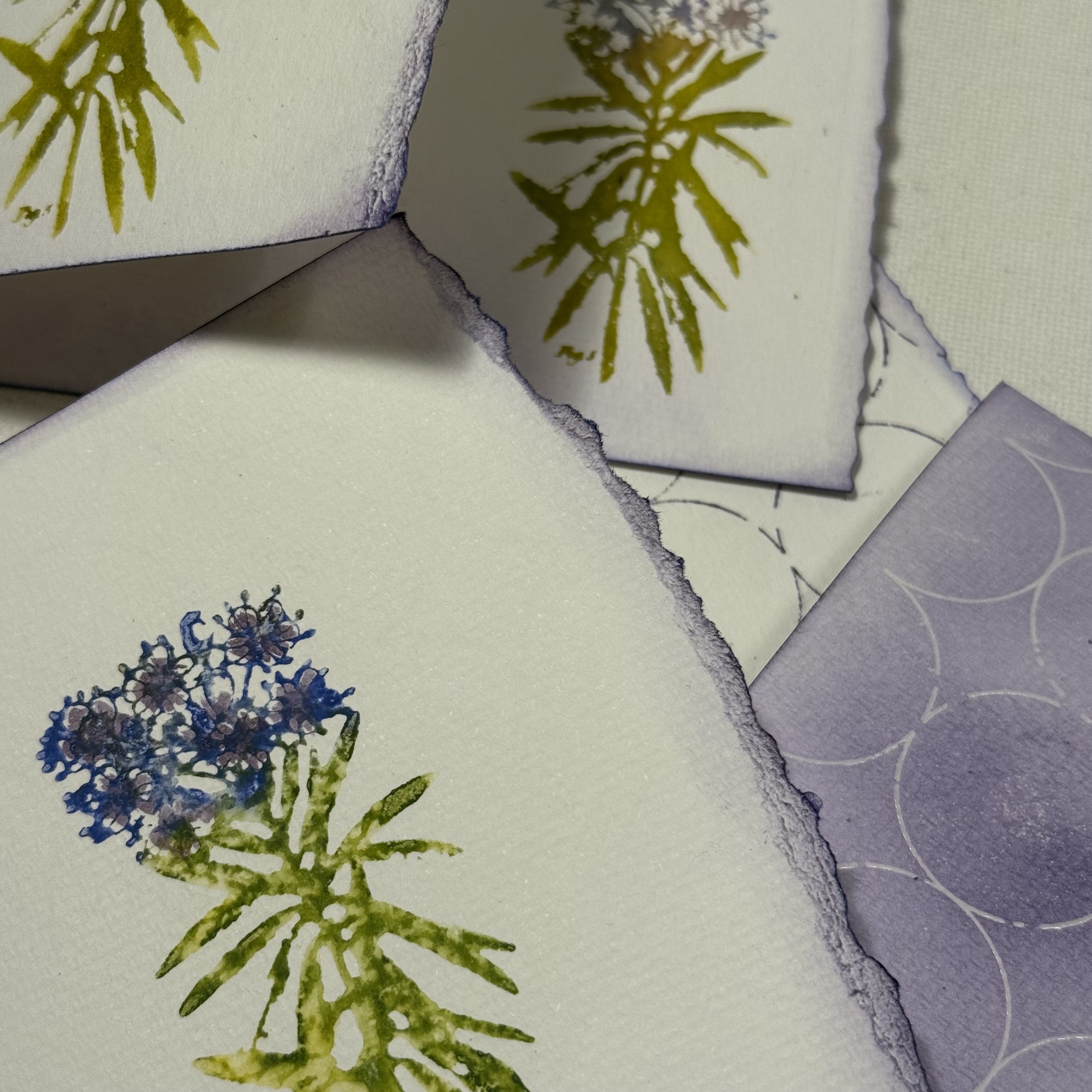
I wanted the first page of each section to be a bold representation of the floral image. For this I used Ranger Distress watercolor pencils. I wet the tip of the pencil and added the dense color to the stamp. I then spritzed the "colored" rubber stamp with water and then created the impression. A couple of the designs are narrower than the others, like the lavender; for these flower designs, I did multiple impressions.


With all of the signatures having a designated flower, I was excited to fill up the additional pages. I noticed how differently the images appear depending on the amount of spritzed water used and decided that I would love to experiment with that on the next pages, only using the stamps with inks and water.


To complete the remainder of the first pages of each signature, I chose one of the graphic design stamps from PaperArtsy Eclectica Stamp Set 02 (EPA02). Wanting to keep with the boldness of the watercolor pencil impression, I inked up the image and added random marks onto the paper. I find it easiest to do this type of stamping without a stamp block. By simply using the stamp loosely in your hand, it is simple to press only on a small area, and to rotate the image freely.


Within each signature, the second pages contain my experiments with watering down the inked stamp. Using Ranger Distress Ink in the same colors that I chose for the water color pencil technique, I added ink to the rubber stamp and then spritzed with water and made an impression.


I also did second (and third) generation stamping, with additional spritzes of water. I continued playing with the water amounts and stamping images all across the page and also on the reverse side. I love how some of the images appear very abstract, with only a subtle indication of the flower type. I could not decide which images I preferred, the crisper versions or the flowy versions. I continued my exploration with each of the floral stamp designs, one per signature.


When considering what I wanted to do on the third pages of each signature, I thought it would be fun to create an embossed resist of the graphic mixed media designs, so the pages would be reverse coloration. For this, I used clear embossing ink and clear embossing powder. When the powder is heat set, and ink is added to the page, the stamped image appears as the original color of the paper.


I randomly placed the mixed media graphic stamp onto the page, sprinkled embossing powder onto the ink then heat set it. Then, using a coordinating color of Ranger Distress Ink to the ones used on the flower petals, I inked up the page.


Note that when the three sheets are folded together into a signature, the floral images will appear adjacent to a page with a different design.


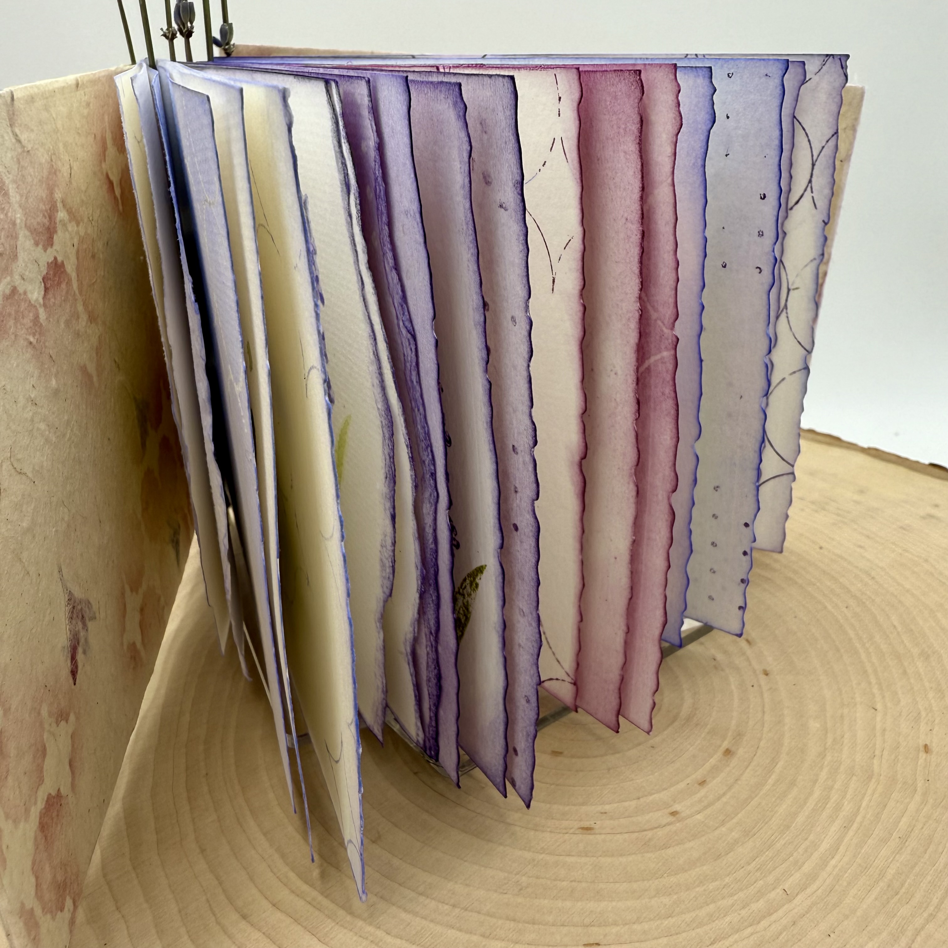
I especially love how the pages look abutted to one another when the three sheets are folded into each other to create the book.


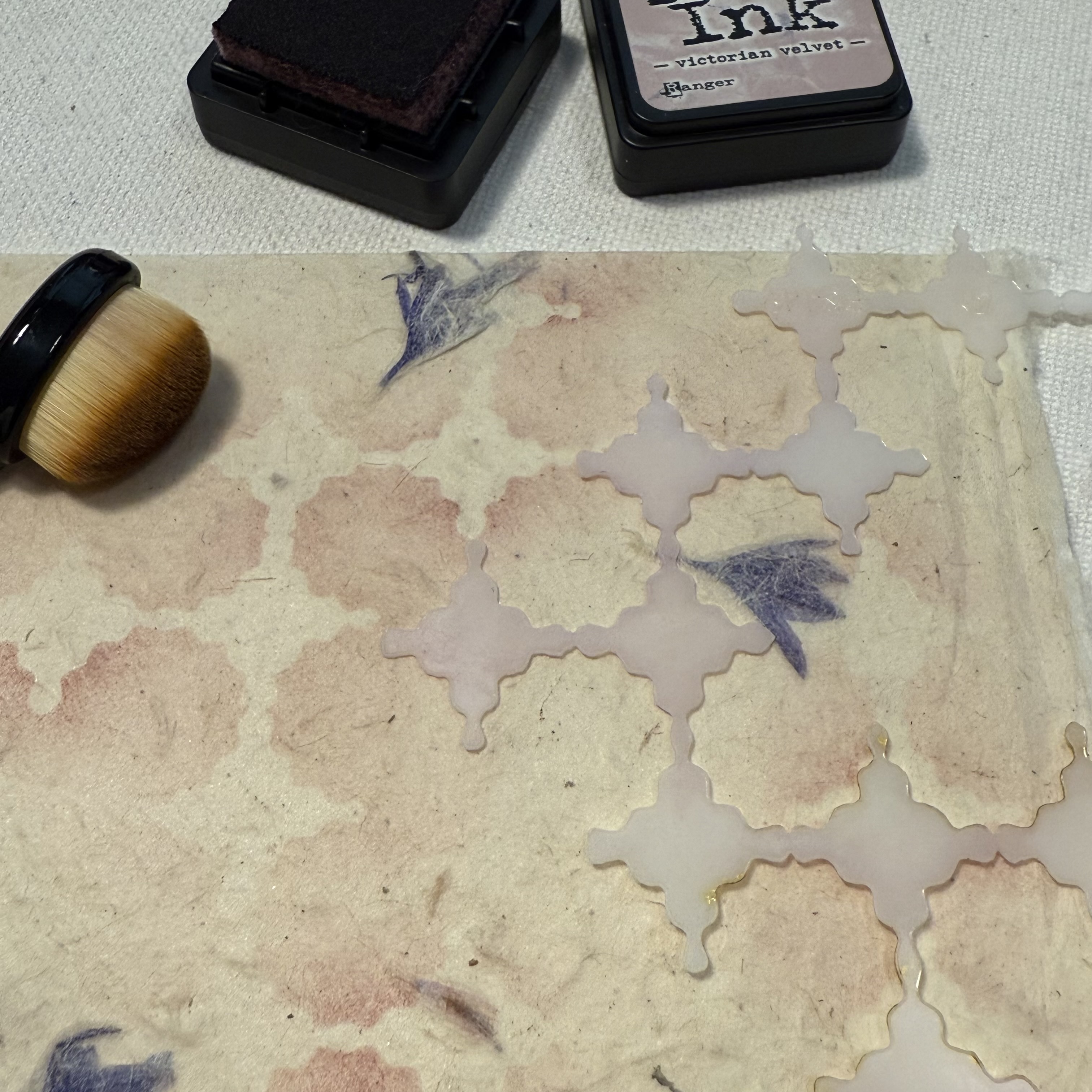
With all of the pages in each signature complete, it is time to create the covers. I had a sheet of natural handmade paper that contained purple flower petals, and decided it would be the perfect cover material. Using the PaperArtsy Stencil (PS449), Ranger Distress Ink and a stencil brush, I added random areas of soft pattern. To achieve the soft effect, be sure to choose a color that is not bold, yet is different from the overall background. I used Victorian Velvet, a subtle pinkish purple that coordinated with the different purples and magenta of my signatures.


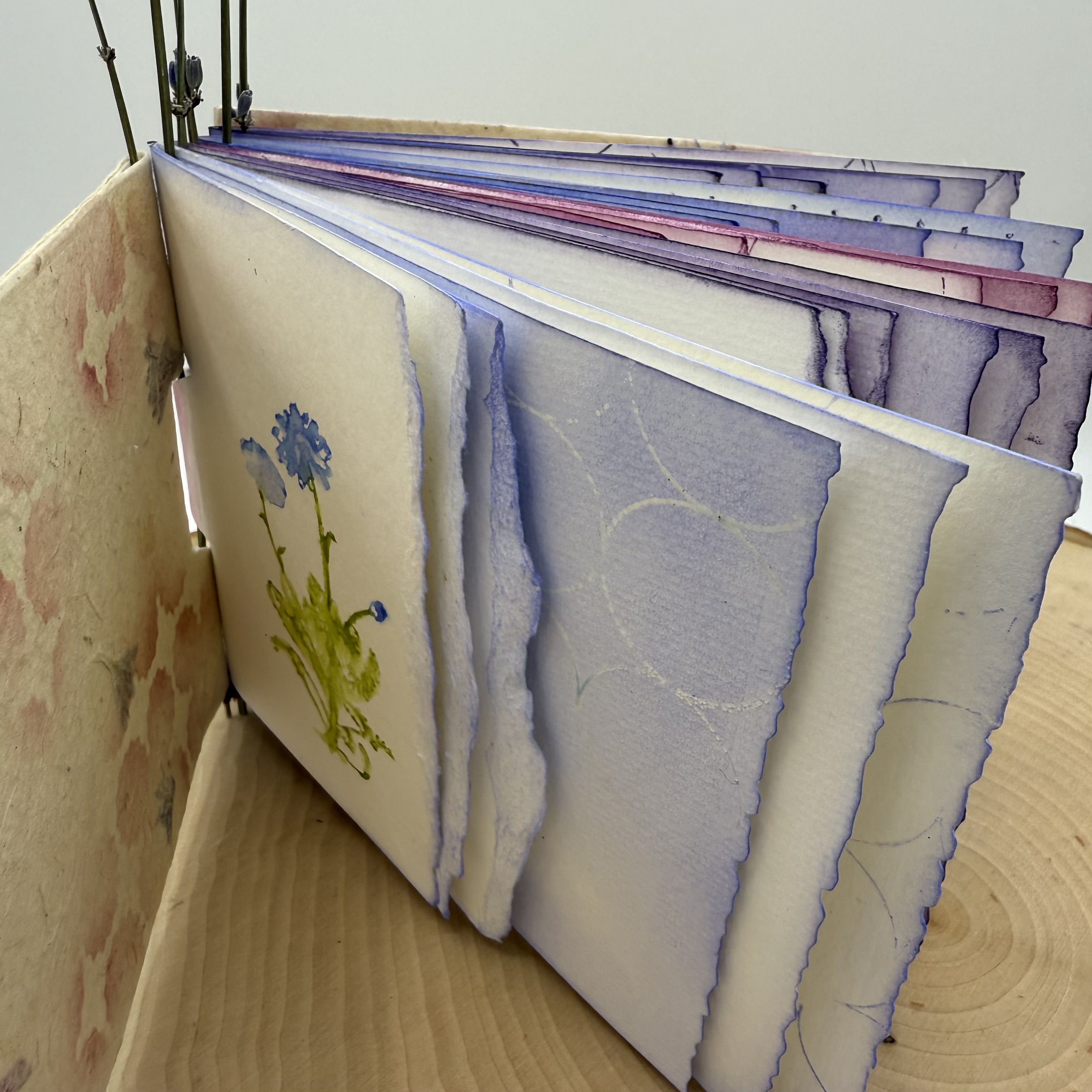
There are many tutorials online for how to make piano hinge books. This was the first time I have attempted to use this type of binding, and surprisingly, it was not too difficult. I suggest making a sample before using your finished signatures to ensure it all goes together well. I also suggest perhaps using something a bit more durable to secure the pieces together. My vision was to use these lavender stems and while I did make it work, I am not sure how well it will last when the book is opened and closed a lot. I do however, love the way it turned out!


I love the finished project, especially with the vellum piece that adorns the cover. I used the distress watercolor pencil technique for the intense colored floral stamping and then stamped the graphic dots on the reverse side of the vellum. A stamp from Alison Bomber's PaperArtsy Set 21 (EAB21) onto the handmade, stenciled cover provides the perfect verse for inspiration.


I imagine this book being used for a journal where I can keep wildflowers picked on my nature walks, with notes or thoughts scribbled beside them.


I am hoping that perhaps you have been inspired to create your own wildflower collective handmade book, or even simply to play and experiment with creating watery abstract images from you stamps, either way it's always a good day to get creative.

Thanks for stopping by,
Ann

Saturday, 16 April 2016

2016 #7 Fossil Resist ATCs {by Alison Bomber}

 2016 Topic 7: Resists


Hello all, it's Alison here from Words and Pictures. I've not been around much lately but I couldn't resist joining in with the Resists theme, and it gave me the excuse to get two of the PaperArtsy Minis I've coveted for ages - finally giving in to temptation (like Oscar Wilde, I can resist everything but temptation!). Regular followers of mine will know that clear embossing is a favourite thing of mine - I love its glossy dimensionality - and it works brilliantly as a resist for the inkiness to follow.

I ended up creating a quartet of ATCs with these fabulously detailed stamps... one pair with the fossils lying in state in a fusty wooden drawer in some zoologist's collection...

... and one pair where they are in a kind of dream of the world they used to inhabit.
I started by cutting ATCs from some off-white card and stamping the fish fossils - Ink & The Dog Mini 100 and Ink & The Dog Mini 101 - in Versamark before embossing with clear embossing powder.

ID Mini 100
ID Mini 101
(You'll see I created a spare pair in case of problems or other ideas!)


For the zoologist's pair, I applied Distress Inks to the ATCs with a blending tool - Antique Linen followed by Vintage Photo and some Black Soot around the edges - keeping some damp paper towel nearby so that I could buff away any excess ink from the bones as I went. Then I did some spritzing and flicking, and also sprayed some Distress Marker splatter to add to the aged look.

I added some vintage script - the zoologist's notes, taken from the Ink & The Dog Words Plate 4 - stamped in Distress Ink so that it could also easily be wiped away from the bones. And finally I added the rub-ons to label the collected specimens, as well as the word stickers which I shaded around with more ink.

Ink & The Dog Words Plate 4

For the underwater pair, I applied my ink differently - pressing the chosen colours - my usual blue/green suspects, Broken China, Salty Ocean, Mowed Lawn, Peacock Feathers, I think - onto the craft mat, spritzing with some water, and then dipping and smooshing my ATCs until I liked the look of them.

I used the branches from Hot Picks HP1008 as seaweed, again stamped in Distress Ink so that the paper towel could spring into action to remove any excess from the embossed fossil.

HP1008

I painted some Snowflake Fresco paint on to my craft mat and then used the top of a paintbrush cover and the other end of the paintbrush..


...to "stamp" my columns of bubbles.


I always enjoy the gleam of the clear embossing in sunlight...
... and it gave me great pleasure to fit in just a little bit of Resistance in my brief few days at home recently. Heat embossing and inks are my favourite, but there are so many ways to create a resist, so I hope you'll be inspired to play with some Resists too. Thanks so much for stopping by today.
Alison x
Words and Pictures


Great smooshing Alison, a fabulous way to blend colours. The embossing resist is so magical, appearing all glossy and bright from under the ink. Great to see both colour options too, showing that these stamps work equally well in a vintage or a bright project. ~Darcy

We would love to see how you interpret this Resists topic by linking what you make to our 2016 Challenge #7: Resists, on this page HERE.
All of our bloggers love to see your twist on their ideas,  particularly if you were inspired directly by their post. 
All links go in the draw to win a £50 voucher to spend on products of your choice from the PaperArtsy online store. The Resists link will close 17:00 (London Time) Sunday, April 17th 2016. The winner will be announced 2 hours later at 19:00.

Friday, 26 December 2014

Xmas 2014 #3UP {Resists}

Hi everyone Leandra here, It's Boxing Day here in the UK, the day when you should really go for a walk to relieve some of the calorific intake over the last 24 hours! So if you've eaten your fill, had a walk with a fruity mince pie and a cuppa tea, then you must be ready for some more #3UP posts. 

3UP evenings like this highlights the creativity of our blog followers. They volunteer for this task with no idea of what they are letting themselves in for, are then given a brief, and this time they were asked to show us their favourite techniques.

Tonight is all about resists.  Using embossing powders as a resist could well have been one of the first techniques you ever learned, but oh how useful it can be when colouring in a stamped image to stop you going outside the lines. 

In a mixed media sense, gel medium, paint, gesso, wax all create amazing resists. A resist is a product that will resists or deflect the layer that sits on top. For example, wax will resist watery paint, gel through a stencil will resit ink or dye sprays, a layer of wax on furniture can be painted over, then wiped back to show the unpainted sections underneath to generate that shabby chic french distressed furniture effect. So what are out #3UP people resisting tonight?

First up it's Mariette. From the Netherlands, if you take a look at her blog, Mariette loves ink resists in particular, there are many example of beautiful backgrounds, do take a look. Tonight Mariette is using gesso resist with ink. A soft and subtle resist that creates a wonderful starting point for a card. Remember, as our paint is a chalk base you can get the same effect with Snowflake Fresco Paint if you don't have any gesso to hand.

Hi everyone. Tonight I want to show you another method of using gesso. Most of the time it is used to cover a whole background. Or perhaps used in combination with stencils. But you can also stamp with it, which will create a perfect resist on your background. 

TIP: make sure you clean up your stamp direct after you have stamped it with gesso!

Step One: 
Adhere a thin layer of gesso on your craft sheet and "ïnk up" the PaperArtsy  Ink and the Dog Mini 18 with it. Stamp this on your white background paper. Repeat this step but make sure you randomly stamp your image, we don't want to have a static background, it need to be loose and playful.


Step Two:
Once the gesso is dry you will need to wet your background again with water :-) This makes sure your distress stain colors will flow better....

So once your background has been spritzed with some water you can apply the 3 different colors randomly on your background. I have used spiced marmalade, peeled paint and peacock feathers distress stains. Let the colors mix with each other, if needed spritz some extra water on it.


Once satisfied you can dry it with your heat tool. You will see that the gesso will act as a resist, if needed you can wipe off some ink residue with a damp cloth.


Step Three:
To finish up your background stamp randomly the PaperArtsy Ink and the Dog Mini 44 with distress ink crushed olive. Ink up the edges of your background with distress ink vintage photo to give it some depth.


Step Four:
Stamp off the flower branch from the PaperArtsy set HP1009 with Versamark on a separate piece of cardstock and adhere white embossing powder on it. And heat set this with your heat tool.

Now you can start coloring the flowers with distress stain peacock feathers using a water brush. I used spiced marmalade for the center of the flowers. Once done and dry, you can fussy cut out the flower.


Finally:
On a separate piece of white cardstock stamp off only the part Happiness of the happiness text from the PaperArtsy set HP1009 with Archival Coffee Ink and create a label of it.

Now you can finish your card. Adhere the background on white cardstock and adhere the flower on it. Use thick foam for the text so that it will create some depth to your card.


I hope I have inspired you to go stamp with gesso!
Mariette

Next we have Gail from Norway, her blog is here, ionabunny  She is going to show us some embossing resists.....

Hi, my name is Gail.  I'm known around blogland as ionabunny.  I was very pleased to be selected to be part of PaperArtsy #3UP.  The technique I want to share with you tonight is using embossing powder as a resist, and particularly a technique called Joseph's Coat of Many Colours which I first saw HERE . I love the bright colours and the contrast you get with this technique and was interested to see if it would work with detailed stamps, in this instance stamps from PaperArtsy Hot Picks 1105.  

Step One: 
I coloured a piece of 160g A4 off white card with various yellow/orange distress inks.  Just smear them on there.  Dry the surface and then stamp and emboss with clear embossing powder.  I started with the large oak leaf stamp (HP1105EZ).  Then I covered everything with Barn Door distress ink.  In the picture I have half the sheet covered.  Wipe excess ink off the embossed areas and let it dry.  Using your heat tool is fine.


Step Two: 
Then stamp with the second stamp (HP1105EZ) and emboss again.  I used the large heart stamp.  I tried to stamp between the leaf stamps so there will be good colour after the next step.  Then I covered everything with green acrylic paint!!  This technique usually uses black but it being Christmas, or thereabouts, I thought gold, red and green was a good combo.  I used a stencil brush which gets the paint well into the detailed embossed areas.  Paint a small area and then wipe the paint off the embossing.  This picture shows me half way.  Once the whole sheet is covered you should have a nice backing sheet with great colour contrast.


Step Three:
But wait!!  A couple of weeks ago I saw this post by Ellen Vargo where she removes the embossing powder by sandwiching the piece between newspaper and ironing. Wondering what effect this would have, and thinking this was the best use for an iron that I had been presented with in a while, I gave it a go.  As well as removing the embossing, and confounding people as to how you made your art, it also brightens the colours and increases the translucence of the paper, which inspired me to this......


Step Four:
I made a solid base by cutting a 9cm and 11cm circle of card.  Stick them together and run a score tool around the 9cm circle.  Then cut out some little wedges, approximately 1cm apart.  The score help the tabs fold easier.  Put a piece of double sided tape along one of the short edges of the backside of your paper.  Then put another piece of double sided along the long edge, but do not overlap the tape at the corner.  Leave a small gap, or it will be too sticky.  Fold up the tabs on the round base and roll it along the longer piece of double sided tape.  When you have rolled all the way you can stick the overlapping short edge down.  Add a battery tea light and sit back and admire your lanterns.  I got the different heights by cutting 4 and 8 cms respectively off the width of 2 other sheets I had coloured in the same way.


Hope you have enjoyed my project.  
Hugz, Gail

Next up tonight is Deb Wainwright. (@lilacsparkles) Deb is showing us a technique called ghosting. Check it out....

Hello, Debs here again with another project, this time using the technique ghosting, which I first saw on a video by Dyan Reavely on you tube. There are lots of videos demonstrating how to achieve this look.

Step One: 
I sprayed several colours of Dylusions Ink onto my page added my stencil by Lin Brown (PS001 and PS005) then sprayed the page with some water. I took off the stencil and waited about 30 seconds before rolling my paper towel over the page to blot.


Step Two: 
I continued to spray and remove different colours until I was happy with look. Sometime the colours on my stencil also came off too, which I really liked.

Finally... 
I used this as the background for a mixed page which you can see full details of my blog but here is the finished page. 


Take care Debs xx

Finally tonight it's a #3UP newbie (although yes she is the 4th #3UP tonight, boxing day bonus!) it's Lou Collins (@LouCollins). Lou is doing my favourite resist technique, the one with Vaseline. I first saw Claudine Hellmuth do this in her book, Collage Discovery Workshop way back when ....(2003), Claudine called it 'Peeled Paint', and it is frequently used by artists, by artists for many years, and it is also the main way you build up layers of paint to achieve that French Shabby Chis distressed furniture style, you can see what Lou has done below easily translates to furniture. Take a look....


Hi Everyone
Every now and then a technique catches my eye that I just have to try out straight away, and this one I saw on a YouTube is no exception. I usually tweak techniques to make them my own, and this particular one has remained one of my favourites for a very long time now. 

Step One:
For my wooden trinket box, I chose three Fresco Chalk Paints, including a dark and very pale colour.


First I covered my wood panels in Haystack with a stiff brush to add texture. I stamped all over the paint when it was dry with the cobblestone stamp from the JOFY12 set with Timber Brown StazOn. This adds even more texture to this bottom layer. To tone the StazOn down I dry-brushed over it with a little more haystack in places.


Step Two:
For the second layer I rubbed Vaseline onto parts of my wood panels, over the yellow, keeping it quite thick. I painted Space Cadet over the top, again with a stiff brush and dried with a heat gun. I roughly stamped the drawn grid stamp from the same JOFY12 set over parts of the blue paint. Finally I used some kitchen towel to rub away the paint where it laid over the Vaseline, which revealed the yellow underneath.


Step Three:
To finish the technique, I repeated the second step but with a much paler colour, Antarctic. When applying the Vaseline this time, I ensured I was covering over parts of both yellow and blue, so that both colours would show through when I removed the resisted paint later. After drying and rubbing down as before, I watered down some Snowflake paint and brushed it lightly over the panels to tone down the contrast of the colours a little.


I used this technique to create a trinket box. After using the resist technique on the wooden panels, I constructed the box and stamped some leaves in the corners from the JOFY12 set and coloured parts of them with the Haystack paint and a small brush.


Thanks everyone
Lou

Wasn't that beautiful! Another fabulous night of #3UP with 4 totally different resist ideas!

So, I guess, not only are you stuffed with food, but ideas too! There's more tomorrow, so don't hang up your skates just yet! Enjoy the festive season! 

Leandra

We would love you to go in our challenge draw for a prize from PaperArtsy, a voucher to spend in our online shop. Link up your creativity HERE. All links go in the draw to win a voucher to spend on products of your choice from the PaperArtsy online store. This link will close 17:00 (London Time) December 31st 2014, the winner will be announced 2 hours later at 19:00, Dec 31st, 2014.


Our ANNUAL SALE HAS STARTED!!


All discounts are automatically calculated at checkout once your order SUB-TOTAL passes each threshold.

When your order sub-total exceeds £50 get 10% OFF
When your order sub-total exceeds £100 get 20% OFF
When your order sub-total exceeds £150 get 30% OFF