Showing posts with label White. Show all posts

Friday, 10 January 2025

2024 - Year in Review - Topics 7, 8, 9, 10 {on the PaperArtsy Blog}


Greetings from PaperArtsy HQ,

It's the final look back at some highlights from 2024 on the PaperArtsy Blog. Today we review Topic 7: (Gel) Printing, Topic 8: White and the designer focus for Topic 9 was Alison Bomber (EAB). 

The theme overarching these topics was Nature and its treasures: shapely leaves, delicate flowers, bold berries. We encouraged our bloggers to incorporate this theme into their posts too.

Speaking of challenges, this year we also introduced the concept of 'With 3 Things' where bloggers were sent 3 things and challenged to do something. For example, a paint or colour item, a stamp or stencil. Sometimes the stamp might be a bit different, but similar so that the bloggers more or less were using the same things.

We are so fortunate to have such wonderful bloggers who share their stunning ideas with us each month. I am really looking forward to appreciating what awesome talent we can all learn from in the year ahead!

Topic 7: (Gel) Printing

Spontaneous, fun and scrappy. Gel printing took the crafting world by storm a few years ago and is a now a favourite process for many crafters. We thought this topic would be a great opportunity to celebrate it, but also share with you all the other forms of printing that historically preceded it. The topic intro post takes you through many techniques, from Relief Printing, to Intaglio, to Monotype, including Gel Printing. You can find there not only varied eye-candy but also lots of educational links to try them with supplies you already have. We hope you give a try to something new!

For out bloggers fabulous projects, let's start with this quirky mini book by Mi Mii. Like a lot of you we love a fun play session with the gel plate, creating loads of yummy printed papers, sure, you can create some pretty dodgy prints along the way, but once armed with some simple techniques, success and confidence quickly grows. Then comes the question of what to do with them. Mi Mii's answer: lots of collaged scraps for dynamic pages. Check her original post HERE for the full process!


In an other style, how about these fresh flowers by Martha Ponsanesi (@CraftingMartha). Gel printing does not have to be complicate or layered to be effective! Nor are you limited to paper as Martha shows with her fabric-printing. Follow Martha on her journey to turn plain fabric into a 3D garden with simple techniques and sunny colours in her original post HERE.


We love when our bloggers try on a new technique and take us on the journey with them. This time Floss Nicholls explored collagraph, mixing it with stamps, and the results are... enlightening! As you can see, she experimented quite a bit so give her original post HERE a read to learn all about collagraph, and maybe level up your gel printing game.


Our designer Kate Crane also joined in the gel printing fun (she includes it quite a lot in her art) for example with alcohol inks. She has shared several of her favourite techniques, not just in her original post HERE, but also in a video on Facebook in the PaperArtsy People group.


Topic 8: White

It is not the first time we pulled the 'White' trick on our blogging team. It often pushes them outside of their comfort zone and always helps us learn something new. This time around, we did not limit the topic to an exclusively white project, but advised the team to think of all uses of white: overlays, resists, washes... They did not disappoint and each gave their own interpretation of white.

Our first pick is this dimensional frame by Victoria Wilding. She did go down the mainly white route white while adding a beautiful contrast with 'kraft' colour. Genius! She uses white in a lot of different techniques so be sure to check her original post HERE to appreciate them all.


Ellie Knol used white as a fantastic texture builder in this nature inspired hanging trio. Many layers went into those yummy backgrounds; can you spot the lace? Go to her original post HERE to follow along her creative process and see the transformations!


Take a look at these jugs of flowers by Floss Nicholls. She is a lover of colour so this was an interesting challenge for her with the white restriction in place. She used white as an overlay, letting some of the colour beneath peak through, for some amazing effects! You can join her in her exploration in her original post HERE.


For her part, Ann Barnes worked with white as a focal, giving it a leading role in this floral and moody journal spread. While at first glance, you would not call it a 'white project', I love how the white definitively pops when paired with darker colours. In this project, Ann played with pattern building in many ways, all detailed in her original post HERE.


Topic 9: Focus on EAB

Alison Bomber goes by 'Words and Pictures' on most of her social media and it couldn't be a better description of her stamp collection with PaperArtsy. A lover of words, she started designing stamps in 2017, going on to create beautiful sets of carefully curated thematic quotes. In 2022, she added some of her delicious sketched botanicals to the word stamps, as well as some ephemera for versatility. You can learn all about her journey and inspiration, as well as how her passion for theatre and craft entwine. It's all in her interview in the topic intro post.

That month the 'with 3 things' parcels did contain some of Alison's wintery stamps and Jenny Marples made a beautiful mistletoe accordion book with hers. We love the contrast between the delicate greenery and the deep grungy background. Be sure to check her original post HERE to discover the other panels!


We really could not leave out this fantastic decorated fan by Keren Baker. So delicate and elegant! If you give her original post HERE a read, you will see this was as finicky and time consuming as you might expect, but the result is incredible, and functional!


I also loved how Nikki Acton 
(a2a.craft) managed to mash her personal style and Alison's designs in this sunflower wall art. As explained in her original post HERE, everything did not go smoothly but the piece speaks for itself. I love the transition from cut to stencil petals! 


Finally I hope you didn't miss this amazing diorama by Mags Woodcock. She truly brought Alison's designs to life! These berries look dangerously delicious! This is a quite involved project so head to Mags' original post HERE to fully appreciate her work.


Topic 10: Gilded

To finish the year, we wanted an open topic that could fit the festive season but also stand alone. 'Gilded' can be any form of gold and metal: embossing, paint, wax... As long as it is opulent, lavish and a little bit indulgent. Who does not like some shine? 

First is some actual gilding, using flakes, by Liesbeth Fiddder de Vos for this Art Deco inspired star book. The sample mailers create the perfect intricate windows for the golden ladies to peak though. Visit Liesbeth's original post HERE to see all the pages!


For her part, Etsuko Noguchi prepared for the end of year celebration with these sparkling decorations. It is a whole set with acorn garlands and ornaments. The baubles are shakers and light up - super fun! Be sure to check the original blog post 
HERE for all the details.


Inspired by Klimt, a master of in the use of gold, Riikka Kovasin (Paperiliitin) made these gorgeous cards. I love how they are definitively a series but still differ slightly, giving each it own identity. Which one is your favourite? Head to the original blog post HERE to see the details of all of them.


Finally, this is outside of the 'Gilded' topic, but for the last 'with 3 things' of the year, we wanted to give our bloggers and readers a little taste of the new year in advance. So we went with pink and hearts to hopefully spread little love ! I loved this practical and cute present box by Victoria Wilding. Would you be happy to receive this, even before knowing what is inside?


Well, this was an amazing year for our fantastic bloggers, full of beautiful and creative projects. For those of you going through winter, I hope it gave you your recommended dose of colour and joy. 

For those 'down under', enjoy a crafty summer and send some sun our way! In addition to health and love, we wish you all a creative and fruitful year for 2025, full of motivation, inspiration, lovely crafty supplies and fun play sessions!

Tuesday, 15 October 2024

2024 Topic 8 : White {by Victoria Wilding}


Hi everyone

Victoria here with you today.

Heading into winter and thinking about the nature theme for this quarter, naturally had me thinking about frosty and snowy winter walks. Some of my favourite memories are being wrapped up warm and being out in the landscape with my boys, so I wanted to create a memory box scene of winter florals.

The white topic might initially seem daunting, but some of my favourite ever projects use a neutral colour palette. Creating a white project is actually pretty simple when you know what to pair it with and you can’t go wrong with some other neutral colours, to help the white stand out. 


Creating my floral memory box was really straight forward and I can’t wait to break down all the steps for you so that you can try it for yourself. Be warned though, you have to enjoy a bit of fussy cutting to make this one! 


Kay Carley’s stamp sets EKC17 and EKC72 had the perfect winter florals for my project, with a nice selection of different shapes and sizes. I also picked out Fresco Finish Chalk Acrylics in Snowflake (FF15), Koala (FF141), and some Crackle Glaze (FF22) to create some extra background texture. Finally, I selected flat white and glitter white embossing powders from my stash.


I started off by prep’ing the box. I wanted something small that could nestle against my other makes on top of the kalax unit in my cabin. I had a frame die cut from an Eileen Hull Sizzix set, in my stash so decided to use that up and create a back using the measurements shown above. You could easily just mark out and cut two of these in place of the die. 


I cut away the corner pieces so that I could fold and glue the sides and bottom.


And scored along all the fold lines.


Next I applied some Fresco Finish Chalk Acrylic in Snowflake, using some cut ‘n’ dry foam, to the frame.


Finally, I applied some distressed white to the background piece. I applied a coat of Fresco Finish Chalk Acrylic in Koala, dried it and, put a coat of crackle glaze on top. I dried this too, before applying a final coat of Snowflake Fresco Finish Chalk Acrylic. This creates a crackle effect texture, which is subtle, but oh so yummy! It also looks a lot less grey in the finished project once it’s paired against the white flowers.


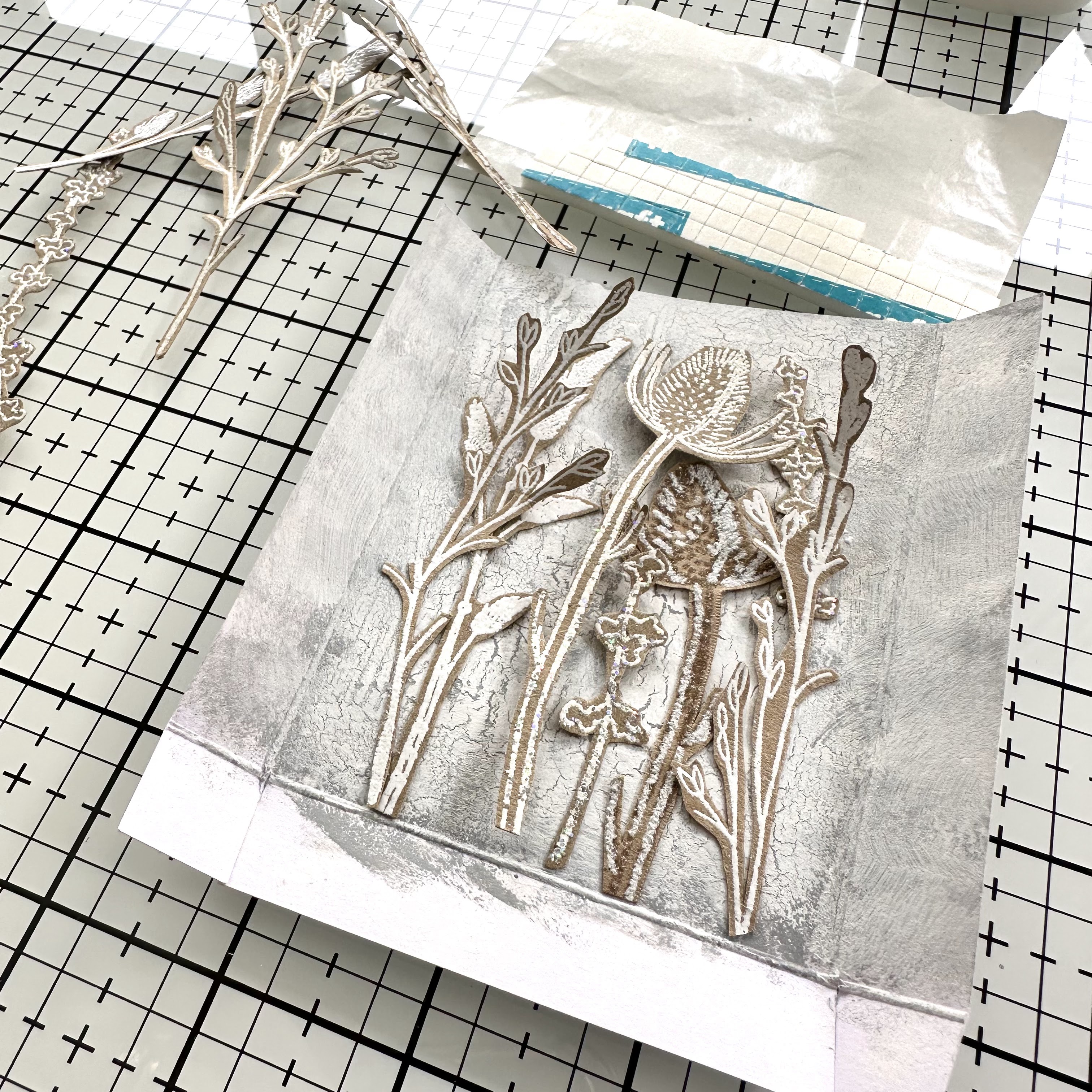
Being a flower fanatic, creating the floral elements is always my favourite part of a project! I wanted to keep things really simple, so selected some kraft card (for extra contrast) and stamped the various flowers, embossing them in flat white and glitter white embossing powders.


Then it was time to get fussy and cut them all out carefully, with a pair of small detail scissors. The white embossing looks fantastic against the kraft and will give some extra depth to the finished project, preventing the flowers from disappearing into the background.  


Assembling the different elements was the final step of the project. I started by layering the flowers onto the background, gluing some flat, adding some where only parts were glued so that the stems could be teased out and then a final layer stuck down of foam pads. This created depth in the floral arrangement. 


Then I stuck the front and back pieces of the box together, using double sided tape.


Before adding some florals to the front of the frame for extra detail.


Finally, I added the memory sentiment (leftover from a previous Scrapcosy ESC32 project) to the bottom middle of the box. 


The finished effect is just what I was aiming for. Slightly distressed and with enough contrast to make the white pop. The glitter from the embossing powders looks magical in real life, unfortunately the camera doesn’t pick it up that well. 


This floral box is going to look lovely amongst all my supplies in my cabin. Nothing beats being surrounded by previous makes for a serious dose of inspiration!


I hope you enjoyed learning about these white techniques and feel inspired to give it a go yourself. If you do, I’d love it if you shared and tagged me on socials. 

Until next time, wishing you a happy, creative week.

Victoria x

Monday, 14 October 2024

2024 Topic 8 : White {by Jenny Marples}


Hi everyone Jenny Marples here with you today. I've always been in awe of the way artists such as Claude Monet and Koichi Okumura used white in their paintings to add light, contrast, movement and a special touch of magic.

That made me reflect on how much the use of white is important in my own work, so throughout this post we'll be looking at a number of methods for doing this.


The finished book features images inspired by French architecture and nature as well as lots of tactile surfaces and textures. I've also looked at the use of 'white space' when constructing pages.


The stamps used throughout include the PaperArtsy Minis MN67, MN68, MN69, MN70, MN71 and MN112. The stencils are also from the PaperArtsy Mini Mask series and include PM015, PM016 and PM018. The colour palette is very limited and will be explained further as we go.


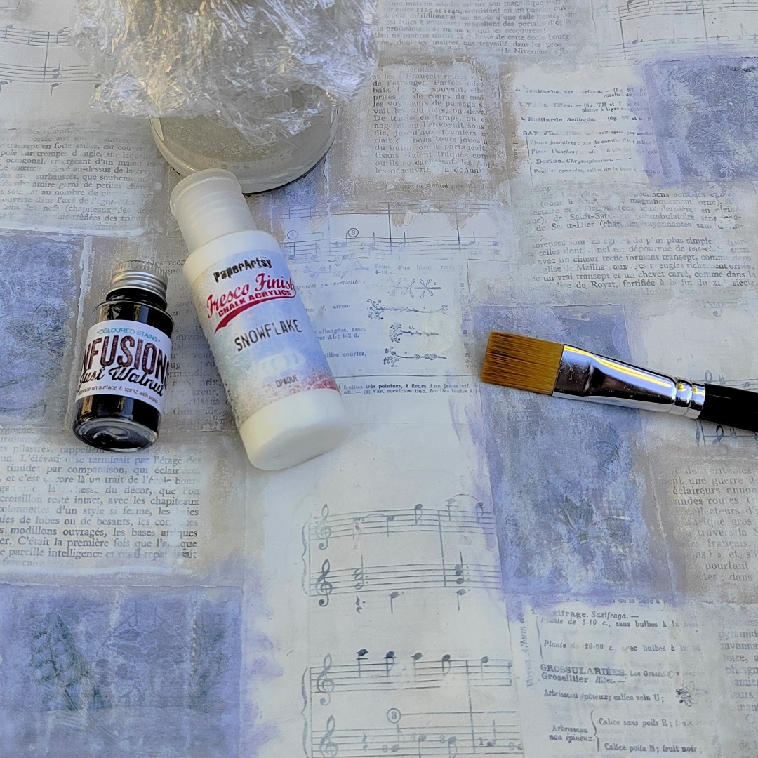
You'll have seen me create collage masterboards for backgrounds in the past, using up paper scraps and blending the edges with matching paints. Then lightly brayer with PaperArtsy Fresco Finish Chalk Acrylic Snowflake Paint over the top to further soften the background.


If you are planning on drawing on this background you don't want it to compete so add a highly dilute mix of PaperArtsy Fresco Finish Chalk Acrylic Snowflake Paint with Just Walnut Infusions. I store a mix of this in an air tight jar because I use it so much these days! Add a thin wash to 'knock back' the colours and script - you can always add further layers if the effect isn't strong enough.


When dry you can cut up this background and attach it to the pages that will go inside your book. White/neutral fabrics make flexible signatures that will be strengthened by the backgrounds on top. A heat-embossed white flower on vellum provides a great focal point if you want to keep it simple.


Now let's get into some more techniques using white mediums.


Simple pen sketches are enhanced by the use of dilute Just Walnut Infusions whilst a permanent white paint pen adds highlights to give the images a sense of perspective.


If drawing isn't your thing use the Mini Masks PM015, PM016 and PM018 in a variety of ways to add architectural interest to your pages. Apply PaperArtsy Grunge Paste onto kraft card and vellum, use white paint through them and even stitch the designs with white embroidery thread.


I mentioned at the beginning of this post looking at the importance of 'white space': by this I mean the area of the page that your eye doesn't notice immediately when you look at a page. For example, below the large white triangle is off-white but as a large shape it competes with the window as a focal point.


Blend it into the 'white space' of the rest of the background by adding complimentary layers - in this case a scrap from the PaperArtsy Frames Printed Tissue PT02, a layer of that dilute Snowflake/Just Walnut solution and some hand-drawn white bricks.


Now your eye is initially drawn by the window and flower before moving around the rest of the 'white space' on the opened page.


Here is the page when closed.


How many ways can you think of for using your stamps to create focal points?


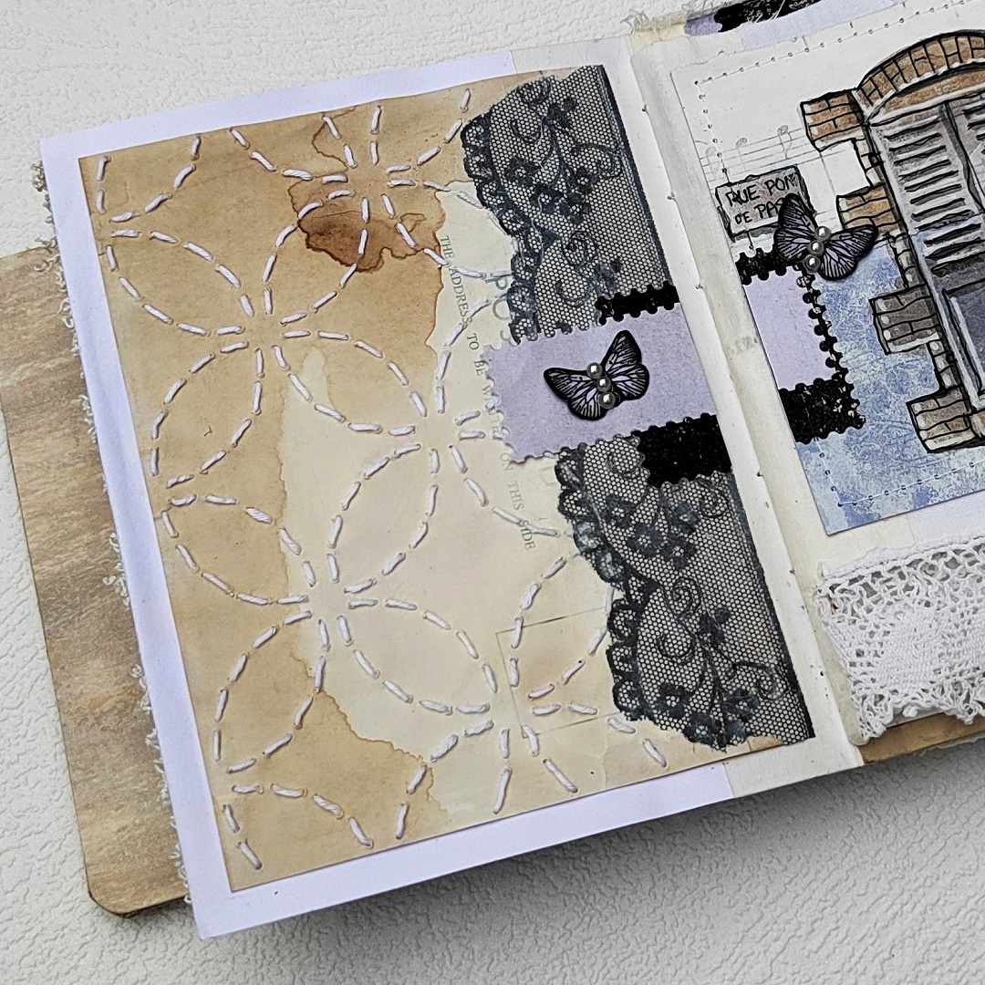
You'll notice I've added white hand-stitching, lace and other white trims throughout the book.


To mix it up a little create a textured background using PaperArtsy Fresco Finish Crackle Glaze and PaperArtsy Fresco Finish Chalk Acrylic Chalk Paint over a layer of PaperArtsy Fresco Finish Chalk Acrylic Little Black Dress Paint. Apply a piece of PaperArtsy Frames Printed Tissue PT02 over the top with PaperArtsy Fresco Finish Matte Glaze.


You can apply the Tissue to fabric in the same way.


And staying with the PaperArtsy Frames Tissue Paper PT02 cut out and paint some of the images on the reverse side to create elements for pocket pages and focal images like the larger butterflies.


Finally try repeat stamping with PaperArtsy Fresco Finish Chalk Acrylic Snowflake Paint on fabric and paper to echo the designs on other pages. Make sure to wash your stamp thoroughly when finished.


Gosh, white really can be used in a multitude of ways!

To finish here's the cover and one more idea - stamping into hot embossing powder, something you can only do with confidence using high quality stamps.


Let's wrap this all up by showing you the remaining pages from this book.


I hope you've enjoyed looking at a range of techniques you can use to incorporate white into your own projects.

Jenny