Showing posts with label PS426. Show all posts

Monday, 11 May 2026

Slimline Box Tutorial with KC {by Autumn Clark}


Hello everyone, Autumn Clark from SewPaperPaint here with you today to share a fun way to turn a few simple gel prints into a birthday gift that keeps on giving.  Grab a cuppa and let's get printing!


I was spending the weekend with my mom, who loves Kate Crane's fun stamps and asked me to work on this project with her.  She graciously allowed me to pick from her selection of PaperArtsy Fresco Chalk Acrylic Paints for our gel printing session.  Because she loves purples and blues, I tried to pick a palette that would gear towards her tastes.  I included Electric Violet, Bougainvillea, Orchid, Snowflake, Bermuda, Sargasso, Aquamarine and Slimed Frescos.  Later in the process we added some stamping and used VersaFine Clair ink pads, in perfectly coordinating hues: Warm Breeze, Charming Pink and Verdant.  We decided upon one focal stamp set, PaperArtsy Kate Crane stamp set 11 (KC011).  


My hope is you will be inspired to make a few new prints inspired by these colors or use some of your stash for a similar project.  Our goal was to create a few quick prints, but it's sooooo hard to stop with just a few.  I ended up making 8 pages using various combinations of the abovementioned colors.


We had a lot of fun using some of Kate's Mini Stencils, including PM033, PM036 and PM035.  We used one larger stencil PS426, mainly to add pattern in Snowflake over the darker colors.  


Our prints were on plain white cardstock and book pages.  I cut some of my favorite pieces into mini slimline card panels (3x6") and layered strips across each panel as shown.  Love the book page showing through!  I then stamped each flower from KC011 directly onto the layered panels.  I was able to see where each focal image would be and then picked out some of Kate's Mini Stamps to add collage stamped layers surrounding the images.  For this, I used my trusty three favorite backgrounds from Kate's Minis: KCM016, KCM03 and KCM001.  


I could see these cards coming together and decided to kick this project up a notch by creating a box pattern to use for gifting the card set.  Now, I based these measurements on the Mini Slimline Envelopes from The Paper Cut, which measure 3 5/8 x 6 1/2".


I just love how easily it is to turn a simple gel print into a beautiful gift!  I created the pattern as follows, I first cut the gel print to 8 3/4 x 5 7/8” then scored 1” from each side.  I snipped the cross score lines to form box and glued those tabs to the inside.  I cut 1” from inner score lines for a window, using red line tape to secure a sheet of acetate.  Then I cut a separate base from white heavy card to 9 3/16 x 6 5/16”, again scoring 1” from each side and cutting the cross score lines to form box, gluing those tabs inward.  I've shared other patterns for boxed greeting cards on my blog, including THIS popular post for standard A2 cards, which could just as easily be adapted for this project if you are unable to get the mini slimline envelopes.  


Next I had some fun restamping my focal flowers onto Bristol and watercoloring them using my markers and aquabrush.  


I added a couple of the smaller flowers from the stamp set onto my box cover, curling the petals with my bone folder for dimension.  I love how they work with the focal flower from the cards inside!


I let my stamped gel prints dry overnight, even after heat setting the VersaFine Clair ink, because it can be smudged easily until fully dry.  I put the papers under a stack of books to help flatten them during that time. 


I hunted through my stash for a birthday sentiment.  I thought, what a fun birthday gift idea to give someone a stash of handmade birthday cards to gift throughout the coming year!  I loved this handwritten font from PaperArtsy Jo Firth Young stamp set 14 (JOFY14) and stamped and fussy cut those.


I really love how the background stamping settled into the gel prints and created a subtle pattern pop!


The focal colors change from one card to the next, based on the gel printing and stamping colors.


Here are the finished cards one by one...


From pinks and purples to blues and greens...


From coneflowers to seed pods to daisies...


Even if you don't decide to gift the cards, creating the box is a fun way to store them throughout the year as you wait to send them in the post.


If you're anything like my mom and me, you have a large stash of gel prints.  Even when you try to be intentional about creating only what you use, the piles grow and grow!  I really hope this post gives you some ideas of how to put those prints to good use through simple layering and coloring techniques.  What's one thing you can give the person who has everything?  Definitely artsy birthday cards!  That's something we all need and never have enough!  :)  Thanks for joining me (and mom) today!  xx, Autumn


YouTube: SewPaperPaint
Facebook: Autumn Clark
Instagram: @sewpaperpaint
Pinterest: SewPaperPaint

Wednesday, 19 February 2025

Mini Book with Kate Crane Products {by Victoria Wilding}


Hi everyone

Victoria here with you today.

This year on the blog, we are being given free rein to do a deep dive into one of the PaperArtsy product ranges, and for this post I have been exploring Kate Crane products. 

Kate has such a good mix of designs in her range, there’s everything from background mark making, to quirky focal points that are just adorable. So I decided to explore some of her mini stamps, and test out combining them into a mini-book. 

I’ve had a Sizzix mini album die for a couple of years, that I still hadn’t got round to using, so I thought I’d take the opportunity to use this for the book construction, although you could easily create the pages using a hole punch and paper trimmer. 


This was such a fun project to put together and used a mix of different techniques and products. The kind of fiddly project that you can get lost in for a few hours, or do in parts and keep coming back to, either way would work. So continue reading for a break down of my process, it includes techniques with watercolours, Mattints and Infusions.


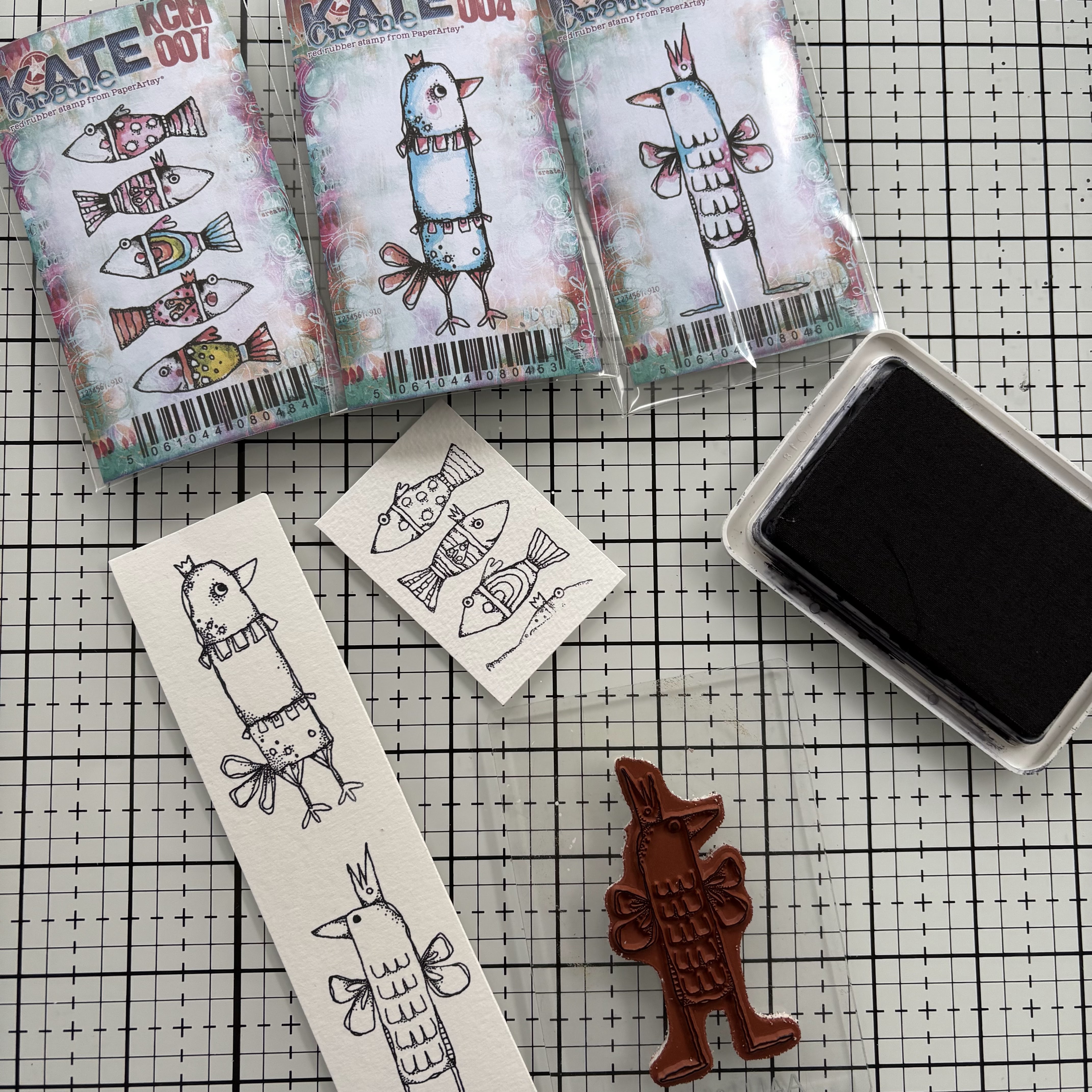
I selected a bunch of Kate Crane mini stamps and a couple of her stencils to use in the projects. I love her quirky animals so of course I had to choose some of these, and settled on KCM004, KCM005, and KCM007. I also wanted some stamps to create background interest, so I chose, KCM001, KCM002, KCM003, KCM013 and KCM014. The last stamp I chose was all about the sentiments and this was KCM006. Then I added a couple of stencils into the mix, selecting PS426 and PS441.

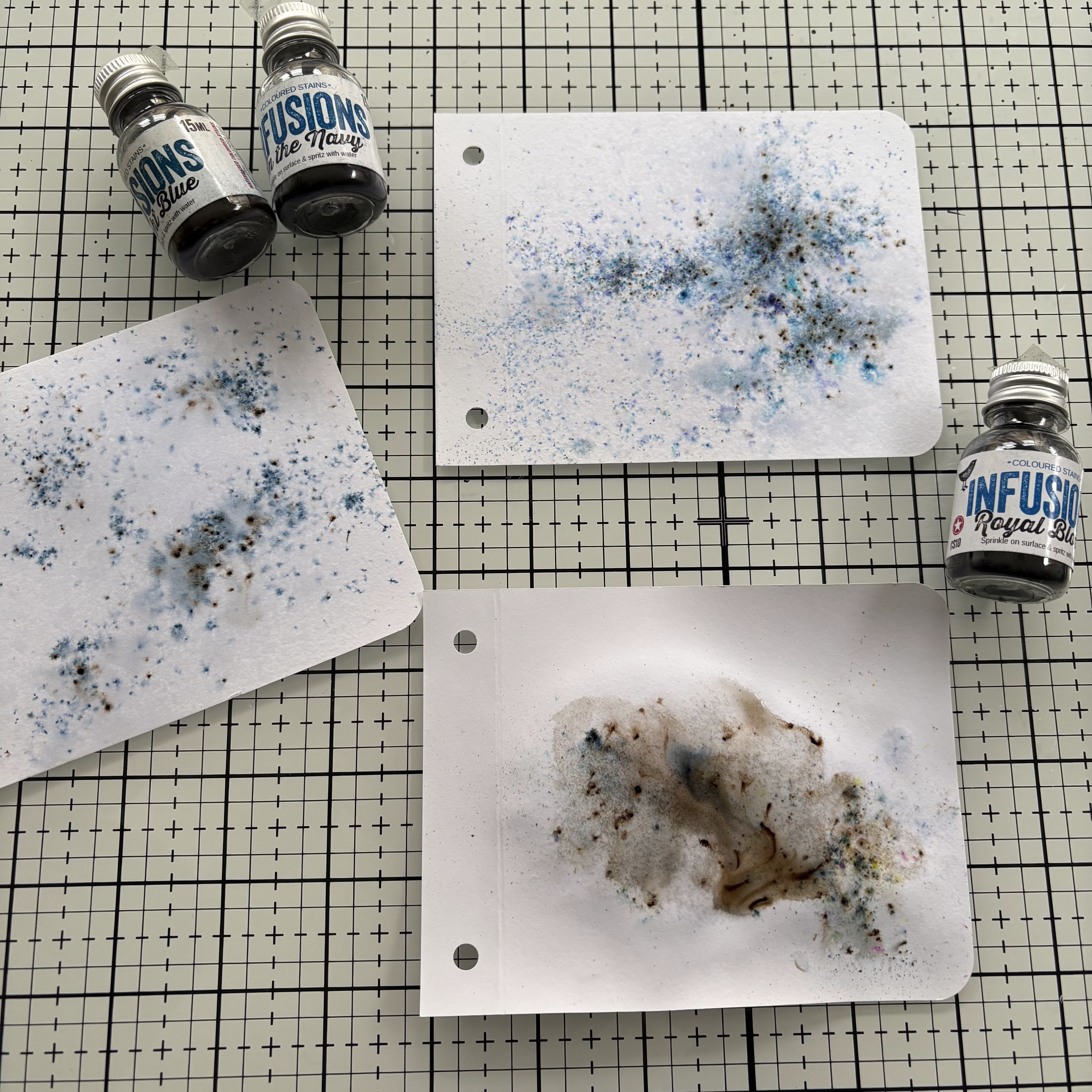
Next up it was all about the colour. I knew I wanted to use my watercolours to colour the quirky birds and fish, so out came my Deep Deep Light palette. For background colour to the pages I chose Mattints in Ash for the cover and Infusions in Sleight Blue (CS13), In the Navy (CS15) and, Royal Blood (CS10).


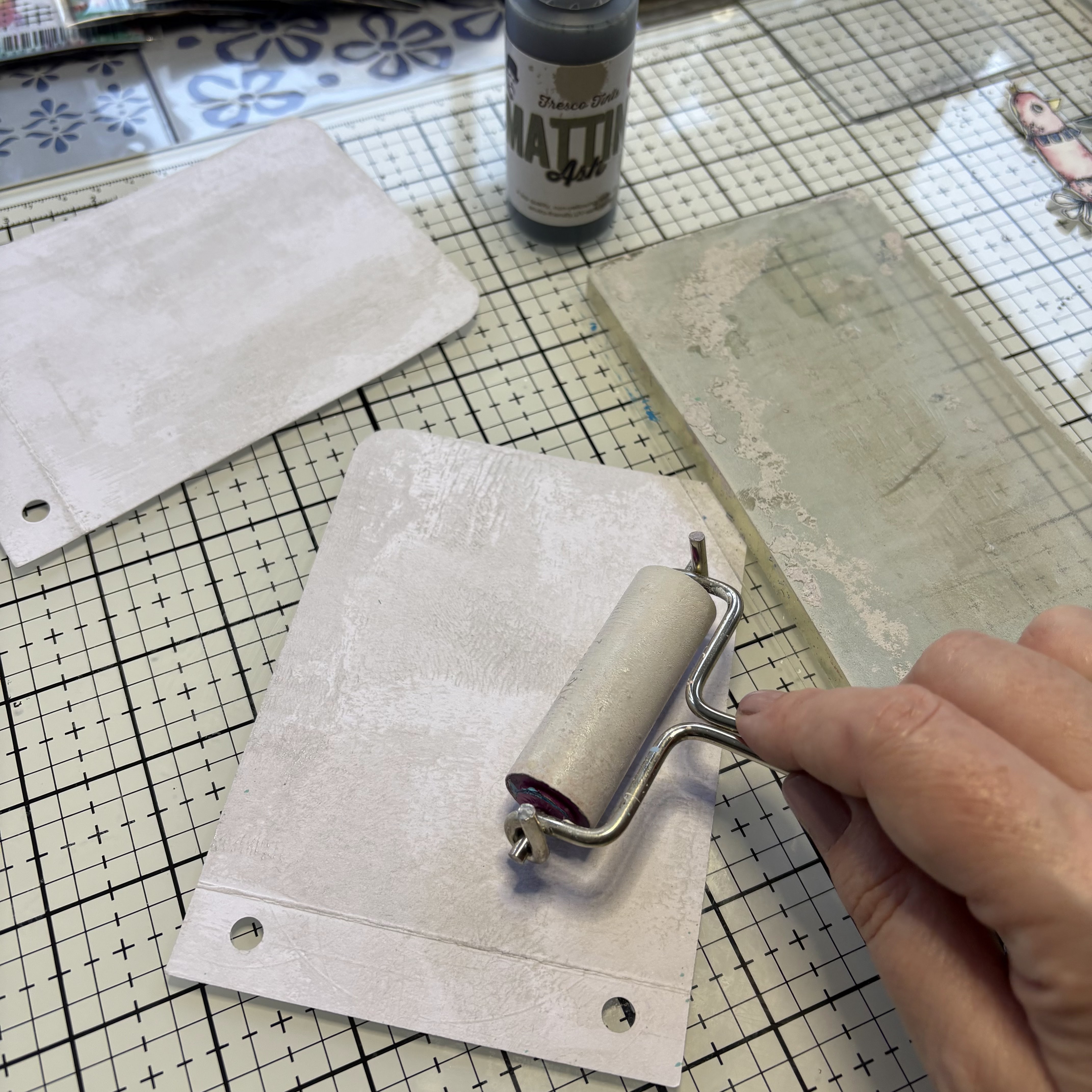
I started off by creating the front and back covers. To provide some subtle background colour I applied Mattints in Ash using a brayer and the gel plate. 


Then I applied blue ink through stencil PS426 to the back cover.


And glued the front and back covers together using the scalloped joining strip.


I wanted the front cover to be quite plain, enticing the viewer to open the album to see the pages inside. I used a die cut piece of card and stamp embossed a sentiment from KCM006 in black and used stamp KCM003 to create some extra texture to the title piece and the edges of the page. I attached the title piece the the front cover using foam pads and moved on to creating the internal pages.


To create some background colour on the internal pages in sprinkles each page with a different colour of blue infusions (Sleight Blue (CS13), In the Navy (CS15) and, Royal Blood (CS10))  and spritzed with water. 


Then I added some extra background texture to ground the focal points using, KCM001KCM002 and, KCM014


Next I moved on to creating the focal points for the pages using the quirky birds and fish stamps, KCM004KCM005, and KCM007. I stamped them out on watercolour paper in black ink. 


And used watercolours to create a soft coloured finish. 


Then I stamped out and mounted the three remaining sentiments from KCM006


I stuck the quirky birds and fish onto the pages using foam pads to create some extra dimension and glued the sentiments in place. 

I thought a couple of the pages needed some extra details so used stamp KCM013 to create some sea planting to the fish scene and stencil PS441 on one of the bird cards. With the pages complete I assembled everything together and secured with some blue sari ribbon. 


The finished book project is lovely to flip through. The cover suggests more arty pages inside and entices you to flip to the next page. 


The combination of the ‘take flight’ sentiment and the butterfly bird is so fun, you can just imagine him furiously flapping his tiny wings to try and fly.


The three fishes page is filled with texture. The hint of leaves at the bottom of the page works really well to imitate sea plants and the splatter of the infusions makes the perfect seawater.

.
On the last page the infusions are watered down much more, which works so nicely against the colouring of the bird.  I love how each page has slightly different elements, but they work so well together as a complete project. 

I hope you feel inspired to try creating your own mini book. Until next time, wishing you a happy creative week. 

Victoria x