Showing posts with label Lines. Show all posts

Wednesday, 23 December 2020

2020 A Year in Review {Topics 11-15}


PaperArtsy Blog 2020 Year in Review - Part 3/4

 
Welcome to the post-Christmas period
 
This is my favourite week of the year. The Christmas crazy is over and we get to relax, look back and look forward. And for us, being here in France this year is a very new experience.
 
No description available.
Yes! We even managed to decorate the front door this year!
 
Like many of you around the world, we have been keeping to ourselves and staying at home except to get groceries. But the last few weeks we have seen a glimmer of normal life here in France when our lock down lifted on Dec 15th. That week, we were invited to our neighbours for a wonderful afternoon of Christmas nibbles and drinks, which was the perfect way to kick us into a more upbeat Christmas spirit than we had thought possible under the conditions. Our schedule too is quite different this year. Normally we are just 2 weeks off doing 3 trade-shows in 6 weeks in 3 different countries, and it is absolute bliss not having that anxious pressure looming which certainly usually undermines the festive period. Not this year!.

No description available.
 
Daily walks around the local village just 20 mins from us and we are constantly amazed at the picturesque views we get to appreciate in this beautiful Dordogne region. 
 
 No description available.
 
I'm slightly obsessed with doorways and mossy steps, paths, walls!
 
 No description available.
 
We are fortunate to have my sister and her fiance arrive here just over a week ago; they are here for a month. It became pretty obvious early in Christmas week we would be working right up to the courier collection late afternoon on Christmas Eve. Along with Courtney, they happily took over all the Christmas planning, and boy were we treated to a French-style Christmas feast. Lots of small courses: aperitif, 2 starters, main, cheese, and the traditional Bûche de Noël (Yule Log) for dessert. 
 
Each course was meticulously planned and utterly delicious. After not eating out all year due to Corona restrictions, it was like being in a restaurant, and felt extra special to have them here and the most wonderful dining experience to boot! One we will never forget! Most of the details were deliberately kept secret from me, so it was such an exciting day of anticipation! 
 
 No description available.
 
They even took their menu to the local wine 'cave' in our village, and the lovely man was quite impressed. They all very much enjoyed selecting the perfect matches for each course. We slowly oozed through each course, suffice to say it was a very long day/night!
 
For us, and each of the past 20 years, Christmas is always a series of video calls to chat with family who are all on the other side of the world, so this year is not so different to how we normally spend Christmas, but I totally understand how difficult it must be for so many people who have not been able to travel or visit with friends and family. I truly hope you have managed to make the most of this very odd Holiday Season.
 
Time to continue with our annual blog round up, today we're sharing picks from Topics 11-15: Calming Colours, Typography, Lines, Fused and Shade of White. Join me as we look back on some wonderful inspirational highlights.

Leandra 

Topic 11: Calming Colours

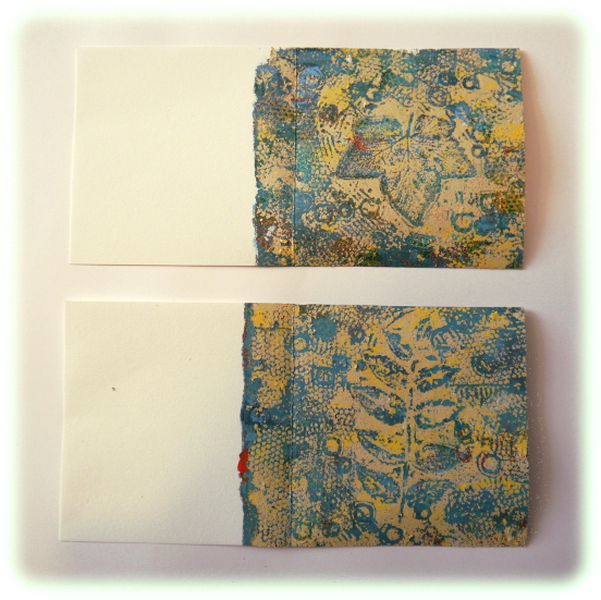
My first pick is this amazing beauty from Alison. I am captivated by these tree-leaves designed by France Papillon. I just love the shapes. Alison Bomber (link) and a lovely journal spread.


And I hope you didn't miss Ellie Knol (link) with her fun Kay Carley mushroom houses.


I adored how Lynn Good (link) made such soft layers in the spread with JOFY stamps, yes the colours are really soothing!


And Claire Snowdon (link) shared soft shades in a Tracy Scott lace book.


Topic 12: Typography

We all seem drawn to the shapes of letters and fonts, and when you are creatinv, there are so many ways to use them, be it as a focal or background. Etsuko Noguchi (link) really makes the word 'nature' pop in this piece.


Corrie Herriman (link) used words and numbers large and small, textured and indecipherable in her background.


  Keren Baker (link) created this fabulous tribute, she does love a bit of acetate! So effective!

 
How about this typography doll by Helen Chilton (link) !
 

Topic 13 : Lines

I loved this planner by Autumn Clark (link) with JOFY stamps. Perfect for fast journalling!


And I hope you didn't miss Jenny Marples (link) and her Zinski house tags

 
Nikki Acton (link)'s contrasting colours and wood panels were fabulous for this card!


Dounia Large (link) with her beautiful mini journal and beautiful painted layers was adorable!


Topic 14 : Fused

Fusing things is lots of fun, and our bloggers came up with lots of ideas! My first pick is from Ellie Knol (link). Loving these colours and how the layers are so beautiful on the corrugated card.


And I hope you didn't miss... Keren Baker (link) who had real fuses in her piece!


  Etsuko Noguchi (link) got out the embossing powders to great effect !


And Carol Fox (link) did this piece on glass! Yes glass!


Topic 15 : Shades of White

This isn't the first time White has been a blog theme. The bloggers always feel challenged by it, but they utterly LOVE the outcome, so if you do anything, try this! Love this by Corrie Herriman (link) .

 
And I hope you didn't miss... Lucy Edmondson (link) - the hessian makes a great backdrop for the gorgeous central frame.


  Jennie Atkinson (link) is no stranger to soft shade of white, so this is her safe place!


Alison Bomber (link) tried some inverse experimenting


We'll be back again in a few days with the final round up for the year. Here's wishing you a great week ahead. Time for a book and curl up in front of the fire.

Leandra 

Saturday, 8 August 2020

2020 #13 Circle Minibook with Lin Brown Stamps {by Dounia Large}

 2020 Topic 13: Lines

Dounia's gel plate has been in overdrive creating some incredibly intricate pages. She takes us through the process really clearly and the layers are really well defined and finished with some contrasting lines. Her explorations have resulted in such a lovely project and we'll have to ask her for her home-made gel plate recipe, which works so perfectly!
~ Keren

Hi everyone, it's Dounia with you today, and I'd like to share with you a project mixing gel printing and line art.

Smooth lines on clean paper are always striking but I also like them popping out of a busy, even messy background. I therefore used this opportunity to mess with my gel plate then play mix and match on the theme of circles.
There are hundreds of ways to use a gel plate but after some experimentation, I found I prefer to build layers on the plate and on the paper. Among my favorite tools for that are rubber stamps as they can provide both background patterns and focal images. Lin Brown has an amazing line of stamps designed just for that! For this project, I used ELB29 & ELB34. The leaves are gorgeous and my lazy self likes making found objects textures without having to find the objects!
I like to start by adding color to the clean plate using the stamps with Fresco Finish Chalk Acrylic paints. I don't worry too much about placement or colours, I just try to be fair and distribute patterns evenly. Here I had a blue palette in mind but I began with accent colours Butternut, Autumn Fire and Brown Shed.


(Don't mind the color of my gel plate, it is homemade and has been melted down and recasted a few times). Over that first texture, I brayered a layer of my main colours: Sargasso, Paua Shell and Smurf. I then used the stamps to take off some the paint layers.

I always try to mix bolder stamps with finer ones for more texture. The holes in this paint layer will let the third one appear. As the previous paints are opaque, I can use a selection of darker blues and greens for this last step before the print: Hyde Park, Space Cadet and Midnight.

Here are the prints. They are quite busy but I like trying lots of techniques, colours and stamps on the same plate. It gives me an idea of what works together and what doesn't. For example here I think I used too much of the contrasting colours, which muddled the palette.
I then repeated the process with new combinations and had fun! I like to keep my selection of colours relatively tight. That way the prints will form a coherent ensemble and can easily be used in the same project. In the next round, I focused on a cream look, using Buff, Sand, and Haystackwith a brown contrasting final layer of Toffee, Mud Splat & Chocolate Pudding.

Again, the prints are quite busy but they are only backgrounds so that's fine! They can of course be used as such but for something with a bit more focus, I like to print a separate, contrasting layer on top.

Of course I want to still see the beautiful background I worked hard for, so after brayering the paint on the plate, I take off as much as I can with the stamps.

Here is the result on the blue backgrounds. (But not using the layer picture above because I was focused on the time sensitive printing and forgot to take pictures consistently, sorry!) A good contrast between the background and the top layer is crucial for the focal image(s) to be visible. I had some struggles with that... (that's why you won't see the cream and brown background again).
Finally, it is time for the actual lines! I think they really play well with prints as they can isolate and emphasise the focal stamps that would otherwise be lost in the texture. I tend to stick to simple designs that will work on a bumpy surface: winding lines, hatchcrosses, simple geometric shapes... (little circles count as lines, right?)
Also, if the background is not that interesting, the line can be the focal point. I used that trick in some of the following pages. As I was planning to bind them together in a book, I chose a common theme for my lines. I went with circles, because they are quite versatile and go well in square pages.
I am really pleased with these even if some are, in my opinion, more interesting than others. I had some difficulty choosing the paint colours for the lines as I had no real way to know or test how contrasting they would look. In the end, some choices were not quite right, too stark or too different a hue. I think that for medium to light backgrounds, black would be a safer bet!

Here is the finished book. For the covers, inside and outside, I used by-products of my printing session: Papers here I "cleaned" my brayer and my stamps with. That way I am sure they will color match!
I hope this encouraged you to try lines on a busy background. It doesn't have to be on gel prints (even if those are fun!). I know I have pattern papers or scraps from masterboards with hidden gems that could be "revealed" by some contrasting lines, and you probably do too! They can make an easy focus element on a card or an embellishment on scrapbooking project so don't hesitate to give it a go!

Stay safe and creative

Dounia x

Thursday, 6 August 2020

2020 #13 My Home Canvas with Kay Carley Stamps {by Jenny Marples}

2020 Topic 13: Lines


Intro
This gorgeous Cottage is dripping with pretty flowers, perfectly summery! Jenny has come up with great 'line' ideas embedded in the background too! And the little key embellishment is perfect! Frescos and stamps combine with serene harmony for this delightful creation.
~ Leandra

Hi everyone, it's Jenny (Pushing The Right Buttons) here today, and I'd like to share with you a home decor canvas featuring, well, a home! And not just any home. Kay Carley has designed this very special, magical home complete with whimsical flowers and quirky windows. To add some detail without overpowering the image itself I decided to use the page from an antique French book about architecture as it's backdrop.


The photo below shows how I got started with working on the book page, stamping Kay's image from her EKC40 stamp set centrally with a stamping platform before painting it with diluted Fresco Finish Paints. Water was added to the paints to ensure some of the text could still be seen through the colour. It was easy to select coordinating shades of brown for the body of the house since they all came from the same 'family'. Then I went with muted cool tones for the flowers and vines to compliment the vintage look and used less water with the paint to cover the words more fully.


With the current theme being lines, this became the main focus when working out the composition for the finished canvas. I covered an A5 canvas in Grunge Paste, dragging it down the surface to ensure parts were left uncovered. Lines were then scored into the paste using a (dirty!) ruler to act as a guide for lining up the elements that would be layered onto the canvas.


Back to the paints and I gave the canvas a coat of Chalk Fresco Finish Paint before applying a dilute layer of French Roast Fresco Finish Paint. Just before it was completely dry I rubbed a clean cloth over the surface to ensure the deeper shade would be left in the crevices. By sanding back the top layer a little in some areas some of the Chalk colour was revealed again.


Moving on to the painted page I folded it along a line and cut along that line, leaving the overlapping areas in place. The book page was then backed with some off cuts of mount board to give it stability and dimension.


You can see below from the first of the close up photos that the cut page is mounted onto the canvas up against a textured strip of paper - it's actually the leftover strip from a paper pad once the pages have been ripped out. Next to that I added a couple of lines of burlap string, frayed at the ends to give them a softer finish.


Before adding the cotton lace I realised added the other side to the page used for the main image which gives the illusion that the page remains in one piece. The lace that was then added has been coloured with the leftover dilute Venice Blue and Forget Me Not Fresco Finish Paints, brushed over with the Chalk Fresco Finish Paint to catch the highlights. The little brass key sat on the torn paper edge fit well with the theme.


To complete the canvas I added some mounted Tim Holtz Clippings Stickers to tell a 'story' with the piece. You may also spot the inclusion of some stamped grass at the bottom, one of the images in the stamp set. That corner felt a little bare so I masked off the edge of the house and added it carefully.


I hope you've enjoyed the tutorial and seeing the finished canvas with its textured design lines, lines of script and of course the lines drawn by the hugely talented Kay Carley. If you haven't experiment with stamping and painting on book pages yet I'd highly recommend giving it a go.

Thanks so much for stopping by.
Jenny

Blog: https://pushingtherightbuttons.blogspot.com
Facebook: https://facebook.com/jenny.marples.73
Pinterest: https://www.pinterest.co.uk/jennymarples73/