2020 Topic 12: Typography

2020
has been a pretty challenging year so far. We all have had to cope with
an unexpected changes to our lives on a Global scale in a short space
of time. Having to adjust so fast, and face such uncertainty has been
an unexpected and challenging strain on our mental health.
In
this very moving and thoughtful post, Keren likens the numerous issues
arising from the implications of COVID-19 to War and the deep desire for
Peace. Not only is her tribute art piece beautiful, but so are the
words written so perfectly to express her thoughts.
~ Leandra
Hi everyone, it's Keren Baker with
you today, and I'd like to share with you a piece of art based on an
initial idea about the wars that are being fought right now, on 3
different levels.
Over this period of the past few months, it's been really obvious that
there are many conflicts going on; war still being fought in many
nations, the 'war' against corona-virus where there have sadly been so
many casualties, and also another realm; people's fight with their
mental health, which is proved so difficult and painful for many at this
time.
I wanted to create something to remind me of my musings over this time and using words and letters fitted in well with the typography theme. I had an idea about using a cotton reel and wrapping some quotes or words onto it. Unfortunately, there are no charity shops or antique shops open near me, so I had to leave that idea aside, until I noticed a leftover twine inner roll and thought I might have a go at creating one myself. After cutting it in half, sanding it down and punching some circles from the backing of paper pad, I thought it might work.
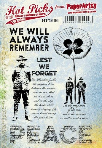
My next idea was have the poppy flowers sticking out of the reel but not to have them as normal poppies as it wasn't a standard representation of war. I had decided to use the Hot Picks set HP1606EZ as there are some lovely images and thoughtful words.
I
wanted to have a nod to the poppy, as it is so closely linked with
remembrance but thought about having another colour inside and didn't
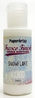
want a flat colour so got my gel plate out. I'd recently got the Drying Retarder from
PaperArtsy and if you've never used it before, it's perfect for use
with gel plates or if you're in a hot environment where paint dries
super quickly. It's easy to use, just a little drop into your pool of
paint (but no more than 5% of the total amount) and it means you have
more 'play' time before the paint dries on the plate. I used Mermaid,
Smurf, Slimed and Snowflake to create my pulls.
I
used one of the pulls to stamp my poppies onto, keeping the soldiers on
one as I needed them for later. I tried to incorporate the white areas
to give the flowers more visual interest.
Painting
the edges and centres with London Bus and Haystack, gave them more of a
floral feeling. I love that London Bus is translucent as it allowed the
colours from the gel pull to show through and give 'texture'. Once cut
out and arranged together, I stamped the 'peace' onto another pull, that
I'd used stencils with. I had wanted to use the PS021 stencil, but thought too many fonts would be distracting, so plumped for PS041 instead.
So
Plan B was to have the letters around the inside of the cotton reel,
but I already wanted to add an acetate collar and that would have
obscured the word too much. I knew I needed another cotton reel to add a
second layer and not look too 'busy'. So, I made another reel and added
slits to the back of the reel cylinder that I could slot the 'collars'
into them. I got into stamping next. Increasingly with stamping on
acetate, I stamp with the acetate on the top, which often means if the
image doesn't come out quite right, I can peel back a little of the
acetate, add more Stazon ink and cheat! It's also easy to see the ink
spreading evenly onto each part of the image this way too.
Trimming a little angled tab into the edge of each acetate piece meant it was easy to insert into the reel and stayed put too.
The
rest of the make involved just putting it all together. Rather than
talk about that, I thought I'd show you some close-ups and explain why I
have done what I've done!
You'll
notice here one of the 3 flowers and the street names protruding
outwards. Three flowers are for the 3 spheres that wars are being
'fought' in currently. Those street names are from London, which seemed
very appropriate as that is where some of heaviest toll on the health
service and also enormous loss of life (particularly in the early days
of lockdown) occurred. It did fit with the theme, but felt more poignant
than just a thematic inclusion. I used the images from HP1208EZ. The beads in the centre of the flowers I'll explain shortly.
This
next photo shows the part representing current global conflict. I tried
to get up to date figures, the most recent are from 2019 and show wars
spanning the globe: Mexico, Russia, Africa, Iraq, Syria, India/Pakistan,
Afghanistan and so many other places. Conflict that we don't always
hear about.
I
was reading about 2 humanitarian workers who lost their lives in
Afghanistan, caught up among fighting in the past few weeks. If you look
at the flower, you'll see numbers. I don't know what the total number
for loss of life in conflict this year, but it will be a substantial
amount. The numbers represent each one, each loved member of a family,
killed or taken too soon. The little hanging beads represent falling
tears, and so, for each sphere of 'war' we've mentioned, there are bead
'tears' at the centre of each flower. Tears for them, tears for the
state of our world, and tears for our own often difficult situations.
The
soldiers represent bravery; the indomitable spirit shown by so many in
so many ways. Secret bravery required to keep going when anxiety and
mental illness threatens to derail life and visible bravery as troops
continue to fight for freedom. This also represents hospital staff and
other key workers who fight to stem the tide of COVID-19 and deliver
care and front line services to those who need it most.
What we're all searching for, is peace.
I
hope that you are finding ways to cope during this difficult time. As
the after-effects of COVID-19 will be felt far into this year, I do hope
you can find time to create soul-soothing art and reflect upon the many
many good things that we still have and can be grateful for. This piece
when I look at it is a reminder of strength, pain, loss and an
encouragement to remember and be thankful.
I
hope this piece might encourage you create some art significant to the
challenging time we have all been a part of. It was good for me to think
more deeply about my feelings and thoughts and have a record (albeit in
artistic form) of it too.
Hope that wherever you are, you can pause and take time to be grateful.


7 comments:
This is beautiful Keren. And a lovely way to put into words what is needed this year. You've chosen beautiful colours too. So lovely to see you create.
Such a poignant post. I love how you have tied the art and what each of the elements represent together so beautifully. Absolutely moved me. xxx
Beautiful work and beautiful words, Keren. Your post is profound, compassionate and powerful, and your wonderful reel construction is too. I love the acetate collars, allowing the words to hover in the air, and the poppies are simply magical.
Alison x
Absolutely marvelous tribute!
Thanks Keren. Beautifully written heartfelt blog post.
A stunning 'piece' Keren. Artistically very difficult to create I'm sure, I've made construction pieces myself before from scratch and they are ten times harder than they look, and this looks very hard! But your words moved me because you haven't been afraid to get to the point: we've been talking in euphemisms a lot the last few months and what you have said chimed with how I am feeling. It's a wonderful idea to have a piece of art to remember this period by, and the other hardships being fought in the world. Well done! X
What a stunning project Keren, I love the way you have used the various typography, and the fabulous object. xx
Post a Comment