Showing posts with label ELB34. Show all posts

Friday, 12 September 2025

September 2025 - With 3 Things - Woven book {by Dounia Large}

Hi friends, 

It's Dounia from PaperArtsy HQ with you for another 'With 3 Things' challenge post. 

For this feature on the PaperArtsy Blog 3 identical items are sent to 3 members of the PaperArtsy Blogging team. Typically we will receive a stamp, a stencil and a couple of Fresco Paints.

We have no clue what PaperArtsy HQ is going to send, the whole idea of this challenge is to do something crafty in our personal style with these 3 items. We can incorporate other PA products into the mix if we feel it is necessary.

So let's take a look at what I 'received' from PA HQ ...


We had a very autumnal kit this time: a lovely stamp set full of textures from Lin Brown (ELB34), a choice of leaves in a fun stencil from the archives, PaperArtsy Stencil PS002  (also from Lin Brown) and two gorgeous warm Fresco Finish acrylic paints from the Seth Apter range: Kiwi Gold and Rusty. I also added a couple Fresco Finish colours from my stash for contrast and variation: Mahogany and Toffee.

With all of that I made a little sketch book with a fun woven cover.

The base for the cover of my book was a series of Regular Smoothy card bands, as well as a full A4 sheet for the inside cover. I worked simultaneously on all of them, without thinking too much, treating each like a mini master board.

I started with the texture stamps from ELB34. I used them quite randomly all over the bands, stamping in coordinated, water resistant inks.

Once dry, I added a layer of paint all over using Kiwi Gold, Rusty, Mahogany and a range of mixes. As all those paints are translucent, you can partially see the layers beneath, creating lovely and subtle textures. For an ever lighter coverage, I diluted some of the mixed with a bit of water.


I cut the finished bands into strips of varying width and it was time for weaving! 

I kept the more textured backgrounds quite large to show them off and the cut the brighter and darker ones one much thinner. I took inspiration from plaid for the weaving sequence but I think a random one would be gorgeous too! I tried to keep everything square with the help of a grid but the end piece is not exactly rectangular...


Now for the stencil, PS002 by Lin Brown. I really love the group of little leaves on it and wanted them to run along the whole cover. I secured the ends of my woven panel with masking tape and turned it over. I positioned the stencil under it and marked the groves with a stylus to create embossing. It is a technique I love but here it was not the easiest to achieve a clear image because of the thickness of the woven substrate and the breaks between the strips.


I then gave the whole cover a wash of Toffee Fresco Finish paint, making sure to push it in all the crevices and them wiping the excess on the raised parts. This disguised the white cut edges of the strips and helped all the colours work together .


I re-did the same technique with pure Toffee paint on the leaves to accentuate the relief. I also lightly sanded the raised parts  to make them stand out even more.


I love the overall effect! Then I 'only' had to glue on the inside cover and sew on the signatures. However, once I had the book completely constructed, I was not convinced the leaves were visible enough, so I dry brushed a little bit of Gold on the raised pattern. It was the final touch I was missing! I reminds me of a sunny autumn day!


The inside cover was done just like the bands with Kiwi Gold and Rusty, just on a bigger size.


I had a lot of fun with this project and love the result. It was a pretty safe bet as the colours are among my favorites! 

I hope this helps you travel toward autumn and maybe inspire you to try your hand at paper weaving.

Stay creative!  

Dounia x

Wednesday, 10 September 2025

September 2025 - With 3 Things - Autumn Book & Box {by Helen Ranger}


Hello, Helen Ranger (butterflywings_beautifulthings) here with you today on the PaperArtsy blog. I was surprised and excited when PaperArtsy asked me to be a guest blogger for the September 'with 3 things' challenge. Some of you may have seen some of my creations on the PaperArtsy People Group on Facebook. I haven't been creating for very long compared to some and still consider myself to be a beginner with a lot to learn. 

For this feature on the PaperArtsy Blog 3 identical items are sent to 3 crafters. Typically we will receive a stamp, a stencil and a couple of Fresco Paints. We have no clue what PaperArtsy HQ is going to send, the whole idea of this challenge is to do something crafty in our personal style with these 3 items. We can incorporate other PA products into the mix if we feel it is necessary.

When my parcel arrived, I carefully opened the beautiful bird paper wrapping to find a autumn inspired selection of Fresco Finish acrylic paints with Rusty and Kiwi Gold, a lovely Lin Brown stamp set ELB34 and PaperArtsy stencil PS002, also by Lin Brown. Ideas began to race through my mind.


Today I have made a mini book and its box, inspired by nature in the fall.

I have to admit nerves set in a little at this point along with a little self doubt for good measure. My usual style is to have delicate stencil backgrounds with very defined focals but this selection was possibly the opposite of that? 


I was feeling a little overwhelmed so I started with some exploration before taking any decision. I began to test the beautiful colors of paint with ink colours and paints that I thought might work well. All those rusty leaves gave me the idea to create a box with an autumn walk themed mini booklet inside.


I began my project by enjoy myself using my gel plate to make some backgrounds. I added small blobs of the two paint colours and used my brayer to blend them, then removing paint onto a spare sheet of copier paper through the stencil. This created a beautiful distressed textures.

I pulled the prints using the Heavy Cream Fresco Finish which toned down the colours a little. Perfect for a background!

Next I trimmed two of the backgrounds to the height of the reclaimed box I had chosen and glued the strips together to create a snippet roll. I used most of the stamps in the stamp set in various colors of ink all the way along the snippet roll. I did a lot of overlapping and some partial stamping. I finished it off with stitching along both edges.


I also needed to decorate the base of the box. Using embossing ink, I stamped onto one of the gel printed backgrounds using the distressed floral stamp. I coated this for two colours of embossing glaze then I added additional stamping and stitching. This way the base coordinates perfectly with the sides but has more texture!


I cut the snippet roll to size and painted the edges of the box in French Roast Fresco Finish I then glued the snippet roll inside and out fitting the base into the bottom of the box.


With the bow all pretty, it was time to begin creating my booklet. I sprayed some Distress stain and oxide through PaperArtsy stencil PS002 onto some card, adding water splats and drying. I brayered on a little of the Kiwi Gold Fresco, mainly around the edges. I glued another piece of the gel printed paper to the back. This will be the cover for my booklet


I wanted the booklet to fit snuggly in the box so I used the measurements of the box reduced by half a centimeter to determine to size of my covers. I cut a strip of the right height in the stencilled card and marked the covers width on each end. I glued on a second piece of card to the back of the booklet along the three edges, as shown above, to create a little pocket then inked up all the edges.

Then I began concertina folding the remaining strip between the covers. I wanted five pages so I created 5 peak folds, but you could have as many as you like. I finally glued together the valley folds on the outside of the booklet, stopping the concertina from opening. This created raised flaps inside the booklet to adhere my pages to.
I think I should have made the folds larger as folding the doubled card was hard on my hands and gluing the small folds was a bit tricky.


For my pages, I cut five pieces of the gel printed paper to the height of my cover minus half a centimeter and double the width. Each was to be folded in half and glued together sandwiching a flap of the cover, thus creating 5 pages.


Those pages now needed to be decorated! I brayered on matching ink to the one on the cover. I added scraps of the lovely tissue paper used to wrap my parcel (PT11 - Birds) and textures stamps to decorate the background.


I stamped many of the main leaves in the ELB34 set on card using different colour inks then painted them layering the two colours Rusty and Kiwi Gold. I also added a little bit of Claret Fresco Finish paint just around the edges as they felt a little "flat". I fussy cut these out and inked around the edges and the back as I knew that I wanted to bend some and I didn't want any white showing.


The next bit is intuitive to me as I love using fragments of fabric, string, book page and card/paper scraps to my nature work. Very often it can be the smallest of pieces. This process began when I created a junk journal for a year it was a period of healing for me.


I added these to the pages arranging the leaves, stamped words, scraps of snippet roll and text from a digital download.


I then added simple doodles, lines, dots and circles to each page.


Nearly there... I added leaves to the box and set about creating the finishing touches. I added some rusty paint to a metal token with a sentiment fitting the project. I let it partially dry and dapped it with kitchen towel. I glued the string inside the back cover so that the metal token dangled on the outside.


I fussy cut a moth and coated it with frosted crystal for my cover. A process I really enjoy!


I put cut off pieces of the base into the back pocket to use as a mini tag. (You didn't think I could create all this without a tag did you?).

All done! Here is a look at the different pages:


I loved all the processes to create this mini booklet and box which I can now fill with projects inspired by the upcoming season. I look forward to filling it and sharing my makes with you on PaperArtsy People!

Helen xx

Facebook: Helen Ranger

Sunday, 19 June 2022

2022 Topic 09: Leftovers {by Claudia Neubacher} with Lin Brown stamps


Hi and servus everyone, Claudia from VonPappe II with you today, and I'm so excited to share with you my latest project that was a true blast to create! PaperArtsy's actual "Leftovers" topic is sooo absolutely up my alley - I am a hoarder of a lot of inspiring bits 'n' pieces and this also includes tiny snippets and left overs from previous projects (honestly from almost every previous project. I just can't throw away the tiniest scraps). I store these in different kinds of gorgeous looking boxes of all sizes - mainly cigar boxes or old wooden boxes, but also in my favourite old watch makers chest of drawers (a gift from my most beloved and wonderful hubby) that holds a lot of different stuff like frozen charlottes, old watch parts, nature finds and fossils, small metal bits, pieces of lace and my most precious flea market finds. I also have small tin dishes on my studio desk where I have my most beautiful and inspiring vintage buttons, frozen charlottes and other tiny bits right in sight. 


When I have no particular design in mind but want to create a mixed media assemblage piece I often rummage all of these for inspiration and combine finds that speak to me on that day with awesome new stamp sets I want to use. The project design kind of evolves from the mix of the pieces and stamps that speak to me most when I see them together spread out on my desk. When that mix feels right it creates a kind of creative tune of texture and contrast play in my head that I am going to follow throughout the creative process.


For this particular assemblage piece I chose not only to use some tiny left overs from my last PaperArtsy project (which you can find here) alongside some nature finds like feathers or drift wood, maybe some old buttons or watch makers bits, left over die cut and embossed strips from other projects and whatever else spoke to me, but I was also inspired by some old left over casts of flourishes and my idea was to do some texture stamping with the lovely leaf and pattern stamps from the beautiful Lin Brown stamp sets ELB32 and ELB34 and PaperArtsy Grunge Paste. Both stamp sets provide beautiful focal images as well as pattern stamp designs - perfect to create a highly textural nature look! 


I start most of my projects with browsing through all my wooden boxes and drawers with old paper scraps, snippets, tiny glass vials, ribbons, buttons and whatever else I have been hoarding since I started to indulge in creating mixed media art. Often that results in finds of long forgotten treasures - which always feels as if I'd found them another time (which is kind of rewarding - even though I also always promise myself to try to get more control over all the stuff I have and get better at using it up). For this project I pulled out a match box that holds tiny manufacturers labels that I have saved from some watch glasses I used quite some time ago, some feathers I gathered on my nature walks, a lovely strip of dry embossed black paper and a scrap of embossed wood grain cardboard (that was a left over from making loads of wood planks for one of my card board mansions I've made). Also a used and dried tea bag, some old watch parts and Dresden trim left overs. My base to work on was a chunky wooden panel with some not so intriguing home decor print on it (I love to buy these at the sales sections of home decor stores at the ridiculous price of one or two Euros as they are a really cool substrate to work on). My plan was to first do a grungy crackled background, then create some awesome nature feel texture in some spots by stamping into PaperArtsy Grunge Paste and combine that with maybe a little aged looking glass vial holding the feathers. The rest of the design - as always - would reveal itself to me during the process.


I applied PaperArtsy Fresco Finish Acrylic - Mud Splat (FF61) as my base colour, dried it with my heat tool and then randomly scraped on some Fresco Finish Crackle Glaze (FF22) with a spatula and fast dried that as well. On top of that I scraped Fresco Finish Acrylic - Niagara Falls (FF205) with a palette knife and let that air dry. You can see the first cracks form almost immediately.


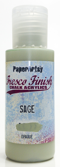
On to the most challenging step - my first time of stamping into Grunge Paste (GP190), which I had seen done so beautifully with others! The picture below shows that I wasn't really successful with that (I guess I was too impatient and/or the idea of mixing in a little dose of Fresco Finish Arcylic - Sage (FF66) wasn't a good one). I half succeeded with one try (in a spot where the scraped on paste mix was really thin and quite dry already) - but as all the other tries were a total failure I decided to completely scrape off the added Grunge Paste with the blade of my palette knife. That also resulted in some loss of crackled paint that was underneath - but when you are a grunge lovin' girl like me you have learned to embrace this kind of imperfections and "texture surprises" as I like to call them. And I will watch some instructional video next time before I try again! ;)


So a change of plan was needed - I decided to use some cement coloured air hardening clay instead (which I had already gathered before I had started because I know that I am not the most skilled into-any-kind-of-paste-stamper.) I had opened that package some time ago and had only used very little of it, so I was happy anyway to use up some more of it before it would start to get too dry or turn into a a useless faux cement brick (which happens way too often I have to admit). I rolled out a small amount of the clay using an empty glass bottle (as my clay roller was in the other studio of course) and stamped the beautiful leaf image from the Lin Brown stamp set (ELB32). I misted the stamp with a bit of water before stamping and also immediately cleaned the stamp afterwards under running water and using a soft old nail brush.


The imprint turned out just beautifully! I love the detail I got from the stamp! I then decided to not cut out the shape of the leaf but add some stamping around and create some random texture by using some of the pattern stamps from Lin Brown stamp sets 32 (ELB32) and 34 (ELB34). I fastened the hardening process with my heat tool (being a very impatient girl that day).


As the "cement" grey looked quite dull I came up with the idea of treating the clay with a mix of PaperArtsy Infusions - Golden Sands (CS05) and Rusting Powder (RP45). I knew that quite a lot of the Infusions would be washed away as the Rusting Powder needed to be sprayed repeatedly with vinegar, so I added a bit more of the crystals at the beginning. I wasn't quite sure how the finished piece would turn out, but I knew I could always seal the piece with some transparent acrylic spray sealant and go in with some paint if I didn't like the result. 


While spraying on vinegar and letting it dry and repeating this step several times I went on with preparing the background for my assemblage piece. The pattern stamps from the two Lin Brown stamp sets were absolutely perfect for this! I used Tsukineko - StazOn - Ink (Ganache) which is a dark rich brown as black would have been quite a hard contrast.


Did you actually know that you can use PaperArtsy Infusions to tint glass vials? The idea to try this out just hit my mind when I found I only had white glass vials but rather wanted some aged looking one and had no alcohol inks at hand to create the effect. I simply poured very few of the Infusions - Golden Sands (CS05) crystals into the vial, added a few drops of water and moved the vial around to spread the mix inside.


I also created some drip lines using the Infusions directly on my wooden panel and spraying on water. To save these from being reactivated I used a matte acrylic spray sealer on top after I had heat dried everything. 
Time to add a piece of stamped tea bag goodness! I picked the gorgeous worn looking flowery design from the Lin Brown stamp set 34 (ELB34) and glued the finished stamped tea bag layer to the base using a wide soft flat brush and DecoArt - Decou-Page (Antique) to add even more brownish tint. Wrinkles were more than welcome to the mix!


In the meantime I continued spraying vinegar onto the leaf imprint while I played with some of the dry embossed leftover strips from my collection on my prepared background. I found one done on black card board that I really loved and dry brushed it with a thin layer of Fresco Finish Acrylic - Niagara Falls (FF205) to fuse it with the background.


For a bit of contrast - colour- and texture-wise - I added a thin strip of gold Dresden trim. That really made the soft turquoise from the glued on strip and the background colour pop! 


Remember the little glass vial I tinted using PaperArtsy Infusions? I really wanted that to make a visual impact on my piece. As you saw it worked just perfect, but I wanted more interest and eye candy! I fetched some tweezers and my heat tool and moved and tilted the vial around so the still left over liquid Infusions inside would be spread and create drip lines and dried paint edges. Directing the heat from the heat tool right into the vial's opening quick dried these drip lines and the result was a true stunner!  


The strip I fixed the vial to the panel with was cut off a leftover dry embossed piece of cardboard I had made wood planks from. I dyed it using PaperArtsy - Infusions - Golden Sands (CS05) again.


I really love the aged look of my vial and the intense colour of the embossed paper strip that holds it in place! 


Next I stamped my affirmative word from The Lin Brown stamp set ELB34 onto an old dictionary page. I like to use the edges of heavily yellowed book pages to create word bands for mixed media pieces!


A new colour was added to my palette - PaperArtsy Fresco Finish Acrylic - Blue Lagoon (FF132). I knew I wanted to use this incredibly beautiful button on my project - so I needed to repeat that awesome colour tone on my background to visually bind it all in. I sprinkled some diluted paint across my project using a heavily loaded brush and gently flicking the paint on.

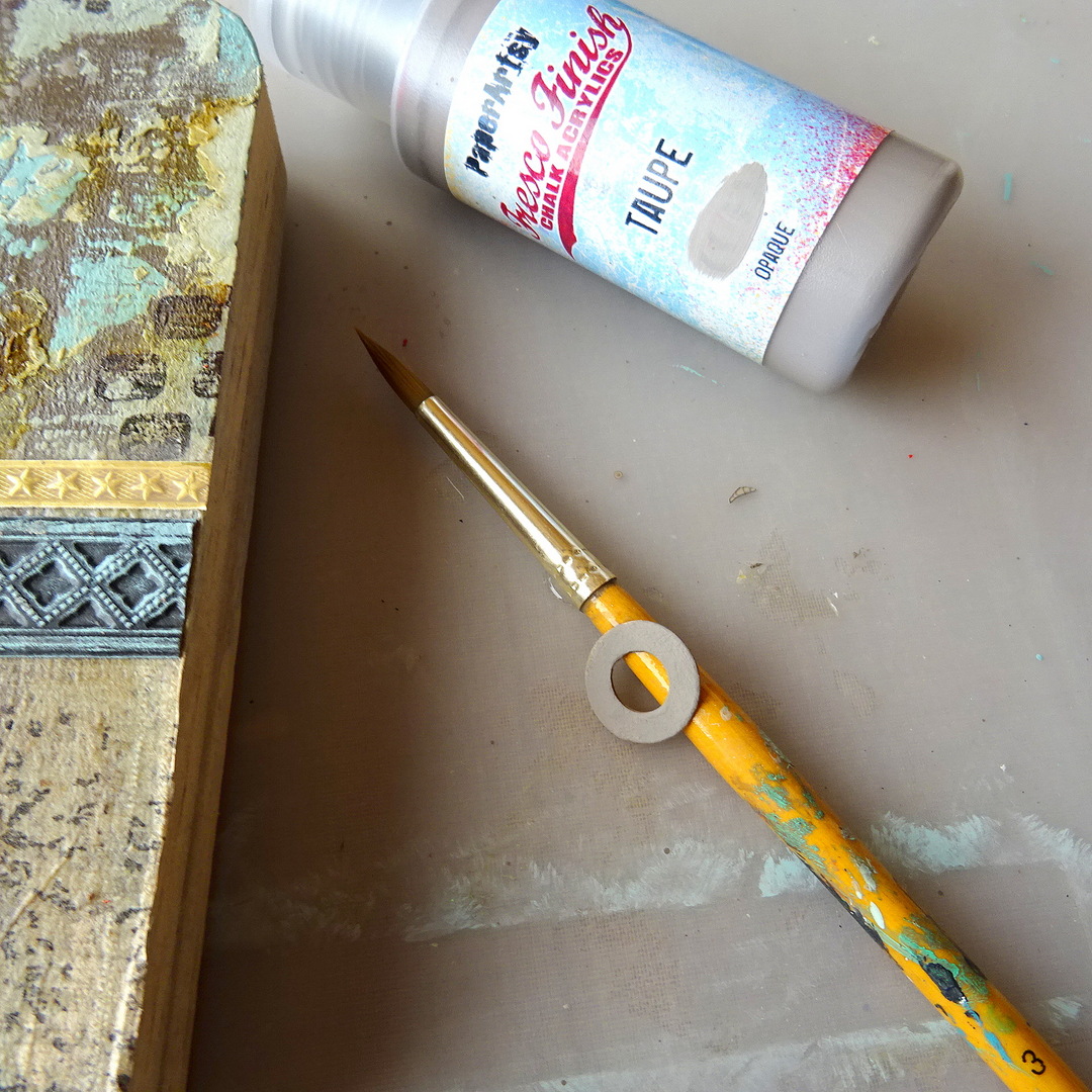
To visually fuse all the elements of my assemblage piece I found I needed to repeat the circle shape of the button at least one other time - so I painted a left over die cut reinforcement ring with Fresco Finish Acrylic - Taupe (FF60) to add it to the mix.


I also needed another small focal element so I used diluted left over Taupe paint on my palette to lightly tint one of the watch glass labels from my match box collection.


In the meantime the leaf clay imprint had beautifully rusted! Finally time to put it all together and find the final spots for all the lovely bits I had created.

The reinforcement ring got another watch glass label added on top and for a final touch I painted tiny dots of Fresco Finish Acrylic - Sage (FF66) around it and also a thin Fresco Finish - Blue Lagoon (FF132) border with tiny dots at the bottom right underneath a lovely vintage lace trim from my cigar box.

To create really tiny dots I like to use my smallest size hand embossing tool. Much better than a detail brush in this case.

As it was already on my desk I used DecoArt - Decou-Page (Antique) again to glue all the bits in place and finish off the project. Once everything had dried the feathers finally found their new home in the tinted glass vial!


Often the projects I am most content and happy with originate from using scraps and left overs of all kinds. I guess this is because rummaging through my treasures makes me happy and gets my mojo going, but also because the random shapes, textures and colours of left over scraps and bits from older projects already give a bit of direction to follow during the creative process. This way, not much thinking and planning is involved in the process - and that is something that really makes me enjoy some relaxed creative me-time in my studio. And seeing some of my long hoarded treasures (and they are actually all treasures to me) on a lovely finished piece of assemblage wall art come to life just makes my heart sing! 

Which kind of collections and left overs inspire you to go create something that shows all of the things you've used are being treasured? Why not browse your boxes and drawers and listen to what the things you keep, hoard and love looking at tell you about your own creative preferences and processes? Being a creative means you are always on a journey towards your inner self - you just have to listen to what your art and art collections tell you about yourself. 

Claudia xxx