Showing posts with label HP2401. Show all posts

Thursday, 23 January 2025

Vintage Cards with PaperArtsy Products {by Etsuko Noguchi}


Hi everyone Etsuko Pixienest here with you today.

For my first blog in 2025 I selected a set of past HP1506 butterflies from PaperArtsy collection of nearly 80 HotPicks to create a slightly vintage card. And when I got my first PaperArtsy stamp, I was eagerly waiting for it to arrive because I knew it would expand my world, and that feeling hasn't changed.


For this project I used the slightly newer Hot Picks stamps HP2401 and HP2402 to make small labels and tags for decoration and Seth Apter tissue PT06 for the card background. I was very impressed with the great effect this large patterned tissue produced. I first became aware of the tissue paper technique from a Leandra tutorial 10 years ago, which I have included a link to if you are interested. Leandra's tissue tutorial


These are the main supplies used in this project. The paper and paints used for the base are presented in the next layer section. The stamps are mainly HP1506 and other HP2402, the Printed tissue papers are Hot Picks PT07 and Seth Apter PT06, and Mattints (The pink, Dragonfly and Glow ) were used for colouring. Mattint works very well with tissue paper and is used frequently.

Mattints were chosen for colouring on tissue paper because of their brilliant transparency and the fact that they can be applied without damaging the paper. And it worked smoothly. I love them!


Ranger Distress Oxide Spray-chipped sapphire and Distress Spray Stain-hickory smoke using a brayer applied randomly over the the Smoothy (heavyweight) A4 white stamping card , allow to dry, knock down with PaperArtsy Fresco Finish Chalk Acrylic - Snowflake and distress in places with Ranger Distress ink - vintage photo using a blending tool. The base background was created. You can also dissolve Infusion in warm water and put it in a spray bottle and use the same method to make a background for a vintage piece, when you have a time.


The paper was then cut into pieces according to the purpose for which the photo-slider were to be used. Round cutters were used for the four corners of the photo-sliderr.


This is the photo-slider for focal point butterfly. Rectangular windows were used for a die-cut.


HP1506 butterfly stamp stamped on A4 Card with Ranger Archival Ink-Jet Black and coloured with coloured pencils.


On the same paper, the script section of Hot Picks PT07 tissue paper was glued on with Mod Podge and when dry, Mattints The Pink, Dragonfly and Glow were applied to each section.


I wanted two decorations on the inside frame of the photo-slider, so I used HP1602 chevrons. Two round marks were also used for labels and tags.


Acetate glued to the holder windows and the butterfly sliders are ready. 


Also dark brown outer frame and HP2402 texts added. The small tag decoration on the side of the slider, which is slightly visible, has been added to the photo below.


Cut out three cards from the first background paper, Tim Holtz clock face cardstock and Seth's printed tissue paper PT06 were each cut and collaged on top of the background.


I wanted to put a small labels underneath between the butterfly holder and the background. So I chose small letter stamps from HP2401 and HP2402 to make these labels.


The labels were made of kraft paper or white paper, coloured slightly with an ink pad and surrounded by Vintage Photo to give a aged.


This is the slider-side dangling, a small bronze eyelet has been added and clipped on.


The finished card was to be underlaid with brown paper as it was, but I wanted contrast to my work, so I made a whitish trim. PT01 printed tissue was applied to white paper and washed with Snowflake and used PS394 PA stencil with Grunge Paste on the paper.


The paper was cut into 5 mm wide strips and trimmed and stuck to the edges of the card.


White trim fitted and background finish. I liked the overall ageing colour finish.


Finally, a butterfly photoslider was attached to each card to complete the process.


I really enjoyed this project using PaperArtsy Hot picks as it allowed me to demonstrate the vintage style I love so much. I have recently been making and storing homemade labels and tabs to create clusters and clips for my junk journal, and I have incorporated that method into this project and collaged the labels. Please try making labels of different shapes and colours from the stamps you have on hand to add to your work and have fun!
Thank you so much for visiting by.
Have a wonderful 2025.

Etsuko xxx


Blog: coming soon   
Instagram: Pixienest
Pinterest: Etsuko N


Saturday, 9 March 2024

2024 With 3 things: Crunchy Cards {by Ann Barnes}


Hello everyone,  Ann (aksbarchitect Creates)  here with you today; sharing some cards that I made for the "with 3 things" challenge. I was so excited to be able to participate in this new feature, especially to be able to stretch my imagination and creativity using the wonderful PaperArtsy products.


When my package arrived, I was looking forward to seeing which three products were chosen for me to create something with. I was certainly not disappointed! These new PaperArtsy Hot Picks stamps (
HP2401) drew me in from the moment I watched the release video. This set contains wonderful small graphics, perfect for backgrounds as well as some bolder sentiments that could work in journals or on cards, even layered into a mixed media piece. 

Just as exciting is the package of Crunchy - Waxed Kraft Paper (WKPA5), oh the possibilities! I love the natural brown color of this paper and the waxed coating that gives way when the paper is scrunched up creating a web-like effect is simply divine. I have always wanted to experiment with just how much this crunchy waxed paper could handle and this was my chance! 

The final product included was a jar of PaperArtsy Infusions Just Walnut. Now this was a treat! The infusions line is so interesting and creates such beautiful finishes where each color includes some of these walnut crystals, but to have a jar of simply walnut crystals, it is pure joy.


Now, I must tell you, once I unpackaged these "3 things" my imagination went into overdrive. so many ideas came to mind. I may even have a little pile of experiments, as well as need to finish pieces, stacked on the corner of my table.

My first experiments involved the PaperArtsy Crunchy - Waxed Kraft Paper. I wadded it up and flattened it out again; heated it with my heat gun, making it crispy; stamped, inked, and dyed it; I even embossed and die cut with it. Each experiment fueled my imagination even more. If you are ever at a crossroads and not sure what to do, playing with products and experimentation is the key to unlocking your creativity. Here are a few of the results from my Crunchy - Waxed Kraft Paper experiments. I love the way that ups get the color variation when the paper is crumpled. and the dry embossed design is gorgeous on the PaperArtsy Crunchy Waxed Kraft Paper.


I also tried some different techniques with the PaperArtsy Infusions (Just Walnut). As you may know, I love working with inks; I sprinkled some of the crystals into one of my palette wells and added drops of water to create a walnut ink. Depending on the ratio of water to crystals, the ink color can range from a deep dark brown to a light almost tea color. These work so well as washes on paper. You can use the ink to dye ribbons and twine as well. Next, I added the crystals to PaperArtsy Fresco Tints - Mattint Glow, I chose to work with Mattint Glow, a wonderful transparent yellow, that when mixed with the Infusions Just Walnut, creates a gorgeous yellow ochre color.


When these papers were dry I knew that I would be creating some cards with the pieces. I have a feeling that if something made with this beautiful, cheerful color would arrive in someone's mailbox, it would make their day. Considering these were to become backgrounds, I wanted to add a bit of interest, using the more ephemeral stamps in the PaperArtsy Hot Pics 2401 stamp set, I lightly inked up the stamps and randomly added them to the papers. I did not use the entire images, just some sections of the stamps. This is easier to you when you do not use a stamp block.


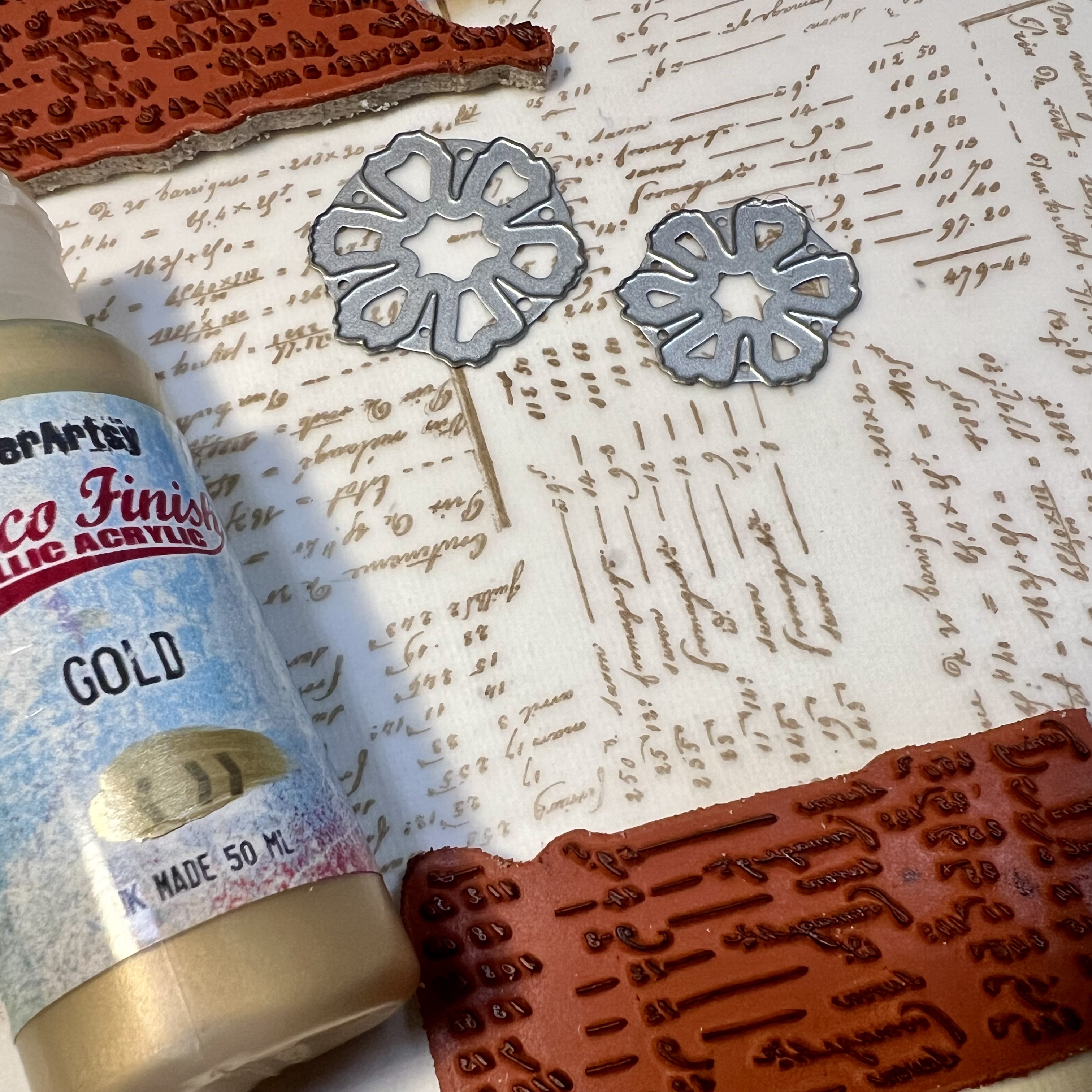
I thought it would be fun to create a selection of cards. Spring is in the air where I live, so I decided to create some layered flowers for one of the cards. I stamped a piece of vellum with two of the PaperArtsy Hot Pics 2401 stamps, then painted the back side of the vellum with PaperArtsy Fresco Finish Chalk Acrylic Gold (FF20). When the paint was dry, I die cut some layered flowers from the vellum as well as from the Crunchy Waxed Kraft Paper and created the flowers.


The flowers were glued onto the background. I painted stems and leaves using some very concentrated Infusions Just Walnut "ink" that I created by mixing the crystals with a little bit of water.


The "aged to perfection" stamp from Hot Picks 2401 seems perfect for a birthday card! 
The other two cards I made were put together in a similar manner, but one uses simple die cut wildflowers. These were cut from the PaperArtsy Crunchy Waxed Kraft Paper, and layered onto the background. 


For the third card, I burned the edge of a piece of the PaperArtsy Crunchy Waxed Kraft paper and used it as a wrap around one of the golden paper bases. I tied it closed with a piece of jute that I dyed with the Infusions Just Walnut. The inside features the "Light your fire" stamp and above the closure there is a wax seal that I created by stamping into the hot wax with a section of one of the stamps included in the PaperArtsy Hot Picks 2401 Stamp set.


I can't wait to send out my cards! I loved being able to take part in this new feature on the PaperArtsy Blog. I hope that maybe you have been inspired to pull out a few supplies and spark your own imagination. Thanks so much for stopping by today, Ann   xx


Thursday, 7 March 2024

2024 With 3 things: Ring Bound Journal Cover {by Autumn Clark}


Hi everyone!  It's Autumn Clark from SewPaperPaint with you today to share my portion of the 'With 3 Things' challenge.  I hope you're following along with the blog posts to see what Liesbeth created yesterday, and what Ann has in store for you tomorrow with (these same) 3 things.  


We bloggers generally have an idea of what we will make, but this challenge was so exciting to me because I didn't pre-plan or sketch out ideas.  I received my 3 Things and immediately decided I would make a mini book/junk journal, covered in Crunch Waxed Kraft Paper.  The funny thing is that Liesbeth and I had the same idea!  Luckily I checked to see what she was up to before starting down that rabbit hole - ha ha!  Otherwise, I would have created a book almost identical to hers.  :)  Well done Liesbeth!


I had to completely switch gears and decided, much like Ann, to approach these new products with playful experimentation.  My first idea was to create some pocket envelopes with the Crunchy Waxed Kraft Paper for a junk journal spread.  I used a Tim Holtz die by Sizzix to cut them.  I wasn't sure if I liked the crinkled version or not.  I had intended to fill the envelopes with postage stamps, but the Kraft Waxed Paper wasn't as transparent as I'd imagined and the postage didn't show through very well.  I still love the envelopes and will incorporate them on another page in my journal.  


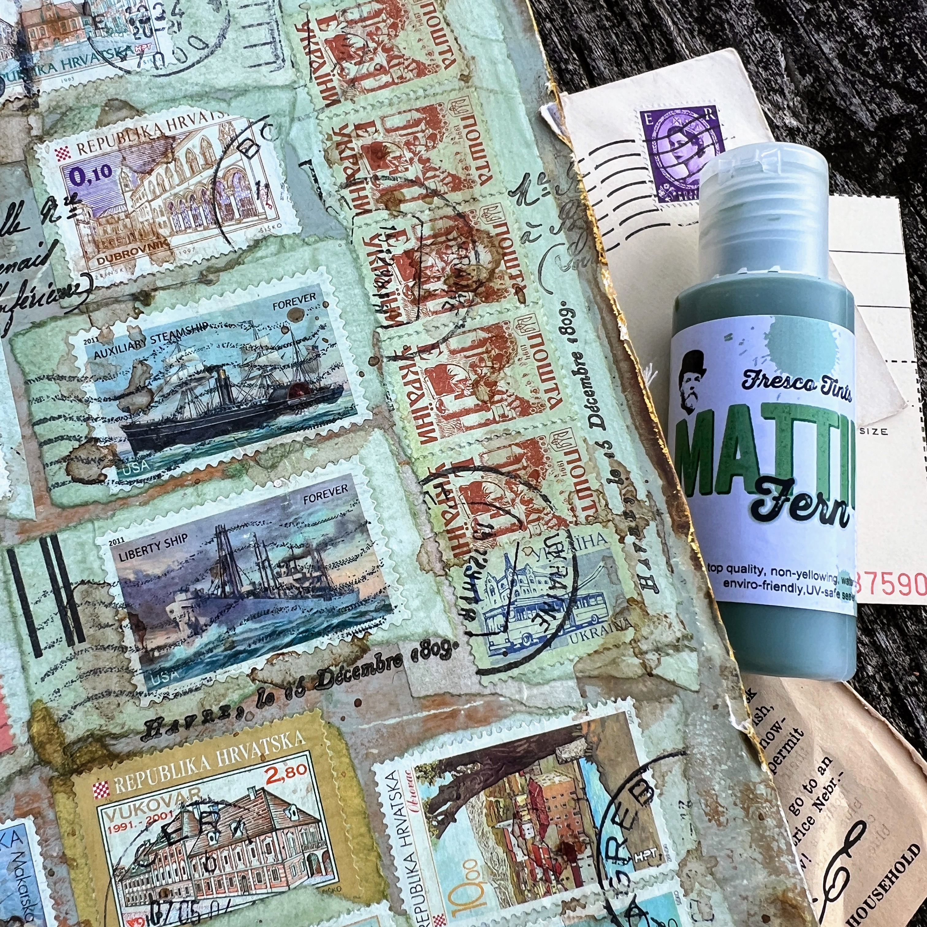
As we kick off the Mattints Topic soon ... I switched gears and decided to experiment with Mattints in Fern.  In the introduction post to this fab new product it states, "Mattints are a TINTED MATTE GLAZE and GLUE."  I was a little sceptical about the glue properties because the product is very thin.  But I had a brave moment and decided to test it out right on the cover of my cardboard junk journal from THIS POST.  You can see how I created the simple ring bound journal from gel printed cardboard pages.


I squished Mattints in Fern right onto my surface as I normally would do with matte Mod Podge, my go to collage medium.  


I started brushing the medium around in small sections then added a cancelled postage stamp, then brushed more Mattints over the stamp and worked my way until I had covered the entire panel. 


I was inspired by my dear friend Barbara, from @alteredart45, who had created this awesome postage roll in Fodder School.   She and I found these cool large spools in a  mountain shop in NC and always intended on making a scroll with them together, but after years of neglect she put hers to good use!  


I let my panel sit for several hours and came back and was completely blown away by the result!  Not only was the entire piece tinted beautifully in the Fern color, but the glue properties worked WONDERFULLY!  And the best part was that the surface did not even appear to have been glued.  To touch it, it felt like rubbing paper, unlike the "silky" feeling when you use Mod Podge.  That's why this product fits well with the PaperArtsy Fresco Chalk Acrylic family at PaperArtsy, because it's wonderfully MATTE!  :)    It made me curious if regular matte medium was the same finish, so I did a test and it was also silky, though less shiny than Mod Podge.  Side by side the Mattints was noticeably different.  WOW!


I pulled out the awesome new HotPicks stamp set 2401 (HP2401) and used the awesome collage style text to blend the postage stamps together, doing first, second and third generation stamping in Versafine black. And of course, as the Fern Mattint is a matte finish (ie toothy), it is also super easy to directly stamp onto the glaze too!


I love that this stamp set has so many font styles and options for subtle background stamping, but could easily be used as a focal element too.  


Next, I watered down the new Just Walnut Infusions powder to create a stain and brushed it randomly over my post to further blend and age it.  This complimented my journal very well because I had previously dipped my pages in Infusions in The Sage and Golden Sands to distress all of the white edges and bare cardboard that wasn't gel printed.


I had initially hoped to add a collage cluster of 3D elements over the postal collage using the Crunchy Waxed Kraft Paper envelopes I had cut, but I couldn't bring myself to cover the postal collage and was afraid I wouldn't enjoy a heavily dimensional cover, since I had many more pages within the journal on which to create.  In the end, I crunched up a long strip of the Waxed Paper to make it resemble washi tape.  I reinforced the binding edge with the faux tape and just love how it looks, resembling leather.  My next project is going to be making a sewn binding with CWKP as the spine, sewn beautifully in place!  


After I saw how beautifully the Mattints in Fern looked on my front cover, I repeated the same style of collage on my back cover.  I wish I had incorporated the CWKP on the back cover of my journal, but since this was sheer play and experimentation, I hadn't thought that far in advance  and hated to cover up the beautiful stamping.  


Reflections....

I've loved this mix up of our normal blogging style here on the PaperArtsy blog and the challenge of creating with an identical brief and two other fabulous designers.  I really hope our posts will encourage you to play and experiment with these products yourself, because let's be honest - that's where the creative magic really comes out!  xx, Autumn

YouTube: SewPaperPaint
Facebook: Autumn Clark
Instagram: @sewpaperpaint
Pinterest: SewPaperPaint